Making images accessible
As the saying goes, a picture is worth a thousand words, and images can add a lot to a web page. Some pictures are decorative, whereas others are an important piece of content that gets your web page’s message across with great impact.
Every time we add an image to a web page, there are accessibility considerations we should take into consideration in order to make the image accessible. Not all users may be able to see an image. For example, if a user requires a screen reader or another form of non-visual browser to be able to navigate through a web page, they will require a textual description of an image to be able to garner any meaning from it. It can also be the case that a user does not download images because of limitations on network bandwidth or for security reasons. All of these users will benefit from an alternative text description of an image.
The way we can provide this information is through the alt attribute, which we learned about in Chapter 1. An alt attribute should provide a meaningful text alternative to an image.
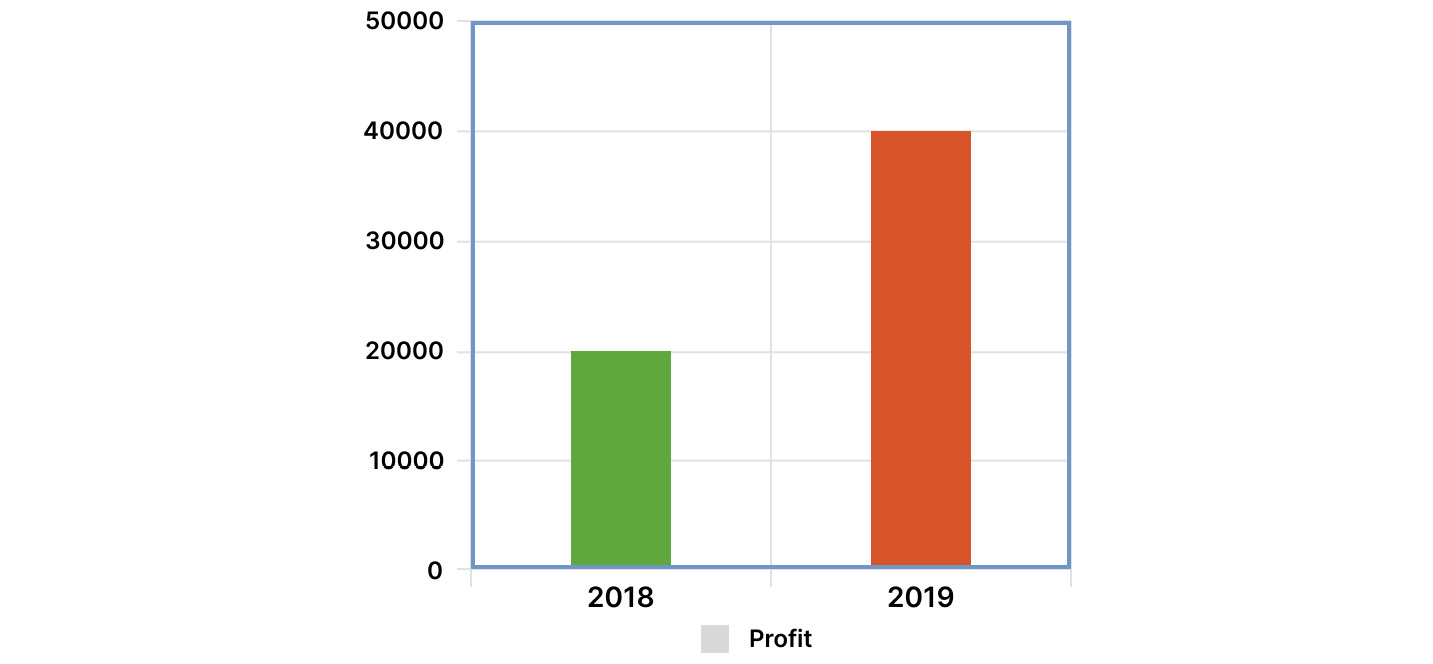
For example, if we were to add an image to our web page that showed an infographic with some important business data, such as the budget for this and last year, the information – any text, labels, or the numbers the bars represent – would not be accessible to a non-visual browser if they were included in the image. We would need to add an alt tag that expressed that information.
The following img tag could be used to provide an image and appropriate alt text:
<img
  src="bar-chart.png"
  alt="Bar graph of profits for 2019 (£40,000), which are
       up £20,000 on profits for 2018 (£20,000)"
/>
The following is our infographic:

Figure 9.1: Bar graph infographic
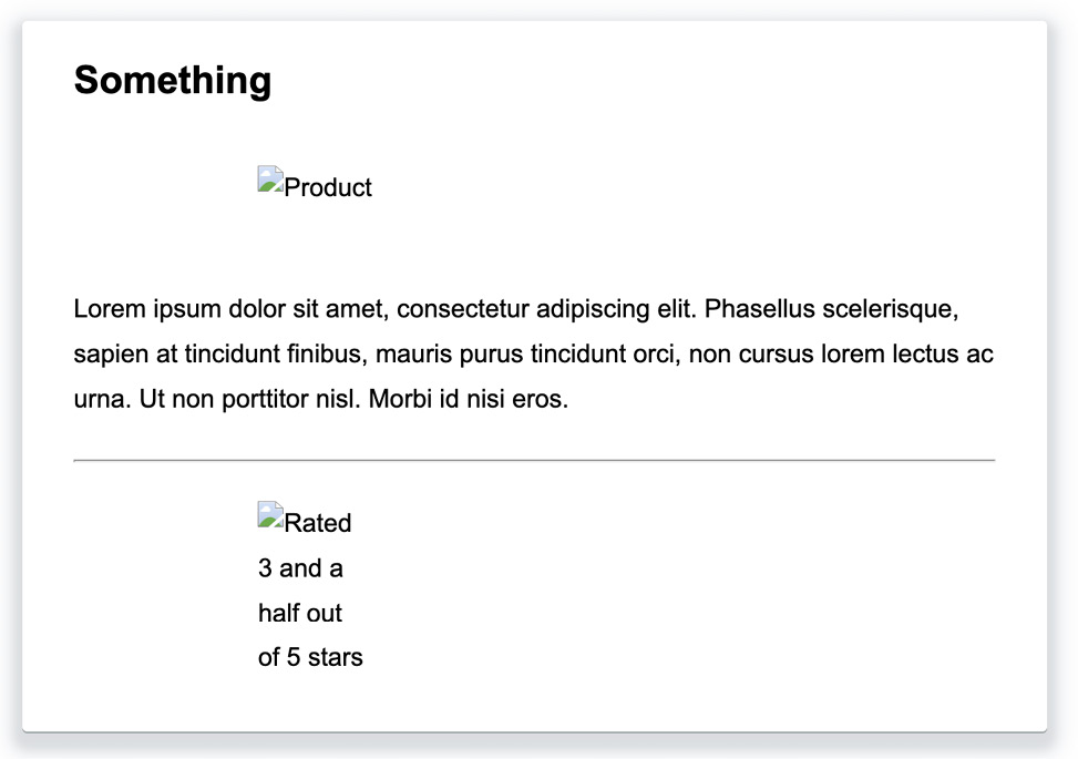
The following screenshot shows the alt tag (with the image not loaded). The alt tag can also be read by a screen reader:

Figure 9.2: alt text for the bar graph image
There are a few decisions we should consider when we add an alt attribute, and these depend on the nature of the image (or images) on our web page.
Note
The W3C provides a decision tree that can be very useful for making a decision about what content you need to provide in the alt attribute of an image on your web page. You can find it at https://www.w3.org/WAI/tutorials/images/decision-tree/.
As we have shown in the previous example, informative images need a text alternative. Where an image provides the user with information in the form of a diagram, graph, photo, or illustration that represents data or a concept, there should also be an alt text attribute. We should, at least, provide a short text description of the essential information the image conveys. Often, and this especially applies where the information in the image is complex, we need to back this up with more text content or with a table of data.
If an image is purely decorative, we should still provide an alt attribute, but we don’t need to add any text. We just add an alt attribute with an empty string (alt=""). Decorative images include those that are used for visual styling and effects.
Images that are described by surrounding text on the page can also be considered decorative. If the information that’s conveyed by an image is also described as text on a web page, you can again add an empty alt tag.
If an image has a functional role – for example, it is an icon that’s used as a button or a link, we need to provide alternative text that describes the function rather than the image. For example, where an image of a floppy disk is used as a button for saving a file, we would provide the alt text Save or Save file rather than something such as Floppy disk icon, which would describe the image but would not be useful for a user who wanted to use that functionality.
Where multiple images are used to convey a single piece of information, we can add alt text to the first image to provide a description. The rest of the images can then have an empty alt attribute. For example, in the forthcoming exercise, we will create an element for showing a rating using five separate star images. By adding an alt text description to the first image and empty alt attributes to the other images, we inform the user of the rating, even when the images are not visible.
Here is the relevant code:
<div class="rating">
  <img
    src="images/full-star.png"
    alt="Rated 3 and a half out of 5 stars"
  />
  <img src="images/full-star.png" alt="" />
  <img src="images/full-star.png" alt="" />
  <img src="images/half-star.png" alt="" />
  <img src="images/empty-star.png" alt="" />
</div>
Having seen the basics of the alt attribute, we will implement this in the following exercise, where we will make the rating section of a typical product page accessible. We will make the group of images accessible with the appropriate use of alt text.
Exercise 9.01 - Accessible ratings
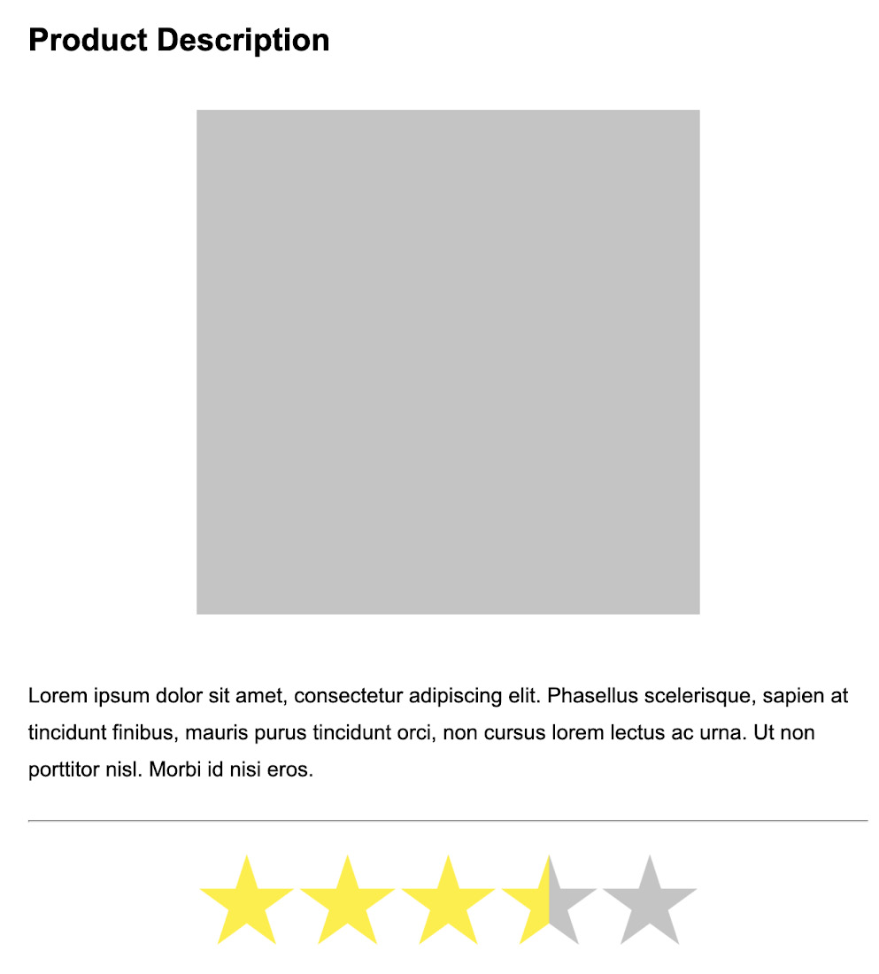
In this exercise, we are going to create a product page. We are going to include an element for showing a product rating. This is a common UI pattern seen on e-commerce sites or anywhere users can rate cultural artifacts such as books and films. The rating will be represented by five stars, and a rating can be any value from zero to five stars, rising in increments of a half.
To create the rating element, we will use five separate images. We will make the group of images accessible by providing alt attributes to express the information on our set of images. In other words, we will describe the rating given.
The following screenshot is what the product page will look like when it’s finished. For this exercise, we will give the product a rating of three and a half stars:

Figure 9.3: Product page with rating UI
The steps are as follows:
- First, we will create an empty web page in which to build up our accessible product page. We will create and save a file named
Exercise 9.01.htmland add the following code to provide a page title and to add some styles to remove white space from the body element:<!DOCTYPE html> <html lang="en"> <head> <meta charset="utf-8"> <title>Exercise 9.01:Accessible rating</title> <style> html { box-sizing: border-box; } *, *:before, *:after { box-sizing: inherit; } body { padding: 0; margin: 0; font-family: Arial, Helvetica, sans-serif; font-size: 16px; line-height: 1.7778; } </style> </head> <body> </body> </html> - In the
bodyelement, add a<div>with aclassattribute with thecontainervalue. This is where our product markup will be hosted:<div class="container"></div>
- We want the product to be centered on the page, so we will use flexbox to center the contents of the container in CSS. By setting the flexbox flow to a column with no wrapping, the elements within that container will flow vertically, one after another. We add the following declaration block to the
styleelement:.container { display: flex; align-items: center; justify-content: center; flex-flow: column nowrap; } - We are going to create a product item page that shows an item with a title, a description, and a rating. We can add the initial markup for the product – a section element with the
productclass attribute and child elements for a product image, as well as a heading and a paragraph for the description. We add this to thebodyelement:<section class="product"> <h2 class="product-heading"> Product Description </h2> <img class="product-image" src="images/product.png" alt="Product" /> <p class="product-description"> Lorem ipsum dolor sit amet, consectetur adipiscing elit. Phasellus scelerisque, sapien at tincidunt finibus, mauris purus tincidunt orci, non cursus lorem lectus ac urna. Ut non porttitor nisl. Morbi id nisi eros. </p> <hr class="divider" /> </section>
- To style the product item, we will add the following CSS declarations. This defines a box for the product with a shadow around it and the content centered:
.product { width: 50vw; min-width: 640px; margin: 2rem; padding: 1rem 2rem; display: flex; justify-content: center; flex-flow: column nowrap; border-radius: 3px; box-shadow: rgba(0, 23, 74, 0.05) 0px 6px 12px 12px, rgba(0, 23, 24, 0.1) 0 6px 6px 6px, rgba(0, 23, 24, 0.3) 0 1px 0px 0px; } .product-heading { margin: 0; } .product-image { padding: 0; margin: 2rem auto; width: 60%; height: 100%; } .product-description { width: 100%; } .divider { width: 100%; } - To create the UI element for showing the ratings, we will add a
divelement with aratingclass attribute and five image elements as children. Each of these images will either show a star, a half-filled star, or an empty star. We will add this below the description at the end of the product section:<div class="rating"> <img src="images/full-star.png" /> <img src="images/full-star.png" /> <img src="images/full-star.png" /> <img src="images/half-star.png" /> <img src="images/empty-star.png" /> </div>
- We need to add some more CSS declarations to the style element to center the ratings and to keep the size of the rating responsive when the container is resized due to window width. We have added
flex-shrinkto each rating image as this will allow the image to shrink in order to fit the available space:.rating { margin: 1rem auto; width: 60%; display: flex; flex-wrap: row nowrap; } .rating img { width: 20%; flex-shrink: 1; } - Next, we will add
altattributes to each image element with an empty string. This means that the images will be treated as decorative:<div class="rating"> <img src="images/full-star.png" alt="" /> <img src="images/full-star.png" alt="" /> <img src="images/full-star.png" alt="" /> <img src="images/half-star.png" alt="" /> <img src="images/empty-star.png" alt="" /> </div>
The five image elements are required to describe some information that our users may find useful. At the moment, our rating element does not describe that information in a text-based format. A screen reader user would not get information about the product rating and that could hamper their choice.
- By adding the rating information as the value of an
alttag for the first image, we provide the necessary information for non-visual users:<div class="rating"> <img src="images/full-star.png" alt="Rated 3 and a half out of 5 stars" /> <img src="images/full-star.png" alt="" /> <img src="images/full-star.png" alt="" /> <img src="images/half-star.png" alt="" /> <img src="images/empty-star.png" alt="" /> </div>
We’ve added
altattributes to each of the images, but only the first one describes the information portrayed by the set of images. This provides information for a user who cannot see the visual representation of the images and means that the ratings are accessible and useful.In a browser, the final result will look like the screenshot that was provided at the beginning of this exercise.
The following screenshot shows the product page without images. The alt text shows that we can still get the information provided by the images when the images are not available. The rating is shown as Rated 3 and a half out of 5 stars so that a user who has a screen reader can make a decision about this product with the same information as a user who can see the images:

Figure 9.4: Product page with alt text replacing images
In the next section, we are going to look at what we can do to make HTML forms accessible to users.


