Making forms accessible
We learned about HTML forms in Chapter 4. Making forms accessible is very important because forms are one of the key areas where users will interact with your site. This is where users will sign up, send feedback, or pay for goods.
Making forms accessible takes some thinking, and there are fundamental practices we should follow when we are creating forms for a web page. By following these practices, we will have gone a long way toward making accessible forms and web pages.
The techniques we will look at here are as follows:
- Labels and input fields
- Fieldsets
A common mistake that’s found in forms across the web can be seen here:
<p>First name:</p>
<br />
<input type="text" id="first-name" />
The following screenshot shows the result of this markup:

Figure 9.5: Form markup
Visually, this markup may look fine. This may be how we’ve designed the input and label. However, the problem for a user of a screen reader is that the First name: text is not associated with the input. A screen reader would not read out the text when navigating to the form field.
We need to provide labels for our form inputs, and we need to make sure that the labels are correctly associated with those input fields.
To make the preceding example accessible, we can do one of two things:
- We can associate a text label with a form
inputfield using alabelelement with aforattribute. The value of theforattribute must match anidattribute value on the appropriate form field. For example, the following code provides the First name label and it is associated with the input with thefirst-nameID:<label for="first-name">First name</label> <input type="text" id="first-name" />
- We can wrap the input with the label, again creating an association between the two. This would look like this:
<label>First name: <input type="text" /></label>
In both cases, we now have a form field associated with a label. When a screen reader user navigates to the input element with the first-name ID, the screen reader will read out the label First name. This explains what information the input field is expecting without the user relying on a visual association.
When forms get more complex with a large number of input fields, they can be difficult to navigate through and understand. We often use white space and visual groupings to break up a form, but that doesn’t work if a user is browsing with a screen reader. To meaningfully break information up into understandable groupings, we can use the fieldset and legend elements.
A fieldset element wraps a set of form input fields. You can add a legend element nested in the fieldset element to provide a textual caption for the fieldset element. For a screen reader user, this grouping and text caption helps them understand what they are being asked to input and provides context.
As an example, the following code creates a form with two fieldsets. The first set of fields asks for the user’s address and the second set asks the user to choose their favorite color. The use of fieldset helps all users understand that the two fieldsets are grouped separately:
<form>
    <fieldset>
         <legend>Provide your address:</legend>
         <label for="house">House</label>
         <input type="text" id="house" />
         <br />
         <label for="street">Street</label>
         <input type="text" id="street" />
         <br />
         <label for="zipcode">ZIP code</label>
         <input type="text" id="zipcode">
    </fieldset>
    <fieldset>
         <legend>Choose a favorite color:</legend>
         <input
             type="radio"
             value="red"
             id="red"
             name="color"
         >
         <label for="red">Red</label>
         <input
             type="radio"
             value="green"
             id="green"
             name="color"
         >
         <label for="green">Green</label>
         <input
             type="radio"
             value="blue"
             id="blue"
             name="color"
         >
         <label for="blue">Blue</label>
    </fieldset>
</form>
The result of the preceding code (with default user agent styling) is shown in the following screenshot:

Figure 9.6: Form with fieldsets and legend
Visually, the two different fieldsets are obvious and thematically related to the input fields. For a screen reader, the second fieldset might be read as follows:
Choose a favorite color radio button Red, radio button Green, radio button Blue.
Having looked at some of the fundamental techniques we can use to make forms accessible, we will put these techniques into practice in the next exercise by creating an accessible sign up form.
Exercise 9.02: accessible sign up form
We are going to create an accessible HTML form in this exercise. The form will be a simple example of a sign up form and we will focus on making it accessible by providing the appropriate fields with labels and grouping them as fieldsets. By doing this, we will learn how to make an accessible form.
We can see the wireframe of the form in the following diagram. This is a sign up form; it is simple and functional, and we will particularly focus on making sure it is accessible by making use of the label and fieldset elements:
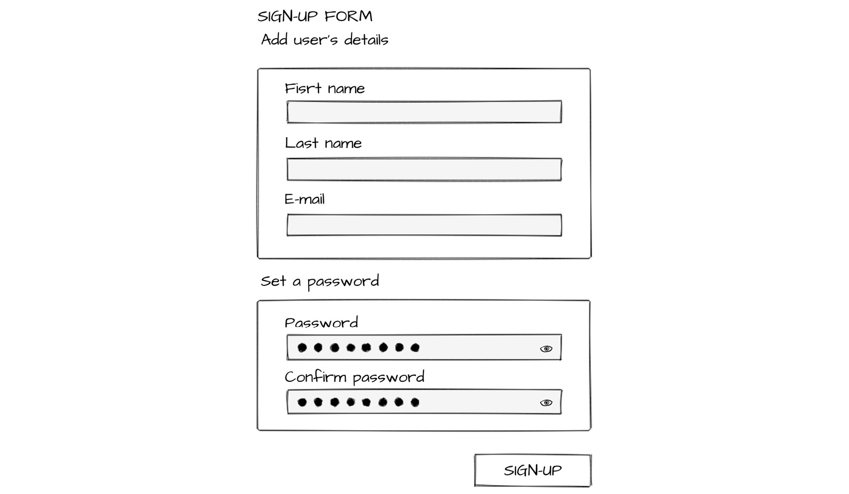
Figure 9.7: Wireframe of the sign up form
As we can see from the wireframe, the form will have a heading (Sign up Form), two fieldsets, each with a legend (Add user’s details and Set a password), a submit button with the Sign up label, and the five input fields with corresponding labels for First name, Last name, email, Password, and Confirm Password:
The steps are as follows:
- First, we will create an empty web page in which to develop our accessible web form. We will create and save a file named
Exercise 9.02.htmland add the following code to set up a basic HTML page with a title and styles to remove white space around thebodyelement:<!DOCTYPE html> <html lang="en"> <head> <meta charset="utf-8"> <title> Exercise 9.02: Accessible sign up form </title> <style> html { box-sizing: border-box; } *, *:before, *:after { box-sizing: inherit; } body { padding: 0; margin: 0; font-family: Arial, Helvetica, sans-serif; font-size: 16px; line-height: 1.7778; } </style> </head> <body> </body> </html> - We want to create a form, so we’ll add a
classattribute with thesign upvalue, which we will use for styling. We will add ah2heading element to the form with the Sign up Form text content so that we know what the form is for:<form class="signup"> <h2>Sign up form</h2> </form>
- Next, we’ll add our
inputfields to the form. The information we want to capture is the user’s first and last name, an email address, and a password. We also need a button to submit the form. We will use thelabelelement to provide the appropriate labeling for each field. To make sure eachlabel/inputpair is on a separate line, we are going to use thebrelement. We have connected eachlabelto aninputusing theforattribute and a correspondingidon theinputelement:<form class="signup"> <h2>Sign up form</h2> <label for="first-name"> First name: </label> <input type="text" id="first-name" /> <br /> <label for="last-name">Last name:</label> <input type="text" id="last-name" /> <br /> <label for="email">E-mail:</label> <input type="email" id="email" /> <br /> <label for="password">Password:</label> <input type="password" id="password" /> <br /> <label for="confirm-password"> Confirm password: </label> <input type="password" id="confirm-password" /> <br /> <button type="submit" class="sign up-button" > Sign-up </button> </form>
The following screenshot shows our form at this stage:
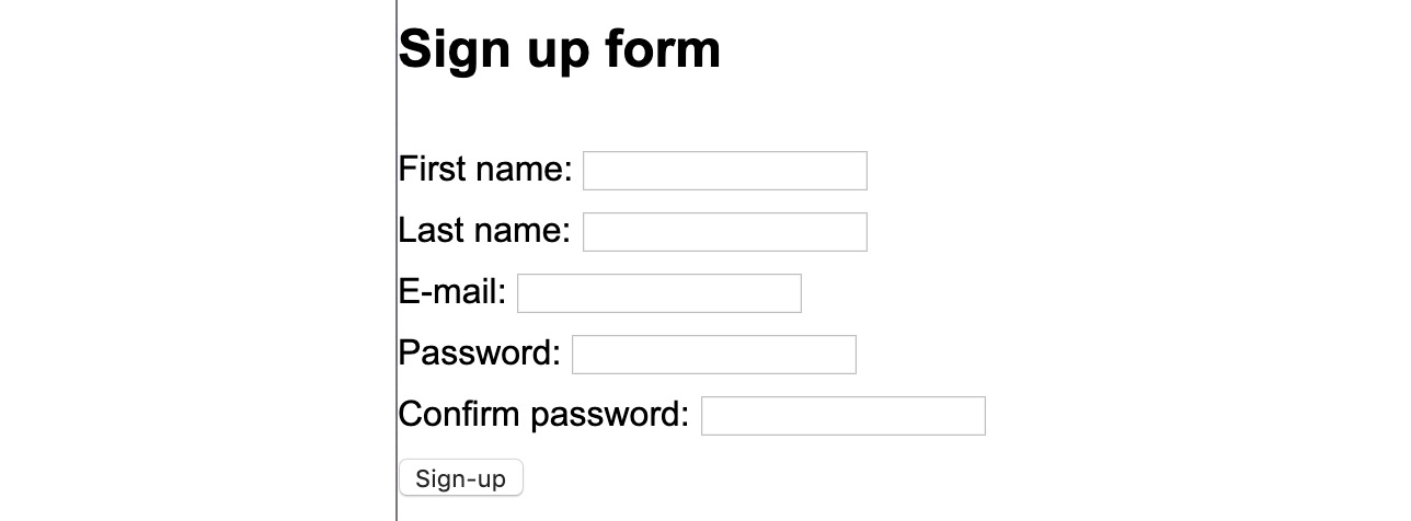
Figure 9.8: Unstyled form with inputs and labels
- We can improve the layout of the form to help make the experience better for visual users. Add the following CSS to the style element in order to add some white space around the form, style the Sign up
buttonso that it’s more visually interesting and so that it stands out more, and increase the size of theinputfields so that they take up a whole line:.signup { margin: 1rem; } .signup-button { -webkit-appearance: none; appearance: none; padding: .5rem 1rem; background: #7e00f4; color: white; font-size: 1rem; border-radius: 3px; margin: 1rem 0; outline: none; float: right; cursor: pointer; } .signup-button:hover, .signup-button:focus { background: #500b91; } .signup label { display: inline-block; width: 150px; } .signup input { width: 100%; height: 2rem; margin-bottom: 1rem; }The following screenshot shows the effect of styling the form with the preceding CSS code. It makes the form more visually appealing and easier to work with:
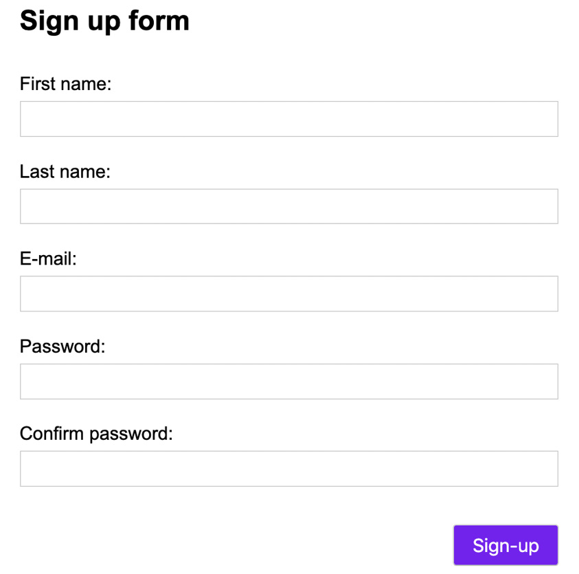
Figure 9.9: Styled sign up form
- All our users will benefit from partitioning the form thematically. It will make it easier to understand for visual and non-visual browsers alike. We will do this by separating the password and user data portions with the
fieldsetelement. We will give each part alegendelement to describe the information being requested.The first
fieldsettag is for user details:<fieldset> <legend>Add user's details:</legend> <label for="first-name"> First name: </label> <input type="text" id="first-name" /> <br /> <label for="last-name"> Last name: </label> <input type="text" id="last-name" /> <br /> <label for="email">E-mail:</label> <input type="email" id="email" /> </fieldset>
The second
fieldsettag is for setting a password:<fieldset> <legend>Set a password:</legend> <label for="password">Password:</label> <input type="password" id="password" /> <br /> <label for="confirm-password"> Confirm password: </label> <input type="password" id="confirm-password" /> </fieldset>
- To finish, we add some styling to the
fieldsetelement by adding the following declaration to the style element:.sign up fieldset { margin: 1rem 0; background: #f5ffff; border: 2px solid #52a752; }
The end result will be similar to what is shown in the following figure. The screenshot shows the final output – an accessible sign up form:
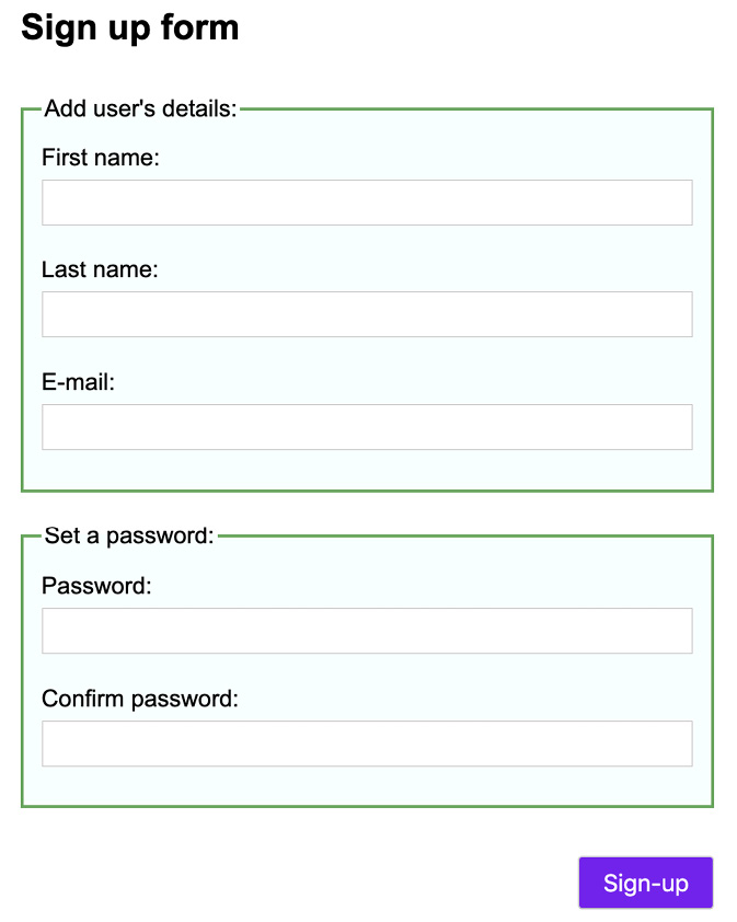
Figure 9.10: The accessible sign up form we have created
This form has been labeled and the labels are paired appropriately, to form fields. The form fields are grouped to help a user make sense of them. All users will benefit from these structural grouping and labeling techniques and they will allow screen reader users to sign up successfully.
In this exercise, we have created an accessible form and learned about grouping parts of a form and associating labels with inputs to make sure users can access the form using a screen reader.
In the next section, we will look at keyboard accessibility. The keyboard provides input for many users who cannot use a mouse. As developers, we cannot take mouse usage for granted. Many users find the mouse difficult or impossible to use and many use the keyboard out of necessity or as a preference.


