Search icon CANCEL
Subscription
0
Cart icon
Your Cart (0 item)
Close icon
You have no products in your basket yet
Save more on your purchases! discount-offer-chevron-icon
Savings automatically calculated. No voucher code required.
Arrow left icon
Explore Products
Best Sellers
New Releases
Books
Videos
Audiobooks
Learning Hub
Free Learning
Arrow right icon
Arrow up icon
GO TO TOP
101 UX Principles – 2nd edition

You're reading from   101 UX Principles – 2nd edition Actionable Solutions for Product Design Success

Arrow left icon
Product type Paperback
Published in May 2022
Publisher Packt
ISBN-13 9781803234885
Length 454 pages
Edition 2nd Edition
Concepts
Arrow right icon
Author (1):
Arrow left icon
Will Grant Will Grant
Author Profile Icon Will Grant
Will Grant
Arrow right icon
View More author details
Toc

Table of Contents (18) Chapters Close

Preface
1. UX Field FREE CHAPTER 2. Typography 3. Controls 4. Content 5. Navigation 6. Iconography 7. Input 8. Forms 9. User Data 10. Progress 11. Accessible Design 12. Journeys and State 13. Terminology 14. Expectations 15. UX Philosophy 16. Other Books You May Enjoy
17. Index

Use an Ellipsis to Indicate That There’s a Further Step

If your user sees a “Remove” button, how do they know if pressing it will:

  • Remove the thing they’re looking at?
  • Ask which thing needs to be removed?
  • Ask them if they really want to remove the thing?
  • Instantly remove all their stuff?

Label the button “Remove…” and the user will have a good idea that there’s another step before all their stuff is removed. Most users will infer from this that the button is the first part of a multi-part process and there will be a second step to confirm or cancel the action. If a control requires an extra step to perform its action, include an ellipsis (...) in the control:
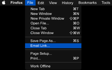
Figure 12.1: New Tab just opens a new tab, while Email Link… will ask for more information in the next step

These little dots are a great example of invisible design: most users will never have even noticed them, but they impart a subtle message as a user’s experience builds over time. They don’t get in the way and they “just work.”

Learning points

  • If the user needs to perform an additional action, show an ellipsis.
  • An ellipsis can give the user more confidence that there’s a further step to confirm an action.
  • Users may well have unconsciously learned what these dots mean in a UI, but you should validate this understanding while testing your product.
lock icon The rest of the chapter is locked
Register for a free Packt account to unlock a world of extra content!
A free Packt account unlocks extra newsletters, articles, discounted offers, and much more. Start advancing your knowledge today.
Unlock this book and the full library FREE for 7 days
Get unlimited access to 7000+ expert-authored eBooks and videos courses covering every tech area you can think of
Renews at $19.99/month. Cancel anytime
Banner background image