CSS Flexbox
CSS Flexbox is a powerful layout module designed to help developers create flexible and responsive web layouts with ease. It allows items within a container to be automatically arranged and adjusted based on the available space, making it particularly useful for responsive design. Here are the key concepts of Flexbox:
- Flex container and flex items: The parent element becomes a flex container when
display: flexordisplay: inline-flexis applied. The children of this container become flex items and are arranged according to Flexbox rules. - Main axis and cross axis: The main axis is the primary direction in which flex items are laid out (default is horizontal). The cross-axis is perpendicular to the main axis.
Figure 8.11 shows how flex items relate to a flex container:
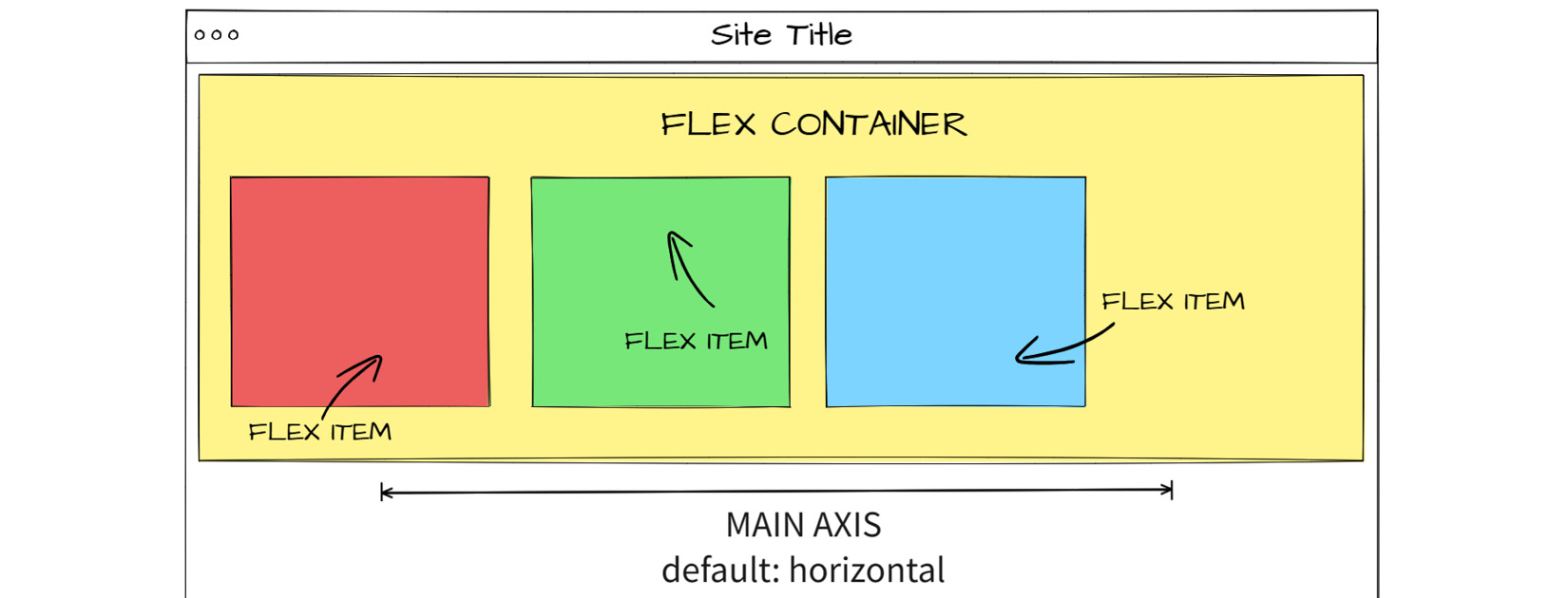
Figure 8.11: Flexbox schema
To make the most of CSS Flexbox, let’s delve deeper into its properties and explore how to use them effectively.
Flexbox basic properties
As the display: flex property is set in the parent element, it gives us a set of properties to better configure the element positioning and its children. Let’s take a look at each one of them:
display: flexis used to declare a flex container; usually, it is the first we setflex-directionis the property that determines the direction of flex itemsjustify-contentis used to align items along the main axis inside the flex containeralign-itemsalso is used to align items, but using the cross axis as a referenceflex-wrapis used to control whether flex items wrapalign-contentis a property used to align each flex container line if there’s any extra space in the cross-axis
Each flex container property accepts different values, as shown in Table 8.1:
|
Property |
Accepted Values |
|
|
|
|
|
|
|
|
|
|
|
|
|
|
|
|
|
|
Table 8.1: Flex container properties and values accepted
The main axis is horizontal by default because the default value for flex-direction is row. If flex-direction is changed to column, the main axis is automatically set to vertical. The flex item properties are the following:
order: Determines the sequence of flex itemsflex-grow: Defines how much a flex item can expand in relation to the other itemsflex-shrink: Determines how much a flex item can reduce its size compared to othersflex-basis: Sets the initial size of an element before space is allocatedalign-self: Lets individual flex items override the default alignment
Each flex item property accepts different values, as shown in Table 8.2:
|
Property |
Accepted Values |
|
|
Any positive number, |
|
|
Any positive number, |
|
|
Any length value, percentage, |
|
|
Shorthand for |
|
|
Any integer |
|
|
|
Table 8.2: Flex item properties and values accepted
Please refer to the following link to see the full code demonstrating how Flexbox properties can simplify responsive styling: https://packt.link/rmaSc
In this code, the .container class is set to display: flex with flex-wrap: wrap to allow wrapping of flex items, styled as follows:
  .container {
    display: flex;
    flex-wrap: wrap;
    justify-content: space-between;
  }
The items are styled as follows:
  .item {
    flex-grow: 1;
    flex-shrink: 1;
    flex-basis: 200px;
    margin: 10px;
    padding: 20px;
    background-color: #f0f0f0;
    text-align: center;
  }
  .item:nth-child(even) {
    background-color: #e0e0e0;
  }
In this code, the .item class is styled as follows:
flex-grow: 1: Each item can grow to fill the available spaceflex-shrink: 1: Each item can shrink if necessaryflex-basis: 200px: Each item has a base size of200px
To ensure responsiveness, the media query guarantees that on screens smaller than 600px, each flex item takes up the full width (100%), as shown in the following code:
@media (max-width: 600px) {
  .item {
    flex-basis: 100%;
  }
In the example, we see that while Flexbox is powerful, it’s also important to use other tools provided by HTML and CSS, such as media queries, to achieve optimal responsiveness. The result of the code is shown in Figure 8.12:
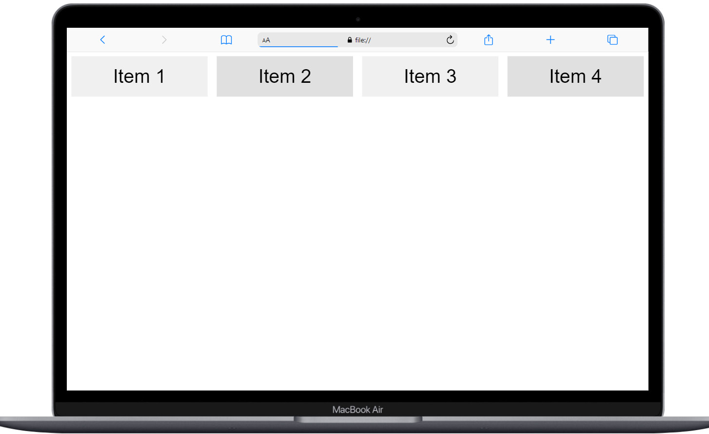
Figure 8.12: Flexbox in desktop
When resized, the code automatically reorganizes itself, as shown in Figure 8.13:
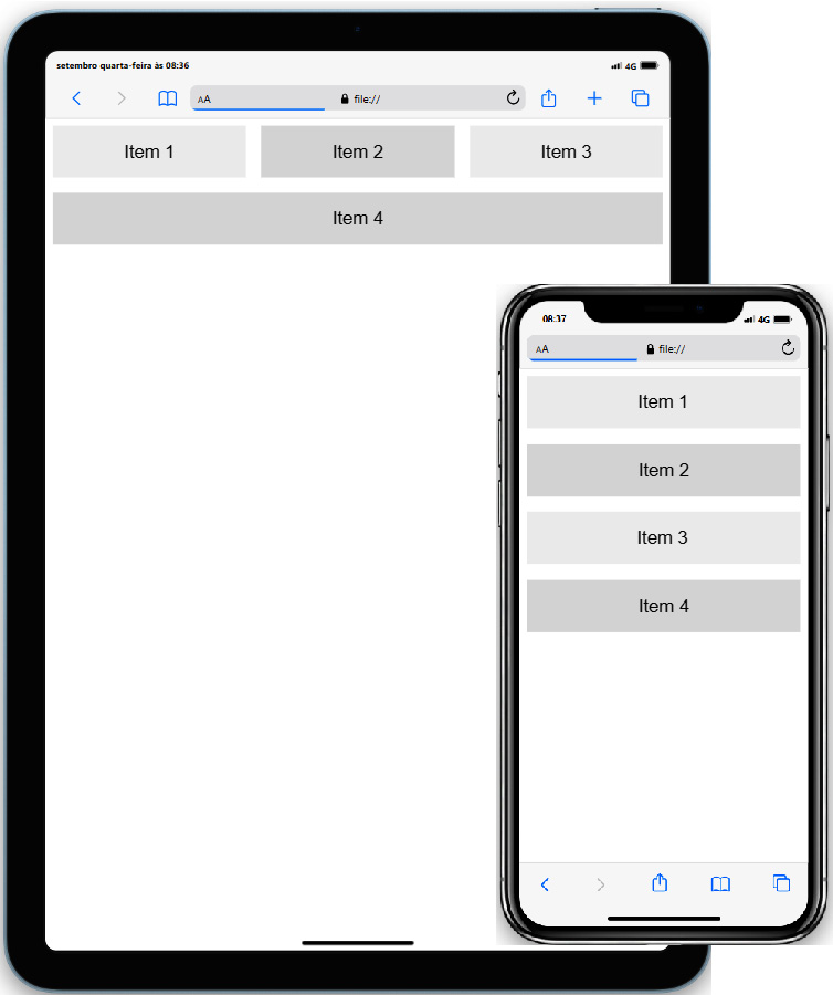
Figure 8.13: Flexbox in tablet and mobile
This example demonstrates how to use Flexbox to create a responsive layout that adapts to different screen sizes, providing a flexible and robust solution for web development.
Next, let’s look at an exercise that uses Flexbox.
Exercise 8.03 – Updating the flower shop catalog for desktop using Flexbox
Let’s create the desktop version of the flower shop catalog we developed in Exercise 8.02 using Flexbox. Begin by establishing a new directory named chapter8-exercise3.
If you have any queries or require guidance, refer to the resolution code provided for this exercise in the project folder: https://packt.link/jTw80
This time, we’ll focus exclusively on leveraging CSS Flexbox for layout optimization without altering the HTML file. However, feel free to enhance the project with additional resources you’ve learned throughout this book:
- After duplicating the files from Exercise 8.02 into the new folder, ensure that your file structure appears as follows in VS Code:
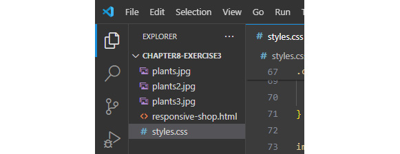
Figure 8.14: Exercise 8.3 folder structure
- Next, navigate to the
styles.cssfile and locate the media query designated for screens larger than820px. Within this query, we’ll convert the.containerclass into a Flexbox container, adjusting its positioning and its child elements accordingly:/* Bigger Screens Styles */ @media (min-width: 820px) { header { display: flex; flex-direction: column; align-items: center; } nav ul { flex-direction: row; justify-content: center; } nav ul li { margin: 0 1rem; width: auto; } .container { display: flex; justify-content: space-around; gap: 2rem; max-width: 120rem; } img { width: auto; max-height: 27.3rem; } } - The
gapproperty is permitted in Flexbox containers and specifies the spacing between flex items. - We’ve additionally applied a
max-heightvalue to the images to ensure they fit more appropriately within the cards. - Furthermore, you may observe that we replaced
width: 100%withwidth: autoto negate the previously setwidthvalue. This adjustment is necessary due to the cascade rule of CSS, which stipulates that if a property is not explicitly altered within the most specific criteria (in this instance, the media query), it will inherit the global value set beforehand.
The output for our flower shop is as follows:
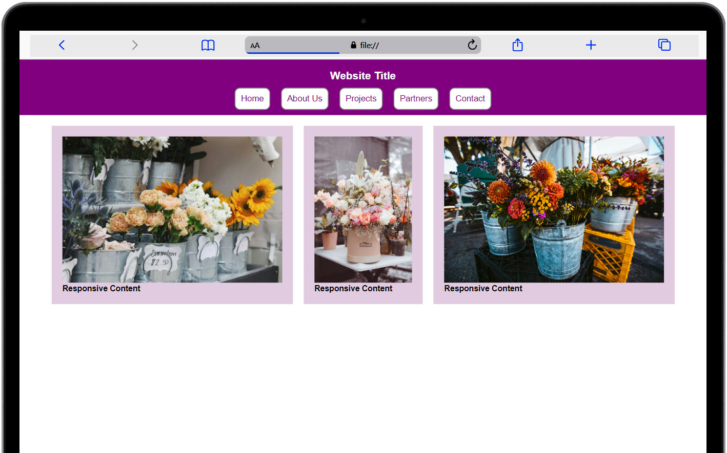
Figure 8.15: Visual output of the exercise
With just a few lines of code, we’ve transformed the content into a more appealing design for larger screens! Incredible! However, there are occasions when users may need to print content for various reasons, prompting developers to utilize responsive tools to enhance the print experience. This will be our focus in the next section.


