Search icon CANCEL
Subscription
0
Cart icon
Your Cart (0 item)
Close icon
You have no products in your basket yet
Arrow left icon
Explore Products
Best Sellers
New Releases
Books
Videos
Audiobooks
Learning Hub
Free Learning
Arrow right icon
Arrow up icon
GO TO TOP
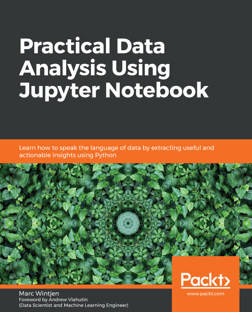
Practical Data Analysis Using Jupyter Notebook

You're reading from   Practical Data Analysis Using Jupyter Notebook Learn how to speak the language of data by extracting useful and actionable insights using Python

Arrow left icon
Product type Paperback
Published in Jun 2020
Publisher Packt
ISBN-13 9781838826031
Length 322 pages
Edition 1st Edition
Languages
Tools
Arrow right icon
Author (1):
Arrow left icon
Marc Wintjen Marc Wintjen
Author Profile Icon Marc Wintjen
Marc Wintjen
Arrow right icon
View More author details
Toc

Table of Contents (18) Chapters Close

Preface 1. Section 1: Data Analysis Essentials
2. Fundamentals of Data Analysis FREE CHAPTER 3. Overview of Python and Installing Jupyter Notebook 4. Getting Started with NumPy 5. Creating Your First pandas DataFrame 6. Gathering and Loading Data in Python 7. Section 2: Solutions for Data Discovery
8. Visualizing and Working with Time Series Data 9. Exploring, Cleaning, Refining, and Blending Datasets 10. Understanding Joins, Relationships, and Aggregates 11. Plotting, Visualization, and Storytelling 12. Section 3: Working with Unstructured Big Data
13. Exploring Text Data and Unstructured Data 14. Practical Sentiment Analysis 15. Bringing It All Together 16. Works Cited
17. Other Books You May Enjoy

Summary

Congratulations – you have now learned some exciting new ways to visualize data and interpret various chart types to help expand your data literacy skills! In this chapter, you learned some best practices to find the right chart for the right type of analysis. You also learned the difference between a dimension and a measure, along with how to model data for analysis to answer questions.

Next, you learned some essential skills for making various plots, such as line graphs and bar charts, by exploring the various time series and date functionality in pandas. We highlighted leaders such as Alberto Cairo and Naomi B. Robbins in the world of data visualization and discussed how they have influenced the evolution of data analysis. Finally, you used the .plot() method to create time series charts using the matplotlib library.

In the next chapter, we will explore techniques we can use to clean, refine, and blend multiple datasets together.

lock icon The rest of the chapter is locked
Register for a free Packt account to unlock a world of extra content!
A free Packt account unlocks extra newsletters, articles, discounted offers, and much more. Start advancing your knowledge today.
Unlock this book and the full library FREE for 7 days
Get unlimited access to 7000+ expert-authored eBooks and videos courses covering every tech area you can think of
Renews at $19.99/month. Cancel anytime
Banner background image