Exploring printable design
Responsive design traditionally refers to making web content adaptable to various screen sizes and devices, ensuring a seamless user experience across different viewports. However, the core principle of responsive design is to adapt content to different contexts and environments, which includes printing.
The following list shows how printable design is a form of responsive design:
- Adaptability: Just as responsive design adjusts layouts for different screen sizes, printable design adjusts the web page layout for optimal printing. This includes changes in font sizes, colors, margins, and visibility of elements.
- Media queries: Both responsive design for screens and printable design use CSS media queries to apply different styles based on the medium (for example, screen or print).
- User experience: The goal in both cases is to improve user experience. For RWD, this means making the content easy to read and navigate on various devices. For printable design, this means making the content clean, well structured, and easy to read on paper.
There are two ways to specify print-only styles in a browser:
- Using a separate style sheet: You can import a separate style sheet dedicated to print styles with a new HTML
<link>tag:<link rel="stylesheet" media="print" href="print.css" />
This code allows the
print.cssstyle sheet to be used only when the browser is in print mode. - Using @media queries in an existing style sheet: You can include print-specific styles within an existing style sheet by using the
@media printquery syntax:@media print { /* Print-specific style changes go here */ }
Both methods are effective for applying styles, specifically when a document is printed. Using a separate style sheet helps keep your print styles organized and distinct from your screen styles, while using @media print within an existing style sheet allows you to maintain all styles in a single file, which can be more convenient for smaller projects or simpler style adjustments.
At the following link, https://packt.link/bu7NR, is an example demonstrating how to create a web page with a separate print style sheet and how to use @media print within an existing style sheet to achieve printable responsiveness. In this code, the HTML includes two style sheets: styles.css for general styles and print.css for print-specific styles.
Let’s look at the styles now. The main CSS file (styles.css) defines basic styles for the web page, ensuring it looks good on screens, and uses media queries to adjust styles for smaller screens, demonstrating responsive design principles. The main style sheet is available at this link for you to study: https://packt.link/acNvH. Figure 8.16 represents the visual output for this code:
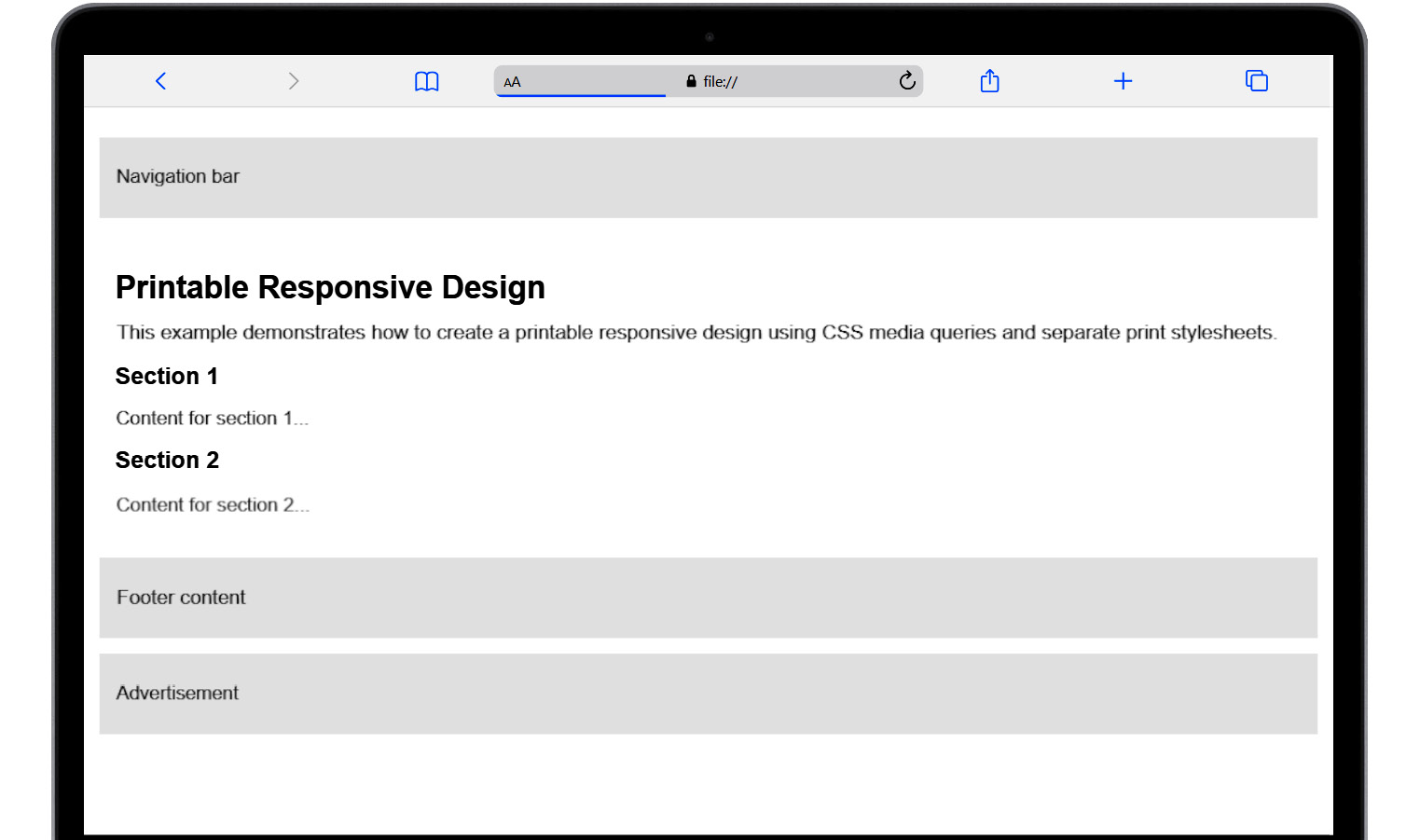
Figure 8.16: Screen view before printing
The print CSS file (print.css) applies styles specifically for when the page is printed, adjusts body margins, font size, and background colors for a clean print layout, and hides elements such as navigation elements, footers, and ads that are not needed in the printed version.
This CSS file also ensures headings avoid page breaks and sections are printed on separate pages for better readability. The result is as follows:
@media print {
  body {
    margin: 1in;
    font-size: 12pt;
    color: black;
    background-color: white;
  }
  .navigation, .footer, .ad {
    display: none;
  }
  .content {
    padding: 0;
  }
  h1, h2, h3 {
    page-break-before: avoid;
  }
  .section {
    page-break-after: always;
  }
}
Figure 8.17 shows how the page looks in the printing preview:
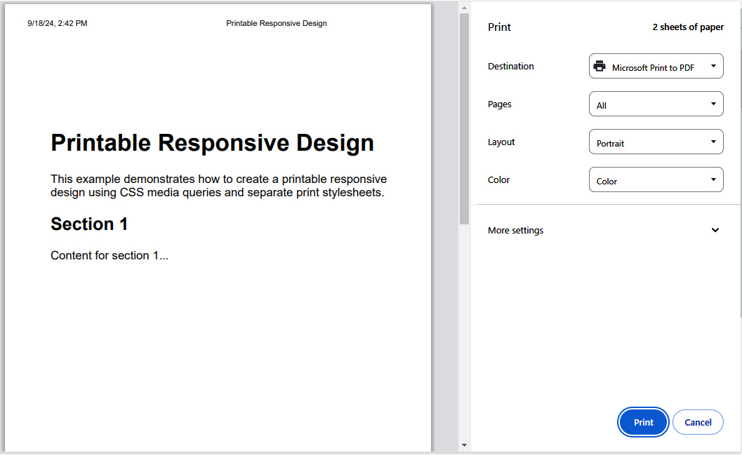
Figure 8.17: Printing preview
In conclusion, mastering print styles is an essential aspect of web development that enhances the versatility and professionalism of your web content. This involves hiding unnecessary elements, adjusting layouts, and managing page breaks to create clean and readable printed documents.
Combining these techniques with a solid understanding of Flexbox and responsive design principles ensures that your web content is adaptable and user-friendly across all devices and formats, ultimately improving the overall user experience.
The final part of this chapter is an exercise for creating printable designs.
Exercise 8.04 – Creating a printable style for the flower shop catalog
Let’s enhance our skills by optimizing our web page for printing. We’ll be working with the HTML and CSS files provided to create a print-friendly version of our flower shop catalog:
- Start by creating a new directory named
chapter8-exercise4. Duplicate the files from the previous exercise (Exercise 8.03) into this new directory. These files will serve as the foundation for our print optimization practice. Remember to look at our GitHub repository to check the assets and resulting code: https://packt.link/f7grZ. - Open the directory in VS Code. In this exercise, we’ll focus on creating CSS styles specifically tailored for printing purposes, ensuring that the printed version of our catalog looks clean and well structured. Create a new file and name it
print.css. The structure of your project should be like this:
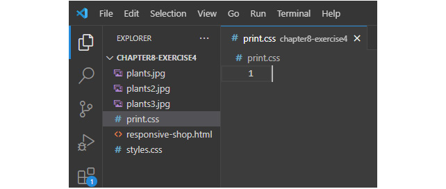
Figure 8.18: Project file structure
- Open the
print.cssfile and include the code as shown here:/* Printing Styles */ @media print { body { font-family: Arial, sans-serif; } header { display: none; } .container { display: block; margin: 0 auto; } .card { page-break-inside: avoid; margin-bottom: 2rem; padding: 2rem; background-color: rgb(224, 203, 224); } img { display: block; width: 100%; max-height: 100%; } nav { display: none; } } - Let’s break down the CSS code for printing styles:
body: We keep the font family asArialorsans-seriffor better readability in print.header: We set the header to be hidden (display: none;) in print mode, as headers are typically not needed in printed documents..container: We ensure that the container appears as a block-level element (display: block;) and is centered horizontally (margin: 0 auto;) on the printed page..card: We usepage-break-inside: avoidto prevent splitting the cards across pages, ensuring that each card stays together on one page for better readability.img: We set the images to be displayed as block-level elements (display: block;), ensuring that they take up the full width of their container. Additionally, we limit the maximum height of images to prevent them from exceeding the height of the printed page (max-height: 100%;).nav: We hide the navigation menu in print mode by settingdisplay: none, as navigation menus are typically not needed in printed documents.
- These CSS rules help optimize the page layout and content for printing, ensuring that the printed document looks clean and well-structured.
- Next, let’s integrate the newly created printing styles into the HTML file by adding a new
<link>tag below the main style sheet:<head> <meta charset="UTF-8"> <meta name="viewport" content="width=device-width, initial-scale=1.0"> <link rel="stylesheet" href="styles.css"> <link rel="stylesheet" href="print.css"> <title>Responsive Menu</title> </head>
The result is as follows:
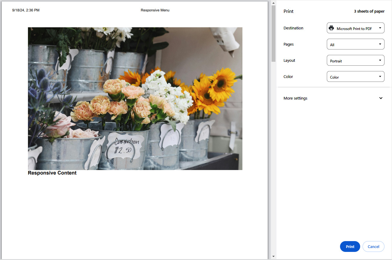
Figure 8.19: How the application appears when printing
By optimizing our web page for printing, we’ve acquired a valuable skill set that enhances user experience beyond the digital realm. This exercise underscores the importance of catering to diverse user needs and reinforces our commitment to delivering exceptional usability across all platforms.


