Search icon CANCEL
Subscription
0
Cart icon
Your Cart (0 item)
Close icon
You have no products in your basket yet
Save more on your purchases! discount-offer-chevron-icon
Savings automatically calculated. No voucher code required.
Arrow left icon
Explore Products
Best Sellers
New Releases
Books
Videos
Audiobooks
Learning Hub
Free Learning
Arrow right icon
Arrow up icon
GO TO TOP
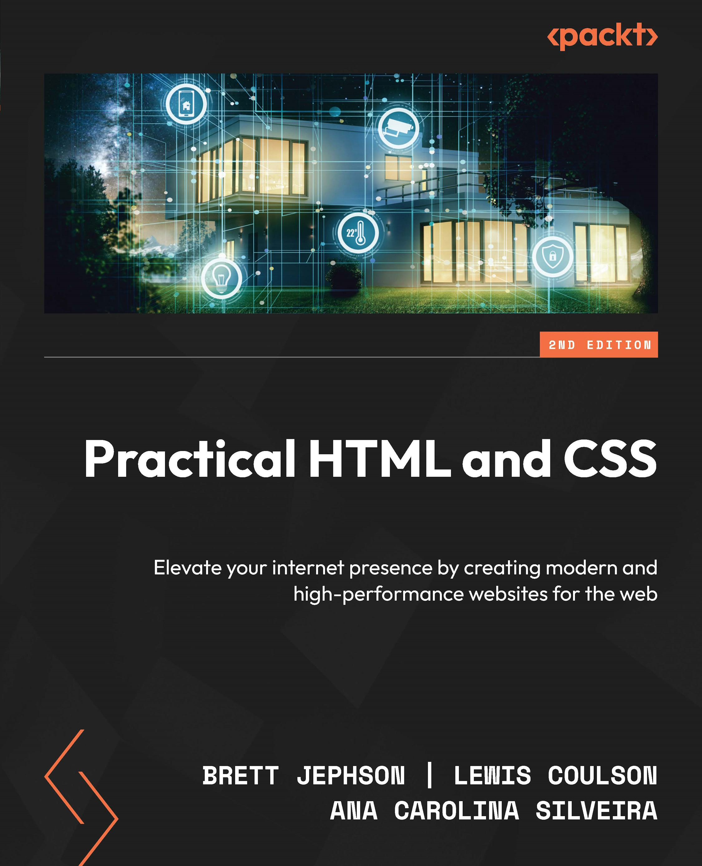
Practical HTML and CSS

You're reading from   Practical HTML and CSS Elevate your internet presence by creating modern and high-performance websites for the web

Arrow left icon
Product type Paperback
Published in Nov 2024
Publisher Packt
ISBN-13 9781835080917
Length 492 pages
Edition 2nd Edition
Languages
Arrow right icon
Authors (3):
Arrow left icon
Brett Jephson Brett Jephson
Author Profile Icon Brett Jephson
Brett Jephson
Lewis Coulson Lewis Coulson
Author Profile Icon Lewis Coulson
Lewis Coulson
Ana Carolina Silveira Ana Carolina Silveira
Author Profile Icon Ana Carolina Silveira
Ana Carolina Silveira
Arrow right icon
View More author details
Toc

Table of Contents (20) Chapters Close

Preface 1. Part 1: Introducing HTML and CSS
2. Chapter 1: Introduction to HTML and CSS FREE CHAPTER 3. Chapter 2: Structure and Layout 4. Chapter 3: Text and Typography Styling 5. Part 2: Understanding Website Fundamentals
6. Chapter 4: Creating and Styling Forms 7. Chapter 5: Adding Animation to Web Pages 8. Chapter 6: Themes, Color, and Polishing Techniques 9. Part 3: Building for All
10. Chapter 7: Using CSS and HTML to Boost Performance 11. Chapter 8: Responsive Web Design and Media Queries 12. Chapter 9: Ensuring Accessibility in HTML and CSS 13. Part 4: Advanced Concepts
14. Chapter 10: SEO Essentials for Web Developers 15. Chapter 11: Preprocessors and Tooling for Efficient Development 16. Chapter 12: Strategies for Maintaining CSS Code 17. Chapter 13: The Future of HTML and CSS – Advancements and Trends 18. Index 19. Other Books You May Enjoy

Responsive values in CSS

Responsive values are fundamental for ensuring responsiveness on the web. By employing these values, developers can dynamically adjust layouts, typography, and other design elements to optimize user experiences across smartphones, tablets, desktops, and beyond. In this section, we’ll delve into the principles and practical applications of responsive values in CSS, emphasizing their role in crafting flexible and user-friendly web interfaces.

Responsive typography units

Responsive typography units such as root em (rem) and em are important tools in web design for creating text that adjusts dynamically based on the user’s preferred font size or the size of the parent element. They allow for scalability and consistency across different devices and screen sizes. Let’s look at both of them in detail here:

  • rem: The rem unit represents the font size of the root element (<html>), making it particularly useful for defining a consistent...
lock icon The rest of the chapter is locked
Register for a free Packt account to unlock a world of extra content!
A free Packt account unlocks extra newsletters, articles, discounted offers, and much more. Start advancing your knowledge today.
Unlock this book and the full library FREE for 7 days
Get unlimited access to 7000+ expert-authored eBooks and videos courses covering every tech area you can think of
Renews at $19.99/month. Cancel anytime
Banner background image