Exploring the project Java and the main layout XML
We are going to look at the resource files that have the code that defines our simple UI layout and the file that has our Java code. At this stage, we will not try to understand it all, as we need to learn some more basics before it makes sense to do so. What we will see, however, is the basic contents and structure of both files, so we can reconcile their contents with what we already know about Android resources and Java.
Examining the MainActivity.java file
Let's look at the Java code first. If, for some reason, this isn't currently visible, you can see this code by left-clicking on the MainActivity.java tab, as shown in the next figure:

Figure 2.2 – MainActivity.java tab
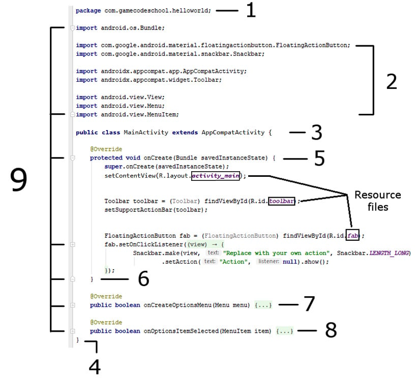
As we are not looking at the intricate details of the code, an annotated screenshot is more useful than reproducing the actual code in text form. Regularly refer to the next figure while reading on in this section:

Figure 2.3 – Java code
The first thing to note is that I have added a few empty lines among the code to space things out a little bit and present a clearer image.
Code folding (hiding) in Android Studio
Now look at the left-hand side of the figure where multiple parts are labeled 9. This points to all the little + and - buttons in the editor, which can collapse and expand parts of the code. I have indeed collapsed some parts of the code, and other parts I have left visible. So, what you can see on your screen is slightly different to what you will see if you look at the figure. In Android Studio, play with the + and – buttons for a while to practice hiding and unhiding sections of the code. You might want to get your screen to look like the figure, but this is not a requirement to continue. The technical term for hiding code like this is folding.
The package declaration
Part 1 is called the package declaration and, as you can see, it is the package name we chose when we created the project preceded by the word package. Every Java file will have a package declaration at the top.
Importing classes
Part 2 is eight lines of code that all begin with the word import. After the word import, we can see there are various dot-separated words. The last word of each line is the name of the class that line imports into our project and all the earlier words in each line are the packages and sub-packages that contain these classes.
For example, this next line imports the AppCompatActivity class from the androidx.appcompat.app package and sub-packages:
import androidx.appcompat.app.AppCompatActivity;
Note
The semicolon at the end of the lines shows the compiler that it is the end of that line of code.
This means that in this file we will have access to these classes. In fact, it is these classes that the auto-generated code uses to make the simple app that we saw in action in the previous chapter.
We will not discuss all these classes in this chapter. It is just the concept that we can do this importing that is significant right now. Note that we can add extra classes from any package at any time and we will when we improve upon our app shortly.
The class
Part 3 of our code is called the class declaration. Here is that line in full; I have highlighted one part of it:
public class MainActivity extends AppCompatActivity {
The class declaration is the start of a class. Notice the highlighted part, MainActivity. This is the name Android Studio gave the class when we created the project and it is also the same as the MainActivity.java filename as we would expect having discussed Java classes previously.
The class and the file can be renamed, but since this is the key/main activity of our app, MainActivity seems appropriate. The extends keyword means that our class called MainActivity will be of the type AppCompatActivity.
We can, and will, use some classes without this extends part. We use extends here because we want to use all the code that went into the AppCompatActivity class, as well as adding our own code to it as well. So, we extend it. All this and more will become clear in Chapter 10, Object-Oriented Programming.
Finally, for part 3, look at the opening curly brace at the end of the line: {. Now look at the bottom of the figure at part 4 of our code. This closing curly brace } denotes the end of the class. Everything in between the opening and closing curly braces, {...}, is part of the MainActivity class.
Methods inside the class
Now look at part 5 of the code. Here is that line of code in full with the key part for our discussion highlighted:
protected void onCreate(Bundle savedInstanceState) {
This is a method signature. The highlighted part, onCreate, is the method name. We make a method execute its code by using its name. We say we are calling a method when we do this.
Although we will not concern ourselves now with the details of the parts of the code on either side of the method name, you might have noticed Bundle, one of the classes we imported at part 2 of our code. If we removed that related import line, Android Studio would not know what Bundle was and it would be unusable and indicated with a red underline as an error.
Our code would then not compile and run. Notice the very last thing in the preceding line of code is an opening curly brace, {. This denotes the start of the code contained within the onCreate method. Now jump to part 6 of our code and you will see a closing curly brace, }. You might have guessed that this is the end of the method. Everything in between the opening and closing curly braces of the onCreate method is the code that executes when the method is called.
We do not need to go into what this code does yet, but as an overview, it sets up the appearance/layout of the app by referring to a resource file that was auto-generated by Android Studio when we created the project. I have highlighted the resource files with an outline in the previous figure.
Parts 7 and 8 are also methods that I have collapsed to make the image and this discussion more straightforward. Their names are onCreateOptionsMenu and onOptionsItemSelected.
We know enough about our Java code to make some progress. We will see this code again and change it later in this chapter.
Summary of the Java code so far
It is true that contained within the code we have just had an overview of, there is some complex syntax. However, what we are doing is building up just enough knowledge about this code, so we can work with it to begin to make fast progress in learning Java and Android without having to learn hundreds of pages of Java theory first. By the end of the book, all the code will make sense, but to make quick progress now, we just need to accept that some of the details will remain a mystery for a little while longer.
Examining the app layout file
Now we will look at just one of the many .xml files. There are several different layout files and we will meet them all throughout the course of the book, but let's start with the most recognizable one, which decides most of the appearance of our app.
In the project explorer window, left-click on the res folder and then left-click on the layout folder. Now double left-click on the fragment_first.xml file. The XML code contents of the file is now displayed in the main window of Android Studio.
We can ignore the res generated folder.
We will explore this XML code soon but first find and left-click the Design button (shown next) to switch to the design view:

Figure 2.4 – To open design view
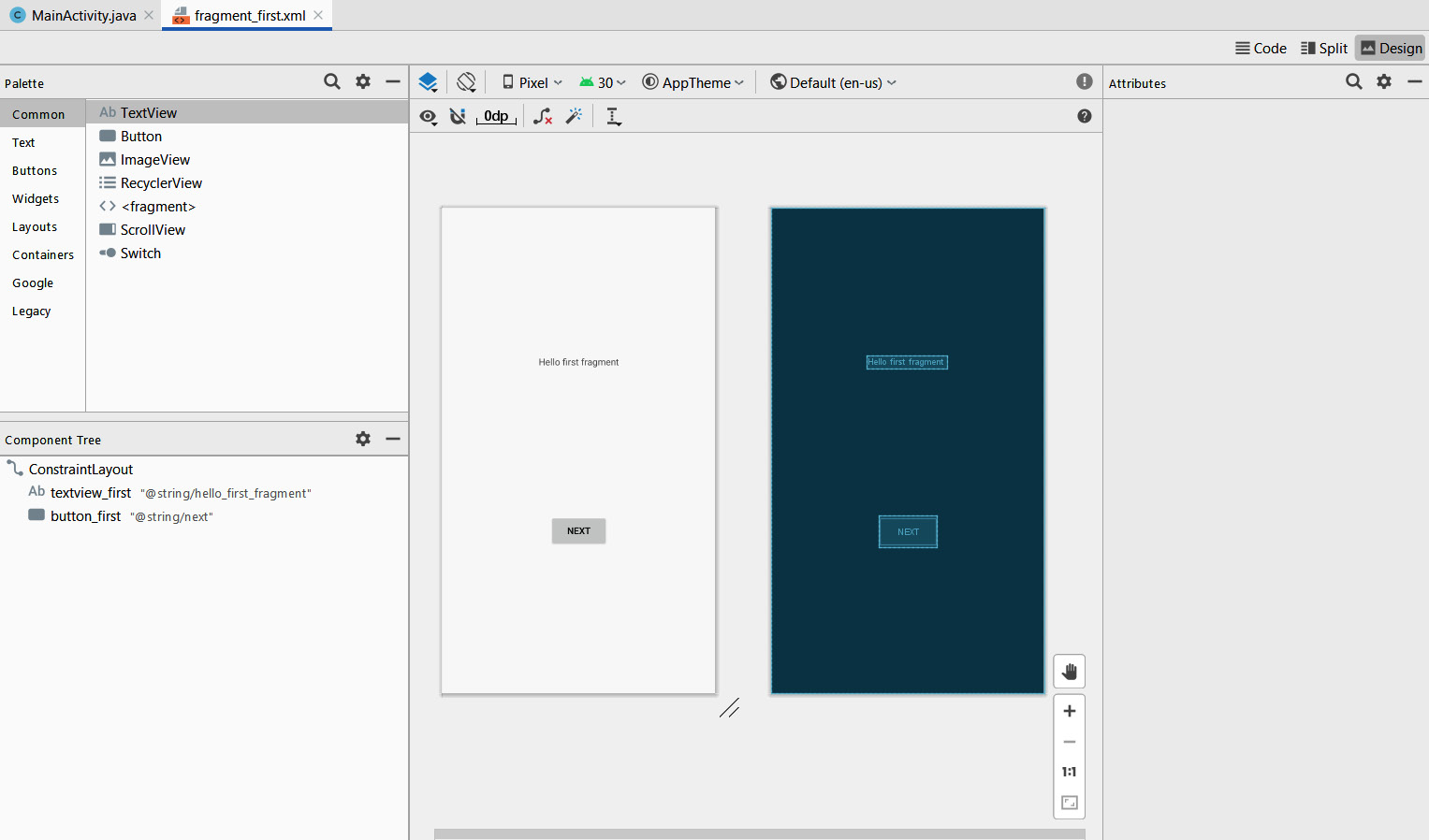
Now we can see the design view that shows us what the XML code will cause to be displayed when the app is run in the emulator:

Figure 2.5 – App display
The preceding figure should look familiar because it shows the layout of our first app that we ran at the end of the previous chapter – the one with the Hello first fragment text and the Next button. If you look in the fragment_second.xml file from the same folder as fragment_first.xml, you will see the second layout we saw in the previous chapter, the one that had the Previous button on it. In fact, there are even more layout-related files than we might first expect, but we will get to discussing them in this chapter and the next.
Most of the work that we do throughout the book when we design apps will be done in this design view. It is important, however, to know what is going on behind the scenes.
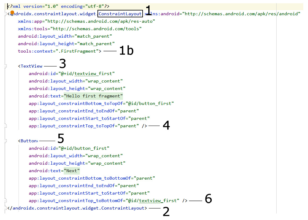
The design view is a graphical representation of the XML code contained in the fragment_first.xml file. Click on the Code tab (near the Design tab in the previous figure) to see the XML code which forms the layout. I have annotated a screenshot of the XML text, so we can discuss it next:

Figure 2.6 – Screenshot of the XML text
The first thing to note is that this file does not represent the entire layout. It does however represent most of the surface area and the entire Hello first fragment message and the Next button. Also, on the left-hand side, we can see the now-familiar + and – icons so we can fold and unfold sections of the code.
UI layout elements
If we first look at the part of the code labeled 1, we can see that the very first thing is …ConstraintLayout.... Now, ConstraintLayout is a UI element that is used to wrap other parts of the UI.
When we add a new element to a UI in Android, we always start a line with a < followed by the element's name.
The code that follows that rather long and cumbersome-looking line defines the attributes this element will have. This can include dozens of different things depending upon the type of UI element it is. Here, among a bit of other XML, we can see things such as layout_width and layout_height. All these attributes define how the ConstraintLayout element will appear on the user's screen. The attributes for the ConstraintLayout element end at the first > labeled 1b.
If we look at the bottom of our XML screenshot, we will see some code labeled 2. This code, </…ConstraintLayout>, marks the end of the ConstraintLayout element. Anything in between the closing > of the element's attributes and </…ConstraintLayout>, which defines its end, is considered a child of the element. So, we can see that our ConstraintLayout has/contains two child elements. Let's look at those children now.
UI text elements
Using what we just learned, we can say that the UI element that starts at position 3 in the screenshot is called a TextView. Just like its parent, it starts with a < and its name: <TextView.... If we look further into our TextView element, we can see it has several attributes. It has a text attribute that is set to "Hello first fragment". This of course is the exact text that our app shows to the user. It also has layout_width and layout_height attributes that are both set to "wrap_content". This tells TextView it can take up as much space as the content it has needs. As we will see throughout the book, there are many more attributes available for this and other UI elements. The final attribute in TextView is id, and we will see how we and Android use the id attribute in the next section when we improve this first app.
Notice that the code at 4 in our XML screenshot is />. This marks the end of the TextView element. This is slightly different to how the end of the ConstraintLayout element was written. When an element in XML has no children, we can just end it like this: />. When the element has children and its end comes further on in the code from where its attributes are defined, it is much clearer to end the element by repeating its name like this: </…ConstraintLayout>.
Note
You might be wondering why the element name for TextView is clear and concise (simply TextView) yet the full name for the ConstraintView is preceded by complicated apparent clutter (androidx.constraintlayout.widget.ConstraintLayout). This ConstraintLayout element is a special layout that is used to ensure our app's compatibility with older versions of Android. As we will see in a minute when we add buttons to the app, most elements have simple and concise names.
UI Button elements
Now we should be able to quickly identify that the code that starts at 5 in the screenshot is a Button element. Just like its parent, it starts with a < and its name: <Button.... If we look further into our Button, we can see it has several attributes. It has a text attribute that is set to "Next". This of course is the exact text displayed on the button the user can click. It also has layout_width and layout_height attributes that are both set to "wrap_content". This, as with the TextView element, causes the onscreen button to take up as much space as the content it has needs. The final attribute in Button is id, and for buttons this is often a vital attribute, even more so than for some other parts of the UI. As the id attribute can distinguish this button from other buttons, we can program different functionality for different buttons based on the value held in the id attribute. We will see this principle in action soon.
Notice that the code at 6 in our XML screenshot is />. As we have come to know, this marks the end of the Button element.
We will edit and add to this XML code in the next section and learn more about the attributes.
Note
The elements of a layout are often referred to as widgets.


