Laying out components
In this very first recipe of the book, we will start laying out components. In SwiftUI, our user interface is composed of different elements. It is very important to understand how to group components together in different layouts. SwiftUI uses three basic layout components, VStack, HStack, and ZStack. Use the VStack view to arrange components on a vertical axis, HStack to arrange components on a horizontal axis, and—you guessed it right—use the ZStack to arrange components along the vertical and horizontal axis.
In this recipe, we will also look at spacing and adjust the position used to position elements. We will also look at how Spacer and Divider can be used for layout.
Getting ready
Let’s start by creating a new SwiftUI project called TheStacks. Use the following steps:
- Start Xcode (Finder | Applications | Xcode).
- Click on Create a new Xcode project from the left pane.
- The following screen asks us to choose an Xcode template. Select iOS, and then App. Click Next.
- A screen to select the options for the project will appear. Enter the product name,
TheStacks. - Make sure that Interface is set to SwiftUI, Language is set to Swift, and Storage is set to None. Click Next.
- Select the folder location to store the project and choose if you want to create a Git repository or not. Then click Create.
How to do it…
Let’s implement the VStack, HStack, and ZStack within a single screen to better understand how each works and the differences between them. The steps are given here:
- Select the
Contentview/Contentview.swiftfile on the navigation pane (left side of Xcode). - Replace the content of the body variable with a
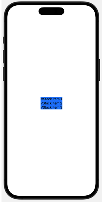
VStackand someTextviews:var body: some View { VStack { Text("VStack Item 1") Text("VStack Item 2") Text("VStack Item 3") } .background(.blue) } - Press Cmd + Option + Enter if the canvas is not visible, then click on the Resume button above the canvas window to display the resulting view:

Figure 1.1: VStack with three items
- Add a
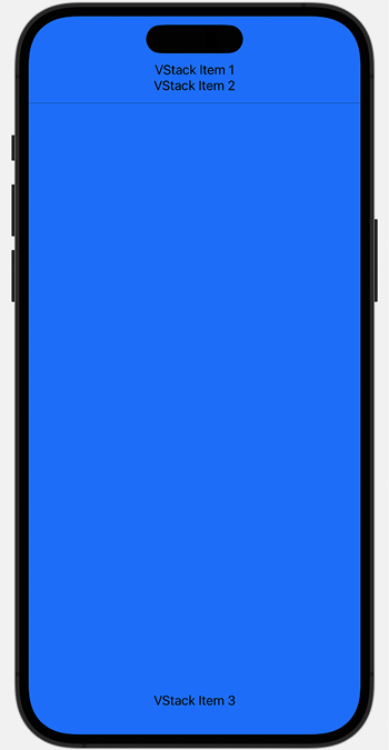
Spacerand aDividerbetweenVStack Item 2andVStack Item 3:Spacer() Divider() .background(.black) - The content expands and covers the screen’s width and height, as follows:

Figure 1.2: VStack + Spacer + Divider
- Add an
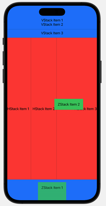
HStackand aZStackbelowVStack Item 3:HStack{ Text("HStack Item 1") Divider() .background(.black) Text("HStack Item 2") Divider() .background(.black) Spacer() Text("HStack Item 3") } .background(Color.red) ZStack{ Text("ZStack Item 1") .padding() .background(.green) .opacity(0.8) Text("ZStack Item 2") .padding() .background(.green) .offset(x: 80, y: -400) } - The preview should look like the following screenshot (it may vary depending on the device selected for previews):

Figure 1.3: VStack, HStack, and ZStack
This concludes our recipe on using stacks. Going forward, we’ll make extensive use of VStack and HStack to position various components in our views.
How it works…
In Xcode 15, a new iOS app project with SwiftUI selected as the interface option starts with a VStack that includes an Image view and a Text view located at the center of the screen. We replaced the content provided by the template with our own VStack, with three embedded Text views. SwiftUI container views like VStack determine how to display content by using the following steps:
- Figure out its internal spacing and subtract that from the size proposed by its parent view.
- Divide the remaining space into equal parts.
- Process the size of its least flexible view.
- Divide the remaining unclaimed space by the unallocated space, and then repeat Step 2.
- The stack then aligns its content and chooses its own size to exactly enclose its children.
Adding the Spacer() forces the view to use the maximum amount of vertical space. This is because the Spacer() is the most flexible view—it fills the remaining space after all other views have been displayed.
The Divider() component is used to draw a horizontal line across the width of its parent view. That is why adding a Divider() view stretched the VStack background from just around the Text views to the entire width of the VStack. By default, the divider line does not have a color. To set the divider color, we add the .background(.black) modifier. Modifiers are methods that can be applied to a view to return a new view. In other words, it applies changes to a view. Examples include .background(.black), .padding(), and .offset(…).
The HStack container is like the VStack but its contents are displayed horizontally from left to right. Adding a Spacer() in an HStack thus causes it to fill all available horizontal space, and a divider draws a vertical line between components in the HStack.
The ZStack is like HStack and VStack but overlays its content on top of existing items.
There’s more…
You can also use the .frame modifier to adjust the width and height of a component. Try deleting the Spacer() and Divider() from the HStack and then apply the following modifier to the HStack:
.frame(
    maxWidth: .infinity,
    maxHeight: .infinity,
    alignment: .topLeading
)


