Introducing the light-dark() function
A groundbreaking addition to CSS, the light-dark() function simplifies the process of establishing dynamic themes. This function enables the setting of foreground and background colors for various color schemes in just one line of code, eliminating the need for the prefers-color-scheme media queries.
Here is the syntax for this:
element {
  property: light-dark(
    [color for light or default],
    [color for dark]
  );
}
The light-dark() CSS color function returns the first value if the user’s preference is set to light or if no preference is set, and the second value if the user’s preference is set to dark:
:root {
  color-scheme: light dark;
}
.element {
  color: light-dark(black, white);
  background-color: light-dark(white, black);
}
Important: light-dark() is an experimental feature
Please note that this feature is experimental and may have limited availability. It’s recommended to test it in your browser environment.
Exercise 4 – simplifying our CSS theming with media queries
To celebrate our journey into the world of CSS theming, let’s practice once more with our bookstore application. We’re going to refactor the CSS theming to set it dynamically based on the user’s preferences. For testing purposes, we’ll use the Microsoft Windows operating system as an example:
- Start by opening the project folder in VS Code and creating a new file named
color-variation.cssin the same location as the other CSS files. We’ll use a single CSS file for both light and dark themes to reduce code repetition. - After creating the file, let’s define that our
:rootelement (representing the whole HTML) will accept variations of light and dark modes. We’ll set this writing the following notation incolor-variation.css::root { color-scheme: light dark; } - After setting this up, let’s create a media query to configure the colors for light mode. We’re creating the
prefers-color-schememedia query incolor-"variation.css"and pasting the entire content fromlight.cssinside it:@media (prefers-color-scheme: light) { :root { --primary-color: #0c457d; --secondary-color: #e8702a; --text-color: #061b1a; --background-color: #fcf6ed; --highlight-color: #6bd2db; } } - Great! We’re halfway there. Now, let’s do the same with the
dark.cssfile. Create aprefers-color-schememedia query and paste all the content fromdark.cssinside it. Note that we’re not using theinvert()filter because, in this context, when one theme is selected, the browser does not render the other one, soinvert()does not have anything to invert from:@media (prefers-color-scheme: dark) { :root { --primary-color: hsl(31, 84%, 26%); --secondary-color: hsl(200, 81%, 51%); --text-color: hsl(358, 100%, 100%); --background-color: hsl(225, 83%, 0%); --highlight-color: hsl(3, 66%, 67%); } }The resulting CSS file should look like this:
:root { color-scheme: light dark; } @media (prefers-color-scheme: light) { :root { --primary-color: #0c457d; --secondary-color: #e8702a; --text-color: #061b1a; --background-color: #fcf6ed; --highlight-color: #6bd2db; } } @media (prefers-color-scheme: dark) { :root { --primary-color: hsl(31, 84%, 26%); --secondary-color: hsl(200, 81%, 51%); --text-color: hsl(358, 100%, 100%); --background-color: hsl(225, 83%, 0%); --highlight-color: hsl(3, 66%, 67%); } } - Now, it’s time to connect our new CSS file to our HTML. Delete the
<link>elements that refer tolight.cssanddark.cssand replace them with the new file that contains all the coloring and logic for our dynamic theme,color-variation.css:<head> <meta charset="UTF-8"> <meta name="viewport" content="width=device-width, initial-scale=1.0" > <title>Rarities - Bookstore</title> <link rel="stylesheet" href="style.css"> <link rel=»stylesheet» href=»color-variation.css»> </head>
- After that, let’s configure our operating system to prefer the dark theme, so we can test it properly.
On Windows 11, right-click with your mouse on the desktop and select Personalization | Colors. Open Colors setting and, under Choose your color, select Custom. Under Choose your default app mode, select Dark.
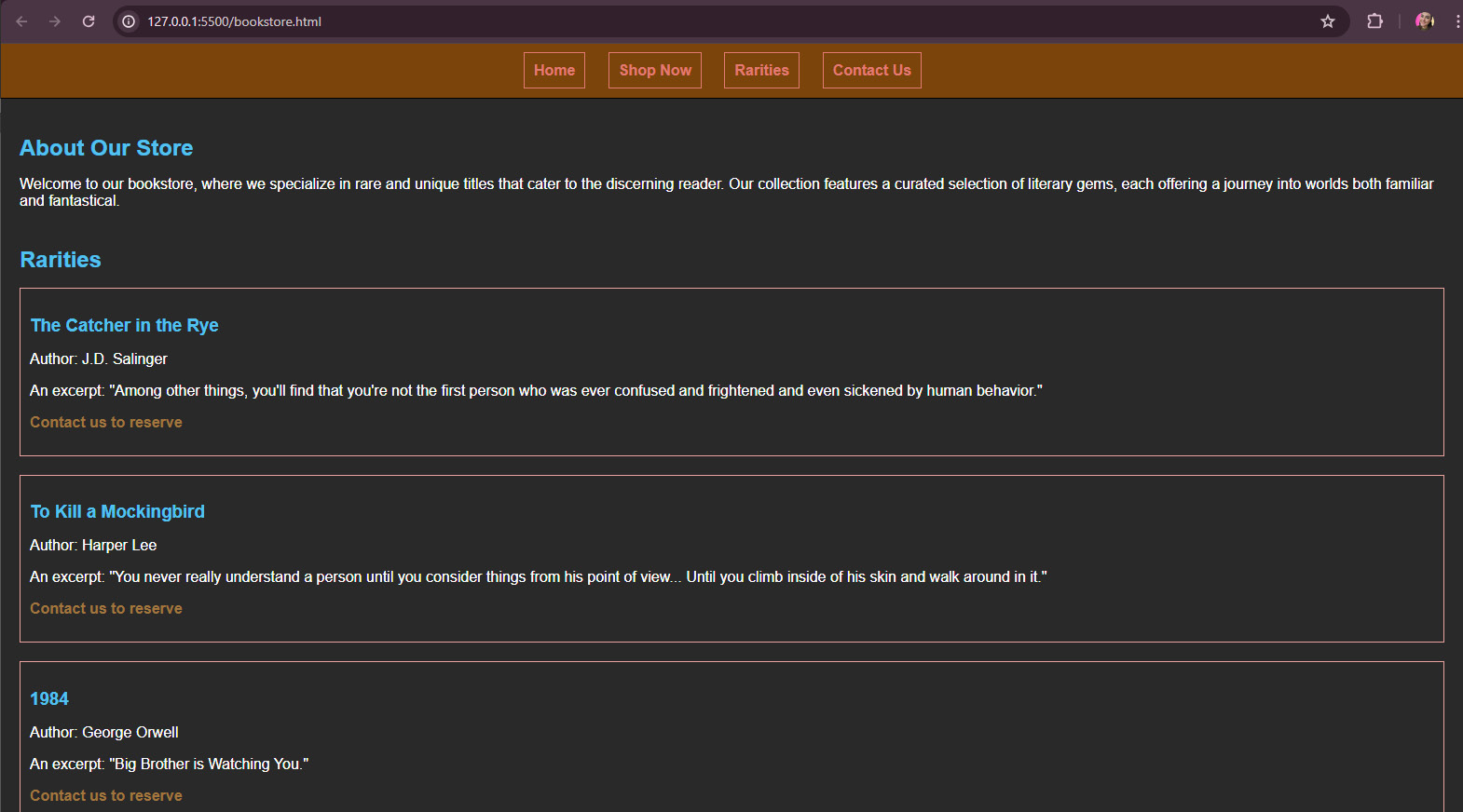
All set! Open the application with your browser to see the result.

Figure 6.13 – How the application should look in the browser
That’s it! We’ve created an application that changes themes dynamically with no need for JavaScript, just with CSS. Theming extends beyond mere color choices; typography is equally vital in shaping a well-designed experience. Neglecting typography can detract from an otherwise thoughtfully curated theme, highlighting the significance of this aspect, which we’ll explore in the next section.


