Search icon CANCEL
Subscription
0
Cart icon
Your Cart (0 item)
Close icon
You have no products in your basket yet
Arrow left icon
Explore Products
Best Sellers
New Releases
Books
Videos
Audiobooks
Learning Hub
Free Learning
Arrow right icon
Arrow up icon
GO TO TOP
Practical Web Design

You're reading from   Practical Web Design Learn the fundamentals of web design with HTML5, CSS3, Bootstrap, jQuery, and Vue.js

Arrow left icon
Product type Paperback
Published in Apr 2018
Publisher Packt
ISBN-13 9781788395038
Length 368 pages
Edition 1st Edition
Languages
Tools
Concepts
Arrow right icon
Author (1):
Arrow left icon
Philippe Hong Philippe Hong
Author Profile Icon Philippe Hong
Philippe Hong
Arrow right icon
View More author details
Toc

Table of Contents (20) Chapters Close

Title Page
PacktPub.com
Contributers
Preface
1. Evolution of Web Design FREE CHAPTER 2. Web Design and its Components 3. Website-Designing Workflow 4. Responsive Versus Adaptive Design 5. Learning HTML5 6. Learning CSS3 7. Building Your Own Website 8. Making Our Website Responsive 9. Adding Interaction and Dynamic Content 10. Optimizing and Launching Our Website 11. What is Bootstrap? 12. Building a Website with Bootstrap 13. Introduction to Client-Side Rendering 14. Tools to Help Your Workflow 1. Other Books You May Enjoy Index

Responsive web design


The first time we heard the term responsive web design, it was from Ethan Marcotte in 2011. In his book on responsive design, he described a new way of designing for the desktop but also for the mobile interface, basically proposing to use the same content, but a different layout for the design on each screen. The introduction of the 960 grid system also helped this responsive issue (https://960.gs). The most popular versions being used were either 12 or 16 columns. It became a standard for designers to design their websites using 12 columns for desktop and downgrading progressively for mobile viewing. With the introduction of media queries with CSS3, it became easier for designers to design websites for mobile screens.

We will be exploring this subject in further detail in the next chapter.

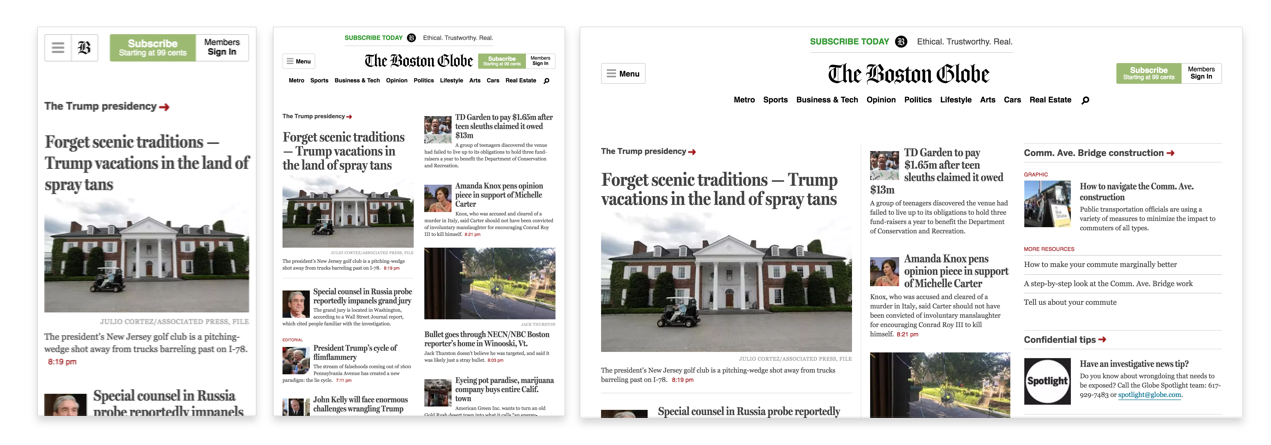
Media queries is a CSS3 module allowing content rendering to adapt to conditions such as screen resolution (for example, a smartphone screen compared to a computer screen). From left to right, we have the iPhone, iPad, and desktop version. This is a perfect example of a grid system and media queries (https://www.wired.com/2011/09/the-boston-globe-embraces-responsive-design/):
You have been reading a chapter from
Practical Web Design
Published in: Apr 2018
Publisher: Packt
ISBN-13: 9781788395038
Register for a free Packt account to unlock a world of extra content!
A free Packt account unlocks extra newsletters, articles, discounted offers, and much more. Start advancing your knowledge today.
Unlock this book and the full library FREE for 7 days
Get unlimited access to 7000+ expert-authored eBooks and videos courses covering every tech area you can think of
Renews at $19.99/month. Cancel anytime
Banner background image