Search icon CANCEL
Subscription
0
Cart icon
Your Cart (0 item)
Close icon
You have no products in your basket yet
Arrow left icon
Explore Products
Best Sellers
New Releases
Books
Videos
Audiobooks
Learning Hub
Free Learning
Arrow right icon
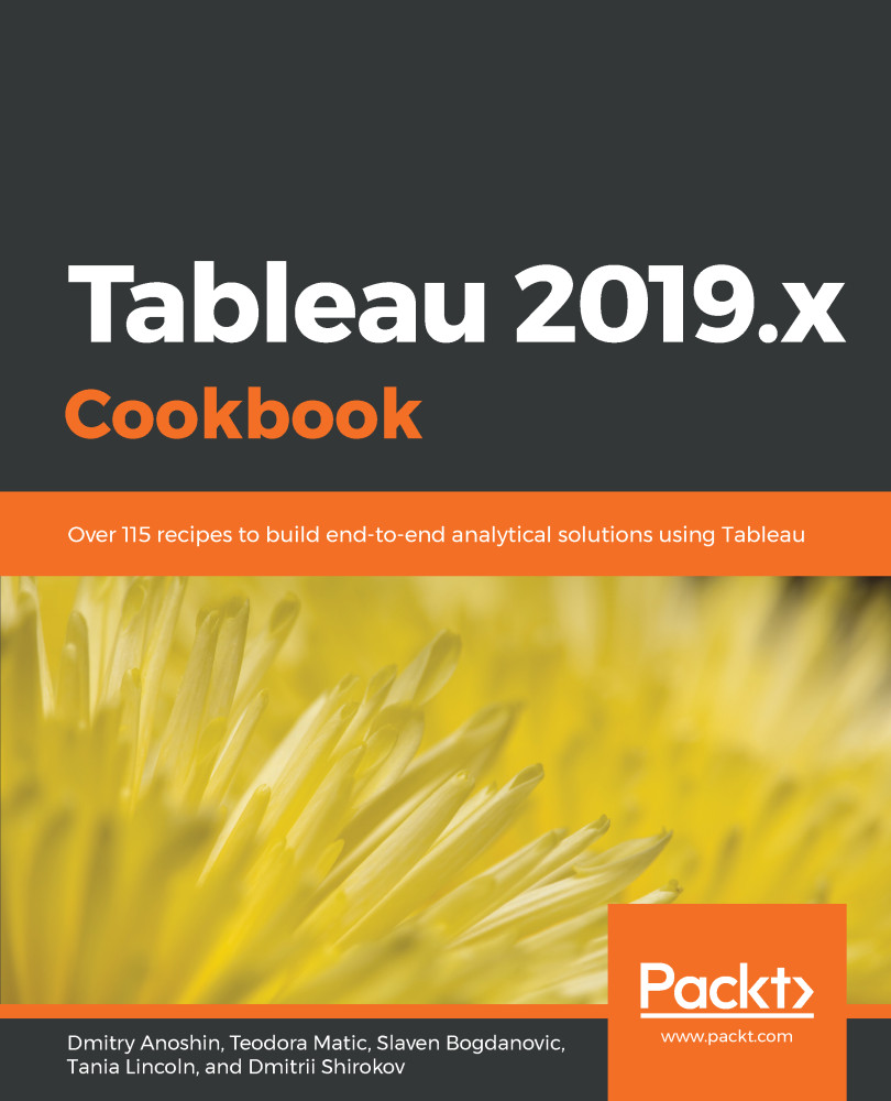
Tableau 2019.x Cookbook

Tableau 2019.x Cookbook: Over 115 recipes to build end-to-end analytical solutions using Tableau

Arrow left icon
Profile Icon Rintaro Sugimura Profile Icon Dmitry Anoshin Profile Icon Shirokov Profile Icon Lincoln Profile Icon Bogdanovic Profile Icon Matic +2 more Show less
Arrow right icon
R$80 R$196.99
Full star icon Full star icon Full star icon Half star icon Empty star icon 3.4 (5 Ratings)
eBook Jan 2019 670 pages 1st Edition
eBook
R$80 R$196.99
Paperback
R$245.99
Subscription
Free Trial
Renews at R$50p/m
eBook
R$80 R$196.99
Paperback
R$245.99
Subscription
Free Trial
Renews at R$50p/m

What do you get with eBook?

Product feature icon Instant access to your Digital eBook purchase
Product feature icon Download this book in EPUB and PDF formats
Product feature icon Access this title in our online reader with advanced features
Product feature icon DRM FREE - Read whenever, wherever and however you want
Product feature icon AI Assistant (beta) to help accelerate your learning
OR
Modal Close icon
Payment Processing...
tick Completed

Billing Address

Table of content icon View table of contents Preview book icon Preview Book

Tableau 2019.x Cookbook

Getting Started with Tableau Software

In this chapter, we will cover the following recipes:

  • Connecting to the data
  • Building a bar chart using Show Me
  • Building a text table
  • Adding filters
  • Adding color
  • Building a tree map
  • Building a map
  • Customizing tooltips
  • Building a dual axis map

Technical requirements

Introduction to Tableau

Tableau is one of the fastest-evolving business intelligence (BI) and data visualization tools at the moment. The user-friendly interface, combined with powerful capabilities, makes it one of the most widely used and popular BI tools around the globe. Tableau offers many functionalities, and getting started with the basic ones is surprisingly easy. This chapter will get you familiar with Tableau basics and, by the end of it, you will have learned how to connect to a data source, and how to make simple visualizations.

To complete the recipes in this chapter, we will be using data on baby names in the US, which have been collected by the US Federal Social Security Administration (SSA). The Baby_names.csv dataset contains the most popular baby names (that have 100 or more registered appearances) in the US, from 2010 through 2017. The dataset contains information about the state, gender of the name, name itself, year, and number of babies with said name.

Connecting to the data

In this recipe, we will go through the basics of connecting to a data source. The first step you must take when you open Tableau, before you create any visualizations, is to connect to a data source. You will then use that data source to create your views and dashboards.

Getting ready

In this recipe, we will be using the Baby_names.csv dataset. Make sure that you have a local copy of the dataset saved to your device.

How to do it...

  1. Open Tableau.
  2. From the Connect pane on the left-hand side, choose the Text file option:
  1. A new window will open. Navigate to your local copy of the Baby_names.csv dataset, select it, and click Open.
  2. Tableau has now opened the Data Source page for you, where the file you loaded has been selected as the data source, and where you can also preview it.
  3. To begin making your first visualization, just click on the Sheet 1 tab in the bottom of the workbook.

You are all set!

How it works...

Tableau reads the file you connected to and recognizes fields and their respective data types. There are the following data types in Tableau:

  • Number (decimal)
  • Number (whole)
  • Date and time
  • Date
  • String
  • Boolean

After you have connected to the data source and you click on Sheet 1, you will see the Data pane on the left-hand side of the workspace, with all the fields from the data source listed, and their respective types marked by small symbols to the left of their names, as shown in the following screenshot:

The globe symbols in front of State, Longitude, and Latitude denotes the geographical roles of these fields, which are important when building maps. On the other hand, the Abc symbol signifies strings, while the # symbol denotes numerical values.

There's more...

Tableau allows users to connect to a wide range of data. You can connect to different types of files that are stored locally on your device, or data stored on the cloud or in relational or multidimensional databases. You can connect to the list of data that is available on the Start page, which opens when you launch Tableau Desktop, under Connect.

See also

Building a bar chart using Show Me

In this recipe, we will build a bar chart using Show Me. The Show Me option is a handy way to get started with building Tableau visualizations. To make a visualization, you don't need to know exactly how to do it, you just need to know what fields from your data source you would like to include in it. Tableau will suggest the appropriate visualizations.

Getting ready

To complete this recipe, you need to connect to the Baby_names.csv dataset and open a new blank worksheet.

How to do it...

We will now create the bar chart using the Show Me option, while referring to the given steps.

Creating a chart using Show Me

  1. Hold the Ctrl key on your keyboard, then on State under Dimensions, and then choose Frequency under Measures.
  2. Release the Ctrl key and click on Show Me in the top-right corner of the workbook:
  1. A menu will open, offering various visualizations that are suitable for your data. Choose horizontal bars. You have just created your first visualization! Now, let's make it tidier and easier to read:

Sorting the chart

  1. Hover over the State pill in the Rows shelf so that a white arrows appears on it. Click on the arrow and select Sort...:
  1. Under Sort order, choose Descending.

  1. Under Sort by, select Field:

  1. Click on OK. The states are now sorted in descending order, by the value of Frequency, as follows:

How it works...

Tableau classifies the fields from a data source you connect to into two main types:

  • Dimensions: This section includes qualitative and categorical values, such as dates, strings, or geographical data
  • Measures: This section includes quantitative and numerical values

Measures and Dimensions can be both continuous, which means that they add axes to a view, and discrete, meaning they add field headers to a view. Continuous fields are marked with a green color, and discrete are marked with blue. However, you will notice that Measures are mostly continuous, while Dimensions are discrete:

When you select some measures and dimensions and click on Show Me, Tableau presents you with a range of basic visualizations that require the particular combination of measures and dimensions you selected.

There's more...

When you connect to a data source, Tableau automatically assigns type (measure or dimension) to each field in your data source. However, you can always change them manually by right-clicking on the field name under Measures/Dimensions and selecting Convert to Dimension / Convert to Measure:

See also

Building a text table

In this recipe, we will build a simple table that includes two dimension, and one measure. Dimensions will define the column and row headers, while the measure will be aggregated.

Getting ready

Connect to the Baby_names.csv dataset and open a new worksheet.

How to do it...

  1. Drag and drop State from Dimensions into the Rows shelf.
  2. Drag and drop Gender from Dimensions into the Columns shelf.
  3. Drag and drop Frequency from Measures onto Text in the Marks card:

How it works...

We have placed State and Gender, two discrete dimensions, into the rows and columns of our table. However, this still leaves the table itself empty. We can only see the Abc placeholder text. When we place Frequency, a continuous measure, onto Text, Tableau fills our table with that measure, and automatically aggregates it along the dimensions we placed in rows and columns.

There's more...

When you place a continuous measure into a view, Tableau needs to aggregate it. It will use SUM as the default aggregation function. You can also see that if you look at the Frequency pill in Text, in the Marks card, it says SUM(Frequency):

However, you can change the aggregation function. Hover over the SUM(Frequency) pill in the Marks card, so that a white arrow appears on it, and click on the arrow. If you hover over Measure (Sum) in the drop-down menu, it opens another drop-down menu. From it, you can choose from a range of aggregation functions, as shown in the following screenshot:

Keep in mind that this method of aggregation only affects the worksheet it is applied in. To change the default aggregation function for a particular measure across all worksheets, consider using the Default Properties function, which is available in the drop-down menu that will appear when we right-click a field under Measures.

See also

Adding filters

This chapter will get you familiar with basic filtering functionality in Tableau. We will create a chart that shows name frequency across years, but we will then filter one name to see how its popularity has been changing over the years, and also narrow our view down to one state.

Getting ready

Connect to the Baby_names.csv dataset, and open a new worksheet.

How to do it...

  1. Drag and drop Year from Dimensions into the Columns shelf.
  2. Drag and drop Frequency from Measures into the Rows shelf.
  3. Drag and drop Name into the Filters shelf.
  4. In the search bar at the top of the list, start typing jac.
  1. Select Jacob, and click OK:
  1. We can see that the name Jacob has been gradually decreasing in popularity since 2010. Let's see how it has fared in Texas specifically. Drag and drop State from Dimensions into the Filters card.
  2. In the search box in the Filter [State] window, type tx.

  1. Select TX, click OK, and you will see the following results:

How it works...

Filters exclude rows from your dataset. When you select the name Jacob using a filter, only rows that contain the Jacob value from your dataset are analyzed, while all the other rows are excluded. You can also filter multiple values and select two, three, or 50 names to show in your view.

There's more...

One of the main advantages of Tableau filters is their interactivity. Let's execute the following steps to see how the Filter option works:

  1. If you hover over the Name: Jacob pill in the Filters shelf, a small white arrow will appear on it.
  2. Click on the arrow, and in the drop-down menu, click on Show Filter.

  1. A list of all the names will appear in the top-right corner of the worksheet. Only Jacob is selected, because that's how we set our filter. However, you can select and deselect any name(s) to change your visualization:
  1. If you hover over the filter control and click on the small black arrow that appears in the top-right corner, you can change the mode of the filter. You can choose whether you would like the filter to allow single or multiple values. You can also decide whether to implement the filter control as a drop-down list, checkboxes, or slider, as shown in the following screenshot:

See also

Adding color

Colors are a very useful way to enrich your visualization. In this recipe, you will learn how to add information to your visualization by selecting Dimension and adding it to Color, which is present in the Marks card.

Getting ready

Connect to your local copy of Baby_names.csv and open a blank worksheet.

How to do it...

  1. Drag and drop State from Dimensions into the Columns shelf.
  2. Drag and drop Frequency from Measures into the Rows shelf.
  3. Drag and drop Name into the Filter shelf.
  4. In the Filter[Name] window, in the General tab, make sure Select from list is selected.
  5. Click on None to deselect all values.
  6. In the search bar at the top of the list, start typing soph.
  7. Tableau will show the results that start with those letters, such as Sophia and Sophie. Select both values:

  1. Click on OK.
  2. Drag and drop Frequency to Label in the Marks card.
  3. We have now created a chart with the summed total frequency of the names Sophie and Sophia per State. But, what if we wanted to know which of the two names is more popular in which state? We will achieve that by adding Name to Color in the Marks card.
  4. Drag and drop Name from Dimensions onto Color in the Marks card:

How it works...

When you add a discrete dimension (Name) to Color, Tableau disaggregates the measure you are using, Frequency, by the categories of Name, and assigns each category a different color. Since we filtered out all names except for Sophia and Sophie, only those two colors appeared in the chart. It's also possible, and often useful, to add a measure to Color. In that case, the value measure will be represented by a color gradient. For an example of adding a measure to Color, you can refer to the Creating a map with a color gradient recipe.

There's more...

It’s possible to customize the colors in your view by performing the following steps:

  1. Click on Color in the Marks card, and then click on Edit Colors…:
  1. In the Edit Colors[Name] window that opens, you can select a color palette from the drop-down menu that appears and click on the Assign Palette button. This will assign colors from the palette that you chose to the categories of your dimension. You can also manually assign specific colors to a category by selecting it in the Select Data Item pane, and by clicking on the desired color on the right-hand side:
  1. When you are satisfied with the colors, click OK to exit. Note that this will only affect the colors in the particular view you created.
  2. You can also hardcode a color palette for a specific measure or dimension. Hover over the field pill under Measures or Dimensions and click on the white arrow that appears on it. In the drop-down menu, navigate to Default Properties | Color...:

This will launch the Edit Colors window, where you can choose the color palette. However, once you assign your desired color palette to a field this way, it will be used by default every time you add this field to Color in a view.

If you plan to use a field in Color in more than one visualization, it's a good practice to hardcode the color palette for it. Using colors in your visualizations consistently makes them cleaner and easier to follow, especially as they get more complex.

See also

Building a tree map

Tree maps are useful for showing relative proportions of many categories in a total. In this recipe, we will investigate the composition of our dataset to see which states are dominant, with the most records, and which are represented with fewer records.

Getting ready

Connect to the Baby_names.csv data source and open a new worksheet.

How to do it...

  1. Drag and drop Number of Records from Measures onto Size in the Marks card.
  2. Drag and drop State from Dimensions onto Detail in the Marks card.
  3. Drag and drop State from Dimensions onto Label in the Marks card.
  1. Drag and drop Number of Records from Measures onto Label in the Marks card:

How it works...

The number of records is an automatically generated measure that simply represents the number of rows in the dataset. We are using it to see the relative representation of each state in our dataset.

There's more...

Placing a measure, in this case, Number of Records, on Size is necessary for creating a tree map. However, you can make your tree map even more intuitive by adding Number of Records to Color as well. You just need to drag and drop Number of Records from Measures onto Color in the Marks card button, and the value of Number of Records will also be reflected by a color gradient of the rectangles. You can also change and adjust the color palette by clicking on the Color button in the Marks card and choosing the settings you prefer:

See also

Building a map

Maps are a great way to present geographical data, as they are intuitive and easy to read. In this recipe, we will show name frequency by state, but this time using a map. This recipe will cover two frequently used ways to present data on a map: creating a map with circles of different sizes, and creating a filled map with a color gradient.

Getting ready

To complete this recipe, you will need to connect to the Baby_names.csv dataset and open a new blank worksheet.

How to do it...

First, we will make a map with circles.

Creating a map with circles

  1. Drag and drop State into the worksheet workspace.
  2. Drag and drop Frequency onto Size in the Marks card.
  3. Click on Size in the Marks card, and move the slider to the center, through which we can increase and decrease the size of the circle in the following map:

You can see the results in the following screenshot:

If the map is failing to display, navigate to File|Workbook Locale in the main menu toolbar and select More.... When the Set Workbook Locale window opens, select English (United States).

Creating a map with a color gradient

  1. Drag and drop State into the worksheet workspace.
  2. Drag and drop Frequency onto Color in the Marks card:

How it works...

Tableau has correctly recognized that the State dimension contains geographical information, and has assigned a geographical role to it. This is indicated by a small globe symbol () next to the dimension name in the Dimensions pane, as well as in the data preview on the Data Source page. Based on that, it has automatically generated two new measures, which are not in the dataset itself: Longitude and Latitude. When you drag and drop the State dimension into the worksheet workspace, the Show Me functionality is implemented. It places State in Detail in the Marks card, Longitude into the Columns shelf, and Latitude into the Rows shelf. Based on what we do with our measure, Frequency, Tableau automatically chooses the appropriate mark type, which is a circle or a map.

There's more...

It is possible to add and subtract layers from a map and change the map style by performing the following steps:

  1. From the main menu toolbar, navigate to Map | Map Layers… to open the Map Layers pane:
  1. In the Map Layers pane, you can add and remove map layers by checking and deselecting the boxes in front of them:
  1. You can also add data layers by selecting them from the Data Layer drop-down menu. Depending on the data you are showing on your map, adding different data layers might add relevant information to your visualization.
  2. It's also possible to adjust the background style under Background.

  1. Set the map style and layers as default. This means that every time you create a new map, those settings will be applied.

See also

Building a dual-axis map

In this recipe, you will learn how to create a dual-axis map. We will build on what we learned in the Building a map recipe and learn how to implement a dual axis.

Getting ready

Connect to the Baby_names.csv dataset and open a new worksheet.

How to do it...

  1. Drag and drop State from Dimensions into the worksheet workspace so that a basic map appears.
  2. Drag and drop Latitude (generated) from Measures into the Rows shelf to the right of the Latitude (generated) pill, which is already there:

Now we have two maps, one beneath the other. Also, notice how new sections have appeared in the Marks card. There is the All section, followed by Latitude (generated), which refers to the upper map, and Latitude (generated) (2), which refers to the bottom map:

  1. Click on the second section, Latitude (generated), in the Marks card to expand it.
  2. Drag and drop Frequency from Measures onto Color:
  1. Click on the Color button and select Edit Colors….
  2. From the Palette drop-down menu, select Gray, and click on OK:
  1. Click on the Color button again, and use the slider to decrease the opacity to around 51%:

  1. Click on the third section, Latitude (generated) (2), to expand it. In it, drag and drop Gender from Dimensions onto Color.
  2. Drag and drop Frequency from Measures onto Size.
  3. Click on the Automatic drop-down menu and change the mark type to Pie:
  1. Let's set the dual axis. In the Rows shelf, hover over the second Latitude (generated) pill so that a small white arrow appears on it:
  1. Click on the arrow, select Dual Axis, and you will get the following result:

How it works...

Adding the Latitude measure to the Rows shelf twice duplicates our view, making two maps instead of one. The two maps initially have the same specifications in the Marks card and State in Detail. However, we then build them separately by adding different dimensions and measures on each of them, and they show different information. We have finally implemented the dual axis, and we have also made the maps overlap. We ended up with one map that has two layers.

There's more...

The dual axis can be implemented with different types of visualizations, not just maps. In the following example, we can see two different measures in the rows so that the upper bar chart shows Frequency and the lower chart shows Number of Records:

If we implement dual axis, both measures will be displayed in one chart:

However, we must notice that the new chart has two y axes on each side—one showing Frequency and the other showing Number of Records. The axes are very different, as these two measures have different scales, thus showing that the same scale would make the measure with the narrower scale, in this case, Number of Records, look flat on the chart. However, Tableau does offer an option for synchronizing the axes, which is useful when the scales are similar.

To implement it, right-click on any of the two y axes and select Synchronize Axis:

See also

Customizing tooltips

When you hover over a point in your view, a tooltip will appear. Tooltips are small boxes, holding detailed information about a data point in the view, and are present by default. In this recipe, you will learn how to customize tooltips.

Getting ready

To follow this recipe, connect to the Baby_names.csv data source and open a new worksheet.

How to do it...

  1. Drag and drop Frequency from Measures onto Size in the Marks card.
  2. Drag and drop State from Dimensions onto Detail in the Marks card.
  3. Drag and drop State from Dimensions onto Label in the Marks card.
  4. Drag and drop Frequency from Measures to Color in the Marks card.
  5. Click on the drop-down menu in the Marks card and select Circle:
  1. Drag and drop Name from Dimensions into the Filter shelf.
  2. In the Filter [Name] window, click None to deselect all values.
  3. Start typing emma in the search bar at the top of the list, select Emma, and click on OK:
  1. Drag and drop Gender from Dimensions onto Detail in the Marks card.
  2. Drag and drop Name from Dimensions onto Tooltip in the Marks card.
  3. Double-click on Tooltip in the Marks card.
  4. In the Edit Tooltip window, hit Enter to add a row above the existing text and place your cursor in the new row.
  5. Click on Insert and select ATTR(Name):
  1. Click on Insert again and select Gender.
  1. Between <ATTR(Name)> and <Gender>, type is a beautiful. After <Gender>, type name. The whole expression should be <ATTR(Name)> is a beautiful <Gender> name, as shown in the following screenshot:
  1. Click on OK. The expression we entered into the tooltip will now appear when you put your mouse over any of the circles:

How it works...

Tooltips are, by default, set to hold information on the fields that are in the view and their current values. However, as we just saw, you can customize them by adding additional elements, or removing the ones that are there by default. We inserted fields such as Name and Gender into the Tooltip section; they will change automatically. If we change the Name filter from Emma to another name, it will change the value of the name in the sentence, as well as automatically update the gender.

There's more...

You can also insert another worksheet from the workbook into the tooltip. Let’s say you want your user to be able to see where the particular state is on the map. We can do this by executing the following steps:

  1. Create another sheet with the map, just by opening a blank worksheet and double-clicking on State in Dimensions.
  2. On the original sheet, double-click on Tooltip to open the Edit Tooltip window and add an empty row:
  1. Click on Insert and navigate to Sheets | Sheet 2. Tableau will insert an expression referencing Sheet 2 into the Tooltip section:
  1. If you go to Sheet 2, you will notice that Tableau added Tooltip (State) as a filter. When your mouse cursor goes over any of the states in Sheet 1, a tooltip with a map marking that state will show up:

See also

Left arrow icon Right arrow icon
Download code icon Download Code

Key benefits

  • Unique problem-solution approach to aid effective business decision-making
  • Create interactive dashboards and implement powerful business intelligence solutions
  • Includes best practices on using Tableau with modern cloud analytics services

Description

Tableau has been one of the most popular business intelligence solutions in recent times, thanks to its powerful and interactive data visualization capabilities. Tableau 2019.x Cookbook is full of useful recipes from industry experts, who will help you master Tableau skills and learn each aspect of Tableau's ecosystem. This book is enriched with features such as Tableau extracts, Tableau advanced calculations, geospatial analysis, and building dashboards. It will guide you with exciting data manipulation, storytelling, advanced filtering, expert visualization, and forecasting techniques using real-world examples. From basic functionalities of Tableau to complex deployment on Linux, you will cover it all. Moreover, you will learn advanced features of Tableau using R, Python, and various APIs. You will learn how to prepare data for analysis using the latest Tableau Prep. In the concluding chapters, you will learn how Tableau fits the modern world of analytics and works with modern data platforms such as Snowflake and Redshift. In addition, you will learn about the best practices of integrating Tableau with ETL using Matillion ETL. By the end of the book, you will be ready to tackle business intelligence challenges using Tableau's features.

Who is this book for?

Tableau 2019.x Cookbook is for data analysts, data engineers, BI developers, and users who are looking for quick solutions to common and not-so-common problems faced while using Tableau products. Put each recipe into practice by bringing the latest offerings of Tableau 2019.x to solve real-world analytics and business intelligence challenges. Some understanding of BI concepts and Tableau is required.

What you will learn

  • Understand the basic and advanced skills of Tableau Desktop
  • Implement best practices of visualization, dashboard, and storytelling
  • Learn advanced analytics with the use of build in statistics
  • Deploy the multi-node server on Linux and Windows
  • Use Tableau with big data sources such as Hadoop, Athena, and Spectrum
  • Cover Tableau built-in functions for forecasting using R packages
  • Combine, shape, and clean data for analysis using Tableau Prep
  • Extend Tableau's functionalities with REST API and R/Python

Product Details

Country selected
Publication date, Length, Edition, Language, ISBN-13
Publication date : Jan 31, 2019
Length: 670 pages
Edition : 1st
Language : English
ISBN-13 : 9781789535358
Vendor :
Tableau
Category :
Tools :

What do you get with eBook?

Product feature icon Instant access to your Digital eBook purchase
Product feature icon Download this book in EPUB and PDF formats
Product feature icon Access this title in our online reader with advanced features
Product feature icon DRM FREE - Read whenever, wherever and however you want
Product feature icon AI Assistant (beta) to help accelerate your learning
OR
Modal Close icon
Payment Processing...
tick Completed

Billing Address

Product Details

Publication date : Jan 31, 2019
Length: 670 pages
Edition : 1st
Language : English
ISBN-13 : 9781789535358
Vendor :
Tableau
Category :
Tools :

Packt Subscriptions

See our plans and pricing
Modal Close icon
R$50 billed monthly
Feature tick icon Unlimited access to Packt's library of 7,000+ practical books and videos
Feature tick icon Constantly refreshed with 50+ new titles a month
Feature tick icon Exclusive Early access to books as they're written
Feature tick icon Solve problems while you work with advanced search and reference features
Feature tick icon Offline reading on the mobile app
Feature tick icon Simple pricing, no contract
R$500 billed annually
Feature tick icon Unlimited access to Packt's library of 7,000+ practical books and videos
Feature tick icon Constantly refreshed with 50+ new titles a month
Feature tick icon Exclusive Early access to books as they're written
Feature tick icon Solve problems while you work with advanced search and reference features
Feature tick icon Offline reading on the mobile app
Feature tick icon Choose a DRM-free eBook or Video every month to keep
Feature tick icon PLUS own as many other DRM-free eBooks or Videos as you like for just R$25 each
Feature tick icon Exclusive print discounts
R$800 billed in 18 months
Feature tick icon Unlimited access to Packt's library of 7,000+ practical books and videos
Feature tick icon Constantly refreshed with 50+ new titles a month
Feature tick icon Exclusive Early access to books as they're written
Feature tick icon Solve problems while you work with advanced search and reference features
Feature tick icon Offline reading on the mobile app
Feature tick icon Choose a DRM-free eBook or Video every month to keep
Feature tick icon PLUS own as many other DRM-free eBooks or Videos as you like for just R$25 each
Feature tick icon Exclusive print discounts

Frequently bought together


Stars icon
Total R$ 764.97
Tableau 2019.x Cookbook
R$245.99
Learning Tableau 2019
R$245.99
Mastering Tableau 2019.1
R$272.99
Total R$ 764.97 Stars icon
Banner background image

Table of Contents

17 Chapters
Getting Started with Tableau Software Chevron down icon Chevron up icon
Data Manipulation Chevron down icon Chevron up icon
Tableau Extracts Chevron down icon Chevron up icon
Tableau Desktop Advanced Calculations Chevron down icon Chevron up icon
Tableau Desktop Advanced Filtering Chevron down icon Chevron up icon
Building Dashboards Chevron down icon Chevron up icon
Telling a Story with Tableau Chevron down icon Chevron up icon
Tableau Visualization Chevron down icon Chevron up icon
Tableau Advanced Visualization Chevron down icon Chevron up icon
Tableau for Big Data Chevron down icon Chevron up icon
Forecasting with Tableau Chevron down icon Chevron up icon
Advanced Analytics with Tableau Chevron down icon Chevron up icon
Deploy Tableau Server Chevron down icon Chevron up icon
Tableau Troubleshooting Chevron down icon Chevron up icon
Preparing Data for Analysis with Tableau Prep Chevron down icon Chevron up icon
ETL Best Practices for Tableau Chevron down icon Chevron up icon
Other Books You May Enjoy Chevron down icon Chevron up icon

Customer reviews

Rating distribution
Full star icon Full star icon Full star icon Half star icon Empty star icon 3.4
(5 Ratings)
5 star 40%
4 star 20%
3 star 0%
2 star 20%
1 star 20%
Ken Mar 31, 2019
Full star icon Full star icon Full star icon Full star icon Full star icon 5
Tableau is complex. Basics are pretty easy, but when you want to do something really interesting, like regression analysis, it's hard. The examples in the book are accessible, clear, and short. You won't find a deep interpretation of the recipes here, but for most of them, you don't need that. Particularly helpful were the examples integrating R and showing advanced visualizations. Overall, a solid and worthwhile book. Nice job!
Amazon Verified review Amazon
Upendra Singh Jul 21, 2019
Full star icon Full star icon Full star icon Full star icon Full star icon 5
Good book with enough examples and explanations.
Amazon Verified review Amazon
Michelle Davis Mar 30, 2019
Full star icon Full star icon Full star icon Full star icon Empty star icon 4
Wonderful and handy to have
Amazon Verified review Amazon
Leon Kowalski Feb 20, 2020
Full star icon Full star icon Empty star icon Empty star icon Empty star icon 2
This book, from PACKT, appears to be a professional handbook on the advanced application of Tableau. At 670 pages, and over £28.00 for the Kindle edition, one might expect an authoritative publication on Tableau. There are downloadable files to create all the examples and everything is presented in a logical manner.I have returned this book and gained a full refund as it was liberally padded with blank pages, provided only rudimentary examples on barely filled pages and was vastly inferior to the free and fully transcribed official tableau website video training.As a result of this purchase experience, and that of searching for authoritative, up to date, books about Tableau on Amazon, I have put in place several rules before considering to buy.1. Does the book allow 'Look inside'? If not, I'm not going to look into the book any further. To date, I have returned all technical references that I have bought that did not support 'Look Inside' as they have proved to be nothing more than cynical or basic guides for beginners.2. Was the book published or revised within the last year? Tableau release about 3 to 4 times a year. What is a credible solution a year ago, may well be a workaround for a new feature today; Dynamic parameters and buffering calculations for creating proximity analysis are cases in point for release 2020.1.With the price of kindle offering almost that of print, I'm not prepared to pay £20-30 a time on books that have no more than 2 years of usable life.3. Is the author known for their success at Tableau application. Whilst not an indication of quality contents in itself, when considered with the first two points, I find that this will help determine if buy the book or not.I have found that established industry specialists with a genuinely high reputation and high profile lecture acumen do write books that deliver on their promise; the O'Reilly range with Ray Sleeper (Practical Tableau 2018) is a good example.BOOK CONTENT AND USEFULNESS-----------------------------------------In practice, this book is very sparsely written and contains so many blank pages that I felt it had been deliberately ‘padded’ to appear more than it was. Due to the similarity in content, I felt that the book was, at best, a version of notes for the freely available official Tableau online training which I completed before looking for books on the advanced application of Tableau.Unlike the website, this book will not train the novice user in BI or Tableau best practice as the user merely repeats the steps presented. Also, this book is already dated where the website is constantly updated with the latest techniques for the latest release.As a BI consultant & developer, I am expected to deliver highly specialised analytical models and dashboards using the client preferred software solution. In preparation for my new project, I first reviewed the entire FREE training offered by the tableau website.QUALIFICATIONS--------------------If formal tableau qualification were required, and as a demonstration of the high level of quality available for free, it is my opinion that the website provides everything a user could need to prepare and qualify in two of the three recognised Tableau standards: Specialist ($100.00 exam) and Associate ($250.00 exam). The third standard is that of professional ($600.00 exam for 3-year certificate) which would require experience and time to achieve where the first two standards could be achieved in a week of dedicated study.TOPICS---------The book and website cover almost similar topics. However, the website is far more complete and fully covers the following:1. Tableau Prep builder2. Tableau Conductor3. Tableau Desktop (Calculations, maps, groups, sets, formatting, dashboard design, etc).4. Tableau Online5. Tableau Server & Online Deployment6. Tableau AdministrationUnlike the book, the website achieves its aim with over 11 hours of ‘how-to’ video, all fully transcribed and supported with a complete suite of the required example datasets and over 90 BI models for working along with plus over 70 finished working examples to verify your solutions against.REFUND REQUEST-----------------------After only 20 mins of reading, I requested a refund for my kindle purchase which Amazon carried out immediately. on the basis of this book, I will be cautious about purchasing any future PACKT offerings.Tableau is a great package with a rich and diverse community. I have since discovered all that I was looking for in youtube videos and forums, such as:1. Map analysis using distance.2. Creation of a product catalog with product to page and including associated images.3. TabPy - application of Python with Tableau4. Complex calculations for driving dynamic user interactive selections for comparison analysis.
Amazon Verified review Amazon
Amazon Customer Sep 23, 2019
Full star icon Empty star icon Empty star icon Empty star icon Empty star icon 1
The content is good but the quality of paper and print is not. I have ebook and wanted hard copy so I didn’t have to go back and forth to practice exercises. Ebook is color and although hard copy is $50 it is black and white. I do not think it is worth the price
Amazon Verified review Amazon
Get free access to Packt library with over 7500+ books and video courses for 7 days!
Start Free Trial

FAQs

How do I buy and download an eBook? Chevron down icon Chevron up icon

Where there is an eBook version of a title available, you can buy it from the book details for that title. Add either the standalone eBook or the eBook and print book bundle to your shopping cart. Your eBook will show in your cart as a product on its own. After completing checkout and payment in the normal way, you will receive your receipt on the screen containing a link to a personalised PDF download file. This link will remain active for 30 days. You can download backup copies of the file by logging in to your account at any time.

If you already have Adobe reader installed, then clicking on the link will download and open the PDF file directly. If you don't, then save the PDF file on your machine and download the Reader to view it.

Please Note: Packt eBooks are non-returnable and non-refundable.

Packt eBook and Licensing When you buy an eBook from Packt Publishing, completing your purchase means you accept the terms of our licence agreement. Please read the full text of the agreement. In it we have tried to balance the need for the ebook to be usable for you the reader with our needs to protect the rights of us as Publishers and of our authors. In summary, the agreement says:

  • You may make copies of your eBook for your own use onto any machine
  • You may not pass copies of the eBook on to anyone else
How can I make a purchase on your website? Chevron down icon Chevron up icon

If you want to purchase a video course, eBook or Bundle (Print+eBook) please follow below steps:

  1. Register on our website using your email address and the password.
  2. Search for the title by name or ISBN using the search option.
  3. Select the title you want to purchase.
  4. Choose the format you wish to purchase the title in; if you order the Print Book, you get a free eBook copy of the same title. 
  5. Proceed with the checkout process (payment to be made using Credit Card, Debit Cart, or PayPal)
Where can I access support around an eBook? Chevron down icon Chevron up icon
  • If you experience a problem with using or installing Adobe Reader, the contact Adobe directly.
  • To view the errata for the book, see www.packtpub.com/support and view the pages for the title you have.
  • To view your account details or to download a new copy of the book go to www.packtpub.com/account
  • To contact us directly if a problem is not resolved, use www.packtpub.com/contact-us
What eBook formats do Packt support? Chevron down icon Chevron up icon

Our eBooks are currently available in a variety of formats such as PDF and ePubs. In the future, this may well change with trends and development in technology, but please note that our PDFs are not Adobe eBook Reader format, which has greater restrictions on security.

You will need to use Adobe Reader v9 or later in order to read Packt's PDF eBooks.

What are the benefits of eBooks? Chevron down icon Chevron up icon
  • You can get the information you need immediately
  • You can easily take them with you on a laptop
  • You can download them an unlimited number of times
  • You can print them out
  • They are copy-paste enabled
  • They are searchable
  • There is no password protection
  • They are lower price than print
  • They save resources and space
What is an eBook? Chevron down icon Chevron up icon

Packt eBooks are a complete electronic version of the print edition, available in PDF and ePub formats. Every piece of content down to the page numbering is the same. Because we save the costs of printing and shipping the book to you, we are able to offer eBooks at a lower cost than print editions.

When you have purchased an eBook, simply login to your account and click on the link in Your Download Area. We recommend you saving the file to your hard drive before opening it.

For optimal viewing of our eBooks, we recommend you download and install the free Adobe Reader version 9.