Using the mobile version of Canva
At this point, I would like to talk a bit about the Canva mobile app, as the majority of people are now using mobiles over desktop computers for everyday life and work, so it is important to get this app set up as well. You can use the same login details that you used for the desktop/web version of Canva and when you do, all of your designs, uploads, images, and branding are carried across, so anything you create on your desktop will be available to you through the mobile app on your phone. There are a few small differences and not all features are carried over to the mobile app. The main difference is the obvious one really: the screen size. On our computers and desktop screens, we can see so much more and can design more complex projects this way. Using your mobile, you are restricted to a smaller screen, so it’s perfect for downloading designs and scheduling or uploading to social media on the go.
To get the Canva mobile app, you will need access to either the App Store on Apple or Google Play Store on Android phones. It will often appear as an advert at the top of the page. Select Canva and log in using your Canva login details.
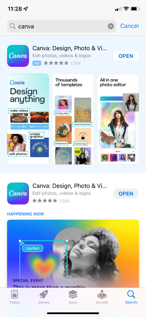
Figure 1.4 – Canva App Store view
It will then open up on your phone and you will see a screen similar to this one:
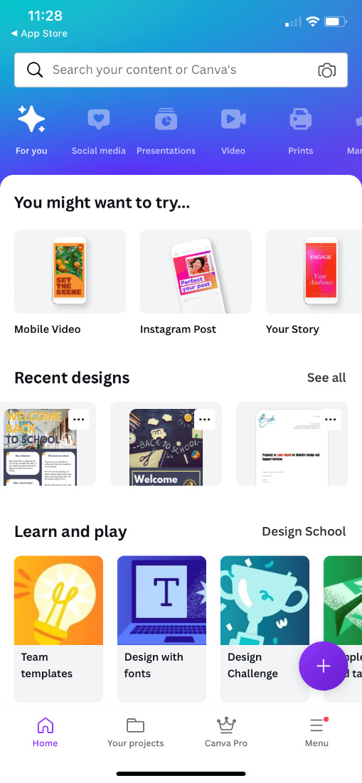
Figure 1.5 – Canva for mobile home screen
There are a few small differences between the desktop version and mobile version of Canva, including the following:
- The main menu is across the bottom rather than the left side, and the Create a design button is the small purple circle in the bottom-right corner:
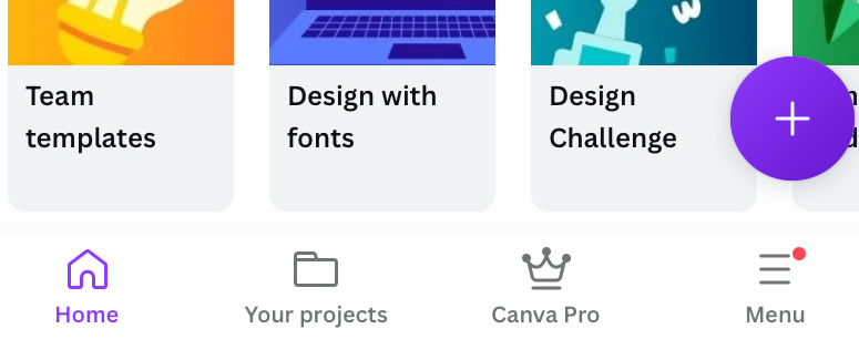
Figure 1.6 – Mobile version main menu
- When designing, all the template features are along the bottom rather than the top:

Figure 1.7 – Mobile version design features
- To access features when you are working on a design, you select the small purple circle in the bottom left and the elements are accessible from there, and to view all your pages together, there is a white circle with a number in a square in it, on the right of the screen:

Figure 1.8 – Mobile version create button and view all pages button
Overall, they are very similar, and any differences have been put in place to accommodate the difference in screen sizes.
The mobile version is great for being on the go and being able to find your designs quickly, which is why we will now look at setting up folders and getting organized.


