Search icon CANCEL
Subscription
0
Cart icon
Your Cart (0 item)
Close icon
You have no products in your basket yet
Arrow left icon
Explore Products
Best Sellers
New Releases
Books
Videos
Audiobooks
Learning Hub
Free Learning
Arrow right icon
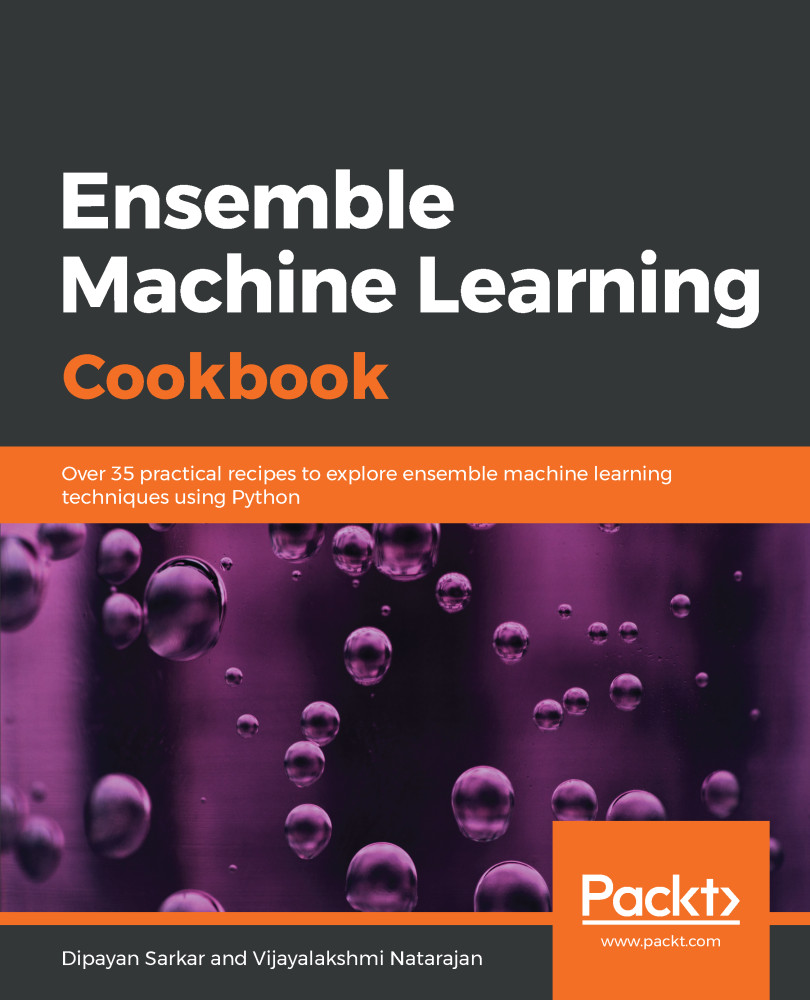
Ensemble Machine Learning Cookbook

Ensemble Machine Learning Cookbook: Over 35 practical recipes to explore ensemble machine learning techniques using Python

Arrow left icon
Profile Icon Sarkar Profile Icon Natarajan
Arrow right icon
£16.99 per month
Full star icon Full star icon Full star icon Full star icon Full star icon 5 (1 Ratings)
Paperback Jan 2019 336 pages 1st Edition
eBook
£20.98 £29.99
Paperback
£36.99
Subscription
Free Trial
Renews at £16.99p/m
eBook
£20.98 £29.99
Paperback
£36.99
Subscription
Free Trial
Renews at £16.99p/m

What do you get with a Packt Subscription?

Free for first 7 days. £16.99 p/m after that. Cancel any time!
Product feature icon Unlimited ad-free access to the largest independent learning library in tech. Access this title and thousands more!
Product feature icon 50+ new titles added per month, including many first-to-market concepts and exclusive early access to books as they are being written.
Product feature icon Innovative learning tools, including AI book assistants, code context explainers, and text-to-speech.
Product feature icon Thousands of reference materials covering every tech concept you need to stay up to date.
Subscribe now
View plans & pricing
Table of content icon View table of contents Preview book icon Preview Book

Ensemble Machine Learning Cookbook

Get Closer to Your Data

In this chapter, we will cover the following recipes:

  • Data manipulation with Python
  • Analyzing, visualizing, and treating missing values
  • Exploratory data analysis

Introduction

In this book, we will cover various ensemble techniques and will learn how to ensemble multiple machine learning algorithms to enhance a model's performance. We will use pandas, NumPy, scikit-learn, and Matplotlib, all of which were built for working with Python, as we will do throughout the book. By now, you should be well aware of data manipulation and exploration.

In this chapter, we will recap how to read and manipulate data in Python, how to analyze and treat missing values, and how to explore data to gain deeper insights. We will use various Python packages, such as numpy and pandas, for data manipulation and exploration, and seaborn packages for data visualization. We will continue to use some or all of these libraries in the later chapters of this book as well. We will also use the Anaconda distribution for our Python coding. If you have not installed Anaconda, you need to download it from https://www.anaconda.com/download. At the time of writing this book, the latest version of Anaconda is 5.2, and comes with both Python 3.6 and Python 2.7. We suggest you download Anaconda for Python 3.6. We will also use the HousePrices dataset, which is available on GitHub.

Data manipulation with Python

In real life, it is often hard to get a complete and clean dataset formatted exactly as we need it. The data we receive often cannot be directly used in statistical or machine learning algorithms. We need to manipulate the raw data so that the processed data can be used for further analysis and modelling purposes. To begin with, we need to import the required packages, such as pandas, and read our dataset into Python.

Getting ready

We will use the os package in the operating system's dependent functionality, and the pandas package for data manipulation.

Let's now take a look at the data definitions to understand our variables. In the following code, we list the data definition for a few variables. The dataset and the complete data definitions are available on GitHub. Here is an abridged version of the data description file:

MS SubClass (Nominal): Identifies the type of dwelling involved in the sale
Lot Frontage (Continuous): Linear feet of street connected to property
Alley (Nominal): Type of alley access to property
Overall Qual (Ordinal): Rates the overall material and finish of the house
Overall Cond (Ordinal): Rates the overall condition of the house
Year Built (Discrete): Original construction date
Mas Vnr Type (Nominal): Masonry veneer type
Mas Vnr Area (Continuous): Masonry veneer area in square feet
Garage Type (Nominal): Garage location
Garage Yr Blt (Discrete): Year garage was built
Garage Finish (Ordinal): Interior finish of the garage
Garage Cars (Discrete): Size of garage in car capacity
Garage Area (Continuous): Size of garage in square feet
Garage Qual (Ordinal): Garage quality
Garage Cond (Ordinal): Garage condition
...
...
SalePrice (Continuous): Sale price $$

We will then import the os and pandas packages and set our working directory according to our requirements, as seen in the following code block:

import os
import pandas as pd

# Set working directory as per your need
os.chdir(".../.../Chapter 1")
os.getcwd()

The next step is to download the dataset from GitHub and copy it to your working directory.

How to do it...

Now, let's perform some data manipulation steps:

  1. First, we will read the data in HousePrices.csv from our current working directory and create our first DataFrame for manipulation. We name the DataFrame housepricesdata, as follows:
housepricesdata = pd.read_csv("HousePrices.csv")
  1. Let's now take a look at our DataFrame and see how it looks:
# See first five observations from top
housepricesdata.head(5)

You might not be able to see all the rows; Jupyter will truncate some of the variables. In order to view all of the rows and columns for any output in Jupyter, execute the following commands:

# Setting options to display all rows and columns
pd.options.display.max_rows = None
pd.options.display.max_columns = None

  1. We can see the dimensions of the DataFrame with shape. shape is an attribute of the pandas DataFrame:
housepricesdata.shape

With the preceding command, we can see the number of rows and columns, as follows:

(1460, 81)

Here, we can see that the DataFrame has 1460 observations and 81 columns.

  1. Let's take a look at the datatypes of the variables in the DataFrame:
housepricesdata.dtypes

In the following code block, we can see the datatypes of each variable in the DataFrame:

Id                 int64
MSSubClass         int64
MSZoning          object
LotFrontage      float64
LotArea            int64
LotConfig         object
LandSlope         object
                  ...   
BedroomAbvGr       int64
KitchenAbvGr       int64
KitchenQual       object
TotRmsAbvGrd       int64
SaleCondition     object
SalePrice          int64
Length: 81, dtype: object

We're now all ready to start with our data manipulation, which we can do in many different ways. In this section, we'll look at a few ways in which we can manipulate and prepare our data for the purpose of analysis.

Let's start by summarizing our data.

  1. The describe() function will show the statistics for the numerical variables only:
housepricesdata.describe()

We can see the output in the following screenshot:

  1. We will remove the id column, as this will not be necessary for our analysis:
# inplace=True will overwrite the DataFrame after dropping Id column
housepricesdata.drop(['Id'], axis=1, inplace=True)
  1. Let's now look at the distribution of some of the object type variables, that is, the categorical variables. In the following example, we are going to look at LotShape and LandContour. We can study the other categorical variables of the dataset in the same way as shown in the following code block:
# Name the count column as "count"
lotshape_frequencies = pd.crosstab(index=housepricesdata["LotShape"], columns="count")

landcountour_frequencies = pd.crosstab(index=housepricesdata["LandContour"], columns="count") # Name the count column as "count"

print(lotshape_frequencies)
print("\n") # to keep a blank line for display
print(landcountour_frequencies)
  1. We will now see how to perform a conversion between datatypes. What we notice is that the data definition of variables such as MSSubClass, OverallQual, and OverallCond are all categorical variables. After importing the dataset, however, they appear as integers.
Prior to typecasting any variable, ensure that there are no missing values.

Here, we'll convert the variables to a categorical datatype:

# Using astype() to cast a pandas object to a specified datatype
housepricesdata['MSSubClass'] = housepricesdata['MSSubClass'].astype('object')
housepricesdata['OverallQual'] = housepricesdata['OverallQual'].astype('object')
housepricesdata['OverallCond'] = housepricesdata['OverallCond'].astype('object')


# Check the datatype of MSSubClass after type conversion
print(housepricesdata['MSSubClass'].dtype)
print('\n') # to keep a blank line for display

# Check the distribution of the levels in MSSubClass after conversion
# Make a crosstab with pd.crosstab()
# Name the count column as "count"
print(pd.crosstab(index=housepricesdata["MSSubClass"], columns="count"))

We can see the count of observations for each category of houses, as shown in the following code block:

category

col_0       count
MSSubClass       
20            536
30             69
40              4
45             12
50            144
60            299
70             60
75             16
80             58
85             20
90             52
120            87
160            63
180            10
190            30

There are many variables that might not be very useful by themselves, but transforming them gives us a lot of interesting insights. Let's create some new, meaningful variables.

  1. YearBuilt and YearRemodAdd represent the original construction date and the remodel date respectively. However, if they can be converted into age, these variables will tell us how old the buildings are and how many years it has been since they were remodeled. To do this, we create two new variables, BuildingAge and RemodelAge:
# Importing datetime package for date time operations
import datetime as dt

# using date time package to find the current year
current_year = int(dt.datetime.now().year)

# Subtracting the YearBuilt from current_year to find out the age of the building
building_age = current_year - housepricesdata['YearBuilt']

# Subtracting the YearRemonAdd from current_year to find out the age since the
# building was remodelled
remodelled_age = current_year - housepricesdata['YearRemodAdd']
  1. Now, let's add the two variables to our dataset:
# Adding the two variables to the DataFrame
housepricesdata['building_age'] = building_age
housepricesdata['remodelled_age'] = remodelled_age

# Checking our DataFrame to see if the two variables got added
housepricesdata.head(5)

We notice that building_age and remodelled_age are now added to the DataFrame, as shown in the following screenshot:

Variables that contain label data need to be converted into a numerical form for machine learning algorithms to use. To get around this, we will perform encoding that will transform the labels into numerical forms so that the algorithms can use them.

  1. We need to identify the variables that need encoding, which include Street, LotShape, and LandContour. We will perform one-hot encoding, which is a representation of categorical variables as binary vectors. We will use the pandas package in Python to do this:
# We use get_dummies() function to one-hot encode LotShape
one_hot_encoded_variables = pd.get_dummies(housepricesdata['LotShape'],prefix='LotShape')

# Print the one-hot encoded variables to see how they look like
print(one_hot_encoded_variables)

We can see the one-hot encoded variables that have been created in the following screenshot:

  1. Add the one-hot encoded variables to our DataFrame, as follows:
# Adding the new created one-hot encoded variables to our DataFrame
housepricesdata = pd.concat([housepricesdata,one_hot_encoded_variables],axis=1)

# Let's take a look at the added one-hot encoded variables
# Scroll right to view the added variables
housepricesdata.head(5)

We can see the output that we get after adding the one-hot encoded variables to the DataFrame in the following screenshot:

  1. Now, let's remove the original variables since we have already created our one-hot encoded variables:
# Dropping the original variable after one-hot encoding the original variable
# inplace = True option will overwrite the DataFrame

housepricesdata.drop(['LotShape'],axis=1, inplace=True)

How it works...

The pandas module is a part of the Python standard library – it is one of the key modules for data manipulation. We have also used other packages, such as os and datetime. After we set our working directory and read the CSV file into Python as a pandas DataFrame, we moved on to looking at a few data manipulation methods.

Step 1 to Step 5 in the preceding section showed us how to read the data from a CSV file in Python using pandas, and also how to use functions such as dtypes.

The pandas package also provides methods for reading data from various file types. For example, pandas.read_excel() reads an Excel table into a pandas DataFrame; pandas.read_json() converts a JSON string into apandas object; and pandas.read_parquet() loads a parquet object from a file path and returns the pandas DataFrame. More information on this can be found at https://bit.ly/2yBqtvd.

You can also read HDF5 format files in Python using the h5py package. The h5py package is a Python interface to the HDF5 binary data format. HDF® supports n-dimensional datasets, and each element in the dataset may itself be a complex object. There is no limit on the number or size of data objects in the collection. More info can be found at https://www.hdfgroup.org/. A sample code block looks like this:

import h5py

# With 'r' passed as a parameter to the h5py.File()
# the file will be read in read-only mode
data = h5py.File('File Name.h5', 'r')

We look at the datatypes of the variables, and use describe() to see the summary statistics for the numerical variables. We need to note that describe() works only for numerical variables and is intelligent enough to ignore non-numerical variables. In Step 6, we saw how to look at the count of each level for categorical variables such as LotShape and LandContour. We can use the same code to take a look at the distribution of other categorical variables.

In Step 7, we took a look at the distribution of the LotShape and LandContour variables using pd.crosstab().

One common requirement in a crosstab is to include subtotals for the rows and the columns. We can display subtotals using the margins keyword. We pass margins=True to the pd.crosstab() function. We can also give a name to subtotal columns using the margins_name keyword. The default value for margins_name is All.

We then moved on to learning how to convert datatypes. We had a few variables that were actually categorical, but appeared to be numerical in the dataset. This is often the case in a real-life scenario, hence we need to learn how to typecast our variables. Step 8 showed us how to convert a numerical variable, such as MSSubClass, into a categorical type. In Step 8, we converted a few variables into a categorical datatype. We then created a crosstab to visualize the frequencies of each level of categorical variables.

In Step 9, we created new meaningful variables from existing variables. We created the new variables, BuildingAge and RemodelAge, from YearBuilt and YearRemodAdd respectively, to represent the age of the building and the number of years that have passed since the buildings were remodeled. This method of creating new variables can provide better insights into our analysis and modeling. This process of creating new features is called feature engineering. In Step 10, we added the new variables to our DataFrame.

From there, we moved on to encoding our categorical variables. We needed to encode our categorical variables because they have named descriptions. Many machine learning algorithms cannot operate on labelled data because they require all input and output variables to be numeric. In Step 12, we encoded them with one-hot encoding. In Step 11, we learned how to use the get_dummies() function, which is a part of the pandas package, to create the one-hot encoded variables. In Step 12, we added the one-hot_encoded_variables to our DataFrame. And finally, in Step 13, we removed the original variables that are now one-hot encoded.

There's more...

The types of data manipulation required depend on your business requirements. In this first recipe, we saw a few ways to carry out data manipulation, but there is no limit to what you can do and how you can manipulate data for analysis.

We have also seen how to convert a numerical variable into a categorical variable. We can do this kind of typecasting in many ways. For example, we can convert a categorical variable into a numerical variable, if required, with the following code:

# Converting a categorical variable to numerical
# Using astype() to cast a pandas object to a specified datatype

# Here we typecast GarageYrBlt from float64 type to int64 type
housepricesdata['GarageYrBlt'] = housepricesdata['GarageYrBlt'].astype('int64')

You can only convert the GarageYrBlt variable if it does not contain any missing values. The preceding code will throw an error, since GarageYrBlt contains missing values.

We have looked at how we can use one-hot encoding to convert categorical variables to numerical variables, and why we do this. In addition to one-hot encoding, we can perform other kinds of encoding, such as label encoding, frequency encoding, and so on. An example code for label encoding is given in the following code block:

# We use sklearn.preprocessing and import LabelEncoder class
from sklearn.preprocessing import LabelEncoder

# Create instance of LabelEncoder class
lb_make = LabelEncoder()

# We create a new variable LotConfig_code to hold the new numerical labels
# We label encode LotConfig variable
housepricesdata["LotConfig_Code"] = lb_make.fit_transform(housepricesdata["LotConfig"])

# Display the LotConfig variable and its corresponding label encoded numerical values
housepricesdata[["LotConfig", "LotConfig_Code"]]

See also

Analyzing, visualizing, and treating missing values

Missing values are caused by incomplete data. It is important to handle missing values effectively, as they can lead to inaccurate inferences and conclusions. In this section, we will look at how to analyze, visualize, and treat missing values.

How to do it...

Let's start by analyzing variables with missing values. Set the options in pandas to view all rows and columns, as shown in the previous section:

  1. With the following syntax, we can see which variables have missing values:
# Check which variables have missing values

columns_with_missing_values = housepricesdata.columns[housepricesdata.isnull().any()]
housepricesdata[columns_with_missing_values].isnull().sum()

This will produce the following output:

  1. You might also like to see the missing values in terms of percentages. To see the count and percentage of missing values, execute the following command:
import numpy as np
import matplotlib.pyplot as plt
%matplotlib inline

# To hold variable names
labels = []

# To hold the count of missing values for each variable
valuecount = []

# To hold the percentage of missing values for each variable
percentcount = []

for col in columns_with_missing_values:
labels.append(col)
valuecount.append(housepricesdata[col].isnull().sum())
# housepricesdata.shape[0] will give the total row count
percentcount.append(housepricesdata[col].isnull().sum()/housepricesdata.shape[0])

ind = np.arange(len(labels))

fig, (ax1, ax2) = plt.subplots(1,2,figsize=(20,18))

rects = ax1.barh(ind, np.array(valuecount), color='blue')
ax1.set_yticks(ind)
ax1.set_yticklabels(labels, rotation='horizontal')
ax1.set_xlabel("Count of missing values")
ax1.set_title("Variables with missing values")

rects = ax2.barh(ind, np.array(percentcount), color='pink')
ax2.set_yticks(ind)
ax2.set_yticklabels(labels, rotation='horizontal')
ax2.set_xlabel("Percentage of missing values")
ax2.set_title("Variables with missing values")

It will show you the missing values in both absolute and percentage terms, as shown in the following screenshot:

We notice that variables such as Alley, PoolQC, Fence, and MiscFeature have 80% to 90% of their values missing. FireplaceQu has 47.26% of its values missing. A few other variables, such as LotFrontage, MasVnrType, MasVnrArea, BsmtQual, BsmtCond, and a few more Garage-related variables have missing values as well.

But there is a catch. Let's look at the Alley variable again. It shows us that it has 93.76% missing values. Now take another look at the data description that we looked at in the preceding section. The variable description for Alley shows that it has three levels: gravel, paved, and no access. In the original dataset, 'No Access' is codified as NA. When NA is read in Python, it is treated as NaN, which means that a value is missing, so we need to be careful.

  1. Now, we will replace the missing values for Alley with a valid value, such as 'No Access':
# Replacing missing values with 'No Access' in Alley variable
housepricesdata['Alley'].fillna('No Access', inplace=True)
  1. Now, let's visualize the missing values and try to see how can we treat them. The following code generates a chart that showcases the spread of missing values. Here we use the seaborn library to plot the charts:
# Lets import seaborn. We will use seaborn to generate our charts
import seaborn as sns

# We will import matplotlib to resize our plot figure
import matplotlib.pyplot as plt
%matplotlib inline
plt.figure(figsize=(20, 10))

# cubehelix palette is a part of seaborn that produces a colormap
cmap = sns.cubehelix_palette(light=1, as_cmap=True, reverse=True)
sns.heatmap(housepricesdata.isnull(), cmap=cmap)

The color of the map is generated with linearly increasing brightness by the cubehelix_palette() function:

From the preceding plot, it is easier to read the spread of the missing values. The white marks on the chart indicate missing values. Notice that Alley no longer reports any missing values.

  1. LotFrontage is a continuous variable and has 17.74% of its values missing. Replace the missing values in this variable with its median as follows:
# Filling in the missing values in LotFrontage with its median value
housepricesdata['LotFrontage'].fillna(housepricesdata['LotFrontage'].median(), inplace=True)

  1. Let's view the missing value plot once again to see if the missing values from LotFrontage have been imputed. Copy and execute the preceding code. The missing value plot will look as follows:

Here, we can see in the preceding plot that there are no more missing values for Alley or LotFrontage.

  1. We have figured out from the data description that several variables have values that are codified as NA. Because this is read in Python as missing values, we replace all of these with their actual values, which we get to see in the data description shown in the following code block:
# Replacing all NA values with their original meaning
housepricesdata['BsmtQual'].fillna('No Basement', inplace=True)
housepricesdata['BsmtCond'].fillna('No Basement', inplace=True)
housepricesdata['BsmtExposure'].fillna('No Basement', inplace=True)
housepricesdata['BsmtFinType1'].fillna('No Basement', inplace=True)
housepricesdata['BsmtFinType2'].fillna('No Basement', inplace=True)

housepricesdata['GarageYrBlt'].fillna(0, inplace=True)

# For observations where GarageType is null, we replace null values in GarageYrBlt=0
housepricesdata['GarageType'].fillna('No Garage', inplace=True)
housepricesdata['GarageFinish'].fillna('No Garage', inplace=True)
housepricesdata['GarageQual'].fillna('No Garage', inplace=True)
housepricesdata['GarageCond'].fillna('No Garage', inplace=True)


housepricesdata['PoolQC'].fillna('No Pool', inplace=True)
housepricesdata['Fence'].fillna('No Fence', inplace=True)
housepricesdata['MiscFeature'].fillna('None', inplace=True)

housepricesdata['FireplaceQu'].fillna('No Fireplace', inplace=True)
  1. Let's take a look at the missing value plot after having treated the preceding variables:

We notice from the preceding plot that there are no more missing values for the variables that we have just treated. However, we are left with a few missing values in MasVnrType, MasVnrArea, and Electrical.

  1. Let's try to look at the distribution of MasVnrType by MasVnrArea with a crosstab:
# Using crosstab to generate the count of MasVnrType by type of MasVnrArea
print(pd.crosstab(index=housepricesdata["MasVnrType"],\
columns=housepricesdata["MasVnrArea"], dropna=False, margins=True))

The following output shows that when MasVnrArea is zero, we have MasVnrType as None in the majority of cases:

  1. We will then impute the missing values in MasVnrType with None and MasVnrArea with zero. This is done with the commands shown in the following code block:
# Filling in the missing values for MasVnrType and MasVnrArea with None and 0 respectively
housepricesdata['MasVnrType'].fillna('None', inplace=True)
housepricesdata['MasVnrArea'].fillna(0, inplace=True)

We are still left with one missing value in the Electrical variable.

  1. Let's take a look at the observation where Electrical has a missing value:
housepricesdata['MSSubClass'][housepricesdata['Electrical'].isnull()]
  1. We see that MSSubClass is 80 when Electrical is null. Let's see the distribution of the Electrical type by MSSubClass:
# Using crosstab to generate the count of Electrical Type by MSSubClass
print(pd.crosstab(index=housepricesdata["Electrical"],\
columns=housepricesdata['MSSubClass'], dropna=False, margins=True))

From the following output, we can see that when MSSubClass is 80, the majority of cases of the Electrical type are SBrkr:

  1. Go ahead and impute the missing value in the Electrical variable with SBrKr by executing the following code:
housepricesdata['Electrical'].fillna('SBrkr', inplace=True)
  1. After this, let's take a look at our missing value plot for a final time:
import seaborn as sns
import matplotlib.pyplot as plt
%matplotlib inline
plt.figure(figsize=(20, 10))

cmap = sns.cubehelix_palette(light=1, as_cmap=True, reverse=True)
sns.heatmap(housepricesdata.isnull(), cmap=cmap)

The output we get can be seen in the following chart:

Notice that the plot has changed and now shows no missing values in our DataFrame.

How it works...

In Step 1 and Step 2, we looked at the variables with missing values in absolute and percentage terms. We noticed that the Alley variable had more than 93% of its values missing. However, from the data description, we figured out that the Alley variable had a No Access to Alley value, which is codified as NA in the dataset. When this value was read in Python, all instances of NA were treated as missing values. In Step 3, we replaced the NA in Alley with No Access.

Note that we used %matplotlib inline in Step 2. This is a magic function that renders the plot in the notebook itself.

In Step 4, we used the seaborn library to plot the missing value chart. In this chart, we identified the variables that had missing values. The missing values were denoted in white, while the presence of data was denoted in color. We noticed from the chart that Alley had no more missing values.

In Step 4, we used cubehelix_palette() from the seaborn library, which produces a color map with linearly decreasing (or increasing) brightness. The seaborn library also provides us with options including light_palette() and dark_palette(). light_palette() gives a sequential palette that blends from light to color, while dark_palette() produces a sequential palette that blends from dark to color.

In Step 5, we noticed that one of the numerical variables, LotFrontage, had more than 17% of its values missing. We decided to impute the missing values with the median of this variable. We revisited the missing value chart in Step 6 to see whether the variables were left with any missing values. We noticed that Alley and LotFrontage showed no white marks, indicating that neither of the two variables had any further missing values.

In Step 7, we identified a handful of variables that had data codified with NA. This caused the same problem we encountered previously, as Python treated them as missing values. We replaced all such codified values with actual information.

We then revisited the missing value chart in Step 8. We saw that almost all the variables then had no missing values, except for MasVnrType, MasVnrArea, and Electrical.

In Step 9 and 10, we filled in the missing values for the MasVnrType and MasVnrArea variables. We noticed that MasVnrType is None whenever MasVnrArea is 0.0, except for some rare occasions. So, we imputed the MasVnrType variable with None, and MasVnrArea with 0.0 wherever those two variables had missing values. We were then only left with one variable with missing values, Electrical.

In Step 11, we looked at what type of house was missing the Electrical value. We noticed that MSSubClass denoted the dwelling type and, for the missing Electrical value, the MSSubClass was 80, which meant it was split or multi-level. In Step 12, we checked the distribution of Electrical by the dwelling type, which was MSSubClass. We noticed that when MSSubClass equals 80, the majority of the values of Electrical are SBrkr, which stands for standard circuit breakers and Romex. For this reason, we decided to impute the missing value in Electrical with SBrkr.

Finally, in Step 14, we again revisited the missing value chart and saw that there were no more missing values in the dataset.

There's more...

Using the preceding plots and missing value charts, it was easy to figure out the count, percentage, and spread of missing values in the datasets. We noticed that many variables had missing values for the same observations. However, after consulting the data description, we saw that most of the missing values were actually not missing, but since they were codified as NA, pandas treated them as missing values.

It is very important for data analysts to understand data descriptions and treat the missing values appropriately.

Usually, missing data is categorized into three categories:

  • Missing completely at random (MCAR): MCAR denotes that the missing values have nothing to do with the object being studied. In other words, data is MCAR when the probability of missing data on a variable is not related to other measured variables or to the values themselves. An example of this could be, for instance, the age of certain respondents to a survey not being recorded, purely by chance.
  • Missing at random (MAR): The name MAR is a little misleading here because the absence of values is not random in this case. Data is MAR if its absence is related to other observed variables, but not to the underlying values of the data itself. For example, when we collect data from customers, rich customers are less likely to disclose their income than their other counterparts, resulting in MAR data.
  • Missing not at random (MNAR): Data is MNAR, also known as non-ignorable if it can't be classified as MCAR nor MAR. For example, perhaps some consumers don't want to share their age when it is above 40 because they would like to hide it.

There are various strategies that can be applied to impute the missing values, as listed here:

  • Source the missing data
  • Leave out incomplete observations
  • Replace missing data with an estimate, such as a mean or a median
  • Estimate the missing data from other variables in the dataset

See also

Exploratory data analysis

We will continue from where we left off in the previous section, on analyzing and treating missing values. Data scientists spend the majority of their time doing data preparation and exploration, not model building and optimization. Now that our dataset has no missing values, we can proceed with our exploratory data analysis.

How to do it...

  1. In the first section on data manipulation, we saw the summary statistics for our datasets. However, we have not looked at this since imputing the missing values.

Let's now look at the data and its basic statistics using the following code:

# To take a look at the top 5 rows in the dataset
housepricesdata.head(5)

# To display the summary statistics for all variables
housepricesdata.describe()
  1. With the preceding code, we can see the summary statistics of the variables in the earlier section.

Now let's see how many columns there are by datatype:

# How many columns with different datatypes are there?
housepricesdata.get_dtype_counts()

The following code shows us how many variables there are for each datatype. We can see that we have 3 float-type variables, 33 integer-type variables, 45 object-type variables, and 4 unsigned integers that hold the one-hot encoded values for the LotShape variable:

  1. Let's create two variables to hold the names of the numerical and categorical variables:
# Pulling out names of numerical variables by conditioning dtypes NOT equal to object type
numerical_features = housepricesdata.dtypes[housepricesdata.dtypes != "object"].index
print("Number of Numerical features: ", len(numerical_features))

# Pulling out names of categorical variables by conditioning dtypes equal to object type
categorical_features = housepricesdata.dtypes[housepricesdata.dtypes == "object"].index
print("Number of Categorical features: ", len(categorical_features))

This shows us the amount of numerical and categorical variables there are:

  1. We will now use the numerical_features variable that we previously created to see the distributions of numerical variables. We will use the seaborn library to plot our charts:
We use the melt() method from pandas to reshape our DataFrame. You may want to view the reshaped data after using the melt() method to understand how the DataFrame is arranged.
melt_num_features = pd.melt(housepricesdata, value_vars=numerical_features)

grid = sns.FacetGrid(melt_num_features, col="variable", col_wrap=5, sharex=False, sharey=False)
grid = grid.map(sns.distplot, "value", color="blue")

The preceding code shows us the univariate distribution of the observations of numerical variables using distribution plots:

  1. Now, we use the categorical_features variable to plot the distribution of house prices by each categorical variable:
melt_cat_features = pd.melt(housepricesdata, id_vars=['SalePrice'], value_vars=categorical_features)

grid = sns.FacetGrid(melt_cat_features, col="variable", col_wrap=2, sharex=False, sharey=False, size=6)
grid.map(sns.boxplot, "value", "SalePrice", palette="Set3")
grid.fig.subplots_adjust(wspace=1, hspace=0.25)

for ax in grid.axes.flat:
plt.setp(ax.get_xticklabels(), rotation=90)
In our dataset, we see that various attributes are present that can drive house prices. We can try to see the relationship between the attributes and the SalesPrice variable, which indicates the prices of the houses.

Let's see the distribution of the house sale prices by each categorical variable in the following plots:

  1. We will now take a look at the correlation matrix for all numerical variables using the following code:
# Generate a correlation matrix for all the numerical variables
corr=housepricesdata[numerical_features].corr()
print(corr)

This will give you the following output:

It might be tough to view the correlations displayed in the preceding format. You might want to take a look at the correlations graphically.

  1. We can also view the correlation matrix plot for the numerical variables. In order to do this, we use the numerical_features variable that we created in Step 3 to hold the names of all the numerical variables:
# Get correlation of numerical variables
df_numerical_features= housepricesdata.select_dtypes(include=[np.number])

correlation= df_numerical_features.corr()
correlation["SalePrice"].sort_values(ascending=False)*100
# Correlation Heat Map (Seaborn library)
f, ax= plt.subplots(figsize=(14,14))
plt.title("Correlation of Numerical Features with Sale Price", y=1, size=20)

# cmap - matplotlib colormap name or object - can be used to set the color options
# vmin and vmax is used to anchor the colormap
sns.heatmap(correlation, square= True, vmin=-0.2, vmax=0.8, cmap="YlGnBu")
In the preceding code, we used select_dtypes(include=[np.number]) to create the df_numeric_features variable. However, in Step 3, we used dtypes[housepricesdata.dtypes != "object"].index. Note that select_dtypes() returns a pandas.DataFrame, whereas dtypes[].index returns a pandas.Index object.

We can now visualize the correlation plot as follows:

cmap is a Matplotlib color map object.There are various categories of color map, including sequential, diverging, and qualitative. Among the sequential colors, you may choose to set your cmap parameter to BuPu or YlGn. For qualitative colors, you can set it to values such as Set3, Pastel2, and so on. More information on color options can be found at https://matplotlib.org/tutorials/colors/colormaps.html.
  1. You may also want to evaluate the correlation of your numerical variables with SalePrice to see how these numerical variables are related to the prices of the houses:
row_count = 11
col_count = 3

fig, axs = plt.subplots(row_count, col_count, figsize=(12,36))
exclude_columns = ['Id', 'SalePrice']
plot_numeric_features = [col for col in numerical_features if col not in exclude_columns]

for eachrow in range(0, row_count):
for eachcol in range(0, col_count):
i = eachrow*col_count + eachcol
if i < len(plot_numeric_features):
sns.regplot(housepricesdata[plot_numeric_features[i]], housepricesdata['SalePrice'], \
ax = axs[eachrow][eachcol], color='purple', fit_reg=False)

# tight_layout automatically adjusts subplot params so that the subplot(s) fits in to the figure area
plt.tight_layout()
plt.show()

The following screenshot shows us the correlation plots. Here, we plot the correlation between each of the numerical variables and SalePrice:


  1. If you want to evaluate the correlation of your numerical variables with the sale prices of the houses numerically, you can use the following commands:
# See correlation between numerical variables with house prices
corr=housepricesdata.corr()["SalePrice"]

# Sort the correlation values.
# Use [::-1] to sort it in descending manner
# Use [::+1] to sort it in ascending manner
corr[np.argsort(corr)[::-1]]

You can view the correlation output sorted in a descending manner in the following table:

How it works...

In Step 1, we started by reading and describing our data. This step provided us with summary statistics for our dataset. We looked at the number of variables for each datatype in Step 2.

In Step 3, we created two variables, namely, numerical_features and categorical_features, to hold the names of numerical and categorical variables respectively. We used these two variables in the steps when we worked with numerical and categorical features separately.

In Step 4 and Step 5, we used the seaborn library to plot our charts. We also introduced the melt() function from pandas, which can be used to reshape our DataFrame and feed it to the FacetGrid() function of the seaborn library. Here, we showed how you can paint the distribution plots for all the numerical variables in one single go. We also showed you how to use the same FacetGrid() function to plot the distribution of SalesPrice by each categorical variable.

We generated the correlation matrix in Step 6 using the corr() function of the DataFrame object. However, we noticed that with too many variables, the display does not make it easy for you to identify the correlations. In Step 7, we plotted the correlation matrix heatmap by using the heatmap() function from the seaborn library.

The corr() function computes the pairwise correlation of variables, excluding the missing values. The pearson method is used as the default for computing the correlation. You can also use the kendall or spearman methods, depending on your requirements. More information can be found at https://bit.ly/2CdXr8n.

In Step 8, we saw how the numerical variables correlated with the sale prices of houses using a scatter plot matrix. We generated the scatter plot matrix using the regplot() function from the seaborn library. Note that we used a parameter, fit_reg=False, to remove the regression line from the scatter plots.

In Step 9, we repeated Step 8 to see the relationship of the numerical variables with the sale prices of the houses in a numerical format, instead of scatter plots. We also sorted the output in descending order by passing a [::-1] argument to the corr() function.

There's more...

We have seen a few ways to explore data, both statistically and visually. There are quite a few libraries in Python that you can use to visualize your data. One of the most widely used of these is ggplot. Before we look at a few commands, let's learn how ggplot works.

There are seven layers of grammatical elements in ggplot, out of which, first three layers are mandatory:

  • Data
  • Aesthetics
  • Geometrics
  • Facets
  • Statistics
  • Coordinates
  • Theme

You will often start by providing a dataset to ggplot(). Then, you provide an aesthetic mapping with the aes() function to map the variables to the x and y axes. With aes(), you can also set the color, size, shape, and position of the charts. You then add the type of geometric shape you want with functions such as geom_point() or geom_histogram(). You can also add various options, such as plotting statistical summaries, faceting, visual themes, and coordinate systems.

The following code is an extension to what we have used already in this chapter, so we will directly delve into the ggplot code here:

f = pd.melt(housepricesdata, id_vars=['SalePrice'],value_vars= numerical_features[0:9])
ggplot(f,aes('value', 'SalePrice')) + geom_point(color='orange') + facet_wrap('variable',scales='free')

The preceding code generates the following chart:

Similarly, in order to view the density plot for the numerical variables, we can execute the following code:

f_1 = pd.melt(housepricesdata, value_vars=numerical_features[0:9])
ggplot(f_1, aes('value')) + geom_density(color="red") + facet_wrap('variable',scales='free')

The plot shows us the univariate density plot for each of our numerical variables. The geom_density() computes and draws a kernel density estimate, which is a smoothed version of the histogram:

See also

Left arrow icon Right arrow icon
Download code icon Download Code

Key benefits

  • Apply popular machine learning algorithms using a recipe-based approach
  • Implement boosting, bagging, and stacking ensemble methods to improve machine learning models
  • Discover real-world ensemble applications and encounter complex challenges in Kaggle competitions

Description

Ensemble modeling is an approach used to improve the performance of machine learning models. It combines two or more similar or dissimilar machine learning algorithms to deliver superior intellectual powers. This book will help you to implement popular machine learning algorithms to cover different paradigms of ensemble machine learning such as boosting, bagging, and stacking. The Ensemble Machine Learning Cookbook will start by getting you acquainted with the basics of ensemble techniques and exploratory data analysis. You'll then learn to implement tasks related to statistical and machine learning algorithms to understand the ensemble of multiple heterogeneous algorithms. It will also ensure that you don't miss out on key topics, such as like resampling methods. As you progress, you’ll get a better understanding of bagging, boosting, stacking, and working with the Random Forest algorithm using real-world examples. The book will highlight how these ensemble methods use multiple models to improve machine learning results, as compared to a single model. In the concluding chapters, you'll delve into advanced ensemble models using neural networks, natural language processing, and more. You’ll also be able to implement models such as fraud detection, text categorization, and sentiment analysis. By the end of this book, you'll be able to harness ensemble techniques and the working mechanisms of machine learning algorithms to build intelligent models using individual recipes.

Who is this book for?

This book is designed for data scientists, machine learning developers, and deep learning enthusiasts who want to delve into machine learning algorithms to build powerful ensemble models. Working knowledge of Python programming and basic statistics is a must to help you grasp the concepts in the book.

What you will learn

  • Understand how to use machine learning algorithms for regression and classification problems
  • Implement ensemble techniques such as averaging, weighted averaging, and max-voting
  • Get to grips with advanced ensemble methods, such as bootstrapping, bagging, and stacking
  • Use Random Forest for tasks such as classification and regression
  • Implement an ensemble of homogeneous and heterogeneous machine learning algorithms
  • Learn and implement various boosting techniques, such as AdaBoost, Gradient Boosting Machine, and XGBoost

Product Details

Country selected
Publication date, Length, Edition, Language, ISBN-13
Publication date : Jan 31, 2019
Length: 336 pages
Edition : 1st
Language : English
ISBN-13 : 9781789136609
Vendor :
Google
Category :
Languages :

What do you get with a Packt Subscription?

Free for first 7 days. £16.99 p/m after that. Cancel any time!
Product feature icon Unlimited ad-free access to the largest independent learning library in tech. Access this title and thousands more!
Product feature icon 50+ new titles added per month, including many first-to-market concepts and exclusive early access to books as they are being written.
Product feature icon Innovative learning tools, including AI book assistants, code context explainers, and text-to-speech.
Product feature icon Thousands of reference materials covering every tech concept you need to stay up to date.
Subscribe now
View plans & pricing

Product Details

Publication date : Jan 31, 2019
Length: 336 pages
Edition : 1st
Language : English
ISBN-13 : 9781789136609
Vendor :
Google
Category :
Languages :

Packt Subscriptions

See our plans and pricing
Modal Close icon
£16.99 billed monthly
Feature tick icon Unlimited access to Packt's library of 7,000+ practical books and videos
Feature tick icon Constantly refreshed with 50+ new titles a month
Feature tick icon Exclusive Early access to books as they're written
Feature tick icon Solve problems while you work with advanced search and reference features
Feature tick icon Offline reading on the mobile app
Feature tick icon Simple pricing, no contract
£169.99 billed annually
Feature tick icon Unlimited access to Packt's library of 7,000+ practical books and videos
Feature tick icon Constantly refreshed with 50+ new titles a month
Feature tick icon Exclusive Early access to books as they're written
Feature tick icon Solve problems while you work with advanced search and reference features
Feature tick icon Offline reading on the mobile app
Feature tick icon Choose a DRM-free eBook or Video every month to keep
Feature tick icon PLUS own as many other DRM-free eBooks or Videos as you like for just £5 each
Feature tick icon Exclusive print discounts
£234.99 billed in 18 months
Feature tick icon Unlimited access to Packt's library of 7,000+ practical books and videos
Feature tick icon Constantly refreshed with 50+ new titles a month
Feature tick icon Exclusive Early access to books as they're written
Feature tick icon Solve problems while you work with advanced search and reference features
Feature tick icon Offline reading on the mobile app
Feature tick icon Choose a DRM-free eBook or Video every month to keep
Feature tick icon PLUS own as many other DRM-free eBooks or Videos as you like for just £5 each
Feature tick icon Exclusive print discounts

Frequently bought together


Stars icon
Total £ 94.97
Machine Learning with scikit-learn Quick Start Guide
£24.99
Hands-On Ensemble Learning with Python
£32.99
Ensemble Machine Learning Cookbook
£36.99
Total £ 94.97 Stars icon
Banner background image

Table of Contents

13 Chapters
Get Closer to Your Data Chevron down icon Chevron up icon
Getting Started with Ensemble Machine Learning Chevron down icon Chevron up icon
Resampling Methods Chevron down icon Chevron up icon
Statistical and Machine Learning Algorithms Chevron down icon Chevron up icon
Bag the Models with Bagging Chevron down icon Chevron up icon
When in Doubt, Use Random Forests Chevron down icon Chevron up icon
Boosting Model Performance with Boosting Chevron down icon Chevron up icon
Blend It with Stacking Chevron down icon Chevron up icon
Homogeneous Ensembles Using Keras Chevron down icon Chevron up icon
Heterogeneous Ensemble Classifiers Using H2O Chevron down icon Chevron up icon
Heterogeneous Ensemble for Text Classification Using NLP Chevron down icon Chevron up icon
Homogenous Ensemble for Multiclass Classification Using Keras Chevron down icon Chevron up icon
Other Books You May Enjoy Chevron down icon Chevron up icon

Customer reviews

Rating distribution
Full star icon Full star icon Full star icon Full star icon Full star icon 5
(1 Ratings)
5 star 100%
4 star 0%
3 star 0%
2 star 0%
1 star 0%
Kindle Customer Apr 19, 2020
Full star icon Full star icon Full star icon Full star icon Full star icon 5
This book is very useful to clear concepts and practical examples are given to illustrate the concepts more in detail.
Amazon Verified review Amazon
Get free access to Packt library with over 7500+ books and video courses for 7 days!
Start Free Trial

FAQs

What is included in a Packt subscription? Chevron down icon Chevron up icon

A subscription provides you with full access to view all Packt and licnesed content online, this includes exclusive access to Early Access titles. Depending on the tier chosen you can also earn credits and discounts to use for owning content

How can I cancel my subscription? Chevron down icon Chevron up icon

To cancel your subscription with us simply go to the account page - found in the top right of the page or at https://subscription.packtpub.com/my-account/subscription - From here you will see the ‘cancel subscription’ button in the grey box with your subscription information in.

What are credits? Chevron down icon Chevron up icon

Credits can be earned from reading 40 section of any title within the payment cycle - a month starting from the day of subscription payment. You also earn a Credit every month if you subscribe to our annual or 18 month plans. Credits can be used to buy books DRM free, the same way that you would pay for a book. Your credits can be found in the subscription homepage - subscription.packtpub.com - clicking on ‘the my’ library dropdown and selecting ‘credits’.

What happens if an Early Access Course is cancelled? Chevron down icon Chevron up icon

Projects are rarely cancelled, but sometimes it's unavoidable. If an Early Access course is cancelled or excessively delayed, you can exchange your purchase for another course. For further details, please contact us here.

Where can I send feedback about an Early Access title? Chevron down icon Chevron up icon

If you have any feedback about the product you're reading, or Early Access in general, then please fill out a contact form here and we'll make sure the feedback gets to the right team. 

Can I download the code files for Early Access titles? Chevron down icon Chevron up icon

We try to ensure that all books in Early Access have code available to use, download, and fork on GitHub. This helps us be more agile in the development of the book, and helps keep the often changing code base of new versions and new technologies as up to date as possible. Unfortunately, however, there will be rare cases when it is not possible for us to have downloadable code samples available until publication.

When we publish the book, the code files will also be available to download from the Packt website.

How accurate is the publication date? Chevron down icon Chevron up icon

The publication date is as accurate as we can be at any point in the project. Unfortunately, delays can happen. Often those delays are out of our control, such as changes to the technology code base or delays in the tech release. We do our best to give you an accurate estimate of the publication date at any given time, and as more chapters are delivered, the more accurate the delivery date will become.

How will I know when new chapters are ready? Chevron down icon Chevron up icon

We'll let you know every time there has been an update to a course that you've bought in Early Access. You'll get an email to let you know there has been a new chapter, or a change to a previous chapter. The new chapters are automatically added to your account, so you can also check back there any time you're ready and download or read them online.

I am a Packt subscriber, do I get Early Access? Chevron down icon Chevron up icon

Yes, all Early Access content is fully available through your subscription. You will need to have a paid for or active trial subscription in order to access all titles.

How is Early Access delivered? Chevron down icon Chevron up icon

Early Access is currently only available as a PDF or through our online reader. As we make changes or add new chapters, the files in your Packt account will be updated so you can download them again or view them online immediately.

How do I buy Early Access content? Chevron down icon Chevron up icon

Early Access is a way of us getting our content to you quicker, but the method of buying the Early Access course is still the same. Just find the course you want to buy, go through the check-out steps, and you’ll get a confirmation email from us with information and a link to the relevant Early Access courses.

What is Early Access? Chevron down icon Chevron up icon

Keeping up to date with the latest technology is difficult; new versions, new frameworks, new techniques. This feature gives you a head-start to our content, as it's being created. With Early Access you'll receive each chapter as it's written, and get regular updates throughout the product's development, as well as the final course as soon as it's ready.We created Early Access as a means of giving you the information you need, as soon as it's available. As we go through the process of developing a course, 99% of it can be ready but we can't publish until that last 1% falls in to place. Early Access helps to unlock the potential of our content early, to help you start your learning when you need it most. You not only get access to every chapter as it's delivered, edited, and updated, but you'll also get the finalized, DRM-free product to download in any format you want when it's published. As a member of Packt, you'll also be eligible for our exclusive offers, including a free course every day, and discounts on new and popular titles.