Search icon CANCEL
Subscription
0
Cart icon
Your Cart (0 item)
Close icon
You have no products in your basket yet
Arrow left icon
Explore Products
Best Sellers
New Releases
Books
Videos
Audiobooks
Learning Hub
Free Learning
Arrow right icon
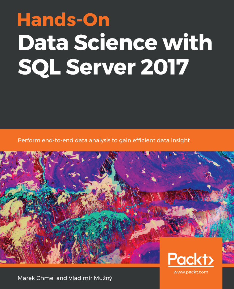
Hands-On Data Science with SQL Server 2017

Hands-On Data Science with SQL Server 2017: Perform end-to-end data analysis to gain efficient data insight

Arrow left icon
Profile Icon Vladimír Mužný Profile Icon Marek Chmel
Arrow right icon
₹800 per month
Paperback Nov 2018 506 pages 1st Edition
eBook
₹799.99 ₹2919.99
Paperback
₹3649.99
Subscription
Free Trial
Renews at ₹800p/m
Arrow left icon
Profile Icon Vladimír Mužný Profile Icon Marek Chmel
Arrow right icon
₹800 per month
Paperback Nov 2018 506 pages 1st Edition
eBook
₹799.99 ₹2919.99
Paperback
₹3649.99
Subscription
Free Trial
Renews at ₹800p/m
eBook
₹799.99 ₹2919.99
Paperback
₹3649.99
Subscription
Free Trial
Renews at ₹800p/m

What do you get with a Packt Subscription?

Free for first 7 days. ₹800 p/m after that. Cancel any time!
Product feature icon Unlimited ad-free access to the largest independent learning library in tech. Access this title and thousands more!
Product feature icon 50+ new titles added per month, including many first-to-market concepts and exclusive early access to books as they are being written.
Product feature icon Innovative learning tools, including AI book assistants, code context explainers, and text-to-speech.
Product feature icon Thousands of reference materials covering every tech concept you need to stay up to date.
Subscribe now
View plans & pricing
Table of content icon View table of contents Preview book icon Preview Book

Hands-On Data Science with SQL Server 2017

Data Science Overview

SQL Server is far more than a regular database management system. It's a huge ecosystem of different services that work together to provide very complex data platform management tasks. With the addition of numerous features in the version of SQL Server 2016 and SQL Server 2017, the capabilities of the system have enlarged again toward modern ways of working with data such as big data, machine learning and data science. You're about to enter a new world with this book, which will allow you to grasp the data-related tasks from a different point of view and get more insight into your data.

Introducing data science

Data science is a modern term that covers a large amount of different disciplines. We can think of data science as a field that uses various tools, processes, methods, and algorithms to extract knowledge and insights from data, which can be stored in a structured and unstructured manner. In one view, we can see data science as being quite similar to data mining.

Data science as a field includes everything that is associated with data manipulation—cleansing, preparation, analysis, visualization, and so on. Data science combines numerous skills that can be used for working with data such as programming, reasoning, mathematical skills, and statistics.

Data science is frequently mentioned together with other buzzwords such as big data, machine learning, and so on. As a matter of the fact, projects working with machine learning and big data are usually using data science principles, tools, and processes to build the the application.

Why is data science so important to us? Well, up until 2005, mankind had created approximately 130 exabytes of data (1 exabyte = 1,000 petabytes). But this number is growing quickly, and actually the amount of data created around the world is not growing in a linear fashion, but rather exponentially, with expectations that it will grow to 40 zettabytes in 2020. Such a large amount of data can hardly be processed by machines, or even data scientists, but a proper approach can increase the fraction of data that we'll be able to analyze.

Data science project life cycle

There are different data science life cycles available, which can fit different projects. We'll focus most on the Team Data Science Process (TDSP) life cycle, which is defined by Microsoft and can be applied to data science with Microsoft SQL Server. The TDSP provides a recommended life cycle that you can use to structure your data science projects. The life cycle outlines the steps, from start to finish, that projects usually follow when they are executed.

Business understanding

When we work with a data science project, this project usually has several phases. Each data science project begins with the business problem, or identifying the question. There are key tasks addressed in this first stage of the project:

  • Define the goal or objective: identify the required business variable that needs to be predicted by the analysis
  • Identify the data sources: find the required data that you will use for the data science project

When you work with stakeholders to identify the key questions and project goals, you should use sharp questions that will help you identify the required data for your analysis.

If your question is, What will my stock's sale price be next month? then you'll need to analyze the data, which includes your stock's price history over months. Also, you will need to analyze the sales of your stock from those months. And, in a similar manner, you need to think about the business problem definition and ask specific questions that include the numbers, names, categories, and so on.

Based on the questions that you'll be trying to answer, you can also foresee the data science methods that you'll use to address such a question. Typical questions for data science projects would include the following:

  • How much, or how many?
  • Which category?
  • Which group?
  • Is this weird?
  • Which option should be taken?

During the first phase of the project, you're also usually building the TDSP, which will consist of various personnel members, each specializing in a particular subject, which will be essential to the success of the project:

  • A data scientist: A highly educated and skilled person who can solve complex data problems by employing deep expertise in scientific disciplines (mathematics, statistics, or computer science).
  • A data professional: A skilled person who creates or maintains data systems, data solutions, or implements predictive modelling. These people will work in professions such as database administration, database development, or BI Development.
  • A software developer: A person who designs and develops programming logic, and who can apply machine learning to integrate predictive functionality into applications.
  • A project leader: A project leader manages the daily activities of individual data scientists and other project contributors on a specific data science project.

Getting data

The second phase of the project is related to data identification, acquisition, and understanding. Data comes from various data sources that provide data in a structured, a semi-structured, and an unstructured format. Data that we have on input may come with different quality and integrity, based on the data source that is used for storing the information. For the data analysis, we need to ingest the data into the target analytic environment, either an on-premise one, or in the cloud. These can include numerous services from Microsoft such as SQL Server (ideally with PolyBase to access external data) or cloud services such as Azure Storage Account, HDInsight, and Azure Data Lake.

Considering we'll load the data into Microsoft SQL Server, we need a good way to break down the dataset of the information into individual rows and columns. Each row in the table will present one event, instance, or item for our analysis. Each column on this table will represent an attribute of the row. Different projects will have data with a different level of detail collected, based on the available data sources and our ability to process such data.

When we talk about the initial loading of the data into SQL Server, this is usually referred to as a staging database. Since the data can be loaded from numerous different databases and repositories, dumping all the data from the source into a centralized repository is usually the first step before building the analytical storage. The next stage would be the data warehouse. Data warehouse is a common term for an enterprise system used for reporting and data analysis, which is usually a core of the enterprise business intelligence solution. While a data warehouse is an enterprise-wide repository of data, extracting insights from such a huge repository might be a challenging task. We can segregate the data according to the department or the category that the data belongs to, so that we have much smaller sections of the data to work with and extract information from. These smaller portions of the data warehouse are then referenced as data marts.

Data in the source systems may need a lot of work before and during loading it into a database or other analytical storage, where we can properly analyze the data. In general, one of the many steps in data science projects is data wrangling, a process of acquiring raw data and mapping and transforming the data into another format that is suitable for its end use, for us, the data analysts. Data wrangling basically has three steps:

  • Getting and reading the data
  • Cleaning the data
  • Shaping and structuring the data

Reading the data sounds simple, but in the end, it's a complex task in the data science project, where one part of the project is a data flow and a pipeline definition on how to connect to the data, read the data with the proper tools, and move the data to the analytics store. This can end up with complex integration work as part of the data science project just to interconnect various data sources together and shape the data from various sources, so you can run powerful analytics on the data to get the insights. The Microsoft SQL Server includes very important services, such as SQL Server Integration Services, which, together with SQL Server Data Tools, can be used as one of the tools available for data wrangling with all three steps.

Once the data is loaded into the analytical store, we need to explore and visualize the available data with the toolset available to get the idea of the structure and develop initial understanding of the data. An initial understanding of the data can be achieved via numerous tools, but if we focus on Microsoft SQL Server, then the choices would include SQL Service Integration Services—Data Profiling Task and SQL Server Management Studio.

When you explore the data, you're looking for basic information such as this:

  • Is the data organized?
  • Are there any missing values?
  • What does each row represent?
  • What do columns represent?
  • Is the data stored as a categorical or a numerical feature?
  • Are there any transformations required?

Modelling and analysis

This part of the project might be the most creative one, since it includes numerous tasks, which have to be taken to deliver the final product. The list of tasks can be very long, and may include these:

  • Data mining
  • Text analytics
  • Model building
  • Feature engineering and extraction
  • Model testing

Microsoft SQL Server has tools built in, which can provide a delivery platform for most of the tasks. When we talk about data mining, there are several different methodologies or frameworks to follow, where so far the Cross Industry Standard Process for Data Mining (CRISP-DM) is the most frequently used one, based on several different methods of research regarding the methodology usage. In 2015, IBM released a new methodology called Analytics Solutions Unified Method for Data Mining/Predictive Analytics, which refined and extended CRISP-DM. CRISP-DM is an open-standard process model that describes common approaches used by data-mining experts, and it's still the most widely used analytics model. CRISP-DM breaks the process of data mining into six major phases. The sequence of the phases is not strict and moves back and forth between different phases, as it is always required. The arrows in the process diagram indicate the most important and frequent dependencies between phases. The outer circle in the diagram symbolizes the cyclic nature of data mining itself. A data-mining process continues after a solution has been deployed. The lessons learned during the process can trigger new, often more focused business questions, and subsequent data-mining processes will benefit from the experiences of the previous ones:

The purpose of data mining is to put structured and unstructured data in relation to each other so as to easily interface them and provide the workers in the sector with a system that is easy to use. The experts of each specified area of business will therefore have access to a complex data system that is able to process information at different levels. This has the advantage of bringing to light the relationships among data, predictive analysis, assessments for specific business decisions, and much more.

Data mining can be used for solving many business problems and to prepare the data for a more advanced approach, such as machine learning, which can be used for:

  • Searching for anomalies
  • Churn analysis
  • Customer segmentation
  • Forecasting
  • Market basket analysis
  • Network intrusion detection
  • Targeted advertisement

Deployment and visualization

Once you have developed a functioning data science solution or some learning model, you're ready for deployment into production. Many of the systems have two primary modes of operations for a data science solution, either real-time operations or batch operation. In this part, we usually consider the data visualization and the proper toolset to deliver the results to our users. Tools such as Power BI or Tableau will help you bring interesting insights to your data in a visual way, which is usually best for the end users.

Final acceptance

The last step of the project is the final presentation and acceptance from the client or the customer. You'll present the insights and translate the findings into the language appropriate for your audience. In this part of the project, you'll work with the customer or the internal team, who will run and support the project once it gets into production, and you'll verify that the outcome meets the required needs.

Data science domains

Data science is linked to numerous other modern buzzwords such as big data and machine learning, but data science itself is built from numerous domains, where you can get your expertise. These domains include the following:

  • Statistics
  • Visualization
  • Data mining
  • Machine learning
  • Pattern recognition
  • Data platform operations
  • Artificial intelligence
  • Programming

Math and statistics

Statistics and other math skills are essential in several phases of the data science project. Even in the beginning of data exploration, you'll be dividing the features of your data observations into categories:

  • Categorical
  • Numeric:
    • Discrete
    • Continuous

Categorical values describe the item and represent an attribute of the item. Imagine you have a dataset about cars: car brand would be a typical categorical value, and color would be another.

On the other side, we have numerical values that can be split into two different categories—discrete and continuous. Discrete values describe the amount of observations, such as how many people purchased a product, and so on. Continuous values have an infinite number of possible values and use real numbers for the representation. In a nutshell, discrete variables are like points plotted on a chart, and a continuous variable can be plotted as a line.

Another classification of the data is the measurement-level point of view. We can split data into two primary categories:

  • Qualitative:
    • Nominal
    • Ordinal
  • Quantitative:
    • Interval
    • Ratio

Nominal variables can't be ordered and only describe an attribute. An example would be the color of a product; this describes how the product looks, but you can't put any ordering scheme on the color saying that red is bigger than green, and so on. Ordinal variables describe the feature with a categorical value and provide an ordering system; for example: Education—elementary, high school, university degree, and so on.

With quantitative values, it's a different story. The major difference is that ratio has a true zero. Imagine the attribute was a length. If the length is 0, you know there's no length. But this does not apply to temperature, since there's an interval of possible values for the temperature, where 0°C or 0°F does not mean the beginning of the scale for the temperature (as absolute zero, or beginning of the scale is 273.15° C or -459.67° F). With °K, it would actually be a ratio type of the quantitative value, since the scale really begins with 0°K. So, as you can see, any number can be an interval or a ratio value, but it depends on the context!

Visualizing the types of data

Visualizing and communicating data is incredibly important, especially with young companies that are making data-driven decisions for the first time, or companies where data scientists are viewed as people who help others make data-driven decisions. When it comes to communicating, this means describing your findings, or the way techniques work to audiences, both technical and non-technical. Different types of data have different ways of representation. When we talk about the categorical values, the ideal representation visuals would be these:

  • Bar charts
  • Pie charts
  • Pareto diagrams
  • Frequency distribution tables

A bar chart would visually represent the values stored in the frequency distribution tables. Each bar would represent one categorical value. A bar chart is also a base line for a pareto diagram, which includes the relative and cumulative frequency for the categorical values:

Bar chart representing the relative and cumulative frequency for the categorical values

If we'll add the cumulative frequency to the bar chart, we will have a pareto diagram of the same data:

Pareto diagram representing the relative and cumulative frequency for the categorical values

Another very useful type of visualization for categorical data is the pie chart. Pie charts display the percentage of the total for each categorical value. In statistics, this is called the relative frequency. The relative frequency is the percentage of the total frequency of each category. This type of visual is commonly used for market-share representations:

Pie chart representing the market share for Volkswagen
All the values are imaginary and are used just for demonstration purposes; these numbers don't represent a real market share by different brands in Volkswagen around the world, or in any city.

For numeric data, the ideal start would be a frequency distribution table, which will contain ordered or unordered values. Numeric data is very frequently displayed with histograms or scatter plots. When using intervals, the rule of thumb is to use 5 to 20 intervals, to have a meaningful representation of the data.

Let's create a table with 20 discrete data points, which we'll display visually. To create the table, we can use the following T-SQL script:

CREATE TABLE [dbo].[dataset](
[datapoint] [int] NOT NULL
) ON [PRIMARY]

To insert new values into the table, let's use the script:

INSERT [dbo].[dataset] ([datapoint]) VALUES (7)
INSERT [dbo].[dataset] ([datapoint]) VALUES (28)
INSERT [dbo].[dataset] ([datapoint]) VALUES (50)
etc. with more values to have 20 values in total

The table will include numbers in the range of 0 to 300, and the content of the table can be retrieved with this:

SELECT * FROM [dbo].[dataset]
ORDER BY datapoint

To visualize a descrete values dataset, we'll need to build a histogram. The histogram will have six intervals, and the interval length can be calculated as a (largest value − smallest value) / number of intervals. When we build the frequency distribution table and the intervals for the histogram, we'll end up with the following results:

A histogram based on the absolute frequency of the discrete values will look such as this one:

Statistics 101

A good understanding of statistics is vital for a data scientist. You should be familiar with statistical tests, distributions, maximum likelihood estimators, and so on. This will also be the case for machine learning, but one of the more important aspects of your statistics knowledge will be understanding when different techniques are (or aren't) a valid approach. Statistics is important for all types of companies, especially data-driven companies where stakeholders depend on your help to make decisions and design and evaluate experiments.

Central tendency

There are three descriptive measures of central tendency—the mean, the median, and the mode, but SQL Server does not have a way to calculate anything other than the mean directly. The arithmetic mean, or simply the mean (there are more types of mean in the central tendency), is the sum of all measurements divided by the number of observations in the dataset. The median is the middle value that separates the higher half from the lower half of the dataset. The median and the mode are the only measures of the central tendency that can be used for ordinal data, in which values are ranked relative to one another but are not measured absolutely. The mode is the most frequent value in the dataset. This is the only central tendency measure that can be used with nominal data, which has purely qualitative category assignments. For looking into such values with SQL Server, we will either need to define our own assembly with a custom aggregate or use complex T-SQL constructs to bypass the missing statistical functions. Another option would be to use the Python code or the R code; the code can be running inside the SQL Server, and you can pass the result set as the argument to the Python code or the R code to work on the descriptive statistics.

Skewness

Skewness indicates whether the data is spread symmetrically or is concentrated on one side of the graph. There are three different types of skewness:

  • Positive skew
  • Negative skew
  • Zero skew

Correctly calculating the skew is quite complex, so we'll focus on understanding the skew, since Python and R have a way to calculate the skew for us correctly. As SQL Server is not a statistical tool, it does not have any built-in function for direct skewness calculation. But we can define the skewness based on the central tendency measures of mean and median:

  • If the mean > median, then you'll observe the positive skew.
  • If the mean < median, then you'll observe the negative skew.
  • If the mean = median, you have zero skew:
Skewness

Variability

If we would like to understand the variability of the data, there are three important measures that we can use to get a better understanding of our data set, and those include the following:

  • Variance
  • Standard deviation
  • Coefficient of variation

Variance measures the distance of the data points around their mean value. Variance has a central role in statistics, where some ideas that use it include descriptive statistics, statistical inference, hypothesis testing, goodness of fit, and Monte Carlo sampling. Variance is an important tool in the sciences, where statistical analysis of data is common. The variance is the square of the standard deviation, the second central moment of a distribution, and the covariance of the random variable with itself.

Standard deviation is a measure of how spread-out numbers are, and based on the number describing the standard deviation, you can see the extent to which a set of numbers lies apart. In addition to expressing the variability of a population, the standard deviation is commonly used to measure confidence in statistical conclusions. Unlike variance, the standard deviation is expressed in the same units as the data, which is very useful.

The coefficient of variation is a measure of the dispersion of probability, or a frequency distribution. It's usually a percentage value, which is defined as a ratio of the standard deviation to the mean.

SQL Server has several built-in functions that can be used to calculate variance and standard deviation. To find out the variability measures from our table, we can run the following query:

SELECT AVG(datapoint),VARP(datapoint), STDEVP(datapoint) FROM dataset

Don't get confused with those function names, as for variance there are are two functions VAR() and VARP() and the same for the standard deviation, STDEV() and STDEVP(). This is very important from a statistics perspective, depending on whether we work with the whole population or just a sample of the population.

Variance for sample and population are not the same, as if you would check the formulas behind these functions have different denominators:

The full query to get the variability measures on our table, which would include both population and sample measures, would look such as this one:

SELECT AVG(datapoint) as Mean,
VAR(datapoint) as 'Sample variation',
VARP(datapoint) as 'Population variation',
STDEV(datapoint) as 'Sample standard deviation',
STDEVP(datapoint) as 'Population standard deviation'
FROM dataset

In such cases, the sample variability measures will be higher than the population measures, due to a lower denominator value. In the case of a sample, where you don't have the whole population data points, the concentrations of extremes and central tendencies can be different based on the whole range of values. When using such functions, you need to know whether you're working with just a sample of the data or the whole population of the data available, so the results are not skewed and you have the proper outcomes of these functions!

Machine learning

A very important part of data science is machine learning. Machine learning is the science of getting computers to act without being explicitly programmed. In the past decade, machine learning has given us self-driving cars, practical speech recognition, effective web search, and a vastly improved understanding of the human genome. Machine learning is so pervasive today that you probably use it dozens of times a day without knowing it.

SQL Server and machine learning

SQL Server has integrated machine learning with the version of 2016, when the first R services were introduced and with the 2017 version, when Python language support was added to SQL Server, and the feature was renamed machine-learning services. Machine-learning services can be used to solve complex problems and the tasks and algorithms are chosen based on the data and the expected prediction.

There are two main flavors of machine learning:

  • Supervised
  • Unsupervised

The main difference between the two is that supervised learning is performed by having a ground truth available. This means that the predictive model is building the capabilities based on the prior knowledge of what the output values for a sample should be. Unsupervised learning, on the other hand, does not have any sort of this outputs and the goal is to find natural structures present in the datasets. This can mean grouping datapoints into clusters or finding different ways of looking at complex data so that it appears simpler or more organized.

Each type of machine learning is using different algorithms to solve the problem. Typical supervised learning algorithms would include the following:

  • Classification
  • Regression

When the data is being used to predict a category, supervised learning is also called classification. This is the case when assigning an image as a picture of either a car or a boat, for example. When there are only two options, it's called two-class classification. When there are more categories, such as when predicting the winner of the World Cup, this problem is known as multi-class classification.

The major algorithms used here would include the following:

  • Logistic regression
  • Decision tree/forest/jungle
  • Support vector machine
  • Bayes point machine

Regression algorithms can be used for both types of variables, continuous and discrete, to predict a value, where for continuous values you'll apply Linear Regression and on discrete values, Logistic Regression. In linear regression, the relationship between the input variable (x) and output variable (y) is expressed as an equation of the form y = a + bx. Thus, the goal of linear regression is to find out the values of coefficients a and b and fit a line that is nearest to most of the points. Some good rules of thumb when using this technique are to remove variables that are very similar (correlated) and to remove noise from your data, if possible. It is a fast and simple technique and a good first algorithm to try.

Logistic regression is best suited for binary classification (datasets where y = 0 or 1, where 1 denotes the default class. So, if you're predicting whether an event will occur, the instance of event occurring will be classified as 1. It measures the relationship between the categorical dependent variable and one or more independent variables by estimating probabilities using a logistic function.

There are numerous kinds of regressions available, depending on the Python or R package that is used; for example, we could use any of the following:

  • Bayesian linear regression
  • Linear regression
  • Poisson regression
  • Decision forest regression
  • Many others

We'll focus on implementing the machine-learning algorithms and models in the following chapters with SQL Server Machine Learning Services to train and predict the values from the dataset.

Choosing the right algorithm

When choosing the algorithm for machine learning, you have to consider numerous factors to properly choose the right algorithm for the task. It should not only based on the predicted output: category, value, cluster, and so on, but also on numerous other factors, such as these:

  • Training time
  • Size of data and number of features you're processing
  • Accuracy
  • Linearity
  • Number of possible parameters

Training time can range from minutes to hours, depending not only on the algorithm, but also on the amount of features entering the model and the total amount of data that is being processed. However, a proper choice of algorithm can make the training time much shorter compared to the other. In general, regression models will reach the fastest training times, whereas neural network models will be on the other side of the training time length spectrum. Remember that developing a machine-learning model is iterative work. You will usually try several models and compare possible metrics. Based on the metric captured, you'll fine-tune the models and run comparison again on selected candidates and choose one model for operations. Even with more experience, you might not choose the right algorithm for your model at first, and you might be surprised that other algorithms can outperform the first chosen candidate, as shown:

With accuracy, there are actually several different metrics, which we can consider when evaluating how a machine-learning model works and performs. Different types of algorithms have different metrics that can be used for comparing the performance, and you won't find the same metrics among those at all. The most common metrics for classification types of algorithms would include these:

  • Confusion matrix
  • Accuracy
  • AUC
  • Precision
  • Recall
  • F1 score

Confusion matrix is the primary one we'll usually use to evaluate the machine-learning model because it's very intuitive and easy to understand. The confusion matrix is actually a pivot table with actual and predicted dimensions displaying the amount of classes in those dimensions. This matrix is not used as a metric itself, but the numbers on the matrix are used for most of the other possible performance measures for the model:

This matrix displays four values. True Positive is the amount of cases when the prediction was true and the actual data was also true. Consider again that we're in the supervised learning category, so this means that the model is training and scoring itself based on known data. So we know the current state—actual and check if the prediction can match the current state. True Negative is actually the opposite—the actual state was false and the prediction was right in predicting false. False Positive and false negative are cases where prediction and actual don't match. A False Positive is also known as a Type I error, and a False Negative as a Type II error, in statistics. The Type I error rate is also known as the significance level, and is usually set to 0.05 (5%). There will always be some errors with your model; otherwise, the model will be overfitted if there won't be any errors at all, and in real production after development, the model would not perform well with unknown data points. There's no rule on what type of error to minimize, this is solely dependent on the business case and the type of data science project and question that you're working on.

Accuracy can be another metric that is used to evaluate a model. Accuracy is represented by a number of correct predictions over all the predictions on the model:

Accuracy is a very good metric if the classes in the data are balanced, but it can be very misleading if one of the classes is extremely dominant compared to the other. As an example, consider a dataset with 100 emails, where only five emails are spam. If the model has a terrible performance and marks all emails as non-spam, it would classify 95 emails correctly and five emails incorrectly. Although the model was not able to classify any email as spam, it's accuracy would still be 95%. As you can see, this can be very misleading with the dataset, which is not balanced.

Very similar to accuracy is precision. Precision is a ratio between positive predictions and total predictions:

Recall is very closely used with precision and the calculation is very similar, where another part of the confusion matrix is used in the denominator:

Recall and precision give us information about the machine-learning model in regard of false negatives and false positives. Precision tells us how precise the model is, where recall is not about capturing the case correctly but more about capturing all cases with a given classification. If you would like to minimize false negatives, you would fine-tune the model to have high recall (nearly 100%) with reasonable precision, and the same if you would like to minimize Type II errors or false positives: you would focus on high precision in your model metrics.

As these two metrics are very close, they are also used to calculate F1 score, which is a combination of both expressed as Harmonic Mean:

When we see a machine-learning model being evaluated, you can usually find all these metrics, together with the confusion matrix, in one place:

The last missing piece of the basic performance metrics is the Area under ROC Curve (AUC) metric. AUC represents the model's ability to properly determine between positive and negative outcomes. When the AUC = 0.5, the model is actually randomly guessing the outcome, and when the AUC reaches 1.0, the model is 100% accurate. Receiver Operating Characteristics (ROC) can be broken down into two factors:

  • Sensitivity: Defined as true positive rate, or actually the recall
  • Specificity: Defined as false positive rate:

On the chart, you can see a comparison between two ROC curves for a machine-learning model, comparing the performance of two different algorithms used on the same dataset.

Big data

Big data is another modern buzzword that you can find around the data management and analytics platforms. The big really does not have to mean that the data volume is extremely large, although it usually is.

There are different imperatives linked to big data, which describe the theorem. These would include the following:

  • Volume: Volume really describes the quantity of the data. There's a big potential to get value and insights from large-volume datasets. The main challenge is that the data sets are so big and complex that the traditional data-processing application software's are inadequate to deal with them.
  • Variety: Data is not strictly a relational database anymore, and data can be stored in text files, images, and social feeds from a social network.
  • Velocity: While we want to have the data available in real-time, the speed of the data generation is challenging for regular DMBS systems and requires specialized forms of deployment and software.
  • Veracity: With a large amount of possible data sources, the quality of the data can vary, which can affect the data analysis and insights gained from the data.

Here are some big data statistics that are interesting:

  • 100 terabytes of data are uploaded to Facebook every day
  • Every hour, Walmart customers' transactions provide the company with about 2.5 petabytes of data
  • Twitter generates 12 terabytes of data every day
  • YouTube users upload eight years worth of new video content every day

SQL Server and big data

Let's face reality. SQL Server is not a big-data system. However, there's a feature on the SQL Server that allows us to interact with other big-data systems, which are deployed in the enterprise. This is huge!

This allows us to use the traditional relational data on the SQL Server and combine it with the results from the big-data systems directly or even run the queries towards the big-data systems from the SQL Server. The answer to this problem is a technology called PolyBase:

PolyBase is a bridge between SQL Server and big-data systems such as Hadoop, which can run in numerous different configurations. You can have your own Hadoop deployment, or utilize some Azure services such as HDInsight or Azure Data Lake, which are implementations of Hadoop and HDFS filesystem from the Hadoop framework. We'll get deeper into PolyBase in Chapter 4, Data Sources for Analytics. If you would like to test drive Hadoop with SQL Server, there are several appliances ready for testing and evaluation, such as Hortonworks Data Platform or Cloudera.

You can download prebuilt virtual machines, which you can connect to from SQL Server with the PolyBase feature to evaluate how the big-data Integration is working. For Hortonworks, you can check out https://hortonworks.com/products/data-platforms/hdp/
For Cloudera Quickstart VMs, you can check out https://www.cloudera.com/downloads/quickstart_vms/5-13.html

Hadoop itself is external to SQL Server and is described as a collection of software tools for distributed storage and the processing of big data. The base Apache Hadoop framework is composed of the following modules:

  • Hadoop Common: Contains libraries and utilities needed by other Hadoop modules
  • Hadoop Distributed File System (HDFS): A distributed filesystem that stores data on commodity machines, providing very high aggregate bandwidth across the cluster
  • Hadoop YARN: Introduced in 2012 as a platform responsible for managing computing resources in clusters and using them for scheduling users' applications
  • Hadoop MapReduce: An implementation of the MapReduce programming model for large-scale data processing:

Summary

Data science is a very broad term that includes numerous tasks in regard to data management and processing. In this chapter, we have covered how these individual domains can be addressed with SQL Server and how SQL Server can be used as a data science platform in the enterprise. Although SQL Server is not primarily considered to be a data science tool, there are numerous data science tasks, where in SQL Server offers very mature services such as the importing and cleaning of data, integration with big-data systems, and rich visualizations, either with reporting services or with PowerBI Report Server.

In the next chapter, we'll go deeper into the SQL Server service overview and how all the services relate to individual data science domains and tasks and how you can fully utilize SQL Server in this new field.

Left arrow icon Right arrow icon
Download code icon Download Code

Key benefits

  • Perform end-to-end data analysis—from exploration to visualization
  • Real-world examples, tasks, and interview queries to be a proficient data scientist
  • Understand how SQL is used for big data processing using HiveQL and SparkSQL

Description

SQL Server is a relational database management system that enables you to cover end-to-end data science processes using various inbuilt services and features. Hands-On Data Science with SQL Server 2017 starts with an overview of data science with SQL to understand the core tasks in data science. You will learn intermediate-to-advanced level concepts to perform analytical tasks on data using SQL Server. The book has a unique approach, covering best practices, tasks, and challenges to test your abilities at the end of each chapter. You will explore the ins and outs of performing various key tasks such as data collection, cleaning, manipulation, aggregations, and filtering techniques. As you make your way through the chapters, you will turn raw data into actionable insights by wrangling and extracting data from databases using T-SQL. You will get to grips with preparing and presenting data in a meaningful way, using Power BI to reveal hidden patterns. In the concluding chapters, you will work with SQL Server integration services to transform data into a useful format and delve into advanced examples covering machine learning concepts such as predictive analytics using real-world examples. By the end of this book, you will be in a position to handle the growing amounts of data and perform everyday activities that a data science professional performs.

Who is this book for?

Hands-On Data Science with SQL Server 2017 is intended for data scientists, data analysts, and big data professionals who want to master their skills learning SQL and its applications. This book will be helpful even for beginners who want to build their career as data science professionals using the power of SQL Server 2017. Basic familiarity with SQL language will aid with understanding the concepts covered in this book.

What you will learn

  • Understand what data science is and how SQL Server is used for big data processing
  • Analyze incoming data with SQL queries and visualizations
  • Create, train, and evaluate predictive models
  • Make predictions using trained models and establish regular retraining courses
  • Incorporate data source querying into SQL Server
  • Enhance built-in T-SQL capabilities using SQLCLR
  • Visualize data with Reporting Services, Power View, and Power BI
  • Transform data with R, Python, and Azure

Product Details

Country selected
Publication date, Length, Edition, Language, ISBN-13
Publication date : Nov 29, 2018
Length: 506 pages
Edition : 1st
Language : English
ISBN-13 : 9781788996341
Vendor :
Microsoft
Category :
Languages :
Concepts :
Tools :

What do you get with a Packt Subscription?

Free for first 7 days. ₹800 p/m after that. Cancel any time!
Product feature icon Unlimited ad-free access to the largest independent learning library in tech. Access this title and thousands more!
Product feature icon 50+ new titles added per month, including many first-to-market concepts and exclusive early access to books as they are being written.
Product feature icon Innovative learning tools, including AI book assistants, code context explainers, and text-to-speech.
Product feature icon Thousands of reference materials covering every tech concept you need to stay up to date.
Subscribe now
View plans & pricing

Product Details

Publication date : Nov 29, 2018
Length: 506 pages
Edition : 1st
Language : English
ISBN-13 : 9781788996341
Vendor :
Microsoft
Category :
Languages :
Concepts :
Tools :

Packt Subscriptions

See our plans and pricing
Modal Close icon
₹800 billed monthly
Feature tick icon Unlimited access to Packt's library of 7,000+ practical books and videos
Feature tick icon Constantly refreshed with 50+ new titles a month
Feature tick icon Exclusive Early access to books as they're written
Feature tick icon Solve problems while you work with advanced search and reference features
Feature tick icon Offline reading on the mobile app
Feature tick icon Simple pricing, no contract
₹4500 billed annually
Feature tick icon Unlimited access to Packt's library of 7,000+ practical books and videos
Feature tick icon Constantly refreshed with 50+ new titles a month
Feature tick icon Exclusive Early access to books as they're written
Feature tick icon Solve problems while you work with advanced search and reference features
Feature tick icon Offline reading on the mobile app
Feature tick icon Choose a DRM-free eBook or Video every month to keep
Feature tick icon PLUS own as many other DRM-free eBooks or Videos as you like for just ₹400 each
Feature tick icon Exclusive print discounts
₹5000 billed in 18 months
Feature tick icon Unlimited access to Packt's library of 7,000+ practical books and videos
Feature tick icon Constantly refreshed with 50+ new titles a month
Feature tick icon Exclusive Early access to books as they're written
Feature tick icon Solve problems while you work with advanced search and reference features
Feature tick icon Offline reading on the mobile app
Feature tick icon Choose a DRM-free eBook or Video every month to keep
Feature tick icon PLUS own as many other DRM-free eBooks or Videos as you like for just ₹400 each
Feature tick icon Exclusive print discounts

Frequently bought together


Stars icon
Total 10,948.97
SQL Server 2017 Developer???s Guide
₹4542.99
Hands-On Data Science with SQL Server 2017
₹3649.99
Data Science with SQL Server Quick Start Guide
₹2755.99
Total 10,948.97 Stars icon
Banner background image

Table of Contents

13 Chapters
Data Science Overview Chevron down icon Chevron up icon
SQL Server 2017 as a Data Science Platform Chevron down icon Chevron up icon
Data Sources for Analytics Chevron down icon Chevron up icon
Data Transforming and Cleaning with T-SQL Chevron down icon Chevron up icon
Data Exploration and Statistics with T-SQL Chevron down icon Chevron up icon
Custom Aggregations on SQL Server Chevron down icon Chevron up icon
Data Visualization Chevron down icon Chevron up icon
Data Transformations with Other Tools Chevron down icon Chevron up icon
Predictive Model Training and Evaluation Chevron down icon Chevron up icon
Making Predictions Chevron down icon Chevron up icon
Getting It All Together - A Real-World Example Chevron down icon Chevron up icon
Next Steps with Data Science and SQL Chevron down icon Chevron up icon
Other Books You May Enjoy Chevron down icon Chevron up icon
Get free access to Packt library with over 7500+ books and video courses for 7 days!
Start Free Trial

FAQs

What is included in a Packt subscription? Chevron down icon Chevron up icon

A subscription provides you with full access to view all Packt and licnesed content online, this includes exclusive access to Early Access titles. Depending on the tier chosen you can also earn credits and discounts to use for owning content

How can I cancel my subscription? Chevron down icon Chevron up icon

To cancel your subscription with us simply go to the account page - found in the top right of the page or at https://subscription.packtpub.com/my-account/subscription - From here you will see the ‘cancel subscription’ button in the grey box with your subscription information in.

What are credits? Chevron down icon Chevron up icon

Credits can be earned from reading 40 section of any title within the payment cycle - a month starting from the day of subscription payment. You also earn a Credit every month if you subscribe to our annual or 18 month plans. Credits can be used to buy books DRM free, the same way that you would pay for a book. Your credits can be found in the subscription homepage - subscription.packtpub.com - clicking on ‘the my’ library dropdown and selecting ‘credits’.

What happens if an Early Access Course is cancelled? Chevron down icon Chevron up icon

Projects are rarely cancelled, but sometimes it's unavoidable. If an Early Access course is cancelled or excessively delayed, you can exchange your purchase for another course. For further details, please contact us here.

Where can I send feedback about an Early Access title? Chevron down icon Chevron up icon

If you have any feedback about the product you're reading, or Early Access in general, then please fill out a contact form here and we'll make sure the feedback gets to the right team. 

Can I download the code files for Early Access titles? Chevron down icon Chevron up icon

We try to ensure that all books in Early Access have code available to use, download, and fork on GitHub. This helps us be more agile in the development of the book, and helps keep the often changing code base of new versions and new technologies as up to date as possible. Unfortunately, however, there will be rare cases when it is not possible for us to have downloadable code samples available until publication.

When we publish the book, the code files will also be available to download from the Packt website.

How accurate is the publication date? Chevron down icon Chevron up icon

The publication date is as accurate as we can be at any point in the project. Unfortunately, delays can happen. Often those delays are out of our control, such as changes to the technology code base or delays in the tech release. We do our best to give you an accurate estimate of the publication date at any given time, and as more chapters are delivered, the more accurate the delivery date will become.

How will I know when new chapters are ready? Chevron down icon Chevron up icon

We'll let you know every time there has been an update to a course that you've bought in Early Access. You'll get an email to let you know there has been a new chapter, or a change to a previous chapter. The new chapters are automatically added to your account, so you can also check back there any time you're ready and download or read them online.

I am a Packt subscriber, do I get Early Access? Chevron down icon Chevron up icon

Yes, all Early Access content is fully available through your subscription. You will need to have a paid for or active trial subscription in order to access all titles.

How is Early Access delivered? Chevron down icon Chevron up icon

Early Access is currently only available as a PDF or through our online reader. As we make changes or add new chapters, the files in your Packt account will be updated so you can download them again or view them online immediately.

How do I buy Early Access content? Chevron down icon Chevron up icon

Early Access is a way of us getting our content to you quicker, but the method of buying the Early Access course is still the same. Just find the course you want to buy, go through the check-out steps, and you’ll get a confirmation email from us with information and a link to the relevant Early Access courses.

What is Early Access? Chevron down icon Chevron up icon

Keeping up to date with the latest technology is difficult; new versions, new frameworks, new techniques. This feature gives you a head-start to our content, as it's being created. With Early Access you'll receive each chapter as it's written, and get regular updates throughout the product's development, as well as the final course as soon as it's ready.We created Early Access as a means of giving you the information you need, as soon as it's available. As we go through the process of developing a course, 99% of it can be ready but we can't publish until that last 1% falls in to place. Early Access helps to unlock the potential of our content early, to help you start your learning when you need it most. You not only get access to every chapter as it's delivered, edited, and updated, but you'll also get the finalized, DRM-free product to download in any format you want when it's published. As a member of Packt, you'll also be eligible for our exclusive offers, including a free course every day, and discounts on new and popular titles.