It's time to start coding! Before starting, however, make sure you have your development environment set up as described in Chapter 1, Introduction to Xamarin.
This chapter will be a classic File | New | Project chapter, guiding you step by step through the process of creating your first to-do list app. There will be no downloads required whatsoever.
Setting up the project
A Xamarin app can essentially be created by using one of two code-sharing strategies:
- As a shared project
- The .NET Standard library
The first choice, a shared project, creates a project that is essentially a linked copy of each file in it. The files exist in one common place and are linked in at build time. This means that we cannot determine the runtime when writing the code and we can only access the APIs that are available on each target platform. It does allow us to use conditional compilations, which can be useful in certain circumstances, but can also be confusing to someone who reads the code later on. Going for the shared project option may also be a bad choice as it locks our code to specific platforms.
We will use the second choice, the .NET Standard library. This is, of course, a matter of choice and both ways will work. With a little imagination, you can still follow along with this chapter, even if you select the shared project option.
Let's get started!
Creating the new project
The first step is to create a new Xamarin.Forms project. Open Visual Studio 2019 and go to File | New | Project:

This will open the Create a new project wizard. In the top-middle section of the wizard, there is a search field. Type in xamarin and select the Mobile App (Xamarin.Forms) item from the list:
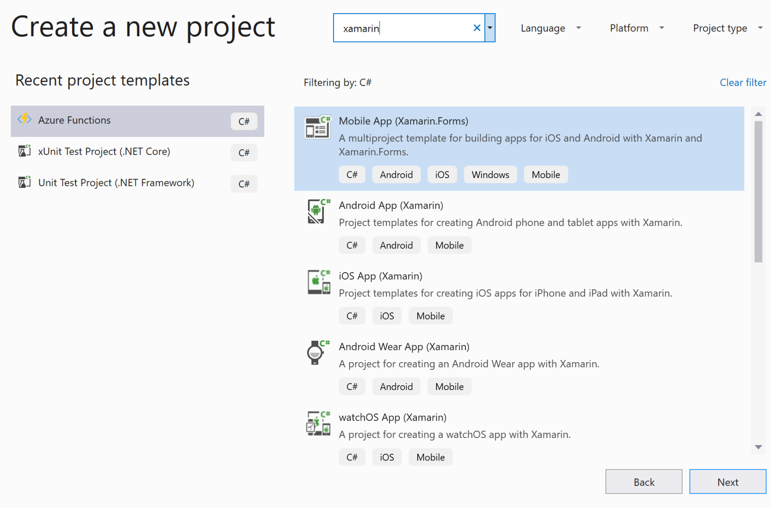
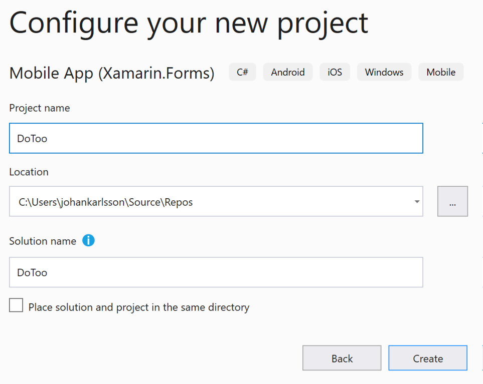
Complete the next page of the wizard by naming your project, and then click Create. Make sure you name the project DoToo to avoid any namespace issues:
The next step is to select a project template and a code-sharing strategy to use. Select Blank to create a bare Xamarin.Forms app. In versions of Visual Studio earlier than 2019, you will also need to change the Code Sharing Strategy option to .NET Standard. In the 2019 version, the blank Xamarin.Forms template app will create a .NET Standard library for you and you will not have the choice to select a shared project. Finalize the setup by clicking OK and wait for Visual Studio to create the necessary projects:
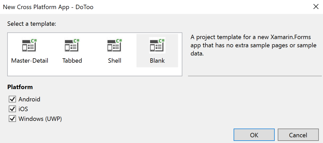
Congratulations! We've just created our first Xamarin.Forms app.
Examining the files
The selected template has now created four projects:
- DoToo: This is a .NET Standard library targeting .NET Standard 2.0. It can be imported by any runtime that supports this version of .NET Standard.
- DoToo.Android: This is an Android app for bootstrapping Xamarin.Forms on Android.
- DoToo.iOS: This is an iOS app for bootstrapping Xamarin.Forms on iOS.
- DoToo.UWP: This is a Universal Windows Platform (UWP) app for bootstrapping Xamarin.Forms on UWP. The UWP option is only available on Windows.
These three platform-specific libraries reference the .NET Standard library. Most of our code will be written in the .NET Standard library and only a small portion of platform-specific code will be added to each target platform.
The project should now look as follows:
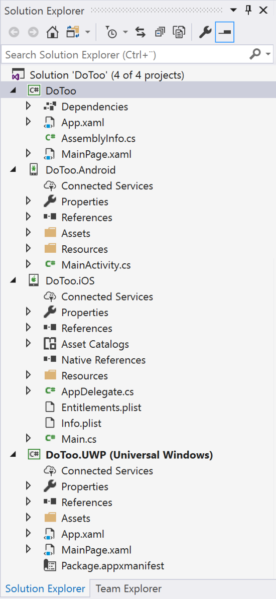
We will highlight a few important files in each project so that we have a basic understanding of what they are. We'll go through these project by project.
DoToo
This is the .NET Standard library that all the platform-specific projects reference and the location that most of our code will be added to. The following screenshot displays the structure of the .NET Standard library:
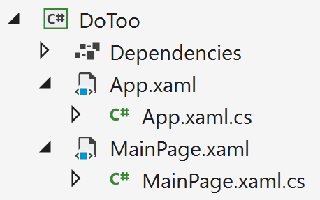
Under Dependencies, we will find references to any external dependencies, such as Xamarin.Forms. We will update the Xamarin.Forms package version in the Updating Xamarin.Forms packages section of this chapter and add more dependencies as we progress through the chapter.
The App.xaml file is an XAML file that represents the app. This is a good place to put application-wide resources, which we will do later on. We can also see the App.xaml.cs file, which contains the start up code and some application lifetime events that we can add custom code to, such as OnStart or OnSleep.
If we open up App.xaml.cs, we can see the starting point for our Xamarin.Forms application:
public partial class App : Application
{
    public App()
    {
        InitializeComponent();
        MainPage = new DoToo.MainPage();
    }

    protected override void OnStart()
    {
        // Handle when your app starts
    }

    // code omitted for brevity
}
The MainPage property is assigned to a page, which is particularly important as this is what determines which page is first shown to the user. In this template, this is the DoToo.MainPage() class.
The last two files are the MainPage.xaml file, which contains the first page of the application, and the code-behind file, which is called MainPage.xaml.cs. These files are removed in order to comply with the Model–View–View–Model (MVVM) naming standards.
DoToo.Android
This is the Android app. It only has one file:
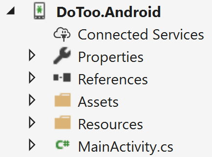
The important file here is MainActivity.cs. This contains the entry point for our application if we run the app on an Android device. The entry point method for an Android app is OnCreate(...).
If you open MainActivity.cs and examine the OnCreate(...) method, it should look something as follows:
protected override void OnCreate(Bundle savedInstanceState)
{
    TabLayoutResource = Resource.Layout.Tabbar;
    ToolbarResource = Resource.Layout.Toolbar;

    base.OnCreate(bundle);

    Xamarin.Essentials.Platform.Init(this, savedInstanceState);
    global::Xamarin.Forms.Forms.Init(this, savedInstanceState);
    LoadApplication(new App());
}
The first two lines assign resources for Tabbar and Toolbar. We then call the base method, followed by the mandatory initialization of Xamarin.Essentials and Xamarin.Forms. Finally, we have the call to load the Xamarin.Forms application that we defined in the .NET Standard library.
You don't need to understand these files in detail; just remember that they are important for the initialization of our app.
DoToo.iOS
This is the iOS app. It contains a few more files than its Android counterpart:
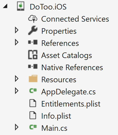
The AppDelegate.cs file is the entry point for an iOS app. This file contains a method called FinishedLaunching(...), which is where we start writing code:
public override bool FinishedLaunching(UIApplication app, NSDictionary options)
{
    global::Xamarin.Forms.Forms.Init();
    LoadApplication(new App());
    return base.FinishedLaunching(app, options);
}
The code starts off by initializing Xamarin.Forms and then loads the application from the .NET Standard library. After that, it returns the control to iOS. It must do this within 17 seconds or the app is terminated by the OS.
The info.plist file is an iOS-specific file that contains information about the app, such as the bundle ID and its provisioning profiles. It has a graphical editor but can also be edited in any text editor since it's a standard XML file.
The Entitlements.plist file is also an iOS-specific file that configures the entitlements that we want our app to take advantage of, such as in-app purchases or push notifications.
As with the Android app's start up code, we don't need to understand what is going on here in detail, other than that it's important for the initialization of our app.
DoToo.UWP
The last project to examine is the UWP app. The file structure of the project appears as in the following screenshot:
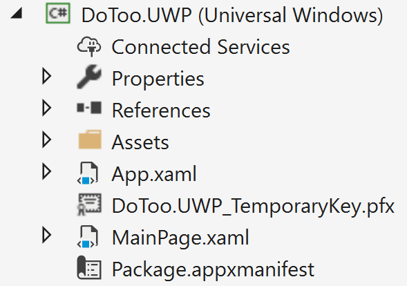
It has an App.xaml file, which is similar to the one in the .NET Standard library but specific to the UWP app. It also has a related file called App.xaml.cs. This contains a method called OnLaunched(...), which is the entry point for a UWP app. This file is quite large, so we won't print it here, but do open it up and see whether you can locate the Xamarin.Forms initialization code in it.
Updating the Xamarin.Forms packages
After creating the project, you should always update your Xamarin.Forms packages to the latest version. To do this, follow these steps:
- Right-click on your solution in Solution Explorer.
- Click on Manage NuGet Packages for Solution...:
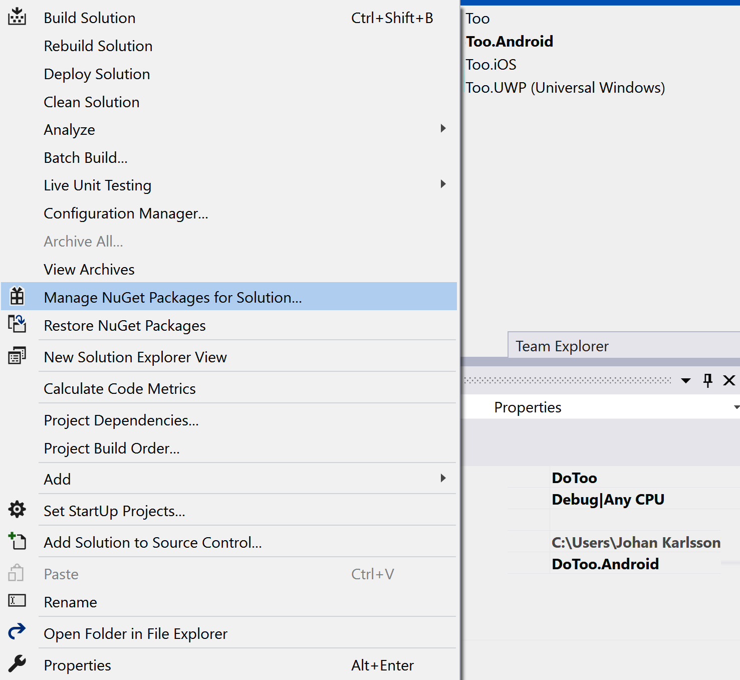
- This brings up the NuGet package manager in Visual Studio:
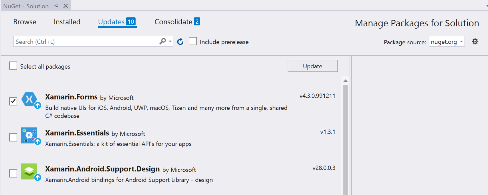
To update Xamarin.Forms to the latest version, perform the following steps:
- Click on the Updates tab.
- Check Xamarin.Forms and click Update.
- Accept any license agreements.
Keep an eye on the output pane and wait for all the packages to update. However, ensure that you don't update any Android packages manually as this might break your application.
Removing the MainPage file
In Xamarin.Forms, we have the concept of pages. This is not the case, however, for the MVVM architectural pattern, which instead uses views. Views (in this version of MVVM) are the same thing as pages, but they are not suffixed with -Page, so we will need to delete the MainPage class generated by the template. We will go into more detail about MVVM shortly, but for the time being, we will need to remove the MainPage.cs class from the solution. This can be done as follows:
- Right-click on the MainPage.xaml file in the DoToo project (the .NET Standard library).
- Click Delete and confirm the delete action.
Creating a repository and a TodoItem model
Any good architecture always involves abstraction. In this app, we need something to store and retrieve the items of our to-do list. These will later be stored in an SQLite database, but adding a reference to the database directly in the code that is responsible for the GUI is generally a bad idea.
What we need, instead, is something to abstract our database from the GUI. For this app, we've chosen to use a simple repository pattern. This repository is simply a class that sits between the SQLite database and our upcoming ViewModels class. This is the class that handles the interaction with the view, which in turn handles the GUI.
The repository will expose methods for getting, adding, and updating items, as well as events that allow other parts of the app to react to changes in the repository. It will be hidden behind an interface so that we can replace the entire implementation later on without modifying anything but a line of code in the initialization of the app. This is made possible by Autofac.
Defining a to-do list item
We will start off by creating a TodoItem class, which represents a single item on the list. This is a simple Plain Old CLR Object (POCO) class, where CLR stands for Common Language Runtime. In other words, this is a .NET class without any dependencies on third-party assemblies. To create the class, follow these steps:
- In the .NET Standard library project, create a folder called Models.
- Add a class called TodoItem.cs to that folder and enter the following code:
using System;

namespace DoToo.Models
{
    public class TodoItem
    {
        public int Id { get; set; }
        public string Title { get; set; }
        public bool Completed { get; set; }
        public DateTime Due { get; set; }
    }
}
This code is pretty self-explanatory; it's a simple POCO class that only contains properties and no logic. We have a Title property that describes what we want to be done, a flag (Completed) that determines whether the to-do list item is completed, a Due date for when we expect it to be done, and a unique id class that we will need later on for the database.
Creating a repository and its interface
Now that we have the TodoItem class, let's define an interface that describes a repository to store our to-do list items:
- In the .NET Standard library project, create a folder called Repositories.
- Create an interface called ITodoItemRepository.cs in the Repositories folder and write the following code:
using System;
using System.Collections.Generic;
using System.Threading.Tasks;
using DoToo.Models;

namespace DoToo.Repositories
{
    public interface ITodoItemRepository
    {
        event EventHandler<TodoItem> OnItemAdded;
        event EventHandler<TodoItem> OnItemUpdated;

        Task<List<TodoItem>> GetItems();
        Task AddItem(TodoItem item);
        Task UpdateItem(TodoItem item);
        Task AddOrUpdate(TodoItem item);
    }
}
This interface defines everything we need for our app. It is there to create logical insulation between your implementation of a repository and the user of that repository. If any other parts of your application want an instance of TodoItemRepository, we can pass it an object that implements ITodoItemRepository, regardless of how it's implemented.
Having that said, let's implement ITodoItemRepository:
- Create a class called TodoItemRepository.cs.
- Enter the following code:
using DoToo.Models;
using System;
using System.Collections.Generic;
using System.IO;
using System.Threading.Tasks;

namespace DoToo.Repositories
{
    public class TodoItemRepository : ITodoItemRepository
    {
        public event EventHandler<TodoItem> OnItemAdded;
        public event EventHandler<TodoItem> OnItemUpdated;

        public async Task<List<TodoItem>> GetItems()
        {
            return null; // Just to make it build
        }

        public async Task AddItem(TodoItem item)
        {
        }

        public async Task UpdateItem(TodoItem item)
        {
        }

        public async Task AddOrUpdate(TodoItem item)
        {
            if (item.Id == 0)
            {
                await AddItem(item);
            }
            else
            {
                await UpdateItem(item);
            }
        }
    }
}
This code is the bare-bones implementation of the interface, except for the AddOrUpdate(...) method. This handles a small piece of logic that states that if the ID of an item is 0, it's a new item. Any item with an ID value greater than 0 is stored in the database. This is because the database assigns a value larger than 0 when we create rows in a table.
There are also two events defined in the preceding code. They will be used to notify subscribers of a list that items have been updated or added.
Connecting SQLite to persist data
We now have an interface, as well as a skeleton to implement that interface. The last thing we need to do to finish this section is to connect SQLite in the implementation of the repository.
Adding the SQLite NuGet package
To access SQLite in this project, we need to add a NuGet package called sqlite-net-pcl to the .NET Standard library project. To do this, right-click on the Dependencies item under the DoToo project node of the solution and click Manage NuGet Packages...:
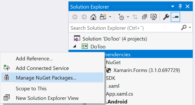
This brings up the NuGet Package Manager window:
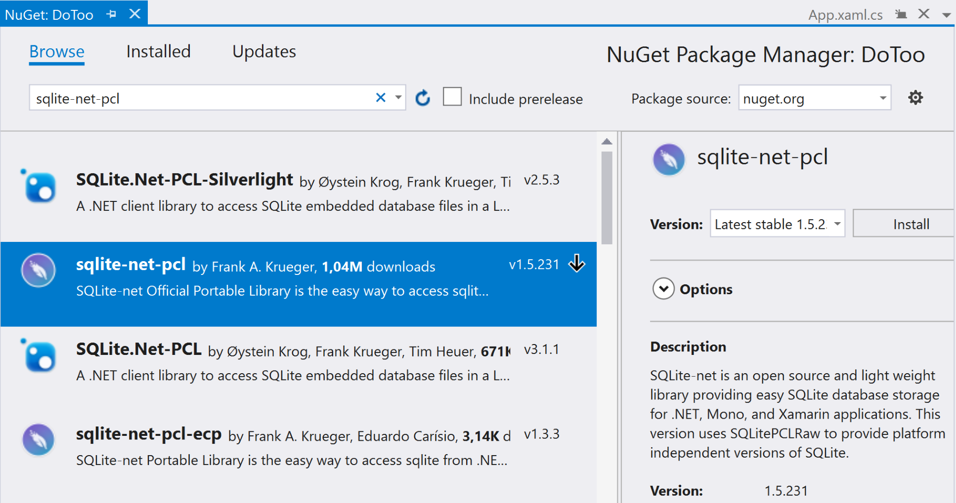
To install the SQLite NuGet package:
- Click Browse and enter sqlite-net-pcl in the search box.
- Select the package by Frank A. Krueger and click Install.
Wait for the installation to complete. We'll then add some code to the TodoItem class and the repository.
Updating the TodoItem class
Since SQLite is a relational database, it needs to know some basic information about how to create the tables that will store our objects. This is done using attributes, which are defined in the SQLite namespace:
- Open up Models/TodoItem.
- Add a using SQLite statement at the start of the file right below the existing using statements, as in the following code:
using System;
using SQLite;
- Add the PrimaryKey and AutoIncrement attributes right before the Id property, as in the following code:
[PrimaryKey, AutoIncrement]
public int Id { get; set; }
The PrimaryKey attribute instructs SQLite that the Id property is the primary key of the table. The AutoIncrement attribute makes sure that the value of Id is increased by 1 for each new TodoItem class that is added to the table.
Creating a connection to the SQLite database
We will now add all the code needed to communicate with the database. The first thing we need to do is define a connection field that will hold the connection to the database:
- Open up the Repositories/TodoItemRepository file.
- Add a using SQLite statement at the start of the file right below the existing using statements, as in the following code:
using DoToo.Models;
using System.Collections.Generic;
using System.IO;
using System.Threading.Tasks;
using SQLite;
- Add the following field right below the class declaration:
private SQLiteAsyncConnection connection;
The connection needs to be initialized. Once it is initialized, it can be reused throughout the life span of the repository. Since the method is asynchronous, it cannot be called from the constructor without introducing a locking strategy. To keep things simple, we will simply call it from each of the methods that are defined by the interface:
- Add the following code to the TodoItemRepository class.
- Add a using System.IO statement at the start of the file so that we can use Path.Combine(...):
private async Task CreateConnection()
{
    if (connection != null)
    {
        return;
    }

    var documentPath = Environment.GetFolderPath(
                       Environment.SpecialFolder.MyDocuments);
    var databasePath = Path.Combine(documentPath, "TodoItems.db");

    connection = new SQLiteAsyncConnection(databasePath);
    await connection.CreateTableAsync<TodoItem>();

    if (await connection.Table<TodoItem>().CountAsync() == 0)
    {
        await connection.InsertAsync(new TodoItem()
        {
            Title = "Welcome to DoToo",
            Due = DateTime.Now
        });
    }
}
The method begins by checking whether we already have a connection. If we do, we can simply return. If we don't have a connection set up, we define a path on the disk to indicate where we want the database file to be located. In this case, we will choose the MyDocuments folder. Xamarin will find the closest match to this on each platform that we target.
We then create the connection and store the reference to that connection in the connection field. We need to make sure that SQLite has created a table that mirrors the schema of the TodoItem table. To make the development of the app easier, we add a default to-do list item if the TodoItem table is empty.
Implementing the GetItems(), AddItems(), and UpdateItems() methods
The only thing left to do in the repository is to implement the methods for getting, adding, and updating items:
- Locate the GetItems() method in the TodoItemRepository class.
- Update the GetItems() method with the following code:
public async Task<List<TodoItem>> GetItems()
{
    await CreateConnection();
    return await connection.Table<TodoItem>().ToListAsync();
}
To ensure that the connection to the database is valid, we call the CreateConnection() method we created in the previous section. When this method returns, we can make sure that it is initialized and that the TodoItem table has been created.
We then use the connection to access the TodoItem table and return a List<TodoItem> item that contains all the to-do list items in the database.
The code for adding items is even simpler:
- Locate the AddItem() method in the TodoItemRepository class.
- Update the AddItem() method with the following code:
public async Task AddItem(TodoItem item)
{
    await CreateConnection();
    await connection.InsertAsync(item);
    OnItemAdded?.Invoke(this, item);
}
The call to CreateConnection() makes sure that we have a connection in the same way as we did for the GetItems() method. After this, we insert it into the database using the InsertAsync(...) method on the connection object. After an item has been inserted into the table, we invoke the OnItemAdded event to notify any subscribers.
The code to update an item is basically the same as the AddItem() method, but also includes calls to UpdateAsync and OnItemUpdated. Let's finish up by updating the UpdateItem() method with the following code:
- Locate the UpdateItem() method in the TodoItemRepository class.
- Update the UpdateItem() method with the following code:
public async Task UpdateItem(TodoItem item)
{
    await CreateConnection();
    await connection.UpdateAsync(item);
    OnItemUpdated?.Invoke(this, item);
}
In the next section, we'll get started with MVVM. Grab a cup of coffee and let's get started!
Using MVVM – creating views and ViewModel
MVVM is all about the separation of concerns. Each part has a specific meaning:
- Model: This relates to anything that represents data and that can be referenced with ViewModel.
- View: This is the visual component. In Xamarin.Forms, this is represented by a page.
- ViewModel: This is the class that acts as the glue between the model and the view.
In our app, we could say that the model is the repository and the to-do list items it returns. ViewModel refers to this repository and exposes properties that the view can bind to. The ground rule is that any logic should reside in ViewModel and no logic should reside in the view. The view should know how to present data, such as converting a Boolean value into Yes or No.
MVVM can be implemented in many ways and there are quite a few frameworks that we can use to do so, such as Prism, MVVMCross, or even TinyMvvm. In this chapter, we have chosen to keep things simple and implement MVVM in a vanilla way, without any framework at all.
The main benefits of using MVVM as an architectural pattern are a clear separation of concerns, cleaner code, and great testability of ViewModel.
Well, enough of that—let's write some code instead!
Defining a ViewModel base class
ViewModel is the mediator between the view and the model. We can benefit from it greatly by creating a common base class for all our ViewModel classes to inherit from. To do this, follow these steps:
- Create a folder called ViewModels in the DoToo .NET Standard project.
- Create a class called ViewModel in the ViewModels folder.
- Resolve references to System.ComponentModel and Xamarin.Forms and add the following code:
public abstract class ViewModel : INotifyPropertyChanged
{
    public event PropertyChangedEventHandler PropertyChanged;

    public void RaisePropertyChanged(params string[] propertyNames)
    {
        foreach (var propertyName in propertyNames)
        {
            PropertyChanged?.Invoke(this, new
            PropertyChangedEventArgs(propertyName));
        }
    }

    public INavigation Navigation { get; set; }
}
The ViewModel class is a base class for all ViewModel objects. It is not meant to be instantiated on its own, so we mark it as abstract. It implements INotifyPropertyChanged, which is an interface defined in System.ComponentModel in the .NET base class libraries. This interface only defines one thing—the PropertyChanged event. Our ViewModel class must raise this event whenever we want the GUI to be aware of any changes to a property. This can be done manually by adding code to a setter in a property or by using an Intermediate Language (IL) weaver, such as PropertyChanged.Fody. We will talk about this in more detail in the next section.
We will also take a little shortcut here by adding an INavigation property to ViewModel. This will help us with navigation later on. This is also something that can (and should) be abstracted since we don't want ViewModel to be dependent on Xamarin.Forms in order to be able to reuse the ViewModel classes on any platform.
Introducing PropertyChanged.Fody
The traditional way of implementing a ViewModel class is to inherit it from a base class (such as the ViewModel class that we defined previously) and then add code that might look as follows:
public class MyTestViewModel : ViewModel
{
    private string name;
    public string Name
    {
       get { return name; }
       set
       {
           if (name != value)
           {
               name = value;
               RaisePropertyChanged(nameof(Name));
           }
        }
    }
}
Each property that we want to add to a ViewModel class yields 13 lines of code. Not too bad, you might think. However, considering that a ViewModel class could potentially contain 10 to 20 properties, this rapidly turns into a lot of code. We can do better than this.
In just a few simple steps, we can use a tool called PropertyChanged.Fody to automatically inject almost all the code during the build process:
- In the .NET Standard library, install the PropertyChanged.Fody NuGet package.
- Create a file called FodyWeavers.xml in the root of the .NET Standard library and add the following XML to it:
<?xml version="1.0" encoding="utf-8" ?>
<Weavers>
    <PropertyChanged />
</Weavers>
PropertyChanged.Fody scans the assembly for any class that implements the INotifyPropertyChanged interface and adds the code needed to raise the PropertyChanged event. It also takes care of dependencies between properties, meaning if you have a property that returns values based on two other properties, it is raised if either of those two values changes.
The result is that the test class we had previously is reduced to a single line of code per property. This makes the code base more readable because everything happens behind the scenes:
public class MyTestViewModel : ViewModel
{
    public string Name { get; set; }
}
Creating the MainViewModel
Up to this point, we have mainly prepared to write the code that will make up the app itself. MainViewModel is the ViewModel class for the first view that is displayed to the user. It is responsible for providing data and logic to a list of to-do list items. We will create the bare-bones ViewModel classes and add code to them as we progress through this chapter:
- Create a class called MainViewModel in the ViewModels folder.
- Add the following template code and resolve the references:
public class MainViewModel : ViewModel
{
    private readonly TodoItemRepository repository;

    public MainViewModel(TodoItemRepository repository)
    {
        this.repository = repository;
        Task.Run(async () => await LoadData());
    }

    private async Task LoadData()
    {

    }
}
The structure of this class is something that we will reuse for all the ViewModel classes to come.
Let's summarize the important features we want the ViewModel class to have:
- We inherit from the ViewModel class to gain access to shared logic, such as the INotifyPropertyChanged interface and common navigation code.
- All dependencies to other classes, such as repositories and services, are passed through the constructor of ViewModel. This is handled by the dependency injection pattern and, more specifically for our case, by Autofac, which is the implementation of the dependency injection we are using.
- We use an asynchronous call to LoadData() as an entry point to initialize the ViewModel class. Different MVVM libraries might do this in different ways, but the basic functionally is the same.
Creating the TodoItemViewModel
TodoItemViewModel is the ViewModel class that represents each item in the to-do list on MainView. It does not have an entire view of its own (although it could have), but is instead rendered by a template in ListView. We will get back to this when we create the controls for MainView.
The important thing here is that this ViewModel object represents a single item, regardless of where we choose to render it.
Let's create the TodoItemViewModel class:
- Create a class called TodoItemViewModel in the ViewModels folder.
- Add the following template code and resolve the references:
public class TodoItemViewModel : ViewModel
{
    public TodoItemViewModel(TodoItem item) => Item = item;

    public event EventHandler ItemStatusChanged;
    public TodoItem Item { get; private set; }
    public string StatusText => Item.Completed ? "Reactivate" :
    "Completed";
}
As with any other ViewModel class, we inherit the TodoItemViewModel class from ViewModel. We conform to the pattern of injecting all the dependencies into the constructor. In this case, we pass an instance of the TodoItem class to the constructor that the ViewModel object will use to expose to the view.
The ItemStatusChanged event handler will be used later when we want to signal to the view that the state of the TodoItem class has changed. The Item property allows us to access the item that we passed in.
The StatusText property is used to make the status of the to-do item human-readable in the view.
Creating the ItemViewModel class
ItemViewModel represents the to-do list item in a view that can be used to create new items and to edit existing items:
- In the ViewModels folder, create a class called ItemViewModel.
- Add the following code:
using DoToo.Models;
using DoToo.Repositories;
using System;
using System.Windows.Input;
using Xamarin.Forms;

namespace DoToo.ViewModels
{
    public class ItemViewModel : ViewModel
    {
        private readonly TodoItemRepository repository;

        public ItemViewModel(TodoItemRepository repository)
        {
            this.repository = repository;
        }
    }
}
The pattern is the same as for the previous two ViewModel classes:
- We use dependency injection to pass the TodoItemRepository class to the ViewModel object.
- We use inheritance from the ViewModel base class to add the common features defined by the base class
Creating the MainView view
Now that we are done with the ViewModel classes, let's create the skeleton code and the XAML required for the views. The first view that we are going to create is MainView, which is the view that will be loaded first:
- Create a folder called Views in the .NET Standard library.
- Right-click on the Views folder, select Add, and then click New Item....
- Select Xamarin.Forms under the Visual C# Items node on the left.
- Select Content Page and name it MainView.
- Click Add to create the page:
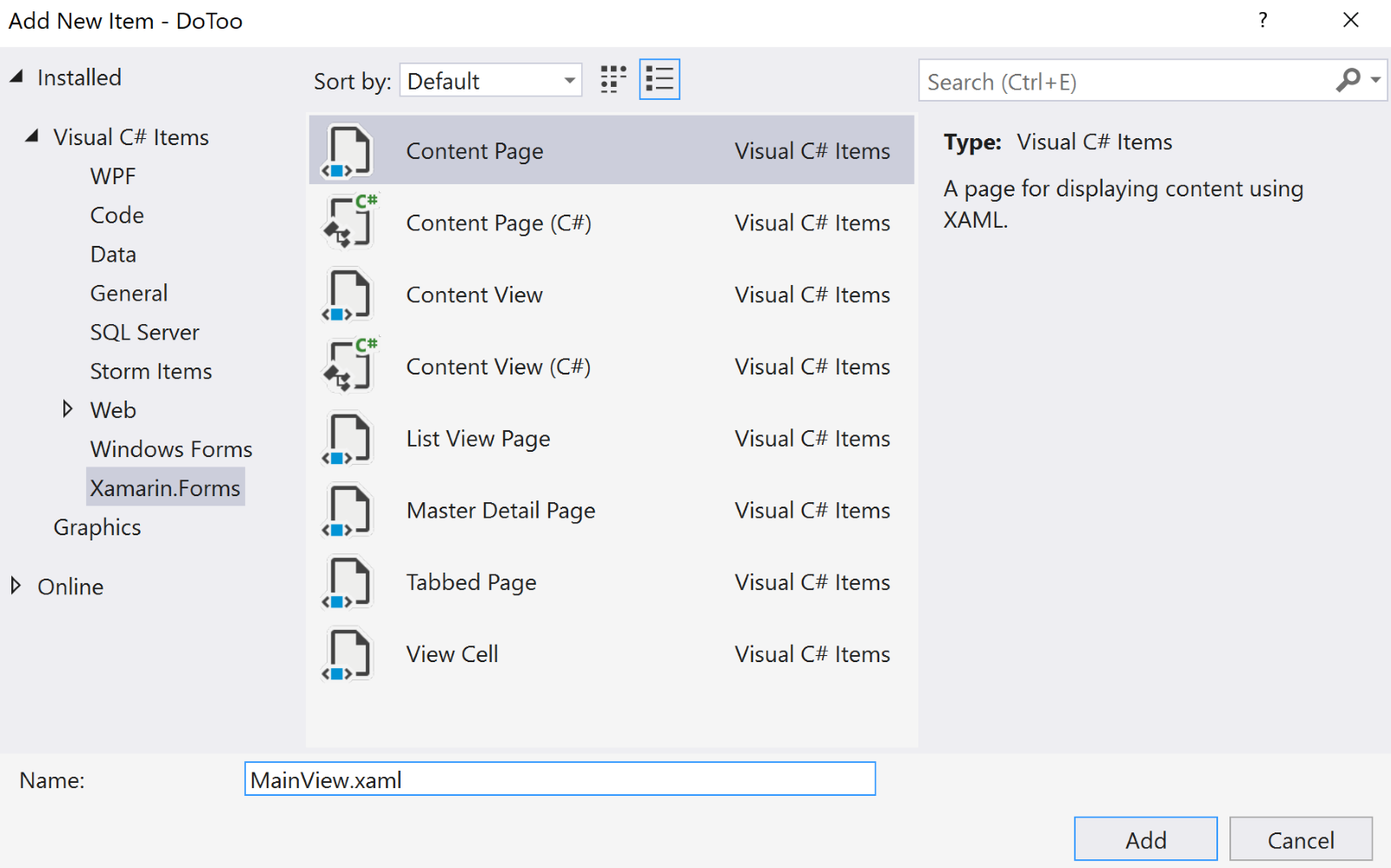
Let's add some content to the newly created view:
- Open MainView.xaml.
- Remove all the template code below the ContentPage root node and add the XAML code marked in bold in the following code:
<?xml version="1.0" encoding="utf-8"?>
<ContentPage xmlns="http://xamarin.com/schemas/2014/forms"
             xmlns:x="http://schemas.microsoft.com/winfx/2009/xaml"
             xmlns:local="clr-namespace:DoToo"
             x:Class="DoToo.Views.MainView"
             Title="Do Too!">

    <ContentPage.ToolbarItems>
        <ToolbarItem Text="Add" />
    </ContentPage.ToolbarItems>

    <Grid>
        <Grid.RowDefinitions>
            <RowDefinition Height="auto" />
            <RowDefinition Height="*" />
        </Grid.RowDefinitions>

        <Button Text="Toggle filter" />

        <ListView Grid.Row="1">
        </ListView>
    </Grid>
</ContentPage>
To be able to access custom converters, we need to add a reference to a local namespace. The xmlns:local="clr-namespace:DoToo" line defines this namespace for us. We will not use it directly in this case, but it's a good idea to have a local namespace defined. If we create custom controls, we can then access them by writing something such as <local:MyControl />.
The Title property on the ContentPage page gives the page a title. Depending on the platform we are running on, the title is displayed differently. If we use a standard navigation bar, it will be displayed at the top, for example, in both iOS and Android. A page should always have a title.
The ContentPage.Toolbar node defines a toolbar item for adding new to-do items. It will also be rendered differently based on the platform, but it always follows the platform-specific UI guidelines.
A page in Xamarin.Forms (and also in an XML document, in general) can only have one root node. The root node in a Xamarin.Forms page populates the Content property of the page itself. Since we want our MainView view to contain a list of items and a button at the top to toggle a filter (to switch between all items and only active items), we need to add a Layout control to position them on the page. Grid is a control that allows you to split up the available space based on rows and columns.
For our MainView view, we want to add two rows. The first row is a space calculated by the height of the button (Height="auto") and the second row takes up all of the remaining space for the ListView (Height="*"). Elements such as ListView are positioned in the grid using the Grid.Row and Grid.Column attributes. Both of these properties default to 0 if they are not specified, just like the button.
ListView is a control that presents items in a list, which is coincidently exactly what our app will do. It's worth noting though that in Xamarin.Forms 4, a new control called CollectionView has been introduced. Subsequent chapters will use this control, but we wanted to introduce you to the good old ListView control as well.
We also need to wire up ViewModel to the view. This can be done by passing the ViewModel class in the constructor of the view:
- Open up the code-behind file of MainView by expanding the MainView.xaml file in Solution Explorer. The code-behind file is named MainView.xaml.cs.
- Add a using
DoToo.ViewModels statement to the top of the file, adjacent to the existing using statements. - Modify the constructor of the class to look as in the following code by adding the code marked in bold:
public MainView(MainViewModel viewModel)
{
    InitializeComponent();
    viewModel.Navigation = Navigation;
    BindingContext = viewModel;
}
We follow the same pattern as we did with the ViewModel classes by passing any dependencies through the constructor. A view is always dependent on a ViewModel class. To simplify the project, we also assign the Navigation property of the page directly to the Navigation property defined in the ViewModel base class. In a larger project, we might want to abstract this property as well to make sure that we separate the ViewModel classes completely from Xamarin.Forms. For the sake of this app, however, it is OK to reference it directly.
Lastly, we assign ViewModel to the BindingContext class of the page. This tells the Xamarin.Forms binding engine to use our ViewModel object for the bindings that we will create later on.
Creating the ItemView view
Next up is the second view. We will use this to add and edit the to-do list items:
- Create a new content page (in the same way that we created the MainView view) and name it ItemView.
- Edit the XAML file so that it appears as in the following code:
 <?xml version="1.0" encoding="UTF-8"?>
 <ContentPage xmlns="http://xamarin.com/schemas/2014/forms"
              xmlns:x="http://schemas.microsoft.com/winfx/2009/xaml"
              x:Class="DoToo.Views.ItemView"
              Title="New todo item">

     <ContentPage.ToolbarItems>
         <ToolbarItem Text="Save" />
     </ContentPage.ToolbarItems>

     <StackLayout Padding="14">
         <Label Text="Title" />
         <Entry />
         <Label Text="Due" />
         <DatePicker />
         <StackLayout Orientation="Horizontal">
             <Switch />
             <Label Text="Completed" />
         </StackLayout>
     </StackLayout>
 </ContentPage>
As with MainView, we need a title. We will give it a default title of New todo item for now, but we will change this to Edit todo item when we reuse this view for editing later on. The user must be able to save a new or edited item, so we have added a toolbar save button. The content of the page uses StackLayout to structure the controls. StackLayout adds an element vertically (the default option) or horizontally based on the space it calculates that the element takes up. This is a CPU-intensive process, so we should only use it on small portions of our layout. In StackLayout, we add a Label control that is a line of text over the Entry control that comes underneath it. The Entry control is a text input control that contains the name of the to-do list item. We then have a section for DatePicker, where the user can select a due date for the to-do list item. The final control is a Switch control, which renders a toggle button to control when an item is complete, as well as a heading next to it. Since we want these to be displayed next to each other horizontally, we use a horizontal StackLayout control to do this.
The last step for the views is to wire up the ItemViewModel model to ItemView:
- Open up the code-behind file of ItemView by expanding the ItemView.xaml file in Solution Explorer.
- Modify the constructor of the class to appear as in the following code. Add the code that is marked in bold:
public ItemView (ItemViewModel viewmodel)
{
    InitializeComponent ();
    viewmodel.Navigation = Navigation;
    BindingContext = viewmodel;
}
- Add a using DoToo.ViewModels statement at the top of the file, adjacent to the existing using statements:
using DoToo.ViewModels;
This code is identical to the code that we added for MainView, except for the type of ViewModel class.
Wiring up a dependency injection through Autofac
Earlier, we discussed the dependency injection pattern, which states that all dependencies, such as the repositories and view models, must be passed through the constructor of the class. This has several benefits:
- It increases the readability of the code since we can quickly determine all the external dependencies.
- It makes dependency injection possible.
- It makes unit testing possible by mocking classes.
- We can control the life time of an object by specifying whether it should be a singleton or a new instance for each resolution.
Dependency injection is a pattern that lets us determine, at runtime, which instance of an object should be passed to a constructor when an object is created. We do this by defining a container where we register all the types of a class. We let the framework that we are using resolve any dependencies between them. Let's say that we ask the container for a MainView class. The container takes care of resolving MainViewModel and any dependencies that the class has.
To set this up, we need to reference a library called Autofac. There are other options out there, so feel free to switch to one that better fits your needs. We also need an entry point to resolve the types into instances. To do this, we will define a bare-bones Resolver class. To wrap it all up, we need a bootstrapper that we will call to initialize the dependency injection configuration.
Adding a reference to Autofac
We need a reference to Autofac to get started. We will use NuGet to install the packages needed:
- Open up the NuGet manager by right-clicking on the Solution node and clicking on Manage NuGet packages for solution....
- Click on Browse and type autofac in the search box.
- Tick all the checkboxes under Project, scroll down, and click Install:
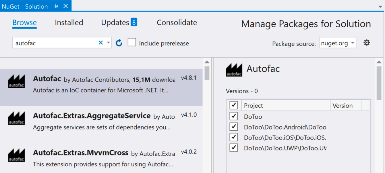
Creating the resolver
The resolver is responsible for creating objects for us based on the type that we request. Let's create the resolver:
- In the root of the .NET Standard library project, create a new file called Resolver.cs.
- Add the following code to the file:
using Autofac;

namespace DoToo
{
    public static class Resolver
    {
        private static IContainer container;

        public static void Initialize(IContainer container)
        {
            Resolver.container = container;
        }

        public static T Resolve<T>()
        {
            return container.Resolve<T>();
        }
    }
}
The container property of the IContainer type is defined in Autofac and represents a container that holds the configuration on how to resolve types. The Initialize method takes an instance of an object that implements the IContainer interface and assigns it to the container property. The Resolve method uses the container property to resolve a type to an instance of an object. While it might seem strange to use this at first, it will become much easier with experience.
Creating the bootstrapper
The bootstrapper's responsibility is to initialize Autofac. It is called at the startup of the application. We can create it as follows:
- In the root of the .NET Standard library project, create a new file called Bootstrapper.cs.
- Enter the following code:
using Autofac;
using System.Linq;
using System.Reflection;
using Xamarin.Forms;
using DoToo.Views;
using DoToo.Repositories;
using DoToo.ViewModels;

namespace DoToo
{
    public abstract class Bootstrapper
    {
        protected ContainerBuilder ContainerBuilder { get; private
        set; }

        public Bootstrapper()
        {
            Initialize();
            FinishInitialization();
        }

        protected virtual void Initialize()
        {
            var currentAssembly = Assembly.GetExecutingAssembly();
            ContainerBuilder = new ContainerBuilder();

            foreach (var type in currentAssembly.DefinedTypes
                      .Where(e =>
                             e.IsSubclassOf(typeof(Page)) ||
                             e.IsSubclassOf(typeof(ViewModel))))
            {
                ContainerBuilder.RegisterType(type.AsType());
            }

            ContainerBuilder.RegisterType<TodoItemRepository>().SingleInstance();
        }

        private void FinishInitialization()
        {
            var container = ContainerBuilder.Build();
            Resolver.Initialize(container);
        }
    }
}
The Bootstrapper class is implemented by each platform since this is where the execution of the app begins. This also gives us the option to add platform-specific configurations. To ensure that we inherit from the class, we define it as abstract.
ContainerBuilder is a class defined in Autofac that takes care of creating the container property for us after we finish the configuration. The building of the container property happens in the FinishInitialization method defined at the end and is called by the constructor right after we call the virtual Initialize method. We can override the Initialize method to add custom registrations to each platform.
The Initialize method scans the assembly using reflection for any types that inherit from Page or ViewModel and adds them to the container property. It also adds the TodoItemRepository property as a singleton to the container property. This means that each time we ask for TodoItemRepository, we get the same instance. The default behavior for Autofac (this may vary between libraries) is to give a new instance for each resolution.
Adding a bootstrapper on iOS
The bootstrapper for iOS is a simple wrapper for the common bootstrapper defined in the .NET Standard library, but with the addition of an Init method that is called at startup:
- In the root of the iOS project, create a new class called Bootstrapper.cs.
- Add the following code to it:
public class Bootstrapper : DoToo.Bootstrapper
{
    public static void Init()
    {
        var instance = new Bootstrapper();
    }
}
The Init method may look strange since we don't retain a reference to the instance we create. Keep in mind, however, that we do keep a reference to a Resolver instance in the Resolver class, which is itself a singleton.
The final step for iOS is to call this Init method in the right place:
- Open up AppDelegate.cs.
- Locate the FinishedLaunching method and add the code in bold from the following code block:
public override bool FinishedLaunching(UIApplication app, NSDictionary options)
{
    global::Xamarin.Forms.Forms.Init();
    Bootstrapper.Init();
    LoadApplication(new App());

    return base.FinishedLaunching(app, options);
}
Adding a bootstrapper in Android
Just as for iOS, the bootstrapper for Android is a simple wrapper for the common bootstrapper defined in the .NET Standard library, but with the addition of an Init method that is called at startup:
- In the root of the Android project, create a new class called Bootstrapper.cs.
- Add the following code to it:
public class Bootstrapper : DoToo.Bootstrapper
{
    public static void Init()
    {
        var instance = new Bootstrapper();
    }
}
We then need to call this Init method. A good place to do this is right before the LoadApplication call in OnCreate:
- Open up MainActivity.cs.
- Locate the OnCreate method and add the code in bold from the following code block:
protected override void OnCreate(Bundle savedInstanceState)
{
    TabLayoutResource = Resource.Layout.Tabbar;
    ToolbarResource = Resource.Layout.Toolbar;

    base.OnCreate(savedInstanceState);

    Xamarin.Essentials.Platform.Init(this, savedInstanceState);
    global::Xamarin.Forms.Forms.Init(this, savedInstanceState);
    Bootstrapper.Init();
    LoadApplication(new App());
}
Adding a bootstrapper in UWP
The bootstrapper for UWP is identical to the other platforms:
- In the root of the UWP project, create a new class called Bootstrapper.cs.
- Add the following code to it:
public class Bootstrapper : DoToo.Bootstrapper
{
    public static void Init()
    {
        var instance = new Bootstrapper();
    }
}
As with the other platforms, we need to call the Init method in a good place:
- In the UWP project, open up the App.xaml.cs file.
- Locate the call to the Xamarin.Forms.Forms.Init() method and add the code in bold from the following code block:
Xamarin.Forms.Forms.Init(e);
Bootstrapper.Init();
Making the app run
We can start the app for the first time as follows:
- Open up App.xaml.cs by expanding the App.xaml node in the .NET Standard library.
- Locate the constructor.
- Add a using statement for DoToo.Views and add the following code line in bold:
public App ()
{
    InitializeComponent();
    MainPage = new NavigationPage(Resolver.Resolve<MainView>());
}
The line we have just added resolves the MainView class (and all its dependencies, including MainViewModel and TodoItemRepository) and wraps it in NavigationPage. NavigationPage is a page defined in Xamarin.Forms that adds a navigation bar and enables the user to navigate to other views.
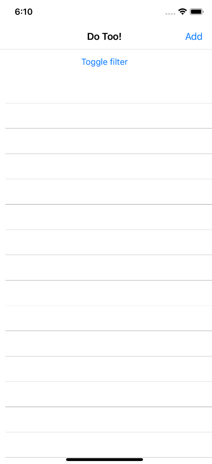
That's it! Now, your project should start. Depending on the platform you are using, it might look as in the following screenshot:
Adding data bindings
Data binding is the heart and soul of MVVM. This is the way that the views and ViewModel communicate with each other. In Xamarin.Forms, we need two things to make data binding happen:
- We need an object to implement INotifyPropertyChanged.
- We need to set the BindingContext class of the page to that object. We already do this on both ItemView andMainView.
A really useful feature of data binding is that it allows us to use two-way communication. For example, when data binding text to an Entry control, the property on the data-bound object is updated directly. Consider the following XAML:
<Entry Text="{Binding Title}" />
To make this work, we need a property named Title on the string object. We have to look at the documentation, define an object, and let Intellisense provide us with a hint to find out what type our property should be.
Controls that perform some kind of action, such as Button, usually expose a property called Command. This property is of the ICommand type and we can either return Xamarin.Forms.Command or an implementation of our own. The Command property is explained in the next section, where we will use it to navigate to ItemView.
Navigating from MainView to ItemView to add a new item
We have an Add toolbar button in MainView. When the user taps this button, we want it to take them to ItemView. The MVVM way to do this is to define a command and then bind that command to the button. Let's add the code:
- Open ViewModels/MainViewModel.cs.
- Add using statements for System.Windows.Input, DoToo.Views, and Xamarin.Forms.
- Add the following property to the class:
public ICommand AddItem => new Command(async () =>
{
    var itemView = Resolver.Resolve<ItemView>();
    await Navigation.PushAsync(itemView);
});
All commands should be exposed as a generic ICommand type. This abstracts the actual command implementation, which is good general practice to follow. The command must be a property; in our case, we are creating a new Command object that we assign to this property. The property is read-only, which is usually fine for a Command object. The action of the command (the code that we want to run when the command is executed) is passed to the constructor of the Command object.
The action of the command creates a new ItemView view through Resolver, and Autofac builds the necessary dependencies. Once the new ItemView view has been created, we simply tell the Navigation service to push it to the stack for us.
After that, we just have to wire up the AddItem command from ViewModel to the Add button in the view:
- Open Views/MainView.xaml.
- Add the Command attribute to ToolbarItem:
<ContentPage.ToolbarItems>
    <ToolbarItem Text="Add" Command="{Binding AddItem}" />
</ContentPage.ToolbarItems>
Run the app and tap the Add button to navigate to the new ItemView view. Notice that the back button appears automatically.
Adding new items to the list
We have now finished adding navigation to a new item. Let's now add the code needed to create a new item and save it to the database:
- Open ViewModels/ItemViewModel.cs.
- Add the following code in bold.
- Resolve the reference to System.Windows.Input:
public class ItemViewModel : ViewModel
{
    private TodoItemRepository repository;

    public TodoItem Item { get; set; }

    public ItemViewModel(TodoItemRepository repository)
    {
        this.repository = repository;
        Item = new TodoItem() { Due = DateTime.Now.AddDays(1) };
    }

    public ICommand Save => new Command(async () =>
    {
        await repository.AddOrUpdate(Item);
        await Navigation.PopAsync();
    });
}
The Item property holds a reference to the current item that we want to add or edit. A new item is created in the constructor and when we want to edit an item, we can simply assign our own item to this property. The new item is not added to the database unless we execute the Save command defined at the end. After the item is added or updated, we remove the view from the navigation stack and return to MainView again.
Now that we have extended ItemViewModel with the necessary commands and properties, it's time to data-bind them in the XAML:
- Open Views/ItemView.xaml.
- Add the code marked in bold:
<?xml version="1.0" encoding="UTF-8"?>
<ContentPage xmlns="http://xamarin.com/schemas/2014/forms"
             xmlns:x="http://schemas.microsoft.com/winfx/2009/xaml"
             x:Class="DoToo.Views.ItemView">
    <ContentPage.ToolbarItems>
        <ToolbarItem Text="Save" Command="{Binding Save}" />
    </ContentPage.ToolbarItems>

    <StackLayout Padding="14">
        <Label Text="Title" />
        <Entry Text="{Binding Item.Title}" />
        <Label Text="Due" />
        <DatePicker Date="{Binding Item.Due}" />
        <StackLayout Orientation="Horizontal">
            <Switch IsToggled="{Binding Item.Completed}" />
            <Label Text="Completed" />
        </StackLayout>
    </StackLayout>

</ContentPage>
The binding to the ToolbarItems command attribute triggers the Save command exposed by ItemViewModel when a user taps the Save link. It's worth noting again that any attribute called Command indicates that an action will take place and we must bind it to an instance of an object implementing the ICommand interface.
The Entry control that represents the title is data-bound to the Item.Title property of ItemViewModel, and the Datepicker and Switch controls bind in a similar way to their respective properties.
We could have exposed Title, Due, and Complete as properties directly on ItemViewModel, but we instead chose to reuse the already-existing TodoItem object as a reference. This is fine, as long as the properties of the TodoItem object implement the INotifyPropertyChange interface.
Binding ListView in MainView
A to-do list is not much use without a list of items. Let's extend MainViewModel with a list of items:
- Open ViewModels/MainViewModel.cs.
- Add using statements for System.Collections.ObjectModel and System.Linq.
- Add a property for the to-do list items:
public ObservableCollection<TodoItemViewModel> Items { get; set; }
ObservableCollection is like an ordinary collection, but it has a useful superpower. It can notify listeners about changes in the list, such as when items are added or deleted. The ListView control listens to changes in the list and updates itself automatically based on these. It's important, however, to be aware that a change to an item in the list will not trigger an update. Changing the title of an item will not cause the list to re-render. Let's move on to implementing the rest of MainViewModel.
We now need some data:
- Open ViewModels/MainViewModel.cs.
- Replace (or complete) the LoadData method and create the CreateTodoItemViewModel and ItemStatusChanged methods.
- Resolve the reference to DoToo.Models by adding a using statement:
private async Task LoadData()
{
    var items = await repository.GetItems();
    var itemViewModels = items.Select(i =>
    CreateTodoItemViewModel(i));
    Items = new ObservableCollection<TodoItemViewModel>
    (itemViewModels);
}

private TodoItemViewModel CreateTodoItemViewModel(TodoItem item)
{
    var itemViewModel = new TodoItemViewModel(item);
    itemViewModel.ItemStatusChanged += ItemStatusChanged;
    return itemViewModel;
}

private void ItemStatusChanged(object sender, EventArgs e)
{
}
The LoadData method calls the repository to fetch all items. We then wrap each to-do list item in TodoItemViewModel. This contains more information that is specific to the view that we don't want to add to the TodoItem class. It is good practice to wrap plain objects in ViewModel; this makes it simpler to add actions or extra properties to it. ItemStatusChanged is a stub that is called when we change the status of the to-do list item from active to completed and vice versa.
We also need to hook up some events from the repository to know when data changes:
- Open ViewModels/MainViewModel.cs.
- Add the following code in bold:
public MainViewModel(TodoItemRepository repository)
{
    repository.OnItemAdded += (sender, item) =>

       Items.Add(CreateTodoItemViewModel(item));
    repository.OnItemUpdated += (sender, item) =>
       Task.Run(async () => await LoadData());

    this.repository = repository;

    Task.Run(async () => await LoadData());
}
When an item is added to the repository, no matter who added it, MainView will add it to the items list. Since the items collection is an observable collection, the list updates. If an item is updated, we simply reload the list.
Let's data-bind our items to ListView:
- Open up MainView.xaml and locate the ListView element.
- Modify it to reflect the following code:
<ListView Grid.Row="1"
          RowHeight="70"
          ItemsSource="{Binding Items}">
    <ListView.ItemTemplate>
        <DataTemplate>
            <ViewCell>
                <Grid Padding="15,10">
                    <Grid.ColumnDefinitions>
                        <ColumnDefinition Width="10" />
                        <ColumnDefinition Width="*" />
                    </Grid.ColumnDefinitions>

                    <BoxView Grid.RowSpan="2" />
                    <Label Grid.Column="1"
                           Text="{Binding Item.Title}"
                           FontSize="Large" />
                    <Label Grid.Column="1"
                           Grid.Row="1"
                           Text="{Binding Item.Due}"
                           FontSize="Micro" />
                    <Label Grid.Column="1"
                           Grid.Row="1"
                           HorizontalTextAlignment="End"
                           Text="Completed"
                           IsVisible="{Binding Item.Completed}"
                           FontSize="Micro" />
                </Grid>
            </ViewCell>
        </DataTemplate>
    </ListView.ItemTemplate>
</ListView>
The ItemsSource binding tells ListView where to find the collection to iterate over and is local to ViewModel. Any bindings in the ViewCell node, however, are local to each item that we iterate in the list. In this case, we are binding to the TodoItemViewModel, which contains a property named Item. This, in turn, has properties such as Title, Due, and Completed. We can navigate down the hierarchy of objects without any problem when defining a binding.
The DataTemplate element defines what each row will look like. We use a grid to partition the space, just as we did earlier.
Creating a ValueConverter object for the item status
Sometimes, we want to bind to objects that are a representation of the original value. This could be a piece of text that is based on a Boolean value. Instead of true and false, for example, we might want to write Yes and No, or return a color. This is where ValueConverter comes in handy. It can be used to convert a value to and from another value. We are going to write a ValueConverter object that converts the status of a to-do list item to a color:
- In the root of the .NET Standard library project, create a folder called Converters.
- Create a class called StatusColorConverter.cs and add the following code:
using System;
using System.Globalization;
using Xamarin.Forms;

namespace DoToo.Converters
{
    public class StatusColorConverter : IValueConverter
    {
        public object Convert(object value, Type targetType,
                              object parameter, CultureInfo
                              culture)
        {
          return (bool)value ?

          (Color)Application.Current.Resources[
          "CompletedColor"]:

          (Color)Application.Current.Resources[
          "ActiveColor"];
        }

        public object ConvertBack(object value, Type
         targetType,
         object parameter, CultureInfo culture)
        {
            return null;
        }
    }
}
A ValueConverter object is a class that implements IValueConverter. This, in turn, only has two methods defined. The Convert method is called when the view reads data from ViewModel and the ConvertBack method is used when ViewModel, gets data from the view. The ConvertBack method is only used for controls that return data from plain text, such as the Entry control.
If we look at the implementation of the Convert method, we notice that any value passed to the method is of the object type. This is because we don't know what type the user has bound to the property that we are adding this ValueConverter class to. We may also notice that we fetch colors from a resource file. We could have defined the colors in the code, but this is not recommended. So, instead, we went the extra mile and added them as a global resource to the App.xaml file. Resources are a good thing to take another look at once you have finished this chapter:
- Open App.xaml in the .NET Standard library project.
- Add the following ResourceDictionary element:
 <Application ...>
     <Application.Resources>
         <ResourceDictionary>
             <Color x:Key="CompletedColor">#1C8859</Color>
             <Color x:Key="ActiveColor">#D3D3D3</Color>
         </ResourceDictionary>
     </Application.Resources>
 </Application>
ResourceDictionary can define a wide range of different objects. We settle for the two colors that we want to access from ValueConverter. Notice that these can be accessed by the key given to them and from any other XAML file using a static resource binding. ValueConverter itself is referenced as a static resource, but from a local scope.
Using ValueConverter
We want to use our brand new StatusColorConverter object in MainView. Unfortunately, we have to jump through some hoops to make this happen. We need to do three things:
- Define a namespace in XAML
- Define a local resource that represents an instance of the converter
- Declare in the binding that we want to use the converter
Let's start with the namespace:
- Open Views/MainView.xaml.
- Add the following namespace to the page:
<ContentPage xmlns="http://xamarin.com/schemas/2014/forms"
             xmlns:x="http://schemas.microsoft.com/winfx/2009/xaml"
             xmlns:converters="clr-namespace:DoToo.Converters"
             x:Class="DoToo.Views.MainView"
             Title="Do Too!>
Add a Resource node to the MainView.xaml file:
- Open Views/MainView.xaml.
- Add the following ResourceDictionary element, shown in bold under the root element of the XAML file:
<ContentPage ...>
    <ContentPage.Resources>
        <ResourceDictionary>
            <converters:StatusColorConverter
             x:Key="statusColorConverter" />
        </ResourceDictionary>
    </ContentPage.Resources>
    <ContentPage.ToolBarItems>
        <ToolbarItem Text="Add" Command="{Binding AddItem}" />
    </ContentPage.ToolbarItems>
    <Grid ...>
    </Grid>
</ContentPage>
This has the same form as the global resource dictionary, but since this one is defined in MainView, it can only be accessed from there. We could have defined this in the global resource dictionary, but it's usually more efficient to define objects that you only consume in one place as close to that place as possible.
The last step is to add the converter:
- Locate the BoxView node in the XAML file.
- Add the BackgroundColor XAML, which is marked in bold:
<BoxView Grid.RowSpan="2"
    BackgroundColor="{Binding Item.Completed,
                     Converter={StaticResource
                     statusColorConverter}}" />
What we have done here is bind a Boolean value to a property that takes a Color object. Right before the data binding takes place, however, ValueConverter converts the Boolean value into a color. This is just one of the many cases where ValueConverter comes in handy. Keep this in mind when you define the GUI.
Navigating to an item using a command
We want to be able to see the details for a selected to-do list item. When we tap a row, we should navigate to the item in that row.
To do this, we need to add the following code:
- Open ViewModels/MainViewModel.cs.
- Add the SelectedItem property and the NavigateToItem method to the class:
public TodoItemViewModel SelectedItem
{
    get { return null; }
    set
    {
        Device.BeginInvokeOnMainThread(async () => await
        NavigateToItem(value));
        RaisePropertyChanged(nameof(SelectedItem));
    }
}

private async Task NavigateToItem(TodoItemViewModel item)
{
    if (item == null)
    {
        return;
    }

    var itemView = Resolver.Resolve<ItemView>();
    var vm = itemView.BindingContext as ItemViewModel;
    vm.Item = item.Item;

    await Navigation.PushAsync(itemView);
}
The SelectedItem property is a property that we will data-bind to ListView. When we select a row in ListView, this property is set to the TodoItemViewModel object that represents that row. Since we can't really use Fody here to carry out its PropertyChanged magic (because of the need for a method call in the setter), we need to go old school and manually add a getter and a setter.
The setter then calls NavigateToItem, which creates a new ItemView view using Resolver. We extract ViewModel from the newly created ItemView view and assign the current TodoItem object that TodoItemViewModel contains. Confused? Remember that TodoItemViewModel actually wraps a TodoItem object and it is that item that we want to pass to ItemView.
We are not done yet. We now need to data-bind the new SelectedItem property to the right place in the view:
- Open Views/MainView.xaml.
- Locate ListView and add the attributes in bold:
<ListView x:Name="ItemsListView"
          Grid.Row="1"
          RowHeight="70"
          ItemsSource="{Binding Items}"
          SelectedItem="{Binding SelectedItem}">
The SelectedItem attribute binds the SelectedItem property's ListView view to the ViewModel property. When the selection of an item in ListView changes, the ViewModel property's SelectedItem property is called and we navigate to the new and exciting views.
The x:Name attribute is for naming ListView because we do need to make a small and ugly hack to make this work. ListView actually stays selected after the navigation is done. When we navigate back, it cannot be selected again until we select another row. To mitigate this, we need to hook up to the ItemSelected event of ListView and reset the selected item directly on ListView. This is not recommended because we shouldn't really have any logic in our views, but sometimes we have no other choice:
- Open Views/MainView.xaml.cs.
- Add the following code in bold:
public MainView(MainViewModel viewmodel)
{
    InitializeComponent();
    viewmodel.Navigation = Navigation;
    BindingContext = viewmodel;

    ItemsListView.ItemSelected += (s, e) =>
    ItemsListView.SelectedItem = null;
}
We should now be able to navigate to an item in the list.
Marking an item as complete using a command
We need to add a functionality that allows us to toggle items between complete and active. It is possible to navigate to the detailed view of the to-do list item, but this is too much work for a user. Instead, we'll add a ContextAction item to ListView. In iOS, for example, this is accessed by swiping left on a row:
- Open ViewModel/TodoItemViewModel.cs.
- Add a using statement for System.Windows.Input and Xamarin.Forms.
- Add a command to toggle the status of the item and a piece of text that describes the status:
public ICommand ToggleCompleted => new Command((arg) =>
{
    Item.Completed = !Item.Completed;
    ItemStatusChanged?.Invoke(this, new EventArgs());
});
Here, we have added a command for toggling the state of an item. When executed, it inverses the current state and raises the ItemStatusChanged event so that subscribers are notified. To change the text of the context action button depending on the status, we added a StatusText property. This is not recommended practice because we are adding code that only exists because of a specific UI case to ViewModel. Ideally, this would be handled by the view, perhaps by using ValueConverter. To save us from having to implement these steps, however, we have left it as a string property:
- Open Views/MainView.xaml.
- Locate the ListView.ItemTemplate node and add the following ViewCell.ContextActions node:
<ListView.ItemTemplate>
    <DataTemplate>
        <ViewCell>
            <ViewCell.ContextActions>
                <MenuItem Text="{Binding StatusText}"
                          Command="{Binding ToggleCompleted}" />
            </ViewCell.ContextActions>
        <Grid Padding="15,10">
        ...
        </Grid>
    </DataTemplate>
</ListView.ItemTemplate>
Creating the filter toggle function using a command
We want to be able to toggle between viewing active items only and all the items. We will create a simple mechanism to do this.
Hook up the changes in MainViewModel as follows:
- Open ViewModels/MainViewModel.cs and locate ItemStatusChangeMethod.
- Add the implementation to the ItemStatusChanged method and a property called ShowAll to control the filtering:
private void ItemStatusChanged(object sender, EventArgs e)
{
    if (sender is TodoItemViewModel item)
    {
        if (!ShowAll && item.Item.Completed)
        {
            Items.Remove(item);
        }

        Task.Run(async () => await
        repository.UpdateItem(item.Item));
    }
}

public bool ShowAll { get; set; }
The ItemStatusChanged event handler is triggered when we use the context action from the last section. Since the sender is always an object, we try to cast it to TodoItemViewModel. If this is successful, we check whether we can remove it from the list if ShowAll is not true. This is a small optimization; we could have called LoadData and reloaded the entire list, but since the Items list is set to ObservableCollection, it communicates to ListView that one item has been removed from the list. We also call the repository to update the item to persist the change of status.
The ShowAll property is what controls which state our filter is in. We need to adjust the LoadData method to reflect this:
- Locate the Load method in MainViewModel.
- Add the following lines of code marked in bold:
private async Task LoadData()
{
    var items = await repository.GetItems();

    if (!ShowAll)
    {
        items = items.Where(x => x.Completed == false).ToList();
    }

    var itemViewModels = items.Select(i =>
    CreateTodoItemViewModel(i));
    Items = new ObservableCollection<TodoItemViewModel>
    (itemViewModels);
}
If ShowAll is false, we limit the content of the list to the items that have not been completed. We can do this either by having two methods, GetAllItems() and GetActiveItems(), or by using a filter argument that can pass to GetItems(). Take a minute to think about how we could implement this.
Let's add the code that toggles the filter:
- Open ViewModels/MainViewModel.cs.
- Add the FilterText and ToggleFilter properties:
public string FilterText => ShowAll ? "All" : "Active";

public ICommand ToggleFilter => new Command(async () =>
{
    ShowAll = !ShowAll;
    await LoadData();
});
The FilterText property is a read-only property used to display the status as a string in a human-readable form. We could have used ValueConverter for this, but to save some time, we simply expose it as a property. The logic for the ToggleFilter command is a simple inversion of the state and then a call to LoadData. This, in turn, causes a reload of the list.
Before we can filter the items, we need to hook up the filter button:
- Open Views/MainView.xaml.
- Locate the button that controls the filter (the only button in the file).
- Adjust your code to reflect the following code:
<Button Text="{Binding FilterText, StringFormat='Filter: {0}'}"
        Command="{Binding ToggleFilter}" />
We have now finished with this feature! However, our app isn't very attractive; we'll deal with this in the following section.
Laying out the contents
This last section is about making the app look a bit nicer. We will just scratch the surface of the possibilities here, but this should give you some ideas about how styling works.
Setting an application-wide background color
Styles are a great way of applying styling to elements. They can be applied either to all elements of a type or to the elements referenced by a key if you add an x:Key attribute:
- Open App.xaml in the .NET Standard project.
- Add the following XAML, which is in bold, to the file:
<ResourceDictionary>
    <Style TargetType="NavigationPage">
        <Setter Property="BarBackgroundColor" Value="#A25EBB" />
        <Setter Property="BarTextColor" Value="#FFFFFF" />
    </Style>

    <Style x:Key="FilterButton" TargetType="Button">
        <Setter Property="Margin" Value="15" />
        <Setter Property="BorderWidth" Value="1" />
        <Setter Property="BorderRadius" Value="6" />
        <Setter Property="BorderColor" Value="Silver" />
        <Setter Property="TextColor" Value="Black" />
    </Style>

    <Color x:Key="CompletedColor">#1C8859</Color>
    <Color x:Key="ActiveColor">#D3D3D3</Color>
</ResourceDictionary>
The first style we will apply is a new background color and text color to the navigation bar. The second style will be applied to the filter button. We can define a style by setting TargetType, which instructs Xamarin.Forms which type of object this style can be applied to. We can then add one or more properties that we want to set. The result will be the same as if we had added these properties directly to the element in the XAML code.
Styles that lack the x:Key attribute are applied to all instances of the type defined in TargetType. Styles that have a key must be explicitly assigned in the XAML of the user interface. We will see examples of this when we define the filter button in the next section.
Laying out the MainView and ListView items
In this section, we will improve the appearance of MainView and ListView. Open up Views/MainView.xaml and apply the changes in bold in the XAML code in each of the following sections.
The filter button
The filter button allows us to toggle the state of the list to show only the active to-do items or all the to-do items. Let's style it to make it stand out a bit in the layout:
- Find the filter button.
- Make the following changes:
<Button Style="{StaticResource FilterButton}"
        Text="{Binding FilterText, StringFormat='Filter: {0}'}"
        BackgroundColor="{Binding ShowAll,
        Converter={StaticResource statusColorConverter}}"
        TextColor="Black"
        Command="{Binding ToggleFilter}">

 <Button.Triggers>
   <DataTrigger TargetType="Button" Binding="{Binding ShowAll}"
      Value="True">
     <Setter Property="TextColor" Value="White" />
  </DataTrigger>
 </Button.Triggers>
</Button>
The style is applied using StaticResource. Anything defined in a resource dictionary, either in the App.xaml file or in the local XAML file, is accessible through it. We then set BackgroundColor, based on the ShowAll property of MainViewModel, and set TextColor to Black.
The Button.Triggers node is a useful feature. We can define a number of types of triggers that fire when certain criteria are met. In this case, we use a data trigger that checks whether the value of ShowAll changes to true. If it does, we set TextColor to white. The coolest part is that when ShowAll becomes false again, it switches back to whichever color it was before.
Touching up ListView
ListView could use a couple of minor changes. The first change is formatting the due date string to a more human-readable format and the second is changing the color of the Completed label to a nice green tint:
- Open up Views/MainView.xaml.
- Locate the labels that bind Item.Due and Item.Completed in ListView:
<Label Grid.Column="1"
       Grid.Row="1"
       Text="{Binding Item.Due, StringFormat='{0:MMMM d, yyyy}'}"
       FontSize="Micro" />

<Label Grid.Column="1"
       Grid.Row="1"
       HorizontalTextAlignment="End"
       Text="Completed"
       IsVisible="{Binding Item.Completed}"
       FontSize="Micro"
       TextColor="{StaticResource CompletedColor}" />
We added a formatting string to the binding to format the date using a specific format. In this case, we used the 0:MMMM d, yyyy format, which will display the date as a string in the format of, for example, May 5, 2020.
We also added a text color to the Completed label that is only visible if an item is completed. We do this by referencing our dictionary in App.xaml.


