Search icon CANCEL
Subscription
0
Cart icon
Your Cart (0 item)
Close icon
You have no products in your basket yet
Arrow left icon
Explore Products
Best Sellers
New Releases
Books
Videos
Audiobooks
Learning Hub
Free Learning
Arrow right icon
Arrow up icon
GO TO TOP
Drupal 8 Quick Start Guide

You're reading from   Drupal 8 Quick Start Guide Get up and running with Drupal 8

Arrow left icon
Product type Paperback
Published in Oct 2018
Publisher Packt
ISBN-13 9781789340310
Length 128 pages
Edition 1st Edition
Tools
Concepts
Arrow right icon
Author (1):
Arrow left icon
J. Ayen Green J. Ayen Green
Author Profile Icon J. Ayen Green
J. Ayen Green
Arrow right icon
View More author details
Toc

The behind-the-scenes tour

Like entering any complex location without a map in hand—a mall, a metro system, an amusement park—Drupal can be daunting to find your way around. So, throughout the rest of this chapter, I will be your tour guide, mapping out Drupal for you.

The home screen on a new site is presented to you via a theme. Themes control where elements appear on the page, their size, their color, and other aspects of the user interface, or UI. The default theme for Drupal 8 is called Bartik. It is important to remember that the homepage can (and likely will at some point) look somewhat or very different as a result of any of the following changing:

  • Browser or browser version
  • Device type (for example, an iPhone instead of a desktop computer)
  • Theme
  • Site's homepage layout
  • User role permissions
  • Items being added to or removed from the menus

So, try not to fixate on the exact location or appearance of the page elements, but rather develop an understanding of what they are so that you know where you want to go or what function you want, regardless of the appearance:
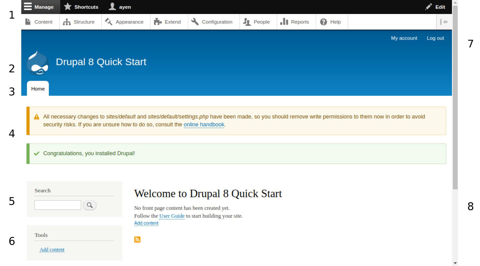
The preceding screenshots have numbers to the left and right that identify functional areas of the page. Each is identified in a key in the following table. A longer description will follow:

Section
1
Administration menu
2
Branding
3
Tabs
4
System message area
5
Search widget
6
User menu
7
Main navigation
8
Content area

Administration menu

The administration menu, or admin menu, is typically only seen by users with the administrator role. Like any other Drupal menu, the entries displayed on it depend on the role of the user and the permissions assigned to that role. For example, someone with the role of editor might not see the choice for Extend, since that is associated with site administration. 

The Manage link acts as a toggle that alternately shows or hides the row below it that contains links to the major administrative management pages.

The Shortcuts link replaces the administrative management links with links that the current user has added as bookmarks. For example, if by clicking links on successive pages you reach a page five clicks later, rather than doing that every time you want to go to that page, you can add it as a shortcut.

The final link in that row is one for the current user's account, which leads to the user page. The user page has tabs through which the user's account settings, including password, can be managed, as well as any shortcuts the user has added. Depending on the site and how it has been customized, this is often the page from which a user can reach the user profile and edit those fields. The fields and an explanation of them is as follows:

  • Content leads to the content administration page on which content titles are listed and content can be managed. This will be covered more in Chapter 4, Creating and Editing Content.
  • Structure leads to a further menu from which various site structures can be managed. Those of interest to content editors include content types and taxonomies, which are discussed in Chapter 2, Structuring Content Types.
  • Appearance is where the installed site themes are listed and where they can be configured. A theme is a collection of files and settings that control the appearance of the site's pages. There are typically two themes that are applied to a site: the theme that visitors see, and the theme used for administrators accessing the site's backend.
  • Extend leads to the module management section. Modules are add-ons for Drupal that provide additional functionality (see Chapter 5, Making Drupal Even More Useful). Here, modules can be installed and uninstalled.
  • Configuration displays a menu of pages that serve as the primary administration portal, where many site settings are configured, such as the name of the site, which you provided during the install process. Here is a list of the various categories of settings, bearing in mind that the options presented are dependent on the user role:
    • Account settings: How user registration and account cancellation are handled, the content of system generated messages to users, whether a contact form is made available, and the role associated with site administrators.
    • Text Format and Editors: The restrictions on what content can contain (such as HTML tags) and which features the content editing tool provides to each user role (for example, you may not want someone who isn't an editor to be able to add links).
    • Maintenance Mode: The ability to set the site to prevent user login during maintenance activities.
    • Configuration Synchronization: The tool for importing or exporting the site configuration settings so that they can be transferred to or from another system.
    • Search Pages: For configuring site search, indexing settings, search logging, and adding site search pages
    • URL Aliases: For creating an alias for a specific page so that the default Drupal URL such as mysite.com/node/22 could be something more user friendly, such as mysite.com/using-drupal. I discuss an even better approach in Chapter 5, Making Drupal Even More Useful.
    • RSS Publishing: Configuration settings to provide a content feed from your site. We'll look at creating a selective RSS content feed in Chapter 7, Feeding the Masses – RSS.
    • Basic Site Settings: Where the initial settings of site name, email address, and others can be changed.
    • Cron: Drupal performs certain tasks in the background, meaning not via the browser, at defined intervals throughout the day. The interval can be configured here and an ad hoc request to run cron can be made.
    • Shortcuts: As mentioned earlier, shortcuts allow you to place Drupal destinations on a task bar so that they can be reached with one click, and groups of them, such as those that apply to a singular purpose, can be managed here.
    • Filesystem: Assets such as images, PDFs, and media files are kept in the web server's filesystem, and here is where their location is managed.
    • Image Styles: Different configurations can be created that you can apply to uploaded images when the image is requested by the browser, depending on the context for their use, such as a cropped thumbnail for use in a list of items, or a full-sized version for use in a full page display of the content. An example of the use of an image style will be shown in Chapter 7, Feeding the Masses – RSS.
    • Image Toolkit: If more than one system library for manipulating images (by the image style) is present, the selection of which to use can be made here.
    • Regional Settings: For changing the locale and timezone settings that were selected or left unchanged during the installation process.
    • Date and Time Formats: For setting the site default on how to display the date and time, an example of which is Monday, December 15, 2020 or Mon, 12/15/20.

As modules are added, the list of configuration pages shown in this section can grow:

  • People is where user accounts, user roles, and user permissions are maintained, created, or in the case only of users and roles, removed. We will cover this in Chapter 3, Managing Users.
  • Reports provide administrative reporting such as a site status report, as well as a report that shows the top search terms used on the site. Add-on modules can add further reports, as can Views, which we will use to add a report in Chapter 8, Welcome Home!
  • Help provides getting-started tips, additional information about add-on modules that have help text associated with them, and other information.

Tabs

Tabs are a way of providing contextual information on a page rather than needing to leave the page to change context. For example, the default homepage has the Home tab as the sole context, but a page such as the user page might have a User tab that contains the user settings such as username and password, and a Profile tab for managing profile information such as country, gender, and social links.

System message area

The system message area is where important notices appear. Remember that the location could be different in another theme, as could the formatting. Unchanged, the location will be above the main page content, and the format will be one of the following:

  • Green: General information worth noting
  • Yellow: Indicating a warning; worth noting but not critical, usually meaning that the system completed what it was requested to do, but not without incident
  • Pink: An error that should be acted upon or investigated, usually indicating that the system was unable to fulfil a request

These statuses are also used when a user completes a form, with the following as the typical presentation:

  • Green: A message indicating that the form was saved or submitted
  • Yellow: Inviting the user to review something in the content or to confirm its submission
  • Pink: Indicating that a required field is without a value or that the value is not correct in context

Search widget

A content site would be of little value without the ability of the user to search for content based on one or more specific search terms or a phrase. So, some form of search widget is common, with a field in which to enter the term(s) and a link or button with which to initiate the search.

User menu

There can be actions or destinations specific to a user role or even a specific user, and a user menu is a good place to provide links to them. User menus are not always present, as often sites limit the navigation to a specific set that is woven into the theme.

Main navigation

The default main navigation consists of a link to the user's account page, which is sometimes represented with a silhouette or user image, and a link to log off though. Customizations can provide additional choices, as well. The main navigation can be much more prominent, such as in the case of e-commerce sites, where actions are as important to the user as the content itself.

Main content area

The heart of the CMS site is, after all, the content, and most homepages and interior pages will have an area in which to display content, whether that be text, video, or some other form of media. Depending on the theme, there could be initial content above and/or below the main content, more than one piece of content within the main content area, and small areas of additional content, blocks, in other parts of the page, such as the Search and Tools menus in the preceding screenshot.

You have been reading a chapter from
Drupal 8 Quick Start Guide
Published in: Oct 2018
Publisher: Packt
ISBN-13: 9781789340310
Register for a free Packt account to unlock a world of extra content!
A free Packt account unlocks extra newsletters, articles, discounted offers, and much more. Start advancing your knowledge today.
Unlock this book and the full library FREE for 7 days
Get unlimited access to 7000+ expert-authored eBooks and videos courses covering every tech area you can think of
Renews at $19.99/month. Cancel anytime
Banner background image