Search icon CANCEL
Subscription
0
Cart icon
Your Cart (0 item)
Close icon
You have no products in your basket yet
Arrow left icon
Explore Products
Best Sellers
New Releases
Books
Videos
Audiobooks
Learning Hub
Free Learning
Arrow right icon
Arrow up icon
GO TO TOP
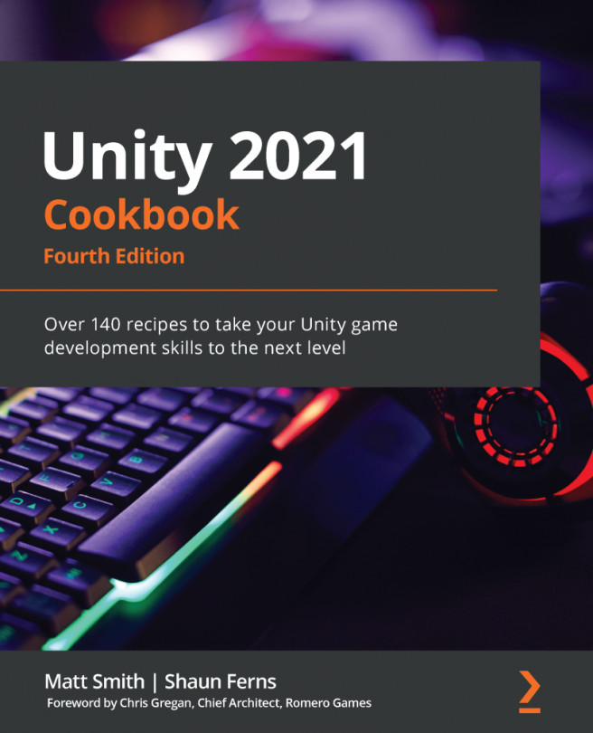
Unity 2021 Cookbook

You're reading from   Unity 2021 Cookbook Over 140 recipes to take your Unity game development skills to the next level

Arrow left icon
Product type Paperback
Published in Sep 2021
Publisher Packt
ISBN-13 9781839217616
Length 816 pages
Edition 4th Edition
Languages
Tools
Arrow right icon
Authors (2):
Arrow left icon
Shaun Ferns Shaun Ferns
Author Profile Icon Shaun Ferns
Shaun Ferns
Matt Smith Matt Smith
Author Profile Icon Matt Smith
Matt Smith
Arrow right icon
View More author details
Toc

Table of Contents (15) Chapters Close

1. Displaying Data with Core UI Elements 2. Responding to User Events for Interactive UIs FREE CHAPTER 3. Inventory and Advanced UIs 4. Playing and Manipulating Sounds 5. Creating 3D Objects, Terrains, Textures, and Materials 6. 2D Animation and Physics 7. Characters, Game Kits, and Starter Assets 8. Web Server Communication and Online Version Control 9. Controlling and Choosing Positions 10. Navigation Meshes and Agents 11. Cameras and Rendering Pipelines 12. Shader Graphs and Video Players 13. Advanced Topics - Gizmos, Automated Testing, and More 14. Particle Systems and Other Visual Effects 15. Virtual and Augmented Reality (VR/AR)

There's more...

There are several ways in which we can visually inform the user that the button is interactive when they move their mouse over it. The simplest way is to add a Color Tint that will appear when the mouse is over the button – this is the default Transition. With Button selected in the Hierarchy window, choose a tint color (for example, red), for the Highlighted Color property of the Button (Script) component in the Inspector window:

Figure 2.6 – Adjusting the mouseover settings for buttons

Another form of visual Transition to inform the user of an active button is Sprite Swap. In this case, the properties of different images for Targeted/Highlighted/Pressed/Disabled are available in the Inspector window. The default Targeted Graphic is the built-in Unity Button (Image) – this is the gray rounded rectangle default when GameObject buttons are created. Dragging in a very different-looking image for the Highlighted sprite is an effective alternative to setting a Color Tint:

Figure 2.7 – Example of an image as a button 

We have provided a rainbow.png image with the project for this recipe that can be used for the Button mouseover's Highlighted sprite. You will need to ensure this image asset has its Texture Type set to Sprite (2D and UI) in the Inspector window. The preceding screenshot shows the button with this rainbow background image.

You have been reading a chapter from
Unity 2021 Cookbook - Fourth Edition
Published in: Sep 2021
Publisher: Packt
ISBN-13: 9781839217616
Register for a free Packt account to unlock a world of extra content!
A free Packt account unlocks extra newsletters, articles, discounted offers, and much more. Start advancing your knowledge today.
Unlock this book and the full library FREE for 7 days
Get unlimited access to 7000+ expert-authored eBooks and videos courses covering every tech area you can think of
Renews at $19.99/month. Cancel anytime
Banner background image