Search icon CANCEL
Subscription
0
Cart icon
Your Cart (0 item)
Close icon
You have no products in your basket yet
Arrow left icon
Explore Products
Best Sellers
New Releases
Books
Videos
Audiobooks
Learning Hub
Free Learning
Arrow right icon
Arrow up icon
GO TO TOP
Practical HTML and CSS

You're reading from   Practical HTML and CSS Elevate your internet presence by creating modern and high-performance websites for the web

Arrow left icon
Product type Paperback
Published in Nov 2024
Publisher Packt
ISBN-13 9781835080917
Length 492 pages
Edition 2nd Edition
Languages
Arrow right icon
Authors (3):
Arrow left icon
Brett Jephson Brett Jephson
Author Profile Icon Brett Jephson
Brett Jephson
Lewis Coulson Lewis Coulson
Author Profile Icon Lewis Coulson
Lewis Coulson
Ana Carolina Silveira Ana Carolina Silveira
Author Profile Icon Ana Carolina Silveira
Ana Carolina Silveira
Arrow right icon
View More author details
Toc

Table of Contents (20) Chapters Close

Preface 1. Part 1: Introducing HTML and CSS
2. Chapter 1: Introduction to HTML and CSS FREE CHAPTER 3. Chapter 2: Structure and Layout 4. Chapter 3: Text and Typography Styling 5. Part 2: Understanding Website Fundamentals
6. Chapter 4: Creating and Styling Forms 7. Chapter 5: Adding Animation to Web Pages 8. Chapter 6: Themes, Color, and Polishing Techniques 9. Part 3: Building for All
10. Chapter 7: Using CSS and HTML to Boost Performance 11. Chapter 8: Responsive Web Design and Media Queries 12. Chapter 9: Ensuring Accessibility in HTML and CSS 13. Part 4: Advanced Concepts
14. Chapter 10: SEO Essentials for Web Developers 15. Chapter 11: Preprocessors and Tooling for Efficient Development 16. Chapter 12: Strategies for Maintaining CSS Code 17. Chapter 13: The Future of HTML and CSS – Advancements and Trends 18. Index 19. Other Books You May Enjoy

CSS Flexbox

CSS Flexbox is a powerful layout module designed to help developers create flexible and responsive web layouts with ease. It allows items within a container to be automatically arranged and adjusted based on the available space, making it particularly useful for responsive design. Here are the key concepts of Flexbox:

  • Flex container and flex items: The parent element becomes a flex container when display: flex or display: inline-flex is applied. The children of this container become flex items and are arranged according to Flexbox rules.
  • Main axis and cross axis: The main axis is the primary direction in which flex items are laid out (default is horizontal). The cross-axis is perpendicular to the main axis.

Figure 8.11 shows how flex items relate to a flex container:
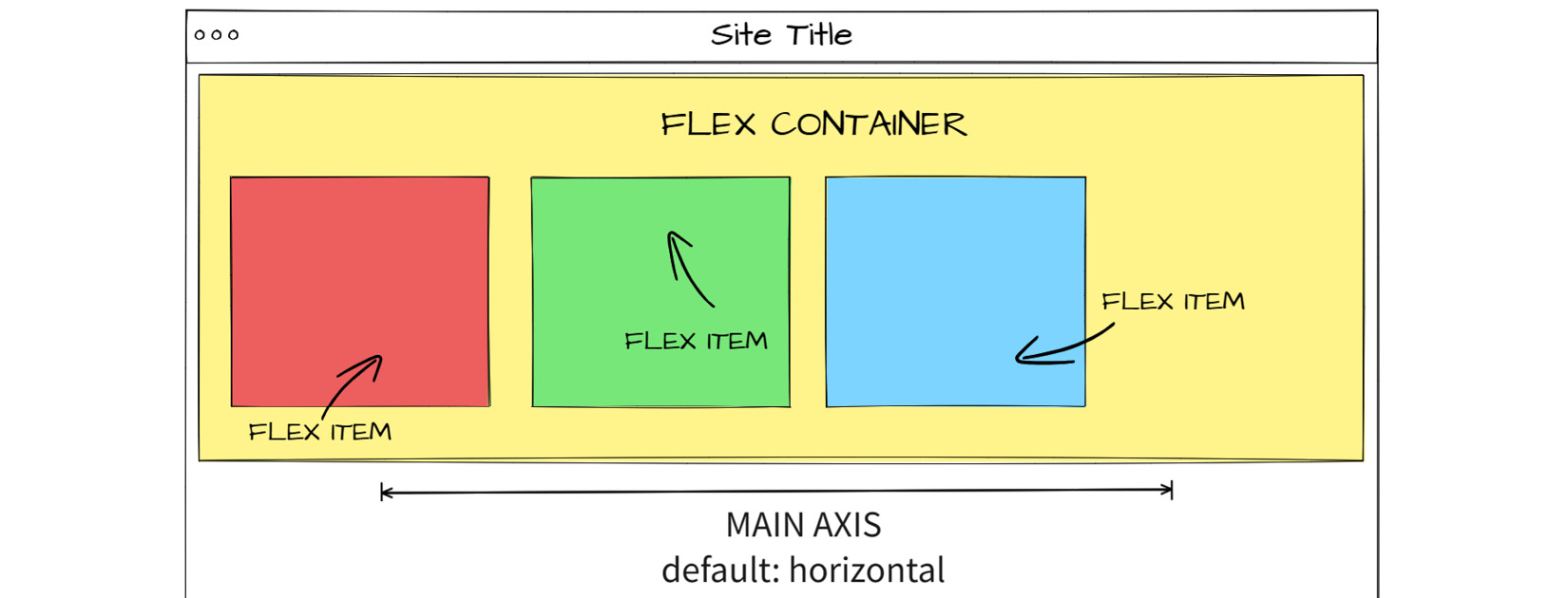
Figure 8.11: Flexbox schema

Figure 8.11: Flexbox schema

To make the most of CSS Flexbox, let’s delve deeper into its properties and explore how to use them effectively.

Flexbox...

lock icon The rest of the chapter is locked
Register for a free Packt account to unlock a world of extra content!
A free Packt account unlocks extra newsletters, articles, discounted offers, and much more. Start advancing your knowledge today.
Unlock this book and the full library FREE for 7 days
Get unlimited access to 7000+ expert-authored eBooks and videos courses covering every tech area you can think of
Renews at $19.99/month. Cancel anytime
Banner background image