Search icon CANCEL
Subscription
0
Cart icon
Your Cart (0 item)
Close icon
You have no products in your basket yet
Arrow left icon
Explore Products
Best Sellers
New Releases
Books
Videos
Audiobooks
Learning Hub
Free Learning
Arrow right icon
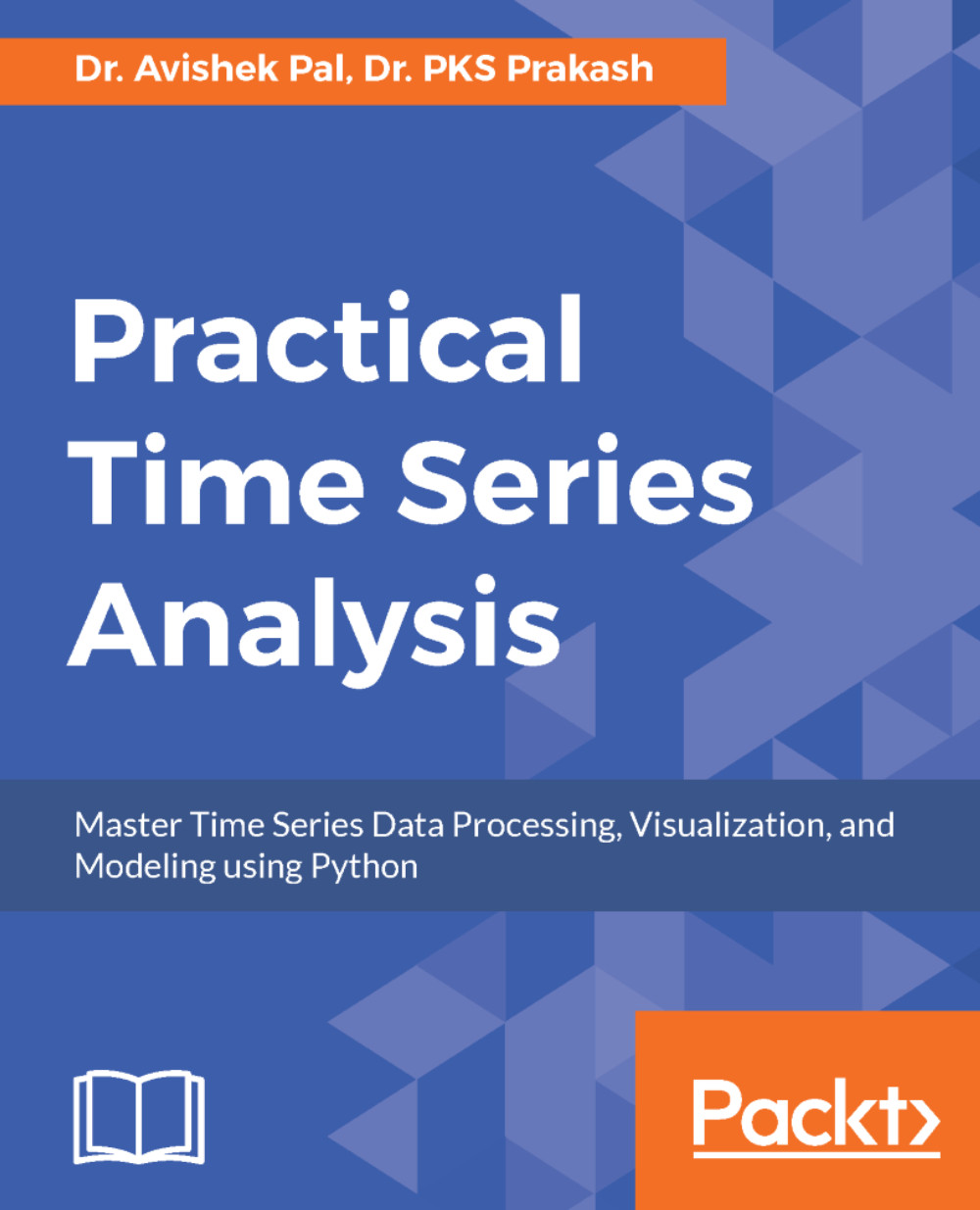
Practical Time Series Analysis

Practical Time Series Analysis: Master Time Series Data Processing, Visualization, and Modeling using Python

Arrow left icon
Profile Icon Avishek Pal Profile Icon PKS Prakash
Arrow right icon
zł59.99 zł158.99
Full star icon Half star icon Empty star icon Empty star icon Empty star icon 1.4 (5 Ratings)
eBook Sep 2017 244 pages 1st Edition
eBook
zł59.99 zł158.99
Paperback
zł197.99
Subscription
Free Trial
Arrow left icon
Profile Icon Avishek Pal Profile Icon PKS Prakash
Arrow right icon
zł59.99 zł158.99
Full star icon Half star icon Empty star icon Empty star icon Empty star icon 1.4 (5 Ratings)
eBook Sep 2017 244 pages 1st Edition
eBook
zł59.99 zł158.99
Paperback
zł197.99
Subscription
Free Trial
eBook
zł59.99 zł158.99
Paperback
zł197.99
Subscription
Free Trial

What do you get with eBook?

Product feature icon Instant access to your Digital eBook purchase
Product feature icon Download this book in EPUB and PDF formats
Product feature icon Access this title in our online reader with advanced features
Product feature icon DRM FREE - Read whenever, wherever and however you want
OR
Modal Close icon
Payment Processing...
tick Completed

Billing Address

Table of content icon View table of contents Preview book icon Preview Book

Practical Time Series Analysis

Introduction to Time Series

The recent few years have witnessed the widespread application of statistics and machine learning to derive actionable insights and business value out of data in almost all industrial sectors. Hence, it is becoming imperative for business analysts and software professionals to be able to tackle different types of datasets. Often, the data is a time series in the form of a sequence of quantitative observations about a system or process and made at successive points in time. Commonly, the points in time are equally spaced. Examples of time series data include gross domestic product, sales volumes, stock prices, weather attributes when recorded over a time spread of several years, months, days, hours, and so on. The frequency of observation depends on the nature of the variable and its applications. For example, gross domestic product, which is used for measuring annual economic progress of a country, is publicly reported every year. Sales volumes are published monthly, quarterly or biyearly, though figures over longer duration of time might have been generated by aggregating more granular data such as daily or weekly sales. Information about stock prices and weather attributes are available at every second. On the other extreme, there are several physical processes which generate time series data at fraction of a second.

Successful utilization of time series data would lead to monitoring the health of the system over time. For example, the performance of a company is tracked from its quarterly profit margins. Time series analysis aims to utilize such data for several purposes that can be broadly categorized as:

  • To understand and interpret the underlying forces that produce the observed state of a system or process over time
  • To forecast the future state of the system or process in terms of observable characteristics

To achieve the aforementioned objectives, time series analysis applies different statistical methods to explore and model the internal structures of the time series data such as trends, seasonal fluctuations, cyclical behavior, and irregular changes. Several mathematical techniques and programming tools exist to effectively design computer programs that can explore, visualize, and model patterns in time series data.

However, before taking a deep dive into these techniques, this chapter aims to explain the following two aspects:

  • Difference between time series and non-time series data
  • Internal structures of time series (some of which have been briefly mentioned in the previous paragraph)

For problem solving, readers would find this chapter useful in order to:

  • Distinguish between time series and non-time series data and hence choose the right approach to formulate and solve a given problem.
  • Select the appropriate techniques for a time series problem. Depending on the application, one may choose to focus on one or more internal structures of the time series data.

At the end of this chapter, you will understand the different types of datasets you might have to deal with in your analytics project and be able to differentiate time series from non-time series. You will also know about the special internal structures of data which makes it a time series. The overall concepts learnt from this chapter will help in choosing the right approach of dealing with time series.

This chapter will cover the following points:

  • Knowing the different types of data you might come across in your analytics projects
  • Understanding the internal structures of data that makes a time series
  • Dealing with auto-correlation, which is the single most important internal structure of a time series and is often the primary focus of time series analysis

Different types of data

Business analysts and data scientists come across many different types of data in their analytics projects. Most data commonly found in academic and industrial projects can be broadly classified into the following categories:

  • Cross-sectional data
  • Time series data
  • Panel data

Understanding what type of data is needed to solve a problem and what type of data can be obtained from available sources is important for formulating the problem and choosing the right methodology for analysis.

Cross-sectional data

Cross-sectional data or cross-section of a population is obtained by taking observations from multiple individuals at the same point in time. Cross-sectional data can comprise of observations taken at different points in time, however, in such cases time itself does not play any significant role in the analysis. SAT scores of high school students in a particular year is an example of cross-sectional data. Gross domestic product of countries in a given year is another example of cross-sectional data. Data for customer churn analysis is another example of cross-sectional data. Note that, in case of SAT scores of students and GDP of countries, all the observations have been taken in a single year and this makes the two datasets cross-sectional. In essence, the cross-sectional data represents a snapshot at a given instance of time in both the cases. However, customer data for churn analysis can be obtained from over a span of time such as years and months. But for the purpose of analysis, time might not play an important role and therefore though customer churn data might be sourced from multiple points in time, it may still be considered as a cross-sectional dataset.

Often, analysis of cross-sectional data starts with a plot of the variables to visualize their statistical properties such as central tendency, dispersion, skewness, and kurtosis. The following figure illustrates this with the univariate example of military expenditure as a percentage of Gross Domestic Product of 85 countries in the year 2010. By taking the data from a single year we ensure its cross-sectional nature. The figure combines a normalized histogram and a kernel density plot in order to highlight different statistical properties of the military expense data.

As evident from the plot, military expenditure is slightly left skewed with a major peak at roughly around 1.0 %. A couple of minor peaks can also be observed near 6.0 % and 8.0 %.

Figure 1.1: Example of univariate cross-sectional data

Exploratory data analysis such as the one in the preceding figure can be done for multiple variables as well in order to understand their joint distribution. Let us illustrate a bivariate analysis by considering total debt of the countries' central governments along with their military expenditure in 2010. The following figure shows the joint distributions of these variables as kernel density plots. The bivariate joint distribution shows no clear correlation between the two, except may be for lower values of military expenditure and debt of central government.

Figure 1.2: Example of bi-variate cross-sectional data
It is noteworthy that analysis of cross-sectional data extends beyond exploratory data analysis and visualization as shown in the preceding example. Advanced methods such as cross-sectional regression fit a linear regression model between several explanatory variables and a dependent variable. For example, in case of customer churn analysis, the objective could be to fit a logistic regression model between customer attributes and customer behavior described by churned or not-churned. The logistic regression model is a special case of generalized linear regression for discrete and binary outcome. It explains the factors that make customers churn and can predict the outcome for a new customer. Since time is not a crucial element in this type of cross-sectional data, predictions can be obtained for a new customer at a future point in time. In this book, we discuss techniques for modeling time series data in which time and the sequential nature of observations are crucial factors for analysis.

The dataset of the example on military expenditures and national debt of countries has been downloaded from the Open Data Catalog of World Bank. You can find the data in the WDIData.csv file under the datasets folder of this book's GitHub repository.

All examples in this book are accompanied by an implementation of the same in Python. So let us now discuss the Python program written to generate the preceding figures. Before we are able to plot the figures, we must read the dataset into Python and familiarize ourselves with the basic structure of the data in terms of columns and rows found in the dataset. Datasets used for the examples and figures, in this book, are in Excel or CSV format. We will use the pandas package to read and manipulate the data. For visualization, matplotlib and seaborn are used. Let us start by importing all the packages to run this example:

from __future__ import print_function 
import os 
import pandas as pd 
import numpy as np 
%matplotlib inline 
from matplotlib import pyplot as plt 
import seaborn as sns 

The print_function has been imported from the __future__ package to enable using print as a function for readers who might be using a 2.x version of Python. In Python 3.x, print is by default a function. As this code is written and executed from an IPython notebook, %matplotlib inline ensures that the graphics packages are imported properly and made to work in the HTML environment of the notebook. The os package is used to set the working directory as follows:

os.chdir('D:\Practical Time Series') 

Now, we read the data from the CSV file and display basic information about it:

data = pd.read_csv('datasets/WDIData.csv') 
print('Column names:', data.columns) 

This gives us the following output showing the column names of the dataset:

Column names: Index([u'Country Name', u'Country Code', u'Indicator Name', 
     u'Indicator Code', u'1960', u'1961', u'1962', u'1963', u'1964',  u'1965', 
       u'1966', u'1967', u'1968', u'1969', u'1970', u'1971', u'1972', u'1973', 
       u'1974', u'1975', u'1976', u'1977', u'1978', u'1979', u'1980', u'1981', 
       u'1982', u'1983', u'1984', u'1985', u'1986', u'1987', u'1988', u'1989', 
       u'1990', u'1991', u'1992', u'1993', u'1994', u'1995', u'1996', u'1997', 
       u'1998', u'1999', u'2000', u'2001', u'2002', u'2003', u'2004', u'2005', 
       u'2006', u'2007', u'2008', u'2009', u'2010', u'2011', u'2012', u'2013', 
       u'2014', u'2015', u'2016'], 
      dtype='object') 

Let us also get a sense of the size of the data in terms of number of rows and columns by running the following line:

print('No. of rows, columns:', data.shape) 

This returns the following output:

No. of rows, columns: (397056, 62) 

This dataset has nearly 400k rows because it captures 1504 world development indicators for 264 different countries. This information about the unique number of indicators and countries can be obtained by running the following four lines:

nb_countries = data['Country Code'].unique().shape[0] 
print('Unique number of countries:', nb_countries) 

As it appears from the structure of the data, every row gives the observations about an indicator that is identified by columns Indicator Name and Indicator Code and for the country, which is indicated by the columns Country Name and Country Code. Columns 1960 through 2016 have the values of an indicator during the same period of time. With this understanding of how the data is laid out in the DataFrame, we are now set to extract the rows and columns that are relevant for our visualization.

Let us start by preparing two other DataFrames that get the rows corresponding to the indicators Total Central Government Debt (as % of GDP) and Military expenditure (% of GDP) for all the countries. This is done by slicing the original DataFrame as follows:

central_govt_debt = data.ix[data['Indicator Name']=='Central government debt, total (% of GDP)'] 
military_exp = data.ix[data['Indicator Name']=='Military expenditure (% of GDP)'] 

The preceding two lines create two new DataFrames, namely central_govt_debt and military_exp. A quick check about the shapes of these DataFrames can be done by running the following two lines:

print('Shape of central_govt_debt:', central_govt_debt.shape) 
print('Shape of military_exp:', military_exp.shape) 

These lines return the following output:

Shape of central_govt_debt: (264, 62) 
Shape of military_exp: (264, 62) 

These DataFrames have all the information we need. In order to plot the univariate and bivariate cross-sectional data in the preceding figure, we need the column 2010. Before we actually run the code for plotting, let us quickly check if the column 2010 has missing. This is done by the following two lines:

central_govt_debt['2010'].describe() 
military_exp['2010'].describe() 

Which generate the following outputs respectively:

count     93.000000 
mean      52.894412 
std       30.866372 
min        0.519274 
25%             NaN 
50%             NaN 
75%             NaN 
max      168.474953 
Name: 2010, dtype: float64 
count    194.000000 
mean       1.958123 
std        1.370594 
min        0.000000 
25%             NaN 
50%             NaN 
75%             NaN 
max        8.588373 
Name: 2010, dtype: float64 

Which tells us that the describe function could not compute the 25th, 50th, and 75th quartiles for either, hence there are missing values to be avoided.

Additionally, we would like the Country Code column to be the row indices. So the following couple of lines are executed:

central_govt_debt.index = central_govt_debt['Country Code'] 
military_exp.index = military_exp['Country Code'] 

Next, we create two pandas.Series by taking non-empty 2010 columns from central_govt_debt and military_exp. The newly created Series objects are then merged into to form a single DataFrame:

central_govt_debt_2010 = central_govt_debt['2010'].ix[~pd.isnull(central_govt_debt['2010'])] 
military_exp_2010 = military_exp['2010'].ix[~pd.isnull(military_exp['2010'])] 
data_to_plot = pd.concat((central_govt_debt_2010, military_exp_2010), axis=1) 
data_to_plot.columns = ['central_govt_debt', 'military_exp'] 
data_to_plot.head() 

The preceding lines return the following table that shows that not all countries have information on both Central Government Debt and Military Expense for the year 2010:

central_govt_debt

military_exp

AFG

NaN

1.897473

AGO

NaN

4.244884

ALB

NaN

1.558592

ARB

NaN

5.122879

ARE

NaN

6.119468

ARG

NaN

0.814878

ARM

NaN

4.265646

ATG

75.289093

NaN

AUS

29.356946

1.951809

AUT

79.408304

0.824770

To plot, we have to take only those countries that have both central government debt and military expense. Run the following line, to filter out rows with missing values:

data_to_plot = data_to_plot.ix[(~pd.isnull(data_to_plot.central_govt_debt)) & (~pd.isnull(data_to_plot.military_exp)), :] 

The first five rows of the filtered DataFrame are displayed by running the following line:

data_to_plot.head() 

central_govt_debt

military_exp

AUS

29.356946

1.951809

AUT

79.408304

0.824770

AZE

6.385576

2.791004

BEL

7.022605

1.084631

BGR

21.286254

1.765384

AUS

29.356946

1.951809

AUT 79.408304 0.824770
AZE 6.385576 2.791004
BEL 7.022605 1.084631
BGR 21.286254 1.765384


The preceding table has only non-empty values and we are now ready to generate the plots for the cross-sectional data. The following lines of code generate the plot on the univariate cross-sectional data on military expense:

plt.figure(figsize=(5.5, 5.5)) 
g = sns.distplot(np.array(data_to_plot.military_exp), norm_hist=False) 
g.set_title('Military expenditure (% of GDP) of 85 countries in 2010') 

The plot is saved as a png file under the plots/ch1 folder of this book's GitHub repository. We will also generate the bivariate plot between military expense and central government debt by running the following code:

plt.figure(figsize=(5.5, 5.5)) 
g = sns.kdeplot(data_to_plot.military_exp, data2=data_to_plot.central_govt_debt) 
g.set_title('Military expenditures & Debt of central governments in 2010') 

Time series data

The example of cross-sectional data discussed earlier is from the year 2010 only. However, instead if we consider only one country, for example United States, and take a look at its military expenses and central government debt for a span of 10 years from 2001 to 2010, that would get two time series - one about the US federal military expenditure and the other about debt of US federal government. Therefore, in essence, a time series is made up of quantitative observations on one or more measurable characteristics of an individual entity and taken at multiple points in time. In this case, the data represents yearly military expenditure and government debt for the United States. Time series data is typically characterized by several interesting internal structures such as trend, seasonality, stationarity, autocorrelation, and so on. These will be conceptually discussed in the coming sections in this chapter.

The internal structures of time series data require special formulation and techniques for its analysis. These techniques will be covered in the following chapters with case studies and implementation of working code in Python.

The following figure plots the couple of time series we have been talking about:

Figure 1.3: Examples of time series data

In order to generate the preceding plots we will extend the code that was developed to get the graphs for the cross-sectional data. We will start by creating two new Series to represent the time series of military expenses and central government debt of the United States from 1960 to 2010:

central_govt_debt_us = central_govt_debt.ix[central_govt_debt['Country Code']=='USA', :].T 
military_exp_us = military_exp.ix[military_exp['Country Code']=='USA', :].T 

The two Series objects created in the preceding code are merged to form a single DataFrame and sliced to hold data for the years 2001 through 2010:

data_us = pd.concat((military_exp_us, central_govt_debt_us), axis=1) 
index0 = np.where(data_us.index=='1960')[0][0] 
index1 = np.where(data_us.index=='2010')[0][0] 
data_us = data_us.iloc[index0:index1+1,:] 
data_us.columns = ['Federal Military Expenditure', 'Debt of Federal  Government'] 
data_us.head(10)  

The data prepared by the preceding code returns the following table:

Federal Military Expenditure

Debt of Federal Government

1960

NaN

NaN

1961

NaN

NaN

1962

NaN

NaN

1963

NaN

NaN

1964

NaN

NaN

1965

NaN

NaN

1966

NaN

NaN

1967

NaN

NaN

1968

NaN

NaN

1969

NaN

NaN

The preceding table shows that data on federal military expenses and federal debt is not available from several years starting from 1960. Hence, we drop the rows with missing values from the Dataframe data_us before plotting the time series:

data_us.dropna(inplace=True)
print('Shape of data_us:', data_us.shape)

As seen in the output of the print function, the DataFrame has twenty three rows after dropping the missing values:

Shape of data_us: (23, 2)

After dropping rows with missing values, we display the first ten rows of data_us are displayed as follows:

Federal Military Expenditure

Debt of Federal Government

1988

5.57993

42.0258

1989

5.37472

43.1439

1990

5.12025

45.3772

1991

4.53985

48.633

1992

4.66626

50.6016

1993

4.32693

50.1657

1994

3.94129

49.3475

1995

3.63849

49.2366

1996

3.35074

46.7174

1997

3.2099

43.2997

Finally, the time series are generated by executing the following code:

# Two subplots, the axes array is 1-d
f, axarr = plt.subplots(2, sharex=True)
f.set_size_inches(5.5, 5.5)
axarr[0].set_title('Federal Military Expenditure during 1988-2010 (% of GDP)')
data_us['Federal Military Expenditure'].plot(linestyle='-', marker='*', color='b', ax=axarr[0])
axarr[1].set_title('Debt of Federal Government during 1988-2010 (% of GDP)')
data_us['Debt of Federal Government'].plot(linestyle='-', marker='*', color='r', ax=axarr[1])

Panel data

So far, we have seen data taken from multiple individuals but at one point in time (cross-sectional) or taken from an individual entity but over multiple points in time (time series). However, if we observe multiple entities over multiple points in time we get a panel data also known as longitudinal data. Extending our earlier example about the military expenditure, let us now consider four countries over the same period of 1960-2010. The resulting data will be a panel dataset. The figure given below illustrates the panel data in this scenario. Rows with missing values, corresponding to the period 1960 to 1987 have been dropped before plotting the data.

Figure 1.4: Example of panel data
A generic panel data regression model can be stated as y_it = W x _it +b+ ϵ _it, which expresses the dependent variable y_it as a linear model of explanatory variable x_it, where W are weights of x_it, b is the bias term, and ϵ_it is the error. i represents individuals for whom data is collected for multiple points in time represented by j. As evident, this type of panel data analysis seeks to model the variations across both multiple individual and multiple points in time. The variations are reflected by ϵ _it and assumptions determine the necessary mathematical treatment. For example, if ϵ_it is assumed to vary non-stochastically with respect to i and t, then it reduces to a dummy variable representing random noise. This type of analysis is known as fixed effects model. On the other hand, ϵ_it varying stochastically over i and t requires a special treatment of the error and is dealt in a random effects model.

Let us prepare the data that is required to plot the preceding figure. We will continue to expand the code we have used for the cross-sectional and time series data previously in this chapter. We start by creating a DataFrame having the data for the four companies mentioned in the preceding plot. This is done as follows:

chn = data.ix[(data['Indicator Name']=='Military expenditure (% of GDP)')&\
(data['Country Code']=='CHN'),index0:index1+1
]
chn = pd.Series(data=chn.values[0], index=chn.columns)
chn.dropna(inplace=True)

usa = data.ix[(data['Indicator Name']=='Military expenditure (% of GDP)')&\
(data['Country Code']=='USA'),index0:index1+1
]
usa = pd.Series(data=usa.values[0], index=usa.columns)
usa.dropna(inplace=True)

ind = data.ix[(data['Indicator Name']=='Military expenditure (% of GDP)')&\
(data['Country Code']=='IND'),index0:index1+1
]
ind = pd.Series(data=ind.values[0], index=ind.columns)
ind.dropna(inplace=True)

gbr = data.ix[(data['Indicator Name']=='Military expenditure (% of GDP)')&\
(data['Country Code']=='GBR'),index0:index1+1
]
gbr = pd.Series(data=gbr.values[0], index=gbr.columns)
gbr.dropna(inplace=True)

Now that the data is ready for all five countries, we will plot them using the following code:

plt.figure(figsize=(5.5, 5.5))
usa.plot(linestyle='-', marker='*', color='b')
chn.plot(linestyle='-', marker='*', color='r')
gbr.plot(linestyle='-', marker='*', color='g')
ind.plot(linestyle='-', marker='*', color='y')
plt.legend(['USA','CHINA','UK','INDIA'], loc=1)
plt.title('Miltitary expenditure of 5 countries over 10 years')
plt.ylabel('Military expenditure (% of GDP)')
plt.xlabel('Years')s
The Jupyter notebook that has the code used for generating all the preceding figures is Chapter_1_Different_Types_of_Data.ipynb under the code folder in the GitHub repo.

The discussion about different types of data sets the stage for a closer look at time series. We will start doing that by understanding the special properties of data that can be typically found in a time series or panel data with inherent time series in it.

Internal structures of time series

In this section, we will conceptually explain the following special characteristics of time series data that requires its special mathematical treatment:

  • General trend
  • Seasonality
  • Cyclical movements
  • Unexpected variations

Most time series has of one or more of the aforementioned internal structures. Based on this notion, a time series can be expressed as xt = ft + st + ct + et, which is a sum of the trend, seasonal, cyclical, and irregular components in that order. Here, t is the time index at which observations about the series have been taken at t = 1,2,3 ...N successive and equally spaced points in time.

The objective of time series analysis is to decompose a time series into its constituent characteristics and develop mathematical models for each. These models are then used to understand what causes the observed behavior of the time series and to predict the series for future points in time.

General trend

When a time series exhibits an upward or downward movement in the long run, it is said to have a general trend. A quick way to check the presence of general trend is to plot the time series as in the following figure, which shows CO2 concentrations in air measured during 1974 through 1987:

Figure 1.5: Time series of CO2 readings with an upward trend

However, general trend might not be evident over a short run of the series. Short run effects such as seasonal fluctuations and irregular variations cause the time series to revisit lower or higher values observed in the past and hence can temporarily obfuscate any general trend. This is evident in the same time series of CO2 concentrations when zoomed in over the period of 1979 through 1981, as shown in the following figure. Hence to reveal general trend, we need a time series that dates substantially back in the past.

Figure 1.6: Shorter run of CO2 readings time series which is not able to reveal general trend

The general trend in the time series is due to fundamental shifts or systemic changes of the process or system it represents. For example, the upward movement of CO2 concentrations during 1974 through 1987 can be attributed to the gradual rise in automobiles and industrialization over these years.

A general trend is commonly modeled by setting up the time series as a regression against time and other known factors as explanatory variables. The regression or trend line can then be used as a prediction of the long run movement of the time series. Residuals left by the trend line is further analyzed for other interesting properties such as seasonality, cyclical behavior, and irregular variations.

Now, let us go through the code that generated the preceding plots on CO2 concentrations. We will also show how to build a trend model using linear regression on the time index (which in this case is the index of the year in the data) as explanatory variable and the CO2 concentration as the dependent variable. But first, let us load the data in a pandas.DataFrame.

The data for this example is in the Excel file Monthly_CO2_Concentrations.xlsx under the datasets folder of the GitHub repo.

We start by importing the required packages as follows:

from __future__ import print_function 
import os 
import pandas as pd 
import numpy as np 
%matplotlib inline 
from matplotlib import pyplot as plt 
import seaborn as sns 
os.chdir('D:\Practical Time Series') 
data = pd.read_excel('datasets/Monthly_CO2_Concentrations.xlsx',                                  converters={'Year': np.int32, 'Month':  np.int32}) 
data.head() 

We have passed the argument converters to the read_excel function in order to make sure that columns Year and Month are assigned the integer (np.int32) datatype. The preceding lines of code will generate the following table:

CO2

Year

Month

0

333.13

1974

5

1

332.09

1974

6

2

331.10

1974

7

3

329.14

1974

8

4

327.36

1974

9

Before plotting we must remove all columns having missing values. Besides, the DataFrame is sorted in ascending order of Year and Month. These are done as follows:

data = data.ix[(~pd.isnull(data['CO2']))&\ 
               (~pd.isnull(data['Year']))&\ 
               (~pd.isnull(data['Month']))] 
data.sort_values(['Year', 'Month'], inplace=True) 

Finally, the plot for the time period 1974 to 1987 is generated by executing the following lines:

plt.figure(figsize=(5.5, 5.5))
data['CO2'].plot(color='b')
plt.title('Monthly CO2 concentrations')
plt.xlabel('Time')
plt.ylabel('CO2 concentratition')
plt.xticks(rotation=30)

The zoomed-in version of the data for the time period 1980 to 1981 is generated by after the DataFrame for these three years:

plt.figure(figsize=(5.5, 5.5))
data['CO2'].loc[(data['Year']==1980) | (data['Year']==1981)].plot(color='b')
plt.title('Monthly CO2 concentrations')
plt.xlabel('Time')
plt.ylabel('CO2 concentratition')
plt.xticks(rotation=30)

Next, let us fit the trend line. For this we import the LinearRegression class from scikit-learn and fit a linear model on the time index:

from sklearn.linear_model import LinearRegression 
trend_model = LinearRegression(normalize=True, fit_intercept=True) 
trend_model.fit(np.array(data.index).reshape((-1,1)), data['CO2']) 
print('Trend model coefficient={} and intercept={}'.format(trend_model.coef_[0], 
                                                           trend_model.intercept_) 
      ) 

This produces the following output:

Trend model coefficient=0.111822078545 and intercept=329.455422234 

The residuals obtained from the trend line model are shown in the following figure and appear to have seasonal behaviour, which is discussed in the next sub section.

The residuals are calculated and plotted in the preceding by the following lines of code:

residuals = np.array(data['CO2']) - trend_model.predict(np.array(data.index).reshape((-1,1)))
plt.figure(figsize=(5.5, 5.5))
pd.Series(data=residuals, index=data.index).plot(color='b')
plt.title('Residuals of trend model for CO2 concentrations')
plt.xlabel('Time')
plt.ylabel('CO2 concentratition')
plt.xticks(rotation=30)
Figure 1.7: Residuals from a linear model of the general trend in CO2 readings

Seasonality

Seasonality manifests as repetitive and period variations in a time series. In most cases, exploratory data analysis reveals the presence of seasonality. Let us revisit the de-trended time series of the CO2 concentrations. Though the de-trended line series has constant mean and constant variance, it systematically departs from the trend model in a predictable fashion.

Seasonality is manifested as periodic deviations such as those seen in the de-trended observations of CO2 emissions. Peaks and troughs in the monthly sales volume of seasonal goods such as Christmas gifts or seasonal clothing is another example of a time series with seasonality.

A practical technique of determining seasonality is through exploratory data analysis through the following plots:

  • Run sequence plot
  • Seasonal sub series plot
  • Multiple box plots

Run sequence plot

A simple run sequence plot of the original time series with time on x-axis and the variable on y-axis is good for indicating the following properties of the time series:

  • Movements in mean of the series
  • Shifts in variance
  • Presence of outliers

The following figure is the run sequence plot of a hypothetical time series that is obtained from the mathematical formulation xt = (At + B) sin(t) + Є(t) with a time-dependent mean and error Є(t) that varies with a normal distribution N(0, at + b) variance. Additionally, a few exceptionally high and low observations are also included as outliers.

In cases such as this, a run sequence plot is an effective way of identifying shifting mean and variance of the series as well as outliers. The plot of the de-trended time series of the CO2 concentrations is an example of a run sequence plot.

Seasonal sub series plot

For a known periodicity of seasonal variations, seasonal sub series redraws the original series over batches of successive time periods. For example, the periodicity in the CO2 concentrations is 12 months and based on this a seasonal sub series plots on mean and standard deviation of the residuals are shown in the following figure. To visualize seasonality in the residuals, we create quarterly mean and standard deviations.

A seasonal sub series reveals two properties:

  • Variations within seasons as within a batch of successive months
  • Variations between seasons as between batches of successive months
Figure 1.8: Quarterly mean of the residuals from a linear model of the general trend in CO2 readings
Figure 1.9: Quarterly standard deviation of the residuals from a linear model of the general trend in CO2 readings

Let us now describe the code used for generating the preceding plots. First, we need to add the residuals and quarter labels to the CO2 concentrations DataFrame. This is done as follows:

data['Residuals'] = residuals 
month_quarter_map = {1: 'Q1', 2: 'Q1', 3: 'Q1', 
                     4: 'Q2', 5: 'Q2', 6: 'Q2', 
                     7: 'Q3', 8: 'Q3', 9: 'Q3', 
                     10: 'Q4', 11: 'Q4', 12: 'Q4' 
                    } 
data['Quarter'] = data['Month'].map(lambda m: month_quarter_map.get(m)) 

Next, the seasonal mean and standard deviations are computed by grouping by the data over Year and Quarter:

seasonal_sub_series_data = data.groupby(by=['Year', 'Quarter'])['Residuals']\ 
                           .aggregate([np.mean, np.std]) 

This creates the new DataFrame as seasonal_sub_series_data, which has quarterly mean and standard deviations over the years. These columns are renamed as follows:

seasonal_sub_series_data.columns = ['Quarterly Mean', 'Quarterly Standard Deviation'] 

Next, the quarterly mean and standard deviations are plotted by running the following lines of code:

#plot quarterly mean of residuals
plt.figure(figsize=(5.5, 5.5))
seasonal_sub_series_data['Quarterly Mean'].plot(color='b')
plt.title('Quarterly Mean of Residuals')
plt.xlabel('Time')
plt.ylabel('CO2 concentratition')
plt.xticks(rotation=30)

#plot quarterly standard deviation of residuals
plt.figure(figsize=(5.5, 5.5))
seasonal_sub_series_data['Quarterly Standard Deviation'].plot(color='b')
plt.title('Quarterly Standard Deviation of Residuals')
plt.xlabel('Time')
plt.ylabel('CO2 concentratition')
plt.xticks(rotation=30)

Multiple box plots

The seasonal sub series plot can be more informative when redrawn with seasonal box plots as shown in the following figure. A box plot displays both central tendency and dispersion within the seasonal data over a batch of time units. Besides, separation between two adjacent box plots reveal the within season variations:

Figure 1.10: Quarterly boxplots of the residuals from a linear model of the general trend in CO2 readings

The code for generating the box plots is as follows:

plt.figure(figsize=(5.5, 5.5)) 
g = sns.boxplot(data=data, y='Residuals', x='Quarter') 
g.set_title('Quarterly Mean of Residuals') 
g.set_xlabel('Time') 
g.set_ylabel('CO2 concentratition') 

Cyclical changes

Cyclical changes are movements observed after every few units of time, but they occur less frequently than seasonal fluctuations. Unlike seasonality, cyclical changes might not have a fixed period of variations. Besides, the average periodicity for cyclical changes would be larger (most commonly in years), whereas seasonal variations are observed within the same year and corresponds to annual divisions of time such as seasons, quarters, and periods of festivity and holidays and so on.

A long run plot of the time series is required to identify cyclical changes that can occur, for example, every few years and manifests as repetitive crests and troughs. In this regard, time series related to economics and business often show cyclical changes that correspond to usual business and macroeconomic cycles such as periods of recessions followed by every of boom, but are separated by few years of time span. Similar to general trends, identifying cyclical movements might require data that dates significantly back in the past.

The following figure illustrates cyclical changes occurring in inflation of consumer price index (CPI) for India and United States over the period of 1960 through 2016. Both the countries exhibit cyclical patterns in CPI inflation, which is roughly over a period of 2-2.5 years. Moreover, CPI inflation of India has larger variations pre-1990 than that seen after 1990.

Figure 1.11: Example of cyclical movements in time series data

Source: The data for the preceding figure has been downloaded from http://datamarket.com, which maintains data on time series from a wide variety of subjects.

You can find the CPI inflation dataset in file inflation-consumer-prices-annual.xlsx, which is in the datasetsfolder, on the GitHub repository.

The code written to generate the figure is as follows:

inflation = pd.read_excel('datasets/inflation-consumer-prices-annual.xlsx', parse_dates=['Year']) 
plt.figure(figsize=(5.5, 5.5)) 
plt.plot(range(1960,2017), inflation['India'], linestyle='-', marker='*', color='r') 
plt.plot(range(1960,2017), inflation['United States'], linestyle='-', marker='.', color='b') 
plt.legend(['India','United States'], loc=2) 
plt.title('Inflation in Consumer Price Index') 
plt.ylabel('Inflation') 
plt.xlabel('Years') 

Unexpected variations

Referring to our model that expresses a time series as a sum of four components, it is noteworthy that in spite of being able to account for the three other components, we might still be left with an irreducible error component that is random and does not exhibit systematic dependency on the time index. This fourth component reflects unexpected variations in the time series. Unexpected variations are stochastic and cannot be framed in a mathematical model for a definitive future prediction. This type of error is due to lack of information about explanatory variables that can model these variations or due to presence of a random noise.

The IPython notebook for all the code developed in this section is in the file Chapter_1_Internal_Structures.ipynb in the code folder of this book's GitHub repository.

Models for time series analysis

The purpose of time series analysis is to develop a mathematical model that can explain the observed behavior of a time series and possibly forecast the future state of the series. The chosen model should be able to account for one or more of the internal structures that might be present. To this end, we will give an overview of the following general models that are often used as building blocks of time series analysis:

  • Zero mean models
  • Random walk
  • Trend models
  • Seasonality models

Zero mean models

The zero-mean models have a constant mean and constant variance and shows no predictable trends or seasonality. Observations from a zero mean model are assumed to be independent and identically distributed (iid) and represent the random noise around a fixed mean, which has been deducted from the time series as a constant term.

Let us consider that X1, X2, ... ,Xn represent the random variables corresponding to n observations of a zero mean model. If x1, x2, ... ,xn are n observations from the zero mean time series, then the joint distribution of the observations is given as a product of probability mass function for every time index as follows:

P(X1 = x1,X2 = x2 , ... , Xn = xn) = f(X1 = x1) f(X2 = x2) ... f(Xn = xn)

Most commonly f(Xt = xt) is modeled by a normal distribution of mean zero and variance σ 2, which is assumed to be the irreducible error of the model and hence treated as a random noise. The following figure shows a zero-mean series of normally distributed random noise of unit variance:

Figure 1.12: Zero-mean time series

The preceding plot is generated by the following code:

import os 
import numpy as np 
%matplotlib inline 
from matplotlib import pyplot as plt 
import seaborn as sns 
os.chdir('D:/Practical Time Series/') 
zero_mean_series = np.random.normal(loc=0.0, scale=1., size=100) 

The zero mean with constant variance represents a random noise that can assume infinitely possible real values and is suited for representing irregular variations in the time series of a continuous variable. However in many cases, the observable state of the system or process might be discrete in nature and confined to a finite number of possible values s1,s2, ... , sm. In such cases, the observed variable (X) is assumed to obey the multinomial distribution, P(X = s1 )= p1, P(X = s2 ) = p2,…,P(X = sm) = pm such that p1 + p2 + ... + pm = 1. Such a time series is a discrete stochastic process.

Multiple throws a dice over time is an example of a discrete stochastic process with six possible outcomes for any throw. A simpler discrete stochastic process is a binary process such as tossing a coin such as only two outcomes namely head and tail. The following figure shows 100 runs from a simulated process of throwing a biased dice for which probability of turning up an even face is higher than that of showing an odd face. Note the higher number of occurrences of even faces, on an average, compared to the number of occurrences of odd faces.

Random walk

A random walk is given as a sum of n iids, which has zero mean and constant variance. Based on this definition, the realization of a random walk at time index t is given by the sum S = x1 + x2 + ... + xn. The following figure shows the random walk obtained from iids, which vary according to a normal distribution of zero mean and unit variance.

The random walk is important because if such behavior is found in a time series, it can be easily reduced to zero mean model by taking differences of the observations from two consecutive time indices as St - St-1 = xt is an iid with zero mean and constant variance.

Figure 1.13: Random walk time series

The random walk in the preceding figure can be generated by taking the cumulative sum of the zero mean model discussed in the previous section. The following code implements this:

random_walk = np.cumsum(zero_mean_series) 
plt.figure(figsize=(5.5, 5.5)) 
g = sns.tsplot(random_walk) 
g.set_title('Random Walk') 
g.set_xlabel('Time index') 

Trend models

This type of model aims to capture the long run trend in the time series that can be fitted as linear regression of the time index. When the time series does not exhibit any periodic or seasonal fluctuations, it can be expressed just as the sum of the trend and the zero mean model as xt = μ(t) + yt, where μ(t) is the time-dependent long run trend of the series.

The choice of the trend model μ(t) is critical to correctly capturing the behavior of the time series. Exploratory data analysis often provides hints for hypothesizing whether the model should be linear or non-linear in t. A linear model is simply μ(t) = wt + b, whereas quadratic model is μ(t) = w1t + w2t2 + b. Sometimes, the trend can be hypothesized by a more complex relationship in terms of the time index such as μ(t) = w0tp + b.

The weights and biases in the trend modes such as the ones discussed previously is obtained by running a regression with t as the explanatory variable and μ as the explained. The residuals xt - μ(t) of the trend model is considered to the irreducible noise and as realization of the zero mean component yt.

Seasonality models

Seasonality manifests as periodic and repetitive fluctuations in a time series and hence are modeled as sum of weighted sum of sine waves of known periodicity. Assuming that long run trend has been removed by a trend line, the seasonality model can be expressed as xt = st + yt, where the seasonal variation with known periodicity is α.

Seasonality models are also known as harmonic regression model as they attempt to fit the sum of multiple sin waves.

The four models described here are building blocks of a fully-fledged time series model. As you might have gathered by now, a zero sum model represents irreducible error of the system and all of other three models aim to transform a given time series to the zero sum models through suitable mathematical transformations. To get forecasts in terms of the original time series, relevant inverse transformations are applied.

The upcoming chapters detail the four models discussed here. However, we have reached a point where we can summarize the generic approach of a time series analysis in the following four steps:

  • Visualize the data at different granularities of the time index to reveal long run trends and seasonal fluctuations
  • Fit trend line capture long run trends and plot the residuals to check for seasonality or irreducible error
  • Fit a harmonic regression model to capture seasonality
  • Plot the residuals left by the seasonality model to check for irreducible error

These steps are most commonly enough to develop mathematical models for most time series. The individual trend and seasonality models can be simple or complex depending on the original time series and the application.

The code written in this section can be found in the Chapter_1_Models_for_Time_Series_Analysis.ipynb IPython notebook located in the code folder of this book's GitHub repository.

Autocorrelation and Partial autocorrelation

After applying the mathematical transformations discussed in the previous section, we will often be left with what is known as a stationary (or weakly stationary) time series, which is characterized by a constant mean E(xt) and correlation that depends only on the time lag between two time steps, but independent of the value of the time step. This type of covariance is the key in time series analysis and is called autocovariance or autocorrelation when normalized to the range of -1 to 1. Autocorrelation is therefore expressed as the second order moment E(xt,xt+h) = g(h) that evidently is a function of only the time lag h and independent of the actual time index t. This special definition of autocorrelation ensures that it is a time-independent property and hence can be reliably used for making inference about future realization of the time series.

Autocorrelation reflects the degree of linear dependency between the time series at index t and the time series at indices t-h or t+h. A positive autocorrelation indicates that the present and future values of the time series move in the same direction, whereas negative values means that present and future values move in the opposite direction. If autocorrelation is close to zero, temporal dependencies within the series may be hard to find. Because of this property, autocorrelation is useful in predicting the future state of a time series at h time steps ahead.

Presence of autocorrelation can be identified by plotting the observed values of the autocorrelation function (ACF) for a given time series. This plot is commonly referred as the ACF plot. Let us illustrate how plotting the observed values of the ACF can help in detecting presence of autocorrelation. For this we first plot the daily value of Dow Jones Industrial Average (DJIA) observed during January 2016 to December 2016:

Figure 1.14: Time series of Dow Jones Industrial Average

From the preceding figure, it might be apparent that when DJIA starts rising, it continues to rise for some time and vice-versa. However, we must ascertain this through an ACF plot.

The dataset for this plot has been downloaded from Yahoo! Finance (http://finance.yahoo.com) and kept as DJIA_Jan2016_Dec2016.xlsx under the datasets folder of this book's GitHub repository.

We will use pandas to read data from the Excel file and seaborn along with matplotlib to visualize the time series. Like before, we will also use the os package to set the working directory.

So let us first import these packages:

import os 
import pandas as pd 
%matplotlib inline 
from matplotlib import pyplot as plt 
import seaborn as sns  
os.chdir('D:/Practical Time Series') 

Next, we load the data as a pandas.DataFrame and display its first 10 rows to have a look at the columns of the dataset:

djia_df = pd.read_excel('datasets/DJIA_Jan2016_Dec2016.xlsx') 
djia_df.head(10) 

The preceding code displays the first 10 rows of the dataset as shown in the following table:

Date

Open

High

Low

Close

Adj Close

Volume

0

2016-01-04

17405.480469

17405.480469

16957.630859

17148.939453

17148.939453

148060000

1

2016-01-05

17147.500000

17195.839844

17038.609375

17158.660156

17158.660156

105750000

2

2016-01-06

17154.830078

17154.830078

16817.619141

16906.509766

16906.509766

120250000

3

2016-01-07

16888.359375

16888.359375

16463.630859

16514.099609

16514.099609

176240000

4

2016-01-08

16519.169922

16651.890625

16314.570313

16346.450195

16346.450195

141850000

5

2016-01-11

16358.709961

16461.849609

16232.030273

16398.570313

16398.570313

127790000

6

2016-01-12

16419.109375

16591.349609

16322.070313

16516.220703

16516.220703

117480000

7

2016-01-13

16526.630859

16593.509766

16123.200195

16151.410156

16151.410156

153530000

8

2016-01-14

16159.009766

16482.050781

16075.120117

16379.049805

16379.049805

158830000

9

2016-01-15

16354.330078

16354.330078

15842.110352

15988.080078

15988.080078

239210000

The first column in the preceding table is always the default row index created by the pandas.read_csv function.

We have used the closing value of DJIA, which is given in column Close, to illustrate autocorrelation and the ACF function. The time series plot has been generated as follows:

plt.figure(figsize=(5.5, 5.5)) 
g = sns.tsplot(djia_df['Close']) 
g.set_title('Dow Jones Industrial Average between Jan 2016 - Dec 2016') 
g.set_xlabel('Time') 
g.set_ylabel('Closing Value') 

Next, the ACF is estimated by computing autocorrelation for different values of lag h, which in this case is varied from 0 through 30. The Pandas.Series.autocorr function is used to calculate the autocorrelation for different values the lag. The code for this is given as follows:

lag = range(0,31) 
   djia_acf = [] 
for l in lag: 
    djia_acf.append(djia_df['Close'].autocorr(l)) 

The preceding code, iterates over a list of 31 values of the lag starting from 0 to 30. A lag of 0 indicates autocorrelation of an observation with itself (in other words self-correlation) and hence it is expected to be 1.0 as also confirmed in the following figure. Autocorrelation in DJIA Close values appears to linearly drop with the lag with an apparent change in the rate of the drop at around 18 days. At a lag of 30 days the ACF is a bit over 0.65.

Figure 1.15: Autocorrelation of Dow Jones Industrial Average calculated for various lags

The preceding plot has been generated by the following code:

plt.figure(figsize=(5.5, 5.5)) 
g = sns.pointplot(x=lag, y=djia_acf, markers='.') 
g.set_title('Autocorrelation function for DJIA') 
g.set_xlabel('Lag in terms of number of trading days') 
g.set_ylabel('Autocorrelation function') 
g.set_xticklabels(lag, rotation=90) 
plt.savefig('plots/ch2/B07887_02_11.png', format='png', dpi=300) 

The ACF plot shows that autocorrelation, in the case of DJIA Close values, has a functional dependency on the time lag between observations.

The code developed to run the analysis in this section is in the IPyton notebook Chapter1_Autocorrelation.ipynb under the code folder of the GitHub repository of this book.

We have written a for-loop to calculate the autocorrelation at different lags and plotted the results using the sns.pointplot function. Alternatively, the plot_acf function of statsmodels.graphics.tsaplots to compute and plot the autocorrelation at various lags. Additionally, this function also plots the 95% confidence intervals. Autocorrelation outside these confidence intervals is statistically significant correlation while those which are inside the confidence intervals are due to random noise.
The autocorrelation and confidence intervals generated by the plot_acf is shown in the following figure:

Figure 1.16: Autocorrelation of Dow Jones Industrial Average with 95% confidence intervals

So far, we have discussed autocorrelation which is a measure of linear dependency between variables x_t and x_(t+h). Autoregressive (AR) models captures this dependency as a linear regression between the x_(t+h) and x_t. However, time series tend to carry information and dependency structures in steps and therefore autocorrelation at lag h is also influenced by the intermediate variables x_t, x_(t+1)…x_(t+h-1). Therefore, autocorrelation is not the correct measure of the mutual correlation between x_t and x_(t+h) in the presence of the intermediate variables. Hence, it would erroneous to choose h in AR models based on autocorrelation. Partial autocorrelation solves this problem by measuring the correlation between x_t and x_(t+h) when the influence of the intermediate variables has been removed. Hence partial autocorrelation in time series analysis defines the correlation between x_t and x_(t+h) which is not accounted for by lags t+1 to t+h-1.
Partial autocorrelation helps in identifying the order h of an AR(h) model. Let us plot the partial autocorrelation of DJIA Close Values using plot_pacf as follows:

Figure 1.17: Partial autocorrelation of Dow Jones Industrial Average with 95% confidence intervals

The first partial autocorrelation at lag zero is always 1.0. As seen in the preceding figure, the partial autocorrelation only at lag one is statistically significant while for rest the lags it is within the 95% confidence intervals. Hence, for DJIA Close Values the order of AR models is one.

Summary

In this chapter, we discussed several types of data such as cross-sectional, time series, and panel data. We delved into the special properties that make time series data special. Several examples and working code in Python have been discussed to give an understanding of how exploratory data analysis can be performed on time series to visualize its properties. We also described autocorrelation and partial autocorrelation and graphical techniques to detect these in a time series. The topics discussed in this chapter give us the stage for a more detailed discussion for working on time series data in Python.
In the next chapter, you will learn how to read more complex data types in time series and use such information for more in-depth exploratory data analysis. We will revisit autocorrelation in the context of stationarity of time series. Statistical methods to detect autocorrelation would be discussed. We would also discuss importance of stationarity and describe different differencing and averaging methods for stationarizing a non-stationary time series. Additive and multiplicative models of time decomposition for estimating trend and seasonality are discussed.

Left arrow icon Right arrow icon
Download code icon Download Code

Key benefits

  • Get your first experience with data analysis with one of the most powerful types of analysis—time series.
  • Find patterns in your data and predict the future pattern based on historical data.
  • Learn the statistics, theory, and implementation of Time Series methods using this example-rich guide

Description

Time Series Analysis allows us to analyze data which is generated over a period of time and has sequential interdependencies between the observations. This book describes special mathematical tricks and techniques which are geared towards exploring the internal structures of time series data and generating powerful descriptive and predictive insights. Also, the book is full of real-life examples of time series and their analyses using cutting-edge solutions developed in Python. The book starts with descriptive analysis to create insightful visualizations of internal structures such as trend, seasonality, and autocorrelation. Next, the statistical methods of dealing with autocorrelation and non-stationary time series are described. This is followed by exponential smoothing to produce meaningful insights from noisy time series data. At this point, we shift focus towards predictive analysis and introduce autoregressive models such as ARMA and ARIMA for time series forecasting. Later, powerful deep learning methods are presented, to develop accurate forecasting models for complex time series, and under the availability of little domain knowledge. All the topics are illustrated with real-life problem scenarios and their solutions by best-practice implementations in Python. The book concludes with the Appendix, with a brief discussion of programming and solving data science problems using Python.

Who is this book for?

This book is for anyone who wants to analyze data over time and/or frequency. A statistical background is necessary to quickly learn the analysis methods.

What you will learn

  • • Understand the basic concepts of Time Series Analysis and appreciate its importance for the success of a data science project
  • • Develop an understanding of loading, exploring, and visualizing time-series data
  • • Explore auto-correlation and gain knowledge of statistical techniques to deal with non-stationarity time series
  • • Take advantage of exponential smoothing to tackle noise in time series data
  • • Learn how to use auto-regressive models to make predictions using time series data
  • • Build predictive models on time series using techniques based on auto-regressive moving averages
  • • Discover recent advancements in deep learning to build accurate forecasting models for time series
  • • Gain familiarity with the basics of Python as a powerful yet simple to write programming language

Product Details

Country selected
Publication date, Length, Edition, Language, ISBN-13
Publication date : Sep 28, 2017
Length: 244 pages
Edition : 1st
Language : English
ISBN-13 : 9781788294195
Category :
Languages :

What do you get with eBook?

Product feature icon Instant access to your Digital eBook purchase
Product feature icon Download this book in EPUB and PDF formats
Product feature icon Access this title in our online reader with advanced features
Product feature icon DRM FREE - Read whenever, wherever and however you want
OR
Modal Close icon
Payment Processing...
tick Completed

Billing Address

Product Details

Publication date : Sep 28, 2017
Length: 244 pages
Edition : 1st
Language : English
ISBN-13 : 9781788294195
Category :
Languages :

Packt Subscriptions

See our plans and pricing
Modal Close icon
$19.99 billed monthly
Feature tick icon Unlimited access to Packt's library of 7,000+ practical books and videos
Feature tick icon Constantly refreshed with 50+ new titles a month
Feature tick icon Exclusive Early access to books as they're written
Feature tick icon Solve problems while you work with advanced search and reference features
Feature tick icon Offline reading on the mobile app
Feature tick icon Simple pricing, no contract
$199.99 billed annually
Feature tick icon Unlimited access to Packt's library of 7,000+ practical books and videos
Feature tick icon Constantly refreshed with 50+ new titles a month
Feature tick icon Exclusive Early access to books as they're written
Feature tick icon Solve problems while you work with advanced search and reference features
Feature tick icon Offline reading on the mobile app
Feature tick icon Choose a DRM-free eBook or Video every month to keep
Feature tick icon PLUS own as many other DRM-free eBooks or Videos as you like for just zł20 each
Feature tick icon Exclusive print discounts
$279.99 billed in 18 months
Feature tick icon Unlimited access to Packt's library of 7,000+ practical books and videos
Feature tick icon Constantly refreshed with 50+ new titles a month
Feature tick icon Exclusive Early access to books as they're written
Feature tick icon Solve problems while you work with advanced search and reference features
Feature tick icon Offline reading on the mobile app
Feature tick icon Choose a DRM-free eBook or Video every month to keep
Feature tick icon PLUS own as many other DRM-free eBooks or Videos as you like for just zł20 each
Feature tick icon Exclusive print discounts

Frequently bought together


Stars icon
Total 597.97
Statistics for Machine Learning
zł221.99
Python Machine Learning, Second Edition
zł177.99
Practical Time Series Analysis
zł197.99
Total 597.97 Stars icon
Banner background image

Table of Contents

6 Chapters
Introduction to Time Series Chevron down icon Chevron up icon
Understanding Time Series Data Chevron down icon Chevron up icon
Exponential Smoothing based Methods Chevron down icon Chevron up icon
Auto-Regressive Models Chevron down icon Chevron up icon
Deep Learning for Time Series Forecasting Chevron down icon Chevron up icon
Getting Started with Python Chevron down icon Chevron up icon

Customer reviews

Rating distribution
Full star icon Half star icon Empty star icon Empty star icon Empty star icon 1.4
(5 Ratings)
5 star 0%
4 star 0%
3 star 0%
2 star 40%
1 star 60%
Dimitri Shvorob Oct 21, 2017
Full star icon Full star icon Empty star icon Empty star icon Empty star icon 2
I had had higher expectations for a book co-authored by two Dr's. In the event, only portions of academic terminology and often-gratuitous formulas distinguish this book from a typical Packt "book product", written by an Indian IT worker. It is semi-competent and lazy, and riddled with typos; the most embarrassing ones are on page 119, where typos turn an AR model into an MA one. The authors' idea of time-series analysis is indeed the good old ARMA models, but bolted on to this material is a 20-plus-page section - these are short Packt pages, mind you - on neural networks, using Keras. Apart from the sketchy Keras code, you have tidbits of Python code using Pandas and Statmethods, and basic time-series plots done with Seaborn. If you are ready to pay $45 for the convenience of seeing this code, I envy you. My advice: stay away, and look elsewhere. I remember seeing a good R-based book, "Introductory Time Series with R" by Cowpertwait and Metcalf, but that was years ago, and better options must be available.
Amazon Verified review Amazon
Amazon Customer Oct 09, 2018
Full star icon Full star icon Empty star icon Empty star icon Empty star icon 2
This is a very elementary book about time series analysis using Python. It is suitable for undergraduate students without any prior knowledge on time series analysis and Python. But the book lacks many important topics such as ARCH/GARCH, vector autoregressions, vector error-correction model, etc., which can be taught in undergraduate classes. It is certainly not recommended for professional researchers.
Amazon Verified review Amazon
Anil Kachroo Feb 19, 2020
Full star icon Empty star icon Empty star icon Empty star icon Empty star icon 1
I have realized that the tech books are not good for Kindle. Never Again.All tech book in paperback only. I will love if Amazon takes this book back and let me buy the same book in paperback.
Amazon Verified review Amazon
Amandeep Dec 10, 2019
Full star icon Empty star icon Empty star icon Empty star icon Empty star icon 1
I cant give zero rating...wrong code....missing data file....i m returning my book
Amazon Verified review Amazon
Y Krinker Aug 01, 2019
Full star icon Empty star icon Empty star icon Empty star icon Empty star icon 1
It is hard to believe Packt would allow this book to be published... full of typos and bad code that won't even work most of the time.On top of that, there is zero analysis... more like, here is the plot of this time series... so what does this plot tell us? it is easy to plot it, but i would want you to tell me how to read this plot.total waste of time and to think that two Drs wrote this book! where did their get their degrees from?
Amazon Verified review Amazon
Get free access to Packt library with over 7500+ books and video courses for 7 days!
Start Free Trial

FAQs

How do I buy and download an eBook? Chevron down icon Chevron up icon

Where there is an eBook version of a title available, you can buy it from the book details for that title. Add either the standalone eBook or the eBook and print book bundle to your shopping cart. Your eBook will show in your cart as a product on its own. After completing checkout and payment in the normal way, you will receive your receipt on the screen containing a link to a personalised PDF download file. This link will remain active for 30 days. You can download backup copies of the file by logging in to your account at any time.

If you already have Adobe reader installed, then clicking on the link will download and open the PDF file directly. If you don't, then save the PDF file on your machine and download the Reader to view it.

Please Note: Packt eBooks are non-returnable and non-refundable.

Packt eBook and Licensing When you buy an eBook from Packt Publishing, completing your purchase means you accept the terms of our licence agreement. Please read the full text of the agreement. In it we have tried to balance the need for the ebook to be usable for you the reader with our needs to protect the rights of us as Publishers and of our authors. In summary, the agreement says:

  • You may make copies of your eBook for your own use onto any machine
  • You may not pass copies of the eBook on to anyone else
How can I make a purchase on your website? Chevron down icon Chevron up icon

If you want to purchase a video course, eBook or Bundle (Print+eBook) please follow below steps:

  1. Register on our website using your email address and the password.
  2. Search for the title by name or ISBN using the search option.
  3. Select the title you want to purchase.
  4. Choose the format you wish to purchase the title in; if you order the Print Book, you get a free eBook copy of the same title. 
  5. Proceed with the checkout process (payment to be made using Credit Card, Debit Cart, or PayPal)
Where can I access support around an eBook? Chevron down icon Chevron up icon
  • If you experience a problem with using or installing Adobe Reader, the contact Adobe directly.
  • To view the errata for the book, see www.packtpub.com/support and view the pages for the title you have.
  • To view your account details or to download a new copy of the book go to www.packtpub.com/account
  • To contact us directly if a problem is not resolved, use www.packtpub.com/contact-us
What eBook formats do Packt support? Chevron down icon Chevron up icon

Our eBooks are currently available in a variety of formats such as PDF and ePubs. In the future, this may well change with trends and development in technology, but please note that our PDFs are not Adobe eBook Reader format, which has greater restrictions on security.

You will need to use Adobe Reader v9 or later in order to read Packt's PDF eBooks.

What are the benefits of eBooks? Chevron down icon Chevron up icon
  • You can get the information you need immediately
  • You can easily take them with you on a laptop
  • You can download them an unlimited number of times
  • You can print them out
  • They are copy-paste enabled
  • They are searchable
  • There is no password protection
  • They are lower price than print
  • They save resources and space
What is an eBook? Chevron down icon Chevron up icon

Packt eBooks are a complete electronic version of the print edition, available in PDF and ePub formats. Every piece of content down to the page numbering is the same. Because we save the costs of printing and shipping the book to you, we are able to offer eBooks at a lower cost than print editions.

When you have purchased an eBook, simply login to your account and click on the link in Your Download Area. We recommend you saving the file to your hard drive before opening it.

For optimal viewing of our eBooks, we recommend you download and install the free Adobe Reader version 9.