Search icon CANCEL
Subscription
0
Cart icon
Your Cart (0 item)
Close icon
You have no products in your basket yet
Arrow left icon
Explore Products
Best Sellers
New Releases
Books
Videos
Audiobooks
Learning Hub
Free Learning
Arrow right icon
Getting Started with Tableau 2018.x

Getting Started with Tableau 2018.x: Get up and running with the new features of Tableau 2018 for impactful data visualization

Arrow left icon
Profile Icon Pires Profile Icon Guillevin
Arrow right icon
$19.99 per month
Full star icon Full star icon Full star icon Full star icon Empty star icon 4 (3 Ratings)
Paperback Sep 2018 396 pages 1st Edition
eBook
$29.99 $43.99
Paperback
$54.99
Subscription
Free Trial
Renews at $19.99p/m
eBook
$29.99 $43.99
Paperback
$54.99
Subscription
Free Trial
Renews at $19.99p/m

What do you get with a Packt Subscription?

Free for first 7 days. $19.99 p/m after that. Cancel any time!
Product feature icon Unlimited ad-free access to the largest independent learning library in tech. Access this title and thousands more!
Product feature icon 50+ new titles added per month, including many first-to-market concepts and exclusive early access to books as they are being written.
Product feature icon Innovative learning tools, including AI book assistants, code context explainers, and text-to-speech.
Product feature icon Thousands of reference materials covering every tech concept you need to stay up to date.
Subscribe now
View plans & pricing
Table of content icon View table of contents Preview book icon Preview Book

Getting Started with Tableau 2018.x

Catching Up with Tableau 2018

Thank you for purchasing Getting Started with Tableau 2018. As its title suggests, this book aims to provide you with explanations, advice, tips, and the best practices to start (or continue) a journey through Tableau, using the most recent features. You'll always find clear descriptions, reproducible examples, and tutorials. Whether you already know how to use Tableau and want to get familiar with its latest features, or you've never used the tool and want to learn from the beginning, this book is for you, and I hope you enjoy it.

If you are a Tableau user looking for information about the new features and how to use them, you are in the right place. If you are new to Tableau, start with Chapter 2, The Tableau Core, to learn about the basics and advanced features of Tableau. Throughout this book, many new features will be explained. Having finished all of the chapters, you can come back here to learn about the newest features, in detail.

In this first chapter, we'll cover the new features in Tableau's 2018 releases (Tableau 2018.1, 2018.2, and 2018.3).

With the 2018.1 version, Tableau has changed the version numeration. All versions now start with the year, then the release number during that year. For example, Tableau 2018.3 is the third major release of 2018.

This chapter will be divided into two parts, as follows:

  • Tableau Desktop
  • Tableau Server

For each part, each major feature has its proper section. Next to the name of the feature, between brackets, the version that introduced the new feature is specified. For example, the section spatial Join (2018.2) covers the feature spatial Join, added in version 2018.2.

This book focuses on data visualization with Tableau Desktop and Tableau Server/Online. The new product that allows you to clean and prepare your data, Tableau Prep, is not covered, as it fulfills a different need. Learn more about Tableau Prep at https://www.tableau.com/products/prep.

Let's start with Tableau Desktop; get ready to discover many great new features! 

Tableau Desktop

This first section, covering Tableau Desktop, is divided into three parts, as follows:

  • Data source improvements: All of the new ways to connect your data and increase performance
  • Visualization improvements: All of the things that you can do on a Worksheet, to create better visualizations
  • Dashboard improvements: All of the options and new features to help you create better Dashboards

To understand and reproduce the examples provided in this chapter, you need to know how to connect to data, build a Data Source, and create Worksheets and Dashboards.

Data Source improvements

In this section of the book, we'll focus on two major improvements: the normalized extract and the spatial join.

Normalized extract (2018.3)

Previously, when creating an extract, Tableau always generated a single table. This was sometimes problematic, especially when a Join duplicated the number of lines. Now, when you Join multiple tables, you can choose the schema, creating either a Single Table or Multiple Tables

For example, you can download the Excel file Multiple Table Storage Test from the Chapter 1 section of my website, book.ladataviz.com (or, browse to https://ladataviz.com/wp-content/uploads/2018/09/Multiple-Table-Storage-Test.xlsx). This file contains the an Orders sheet, with approximately 10,000 rows and another sheet, User Access, with 6,000 rows.

Individually, those tables are small, and creating an extract only takes a few seconds. When you Join the two tables, the data is duplicated. The result of the Join produces more than 11 million rows. When you created an extract, prior to Tableau 2018.3, the 11 million rows had to be retrieved, as you can see in the following screenshot:

Thanks to Tableau 2018.3, if you select the Multiple Tables schema when creating an extract, the extraction time is very short because the two tables are generated separately, prior to being joined. The only drawback is that you can't use all of the Extract options (Filters, Aggregation, and Number of rows).

The next new feature is also related to Joins. 

Spatial join (2018.2)

A new type of Join, called an Intersect, is now available, and it was created especially for spatial files. You can find it in the Join configuration, highlighted as follows:

Intersects are useful when the only common field between the two tables is the spatial one. Tableau joins the data when there is a spatial intersection between a polygon and a point. 

For example, let's look at how to join the two following shapefiles. The first one contains the polygons of the French regions:

The second one contains a list of ports around the world:

To recreate the example, you can download the ZIP file Spatial Join from the Chapter 1 section of my website, book.ladataviz.com (or, browse to https://ladataviz.com/wp-content/uploads/2018/09/Spatial-Join.zip).

Let's create a spatial Join between the two spatial files, as follows:

  1. Open Tableau and connect to the first spatial file, contours-geographiques-des-nouvelles-regions-metropole.shp.
  2. Add a second spatial connection in the same Data Source (see Chapter 12, Advanced Data Connections, if you don't know how to create cross-database Joins), and choose the ne_10m_ports.shp file.
  3. Choose an Inner interest Join between the two tables, shown as follows:

  1. You can test your Data Source; the remaining French regions are the ones with ports, and the remaining ports are only French ones. If you create a Dual Axis map, you can show both the regions and the ports on the same map, as follows:

This is surely a great advancement for using spatial files in Tableau. Let's finish this section by looking at other Data Source improvements.

Other Data Source improvements

Some other Data Source improvements are as follows:

  • From Tableau 2018.1, Tableau can recognize spatial columns in SQL Server and use them for mapping. You can also use Custom SQL to write an advanced analysis using your spatial fields.
  • Cross-database Joins and MDX queries have improved in performance since Tableau 2018.2.

Now, let's take a look at visualization improvements.

Visualization improvements

Many new features are available when speaking about visualizations. With the new versions of Tableau, you can use a new type of Marks, create Dual Axis mapping, step lines, jump lines, save and reuse your clusters, and much more. Let's start with the new Density Mark.

Density Mark (2018.3)

Density is the newest Marks type, introduced in Tableau 2018.3 and represented with the following icon:

This new mark fills a gap: to show the Density of Marks. The superposition of multiple Marks determines the color intensity. It's a straightforward Marks type; you can use it in various cases, as long as you have many Marks overlapping.

In the following example, you can see that the concentration of customers by Sales and Quantity:

The most important property for the Density Mark is the color. Thanks to the intensity of the color, you can see the Density of the Marks. To deal with this particularity, there is a new option when you click on the Color property: Intensity. Changing the intensity of the color tells different stories. In the following screenshot, the Intensity is set to 90%

In the following screenshot, the Intensity is set to 40%:

Tableau has also added new color palettes, specially designed for the Density Mark. You'll find palettes for bright and dark backgrounds. Currently, the only drawback is the impossibility to open the Edit Color menu and select a color on your screen or enter a color code. You can, however, use your custom palette, specified in the Preference.tps file of your Tableau Repository.

Step and jump lines (2018.1)

Since version 2018.1, when you use the Line Marks type, a click on the Path button has opened a menu where you can select the Line Type: Linear, Step, or Jump. The following screenshot shows an example of a step line:

Although it's not the most spectacular new feature, it's nevertheless a great addition, simplifying a complicated procedure to build the same visualization.

Worksheet transparency (2018.3)

A long-awaited feature is the Worksheet transparency. It is a great addition, allowing you to build better visualizations; but it's also an open door to terrible practices and designs.

Data is the most crucial element in data visualization—not the design. The design is important, as it's a vector of success for your Dashboards, but it's not the primary concern. Please, always focus on the clarity of the data, and keep in mind the Data-Ink Ratio introduced by Edward Tufte: https://infovis-wiki.net/wiki/Data-Ink_Ratio.

To make the background of a Worksheet transparent, follow these steps:

  1. Click on Format... in the Worksheet options, as highlighted in the following screenshot:

  1. Click on the third icon, Shading, to modify the shading format.
  2. Select None in the Default Worksheet shading, highlighted as follows:

Use this new feature with caution! The next new feature is the ability to create Dual Axis, with different types of coordinates.

Dual Axis mapping (2018.1)

Before Tableau 2018.1, you could already build a Dual Axis map. To do so, duplicate the longitude in columns, or latitude in rows, and select Dual Axis in the pill option. Thanks to the Dual Axis option, it is possible to have two different Mark types and a different level of detail in each Marks layer. In the following screenshot, you can see a Dual Axis map, with a filled map for the state with the Sales in color in the first layer, and circles for each city, colored in black, in the second Marks layer:

Unfortunately, in previous versions of Tableau, it was impossible to create a Dual Axis map by combining Tableau-generated coordinates and custom coordinates in your data. Since Tableau 2018.1, it's been possible. Let's look at how to do it.

To reproduce the example, download the Orders without City file from my website, book.ladataviz.com, or browse to https://ladataviz.com/wp-content/uploads/2018/09/Orders-without-City.xlsx.

In the Orders without City file, the cities have been removed and replaced by their latitude and longitude, in two different columns: Latitude City and Longitude City. The goal is to rebuild the preceding example with this new file. Do as follows:

  1. Open Tableau and connect to the Orders without City file.
  2. Right-click on the Latitude City field and select Convert to Dimension. Repeat the same for Longitude City.
  3. Double-click on State to create a map, and put Sales in color.
  4. Add Latitude (generated) next to the existing Latitude (generated) pill.
  5. Right-click on the second Latitude (generated) pill and click on Dual Axis.
  6. On the second Marks layer, change the Type to Circle, add Latitude City and Longitude City in Detail, change the Quantity from Color to Size, and, finally, change the color of the Marks to black. The final result is as follows:

As you can see, since Tableau 2018.1, you can combine generated coordinates with custom ones.

The next enhancement was one of the longest-standing requests from the community: the nested sort.

Nested sort (2018.2)

Sorting a measure across two dimensions was inexplicably difficult prior to Tableau 2018.2. If you tried to sort the categories by Sales for each dimension, you would see the following:

As you can see, the categories were sorted without taking the years into account (making it difficult to rank the categories in 2016 or 2018, for example). It was possible to get the desired sort with a hidden combined field or some table calculations, but everyone agrees that it was unnecessarily complicated. 

From Tableau 2018.2, if you click on the Sort button on the axis, Tableau creates a nested sort, displaying the best Category per year as follows:

If you still want to use the previous method of sorting, you can use the sorting icon in the toolbar. 

This small enhancement makes the product a lot simpler to use. The next feature is quite similar, with a simple addition having a tremendous positive impact.

Hierarchy filtering (2018.1)

If you display the Quick Filter of a field that is part of a hierarchy, a new option is now available: All Values in Hierarchy. This new option is applied by default.

With this option, the Quick Filter only shows the possible values, considering the filtered parent value of the hierarchy. It produces the same result as the Only relevant values option, but automatically, and with better performance.

Let's finish by looking at a list of other small enhancements that will make your life easier (when using Tableau, of course).

Other improvements

The following is a list of other small visualization improvements:

  • Tableau 10.5 introduced the Viz In Tooltip feature. Unfortunately, in previous versions, it was impossible to hide a worksheet that was only used in a tooltip. You can now hide those Worksheets in every Tableau 2018 version.
  • From Tableau 2018.1, saved clusters are no longer just groups, but are a special field with this icon You can reuse saved clusters, and, with a right-click, you can refit the clusters to take the new data into account.
  • You can revert your workbook to Tableau 10.2 by using the option Export as Version in the top File menu. From Tableau 2018.2, you also get clear information about the compatibility and lost functions.
  • When you hover over a grayed option in the Analytics pane, Tableau now gives you information about why you can't use that option.
  • Tableau now displays the link to the Driver Installation page in the Connection menu, for a specific connection.
  • You can display negative values on a logarithmic axis, from Tableau 2018.2.
  • Dates can be represented in ISO 8601 format, from Tableau 2018.2.
  • Geocoding has been improved in the 2018.2 version, with Japanese municipalities, wards, seven-digit postal codes, and 2018 Pennsylvania Congressional Districts.
  • Cross-database Joins and multi-dimensional expression queries for cubes have improved performance since Tableau 2018.2.
  • In Tableau 2018.3, you can connect to the ESRI Geodatabase, KML, and the TopoJSON file.

Now, we'll look at the new features available for Dashboards.

Dashboard improvements

This year, two new Dashboard items, two new actions, the Grid, and the automatic Mobile layout were released by Tableau. 

Let's start with the extensions, which are likely the most important new feature in this book.

Extensions (2018.2)

If you have been a Tableau user for a long time, I'm sure that you have dreamed about one of the following features: dynamic parameters, an automatic date updater, export to CSV buttons, an automatic radar chart or Sankey diagram, and more. Thanks to the extensions, all of these features are now available! And the best part is: this is just the beginning. 

Extensions provide the ability to interact with other applications or services, directly inside Tableau, without leaving your Dashboard. You can also use them to expand Tableau's limits. The extensions are supported on Tableau Desktop and Tableau Server.

You can add new extensions from the Dashboard pane, on the left-hand side, as follows:
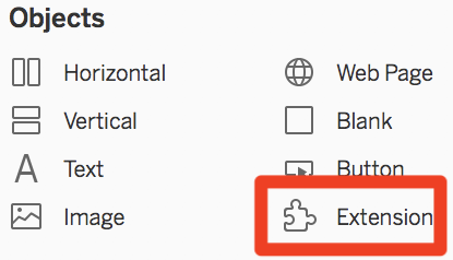
When you add an Extension object, Tableau opens a new window, where you have to select a .TREX file. You can either download existing .TREX files in the Extension Gallery, or create your own.

The Extension Gallery is available at https://extensiongallery.tableau.com. From here, you can find and download many extensions, developed by Tableau and their partners. One example is the Data-Driven Parameters extension page, with the Download button highlighted, as follows:
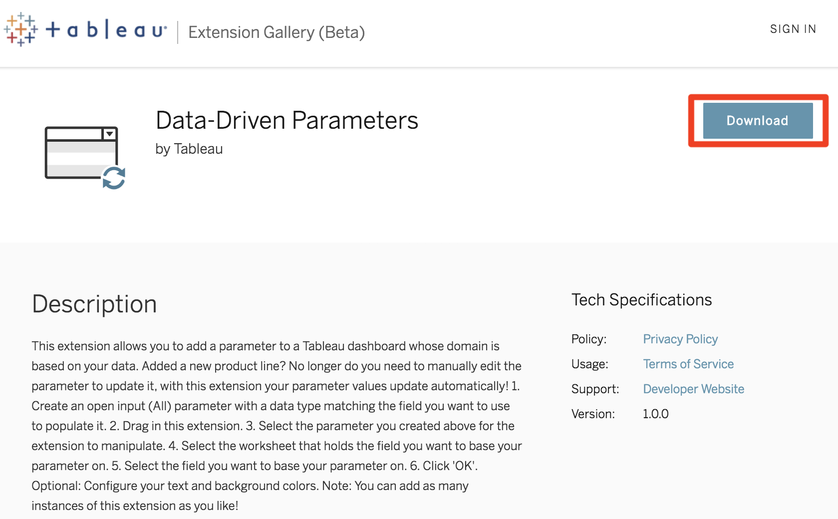
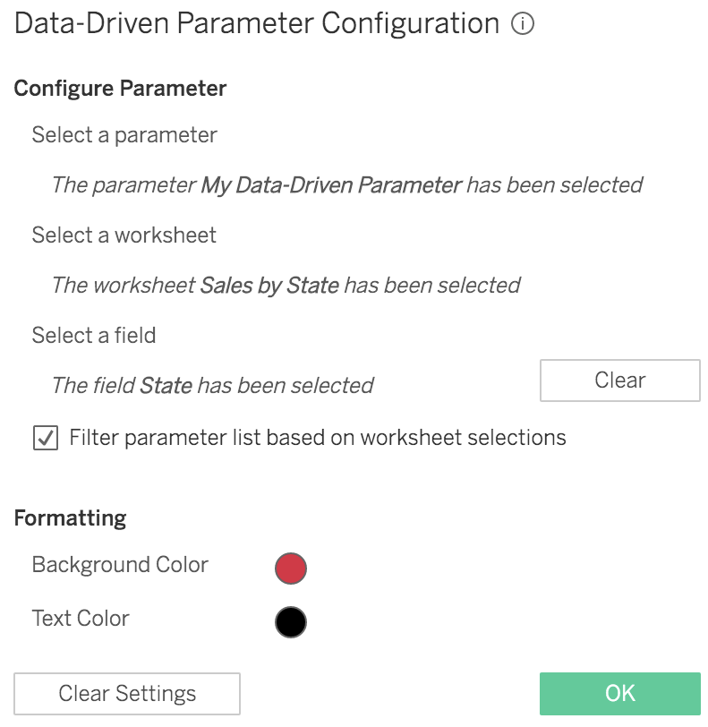
When you add an extension, Tableau opens a warning, asking you to allow and trust the extension. Then, you'll likely have to configure the extension. As every extension is different, each configuration window is different. The following is an example of the Data-Driven Parameter Configuration window, where you have to select a parameter, a worksheet, and a field:
Using the Extensions API, you can also develop new extensions in Node.js to create new interactions with your applications. Unfortunately, you will not learn how to code in Node.js in this book. However, if you want to learn how to build your own extensions, you'll find tutorials, samples, and clear explanations in the Tableau Extensions GitHub page, at https://tableau.github.io/extensions-api

As you can see, the possibilities are infinite. Tableau will frequently update the Extension Gallery, offering new ways to work with Tableau.

The next feature is also a new Dashboard object!

Dashboard navigation button (2018.3)

Have you ever created a navigation button in Tableau, to change from one Dashboard to another? It was one of those unnecessarily complicated processes: you had to add a Worksheet with a custom shape on a Dashboard, and add an action to another Dashboard: complicated, long, and now, obsolete.

Since Tableau 2018.3, the Button object is available on the Dashboard pane, as highlighted in the following screenshot:

You can add a Button to your Dashboard as follows:

  1. Drag and drop the Button object to wherever you please.
  2. When you add a Button, Tableau will display it, and you can then configure it with a right-click, as follows:

  1. On the configuration window, you will have to specify a target sheet (a Worksheet, Dashboard, or Story), and you can change the image and add a tooltip. The following is an example of a button that redirects to the Product Dashboard, with a personalized image and a tooltip:

  1. Finally, without having to use shapes and actions, you can add navigation buttons to your Dashboard, as highlighted in the following screenshot:

In 2018, Tableau added two new Dashboard objects, and also two new actions. Let's start with the first one, which is really close to the Button object.

Navigation action (2018.3)

In Tableau 2018.3, when you add an Action, you will find the Go to Sheet... action, highlighted as follows:

This action is straightforward: from one or multiple source Worksheets, you can navigate to a Target Sheet (Worksheet, Dashboard, or Story)The following screenshot shows the configuration window, when you add a Go to Sheet... action: 

In this configuration window, you can specify the following:

  • The Name of the action
  • The Source Sheets
  • The trigger (Hover, Select, or Menu)
  • The Target Sheet (Worksheet, Dashboard, or Story)

This action is quite similar to the Button object, as both allow you to navigate between your sheets. The difference, however, is crucial: one is a configurable Dashboard object, while the other is an action based on a sheet and a trigger.

The second new action allows you to create new ways to interact with your Worksheets.

The Change Set Values action (2018.3)

The Change Set Values action allows you to visually select the values to put in a set. From one or multiple source Worksheets, you can update the values of a set in your Data Source to impact other visualization in your Workbook. 

When you create a Change Set Values action, a configuration window will open, where you can specify the following:

  • The Name of the action
  • The Source Sheets
  • The trigger (Hover, Select, or Menu)
  • The set—you have to specify the Data Source and the set

As for the action filter, you can dictate the behavior when clearing the action. There are three different behaviors, as follows:

  • Keep set value: When you clear the selection, the current values of the set stay as selected.
  • Add all values to set: When you clear the selection, all of the values will be in the set.
  • Remove all values from set: When you clear the selection, all of the values will be out of the set. 

Let's go through a guided tutorial, using Sample-Superstore, to see how to configure and use this new action:

  1. Create a first Worksheet, Sales by State a map of State with Sales in color, as shown in the following screenshot:

  1. Create a set, State Set, based on State (right-click on the State field and go to Create, then Set). On the Edit Set window, select Use allas follows:

  1. Create a second Worksheet, Sales by Sub-Category, with Sales in Columns, Sub-Category in Rows, and the new State Set in Color. The following screenshot shows what your Worksheet should look like:

  1. Create a Dashboard. First, add Sales by State, then add Sales by Sub-Category to the right. Add an action and choose Change Set Values. We want to update State Set when we click on a state on the map. When we clear the selection, all of the values will bIn the set. The following screenshot illustrates the required configuration:

  1. Let's test our action! When you select one or multiple states on the map, you should see the portion of sales coming from the selected state(s) on the right. In the following screenshot, you can see the portion of Sales coming from the state of California:

The ability to visually select the values of a set will surely provide great opportunities.

The next feature will be a great time saver if you have to create Mobile layouts.

Automatic Mobile layouts (2018.2)

From Tableau 2018.2, when you add a Phone or Tablet layout, Tableau automatically rearranges the Dashboard layout, making it ready to use. In the previous versions, you had to reorder it yourself. 

Consider the automatic Phone layout created by Tableau before 2018.2, as shown in the following screenshot:

The following is the same layout, automatically built by Tableau in 2018.2:

If you decide to change something inside of your custom layout, you can use the Rearrange layout option. It will automatically reorder the items and change the sizes. The option is available when you click on the three dots (...) next to a layout, highlighted as follows:

This feature doesn't allow you to create new things, but it'll save you a lot of time. The next feature is similar.

Grids (2018.2)

Whether you are working with floating or container layouts, the goal is the same: to have a nice-looking Dashboard. With Grids, Tableau makes it easier for you to achieve this. You can show or hide the Grid from the Dashboard menu, or by pressing the G key on your keyboard. 

From the Dashboard menu, you can also open the Grid option and choose its size in pixels. The following screenshot shows an example of a ten-pixel grid:

The Grid comes with another great enhancement: you can move the floating items, pixel by pixel, with the keyboard arrows. Achieving great designs has never been simpler!

This ends the section about Tableau Desktop. As always, Tableau has improved both Tableau Desktop and Tableau Server. Now, let's look at all of the new features available in Tableau Server and Tableau Online.

Tableau Server/Online

This second section, about Tableau Server, is also divided into three parts, as follows:

  • Interacting: The new features available when you open a published Workbook
  • Web authoring: The new features available when you create a new Workbook online
  • Administration: The changes and enhancements involved in administrating a Tableau Server

To reproduce the examples presented in this chapter, you will have to know how to connect to Tableau Server, open published Workbooks, and create new Workbooks online.

Interacting

The major change comes in Tableau 2018.3 with the new browsing experience: mixed content. However, there are other nice new features when interacting with a view like the preview for Mobile layout and the ability to tag people in the comments.

Mixed content (2018.3)

From version 2018.3, Tableau Server has two ways to display the content. The new default way is called mixed content, and it shows different types of content in the same place.

Before Tableau Server 2018.3, the different types of content were separated into different tabs, and you had to select a specific tab to see its content. In the following screenshot, you can see an example of a project called Sales:

As you can see in the preceding screenshot, each tab contains a different type of content. In the following screenshot, you can see the same sales project with the sub-project (Sales Projection), one Workbook, and one Data Source, all displayed in the same place:

This new browsing method is simpler, and it keeps all of the same functionalities. If you prefer to keep the traditional browsing experience, you can deactivate the option in the Settings of Tableau Server, as follows:

In Tableau Desktop 2018.2, the Automatic Mobile layout feature allows you to build great Phone and Tablet layouts more efficiently. With the next feature, you'll be able to test them online in seconds.

Mobile preview (2018.3)

From Tableau 2018.3, you can preview the different layouts in Tableau Server. Above the toolbar, when you open a View, a new button, Preview Device Layouts, is now available, as follows:

When you click on the button, Tableau opens the preview mode, where you can select Laptop, Tablet, or Phone, to see how your Dashboard renders. For example, if you preview the preceding Dashboard, you can see the Phone layout, as follows:

Phone layout view

This new feature is a great addition to test your different layouts, without having to use the devices or special tools.

Comments (2018.2)

From Tableau Server 2018.3, you can mention Tableau Server/Online users by using the @ symbol in the comments. They will be notified by email, making it easier to follow the discussions and answer questions.

Let's move on to the web authoring improvements.

Web authoring

Web authoring is getting better and better with each release of Tableau Server. Tableau Server 2018.1 added a significant new feature: the ability to connect to data directly from the web.

Connecting to data (2018.1)

In Tableau 2018.1, Tableau changed its Tableau License model, with three new roles: creator, explorer, and viewer. A particularity of the creator role is the ability to create a new Data Source, directly on the web.

When you create a new Workbook in Tableau Server, Tableau opens the web authoring mode and asks you to connect to data. From this page, you can connect to files and servers directly from the web! There are four types of data connections available, as follows:

  • File: Drag and drop an Excel file or CSV on the web page; you can choose the sheets and build a new Data Source, just like in Tableau Desktop.
  • Connectors: A list of server-hosted databases available directly from Tableau Server.
  • On this site: Use an existing, published Data Source.
  • Dashboard Starters: Start with pre-built templates of cloud-based systems.
Users that don't have a creator license can always use published Data Sources to create new analyses, but they can't connect to new data from files or servers.

You can also add a new Data Source to an existing workbook in the web authoring, just like in Tableau Desktop.

Other web authoring improvements

As you know, the web authoring mode of Tableau Server does not yet include all of the functionalities of Tableau Desktop. However, each new version adds a list of new capabilities, getting closer and closer to Tableau Desktop. The following are some of the important missing functionalities, which are now available online:

  • Adding, removing, and editing annotations
  • Updating axes and resizing headers
  • Using Show Me from a Dashboard
  • Finding fields in your Data Source by using the search button
  • Adding images to a Dashboard
  • Connecting to Google BigQuery and opening files from Dropbox and OneDrive 
  • Creating Joins, cross-database Joins, Unions, and Pivots
You can find all of the differences between Tableau Desktop and Tableau Server/Online at https://public.tableau.com/views/TableauDesktopvTableauWebEditing/DesktopvsWebEdit, created by Andrew Pick.

From Tableau Server 2018.1, the toolbar used to interact with a view is WCAG 2.0 AA compliant. Thanks to this improvement, the experience of using Tableau Online has been better for people that use screen readers, keyboards in braille, or keyboards only.

The time when saving a workbook online was also optimized in Tableau Server 2018.3. Of course, many of the new features of the latest Tableau Desktop version, such as extensions, buttons, and the Density Mark, are also included in the web authoring mode.

In the last section, we'll focus on the improvements for Tableau Server administrators.

Administration

The major change for administrators is the new Tableau Service Manager, but you'll find many other enhancements.

Tableau Service Manager (2018.2)

The first version of Tableau Service Manager (TSM) was introduced in Tableau Server 10.5, on Linux, with the TSM command-line interface (CLI). Now, with Tableau Server 2018.2, the TSM is available for both Windows and Linux, and contains three major components, as follows:

  • A TSM CLI that replaces the previous tabadmin commands.
If you migrate from Tabadmin to the TSM CLI, the corresponding commands are available at https://onlinehelp.tableau.com/current/server/en-us/tabadmin_to_tsm_cli.htm.
  • A Tableau Service Manager API (currently in alpha) that allows you to perform administrative tasks through an API.
  • A web UI interface that allows Tableau Server administrators to configure and manage the server directly from the web, without having to connect to the machine to open the configuration.

The most interesting feature is undoubtedly the web interface. You can access the administrative Tableau Server web page by using a URL, as if you were logging in to Tableau Server. From the web page, you can directly stop and start Tableau Server. The administration web page contains three tabs, as follows:

  • Status: Check the current state of your Tableau Server.
  • Maintenance: Generate, download, and analyze the log files, as well as other maintenance tasks.
  • Configuration: Modify the topology of the server (the number of processes and nodes), the security, the user identity access, the notifications, and the licensing.

In short, all of the actions that require the administrators to connect to the machine where the server is installed to perform administrative tasks can now be done from the web, or by using the API. This improvement will surely make life easier for all administrators and DevOps teams!

To finish, let's review some other administrative improvements.

Other administrative improvements

The following is a list of other improvements for admins:

  • Tableau Bridge handles load-balanced live connections across multiple pooled clients.
  • Two new backgrounder API functions are available: the GetJobList API (pulls the list of all jobs) and the CancelJob API (reclaims the resources of running and pending jobs).
  • Tableau Online users are notified by email when they are added to a Tableau Online site.
  • New admin Data Sources are available online, to create administrative views.
  • You can activate System for Cross-Domain Identity Provider (SCMI) to manage the Tableau Server users with an external identity provider, such as Okta or OneLogin.

Summary

With version 10.5, Tableau introduced a new data engine, Hyper, and included a long-awaited feature, the Viz in Tooltip. The 2018 releases have nothing to be ashamed of, in comparison! Every release brings a lot of new features and improvements.

In Tableau Desktop, with the multiple table schema and the spatial Join, you can create better Data Sources with improved performances. Visualizing the data has also improved considerably, with the new Density Marks type, step and jump lines, Worksheet transparency, and many more improvements for Dual Axis map, hierarchy filters, and nested sorts. 

The most notable new features concern Dashboards. The ability to download and add extensions developed by Tableau and their partners from the Extension Gallery provides tons of new uses for Tableau. A few of the Tableau user dreams have already come true, thanks to the extensions. Also, you can develop your extensions to create the interactions that meet your needs. That's just one new feature! The navigation button and action, the update set value action, the automatic Mobile layout, and the grid, are some of the other features that will have huge impacts on building a Dashboard.

Tableau Server was not left out! A new browsing experience, a Mobile layout preview, and improved comments are now available when you interact with Tableau Server. Administrators also have some great new ways to perform their work, with the TSM allowing them to manage the server from a web page. However, the biggest change has come with the 2018.1 version and the ability to connect to data directly from a browser.

2018 was a great year for Tableau users and the Tableau community. This first chapter, which described the new features, is now over. If you learned how to use Tableau with this book, I hope that this chapter has provided you with a greater desire to use Tableau. If you started with this chapter, you must already know about Tableau. However, I'm sure this book has more to teach you (and that's surely why you purchased it), so don't hesitate to continue reading: read the tips, try the tutorials, and learn more about Tableau Desktop, Tableau Server, and the Tableau community.

Left arrow icon Right arrow icon
Download code icon Download Code

Key benefits

  • •Explore all the new features of Tableau 2018.x
  • •Begin your Tableau journey by understanding its core functionalities
  • •Apply advanced techniques such as data blending and parameters to make the best of Tableau

Description

Tableau is one of the leading business intelligence tools used worldwide, in organizations of every scale. In its latest release, Tableau 2018 promises richer and more useful features related to visual analytics, reporting, dashboarding, and a host of other data visualization aspects. Getting Started with Tableau 2018.x will get you up and running with these features. The book starts with all the new functionalities of the different Tableau 2018 versions, along with concrete examples of how to use them. However, if you're new to Tableau, don't worry! The rest of the book will guide you through each major aspect of Tableau with examples. You'll learn how to connect to data, build a data source, visualize your data, build a dashboard, and share it online. In the final chapters, you'll also learn advanced techniques such as creating a cross-database join, data blending, and more. By the end of the book, you will have a firm understanding of how to effectively use Tableau to create quick, cost-effective, and business-efficient business intelligence solutions.

Who is this book for?

If you’re a beginner or an existing BI professional looking to get the most out of Tableau 2018's latest features, this book is for you. You’ll also find this book useful if you’re an aspiring analyst who wants to learn the capabilities of Tableau to answer business-specific questions. No prior knowledge or experience with Tableau or any other Business Intelligence tool is necessary.

What you will learn

  • • Discover new functionalities such as density, extensions, and transparency introduced in Tableau 2018.x
  • • Connect tables and make transformations such as pivoting the field and splitting columns
  • • Build an efficient data source for your analysis
  • • Design insightful data visualization using different mark types and properties
  • • Build powerful dashboards and stories
  • • Share your work and interact with Tableau Server
  • • Use Tableau to explore your data and find new insights
  • • Explore Tableau s advanced features and gear up for upcoming challenges

Product Details

Country selected
Publication date, Length, Edition, Language, ISBN-13
Publication date : Sep 28, 2018
Length: 396 pages
Edition : 1st
Language : English
ISBN-13 : 9781788838689
Vendor :
Tableau
Category :
Tools :

What do you get with a Packt Subscription?

Free for first 7 days. $19.99 p/m after that. Cancel any time!
Product feature icon Unlimited ad-free access to the largest independent learning library in tech. Access this title and thousands more!
Product feature icon 50+ new titles added per month, including many first-to-market concepts and exclusive early access to books as they are being written.
Product feature icon Innovative learning tools, including AI book assistants, code context explainers, and text-to-speech.
Product feature icon Thousands of reference materials covering every tech concept you need to stay up to date.
Subscribe now
View plans & pricing

Product Details

Publication date : Sep 28, 2018
Length: 396 pages
Edition : 1st
Language : English
ISBN-13 : 9781788838689
Vendor :
Tableau
Category :
Tools :

Packt Subscriptions

See our plans and pricing
Modal Close icon
$19.99 billed monthly
Feature tick icon Unlimited access to Packt's library of 7,000+ practical books and videos
Feature tick icon Constantly refreshed with 50+ new titles a month
Feature tick icon Exclusive Early access to books as they're written
Feature tick icon Solve problems while you work with advanced search and reference features
Feature tick icon Offline reading on the mobile app
Feature tick icon Simple pricing, no contract
$199.99 billed annually
Feature tick icon Unlimited access to Packt's library of 7,000+ practical books and videos
Feature tick icon Constantly refreshed with 50+ new titles a month
Feature tick icon Exclusive Early access to books as they're written
Feature tick icon Solve problems while you work with advanced search and reference features
Feature tick icon Offline reading on the mobile app
Feature tick icon Choose a DRM-free eBook or Video every month to keep
Feature tick icon PLUS own as many other DRM-free eBooks or Videos as you like for just $5 each
Feature tick icon Exclusive print discounts
$279.99 billed in 18 months
Feature tick icon Unlimited access to Packt's library of 7,000+ practical books and videos
Feature tick icon Constantly refreshed with 50+ new titles a month
Feature tick icon Exclusive Early access to books as they're written
Feature tick icon Solve problems while you work with advanced search and reference features
Feature tick icon Offline reading on the mobile app
Feature tick icon Choose a DRM-free eBook or Video every month to keep
Feature tick icon PLUS own as many other DRM-free eBooks or Videos as you like for just $5 each
Feature tick icon Exclusive print discounts

Frequently bought together


Stars icon
Total $ 147.97
Getting Started with Tableau 2018.x
$54.99
Tableau 2019.x Cookbook
$43.99
Mastering Tableau 2019.1
$48.99
Total $ 147.97 Stars icon
Banner background image

Table of Contents

15 Chapters
Catching Up with Tableau 2018 Chevron down icon Chevron up icon
The Tableau Core Chevron down icon Chevron up icon
A First Dashboard and Exploration Chevron down icon Chevron up icon
Connect to Data and Simple Transformations Chevron down icon Chevron up icon
Build an Efficient Data Source Chevron down icon Chevron up icon
Design Insightful Visualizations - Part 1 Chevron down icon Chevron up icon
Design Insightful Visualizations - Part 2 Chevron down icon Chevron up icon
Create Powerful Dashboards and Stories Chevron down icon Chevron up icon
Publish and Interact in Tableau Server Chevron down icon Chevron up icon
An Introduction to Calculations Chevron down icon Chevron up icon
Analytics and Parameters Chevron down icon Chevron up icon
Advanced Data Connections Chevron down icon Chevron up icon
Deal with Security Chevron down icon Chevron up icon
How to Keep Growing Your Skills Chevron down icon Chevron up icon
Other Books You May Enjoy Chevron down icon Chevron up icon

Customer reviews

Rating distribution
Full star icon Full star icon Full star icon Full star icon Empty star icon 4
(3 Ratings)
5 star 66.7%
4 star 0%
3 star 0%
2 star 33.3%
1 star 0%
Christian Oct 15, 2018
Full star icon Full star icon Full star icon Full star icon Full star icon 5
All features are well detailed with clear explanations and hands-on examples. The pictures are in black and white in the book, which is not perfect, but it did not prevent me from learning how to use Tableau (and you can download the screenshots in color). Most important: I'm now able to use Tableau efficiently, and that's what I asked from the book.
Amazon Verified review Amazon
Placeholder Jul 23, 2019
Full star icon Full star icon Full star icon Full star icon Full star icon 5
Good
Amazon Verified review Amazon
Gavin Oct 13, 2018
Full star icon Full star icon Empty star icon Empty star icon Empty star icon 2
The information is pretty good from the sources I've read so far on Tableau but know that it's printed in black and white which is disappointing given its price and importance to data visualization.
Amazon Verified review Amazon
Get free access to Packt library with over 7500+ books and video courses for 7 days!
Start Free Trial

FAQs

What is included in a Packt subscription? Chevron down icon Chevron up icon

A subscription provides you with full access to view all Packt and licnesed content online, this includes exclusive access to Early Access titles. Depending on the tier chosen you can also earn credits and discounts to use for owning content

How can I cancel my subscription? Chevron down icon Chevron up icon

To cancel your subscription with us simply go to the account page - found in the top right of the page or at https://subscription.packtpub.com/my-account/subscription - From here you will see the ‘cancel subscription’ button in the grey box with your subscription information in.

What are credits? Chevron down icon Chevron up icon

Credits can be earned from reading 40 section of any title within the payment cycle - a month starting from the day of subscription payment. You also earn a Credit every month if you subscribe to our annual or 18 month plans. Credits can be used to buy books DRM free, the same way that you would pay for a book. Your credits can be found in the subscription homepage - subscription.packtpub.com - clicking on ‘the my’ library dropdown and selecting ‘credits’.

What happens if an Early Access Course is cancelled? Chevron down icon Chevron up icon

Projects are rarely cancelled, but sometimes it's unavoidable. If an Early Access course is cancelled or excessively delayed, you can exchange your purchase for another course. For further details, please contact us here.

Where can I send feedback about an Early Access title? Chevron down icon Chevron up icon

If you have any feedback about the product you're reading, or Early Access in general, then please fill out a contact form here and we'll make sure the feedback gets to the right team. 

Can I download the code files for Early Access titles? Chevron down icon Chevron up icon

We try to ensure that all books in Early Access have code available to use, download, and fork on GitHub. This helps us be more agile in the development of the book, and helps keep the often changing code base of new versions and new technologies as up to date as possible. Unfortunately, however, there will be rare cases when it is not possible for us to have downloadable code samples available until publication.

When we publish the book, the code files will also be available to download from the Packt website.

How accurate is the publication date? Chevron down icon Chevron up icon

The publication date is as accurate as we can be at any point in the project. Unfortunately, delays can happen. Often those delays are out of our control, such as changes to the technology code base or delays in the tech release. We do our best to give you an accurate estimate of the publication date at any given time, and as more chapters are delivered, the more accurate the delivery date will become.

How will I know when new chapters are ready? Chevron down icon Chevron up icon

We'll let you know every time there has been an update to a course that you've bought in Early Access. You'll get an email to let you know there has been a new chapter, or a change to a previous chapter. The new chapters are automatically added to your account, so you can also check back there any time you're ready and download or read them online.

I am a Packt subscriber, do I get Early Access? Chevron down icon Chevron up icon

Yes, all Early Access content is fully available through your subscription. You will need to have a paid for or active trial subscription in order to access all titles.

How is Early Access delivered? Chevron down icon Chevron up icon

Early Access is currently only available as a PDF or through our online reader. As we make changes or add new chapters, the files in your Packt account will be updated so you can download them again or view them online immediately.

How do I buy Early Access content? Chevron down icon Chevron up icon

Early Access is a way of us getting our content to you quicker, but the method of buying the Early Access course is still the same. Just find the course you want to buy, go through the check-out steps, and you’ll get a confirmation email from us with information and a link to the relevant Early Access courses.

What is Early Access? Chevron down icon Chevron up icon

Keeping up to date with the latest technology is difficult; new versions, new frameworks, new techniques. This feature gives you a head-start to our content, as it's being created. With Early Access you'll receive each chapter as it's written, and get regular updates throughout the product's development, as well as the final course as soon as it's ready.We created Early Access as a means of giving you the information you need, as soon as it's available. As we go through the process of developing a course, 99% of it can be ready but we can't publish until that last 1% falls in to place. Early Access helps to unlock the potential of our content early, to help you start your learning when you need it most. You not only get access to every chapter as it's delivered, edited, and updated, but you'll also get the finalized, DRM-free product to download in any format you want when it's published. As a member of Packt, you'll also be eligible for our exclusive offers, including a free course every day, and discounts on new and popular titles.