Adding a legend
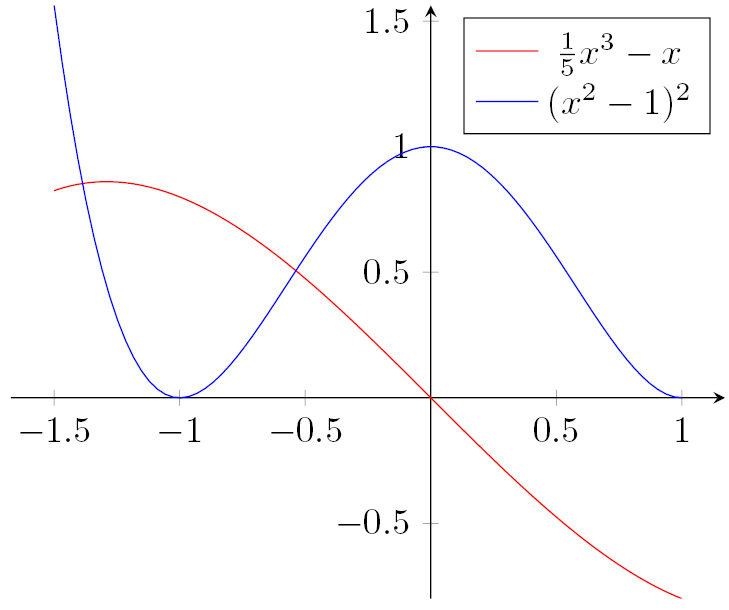
When we have several plots or datasets, it can help to identify each plot with a different color and a description. To do this, we can add a legend. Typically, this is a box within the plot area containing a symbol or color to identify each plot, along with their descriptions.
To the code of the previous example, we just need to add the following axis option:
legend entries = {$\frac{1}{5}x^3-x$, $(x^2-1)^2$}
This adds a box with a description of our plot:

Figure 13.9 – Plots with a legend
To place the legend in the top left of the plot, add legend pos = north west to the axis options. Similarly, you can choose south west or south east, whereas north east is the default. If you don’t have any whitespace where the legend fits nicely, you can set legend pos = outer north east; then, the legend will be placed next to the top-right corner of the plot without overlapping. You can see this in Figure 14.13.
The legend...


