Search icon CANCEL
Subscription
0
Cart icon
Your Cart (0 item)
Close icon
You have no products in your basket yet
Arrow left icon
Explore Products
Best Sellers
New Releases
Books
Videos
Audiobooks
Learning Hub
Free Learning
Arrow right icon
Arrow up icon
GO TO TOP
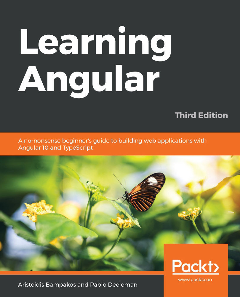
Learning Angular

You're reading from   Learning Angular A no-nonsense beginner's guide to building web applications with Angular 10 and TypeScript

Arrow left icon
Product type Paperback
Published in Sep 2020
Publisher Packt
ISBN-13 9781839210662
Length 430 pages
Edition 3rd Edition
Languages
Tools
Arrow right icon
Authors (2):
Arrow left icon
Aristeidis Bampakos Aristeidis Bampakos
Author Profile Icon Aristeidis Bampakos
Aristeidis Bampakos
Pablo Deeleman Pablo Deeleman
Author Profile Icon Pablo Deeleman
Pablo Deeleman
Arrow right icon
View More author details
Toc

Table of Contents (19) Chapters Close

Preface 1. Section 1: Getting Started with Angular
2. Chapter 1: Building Your First Angular App FREE CHAPTER 3. Chapter 2: Introduction to TypeScript 4. Section 2: Components – the Basic Building Blocks of an Angular App
5. Chapter 3: Component Interaction and Inter-Communication 6. Chapter 4: Enhance Components with Pipes and Directives 7. Chapter 5: Structure an Angular App 8. Chapter 6: Enrich Components with Asynchronous Data Services 9. Section 3: User Experience and Testability
10. Chapter 7: Navigate through Components with Routing 11. Chapter 8: Orchestrating Validation Experiences in Forms 12. Chapter 9: Introduction to Angular Material 13. Chapter 10: Giving Motion to Components with Animations 14. Chapter 11: Unit test an Angular App 15. Section 4: Deployment and Practice
16. Chapter 12: Bringing an Angular App to Production 17. Chapter 13: Develop a Real-World Angular App 18. Other Books You May Enjoy

Designing layouts using flexbox

Flexbox is a popular CSS pattern that is concerned with the layout of items in a container. It helps us to align and distribute elements inside a container efficiently and responsively. The container can dynamically adapt to the size of its elements accordingly in the best way. It can expand to fill the available space or collapse to prevent overflow.

The flexbox API contains various CSS properties that we can use to define the layout of our application. Some of the most important ones are as follows:

  • display: Sets its value to flex to indicate that we want to use flexbox.
  • flex-direction: Defines how items are placed inside the container.
  • flex-grow: Indicates that an item can grow if necessary.
  • flex-shrink: Opposite to flex-grow; indicates that an item can shrink if necessary.
  • flex-wrap: Indicates that items will not try to fit in just one line, but instead will wrap to accommodate all space.
  • justify-content: Indicates...
lock icon The rest of the chapter is locked
Register for a free Packt account to unlock a world of extra content!
A free Packt account unlocks extra newsletters, articles, discounted offers, and much more. Start advancing your knowledge today.
Unlock this book and the full library FREE for 7 days
Get unlimited access to 7000+ expert-authored eBooks and videos courses covering every tech area you can think of
Renews at $19.99/month. Cancel anytime
Banner background image