Data Preprocessing
In this section, we perform some preprocessing steps, which will allow us to transform the data into a more human-readable format. Note that data preprocessing and wrangling is one of the most important parts of data analysis. In fact, a lot of hidden patterns and relationships might arise when data is transformed in the correct way.
Furthermore, some machine learning algorithms might not even converge, or they may provide an erroneous result when fed with badly preprocessed data (a typical example of this is not scaling data in deep learning). In other cases, deriving insights from normalized data might be difficult for a human; therefore, it is good practice to transform the data before presenting the results.
In this use case, the data is already normalized and ready for analysis; nevertheless, some of its columns are hard to interpret from a human perspective. Before proceeding further, we will perform some basic transformations on the columns, which will result in a more easy-to-understand analysis at a later stage.
Exercise 1.01: Preprocessing Temporal and Weather Features
In the first part of this exercise, we are going to encode the temporal features into a more human-readable format. The seasons column contains values from 1 to 4, which encode, respectively, the Winter, Spring, Summer, and Fall seasons. The yr column contains the values 0 and 1 representing 2011 and 2012, while the weekday column contains values from 0 to 6, with each one representing a day of the week (0: Sunday, 1: Monday, through to 6: Saturday). Furthermore, we scale the hum column to values between 0 and 100 (as it represents the humidity percentage), and the windspeed column to values between 0 and 67 (as those are the registered minimum and maximum wind speed):
- As a first step, create a copy of the original dataset. This is done as we do not want a specific transformation to affect our initial data:
# create a copy of the original data
preprocessed_data = hourly_data.copy()
- In the next step, map the
seasonvariable from a numerical to a nicely encoded categorical one. In order to do that, we create a Python dictionary, which contains the encoding, and then exploit theapplyandlambdafunctions:# transform seasons seasons_mapping = {1: 'winter', 2: 'spring', \ 3: 'summer', 4: 'fall'} preprocessed_data['season'] = preprocessed_data['season']\ .apply(lambda x: seasons_mapping[x]) - Create a Python dictionary for the
yrcolumn as well:# transform yr yr_mapping = {0: 2011, 1: 2012} preprocessed_data['yr'] = preprocessed_data['yr']\ .apply(lambda x: yr_mapping[x]) - Create a Python dictionary for the
weekdaycolumn:# transform weekday weekday_mapping = {0: 'Sunday', 1: 'Monday', 2: 'Tuesday', \ 3: 'Wednesday', 4: 'Thursday', 5: 'Friday', \ 6: 'Saturday'} preprocessed_data['weekday'] = preprocessed_data['weekday']\ .apply(lambda x: weekday_mapping[x])Let's now proceed with encoding the weather-related columns (
weathersit,hum, andwindspeed). According to the information provided by the data, theweathersitcolumn represents the current weather conditions, where1stands for clear weather with a few clouds,2represents cloudy weather,3relates to light snow or rain, and4stands for heavy snow or rain. Thehumcolumn stands for the current normalized air humidity, with values from 0 to 1 (hence, we will multiply the values of this column by 100, in order to obtain percentages). Finally, thewindspeedcolumn represents the windspeed, which is again normalized to values between 0 and 67 m/s. - Encode the
weathersitvalues:# transform weathersit weather_mapping = {1: 'clear', 2: 'cloudy', \ 3: 'light_rain_snow', 4: 'heavy_rain_snow'} preprocessed_data['weathersit'] = preprocessed_data['weathersit']\ .apply(lambda x: \ weather_mapping[x]) - Finally, rescale the
humandwindspeedcolumns:# transform hum and windspeed preprocessed_data['hum'] = preprocessed_data['hum']*100 preprocessed_data['windspeed'] = preprocessed_data['windspeed']\ *67
- We can visualize the results from our transformation by calling the
sample()method on the newly created dataset:# visualize preprocessed columns cols = ['season', 'yr', 'weekday', \ 'weathersit', 'hum', 'windspeed'] preprocessed_data[cols].sample(10, random_state=123)
The output should be as follows:
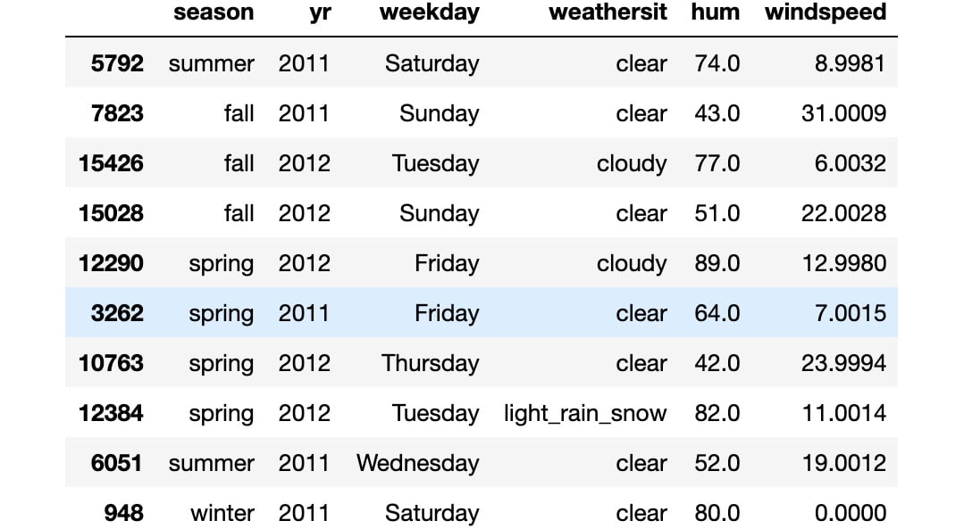
Figure 1.2: Result from the transformed variables
Note
To access the source code for this specific section, please refer to https://packt.live/2AFELjq.
You can also run this example online at https://packt.live/3e6xesx. You must execute the entire Notebook in order to get the desired result.
As you can see from the output, the transformed features have categorial values instead of numerical ones. This makes the data more readable and allows certain pandas functions to correctly plot the data (as will be demonstrated later).
Note that, in this exercise, we did not transform the temp and atemp columns (that is, the true and perceived temperatures, respectively). The reason for this is that they assume only positive values in the original dataset (hence, we do not know when the negative temperatures occurred). Furthermore, as their scales are different (the maximum value registered in the true temperature is 41 degrees, while the perceived one is 67), we do not want to modify their relations (that is, the hours at which the true temperature is greater than the perceived one and vice versa).
Registered versus Casual Use Analysis
We begin our analysis of the single features by focusing on the two main ones: the number of rides performed by registered users versus the number of rides performed by non-registered (or casual) ones. These numbers are represented in the registered and casual columns, respectively, with the cnt column representing the sum of the registered and casual rides. We can easily verify the last statement for each entry in the dataset by using the assert statement:
"""
assert that total number of rides is equal to the sum of registered and casual ones
"""
assert (preprocessed_data.casual \
        + preprocessed_data.registered \
        == preprocessed_data.cnt).all(), \
       'Sum of casual and registered rides not equal '\
       'to total number of rides'
Note
The triple-quotes ( """ ) shown in the code snippet above are used to denote the start and end points of a multi-line code comment. Comments are added into code to help explain specific bits of logic.
The first step in analyzing the two columns is to look at their distributions. A useful Python package that we will use extensively in this book is seaborn. It is a data visualization library built on top of the standard matplotlib package, which provides a high-level interface for various statistical plots. In this way, the plots we present later will be both nicer and easier to produce. Let's start by visualizing the distribution of the registered and casual rides:
# plot distributions of registered vs casual rides
sns.distplot(preprocessed_data['registered'], label='registered')
sns.distplot(preprocessed_data['casual'], label='casual')
plt.legend()
plt.xlabel('rides')
plt.title("Rides distributions")
plt.savefig('figs/rides_distributions.png', format='png')
The output should be as follows:
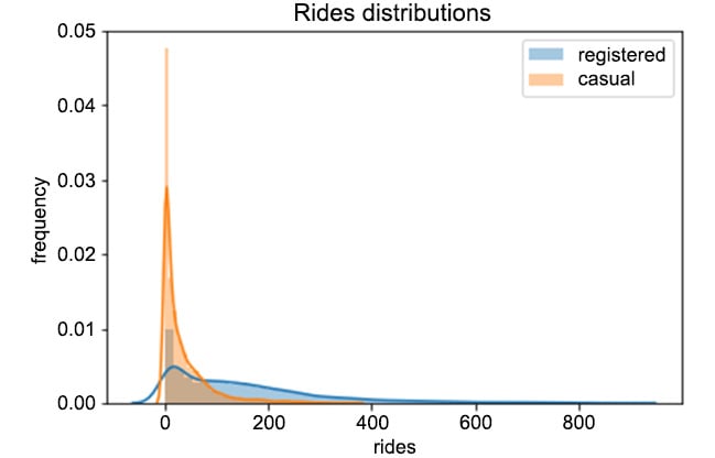
Figure 1.3: Distributions of registered versus casual rides per hour
From Figure 1.3, we can easily see that registered users perform way more rides than casual ones. Furthermore, we can see that the two distributions are skewed to the right, meaning that, for most of the entries in the data, zero or a small number of rides were registered (think, for example, of overnight rides). Finally, every entry in the data has quite a large number of rides (that is, higher than 800).
Let's now focus on the evolution of rides over time. We can analyze the number of rides each day with the following piece of code:
# plot evolution of rides over time
plot_data = preprocessed_data[['registered', 'casual', 'dteday']]
ax = plot_data.groupby('dteday').sum().plot(figsize=(10,6))
ax.set_xlabel("time");
ax.set_ylabel("number of rides per day");
plt.savefig('figs/rides_daily.png', format='png')
Here, we first take a subset of the original preprocessed_data dataset. Afterward, we compute the total number of rides for each day by first grouping the data by the dteday column, and then summing the single entries for the casual and registered columns. The result of the code snippet is given in the following figure:
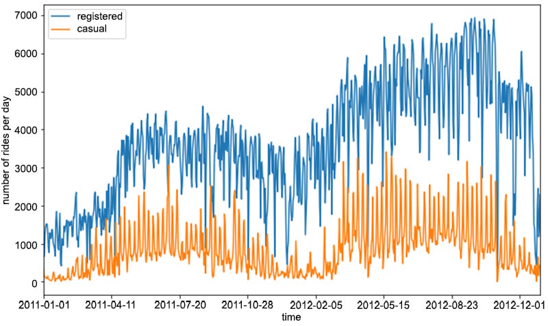
Figure 1.4: Evolution of the number of rides per day for registered and casual customers
As you can see from the preceding figure, the number of registered rides is always above and significantly higher than the number of casual rides per day. Furthermore, we can observe that during winter, the overall number of rides decreases (which is totally in line with our expectations, as bad weather and low temperatures have a negative impact on ride sharing services). Note that there is quite a lot of variance in the time series of the rides in Figure 1.4. One way to smooth out the curves is to take the rolling mean and standard deviation of the two time series and plot those instead. In this way, we can visualize not only the average number of rides for a specific time period (also known as a window) but also the expected deviation from the mean:
"""
Create new dataframe with necessary for plotting columns, and obtain number of rides per day, by grouping over each day
"""
plot_data = preprocessed_data[['registered', 'casual', 'dteday']]
plot_data = plot_data.groupby('dteday').sum()
"""
define window for computing the rolling mean and standard deviation
"""
window = 7
rolling_means = plot_data.rolling(window).mean()
rolling_deviations = plot_data.rolling(window).std()
"""
Create a plot of the series, where we first plot the series of rolling means, then we color the zone between the series of rolling means +- 2 rolling standard deviations
"""
ax = rolling_means.plot(figsize=(10,6))
ax.fill_between(rolling_means.index, rolling_means['registered'] \
                + 2*rolling_deviations['registered'], \
                rolling_means['registered'] \
                - 2*rolling_deviations['registered'], \
                alpha = 0.2)
ax.fill_between(rolling_means.index, rolling_means['casual'] \
                + 2*rolling_deviations['casual'], \
                rolling_means['casual'] \
                - 2*rolling_deviations['casual'], \
                alpha = 0.2)
ax.set_xlabel("time");
ax.set_ylabel("number of rides per day");
plt.savefig('figs/rides_aggregated.png', format='png')
The preceding code snippet produces the following figure:
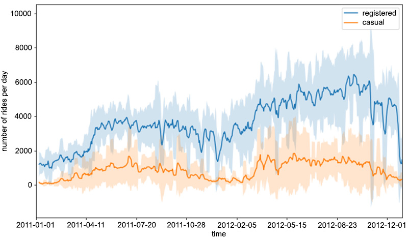
Figure 1.5: The rolling mean and standard deviation of rides
In order to compute the rolling statistics (that is, the mean and standard deviation), we use the rolling() function, in which we use mean() and std() to compute the rolling mean and standard deviation, respectively. This is a handy way to compute rolling statistics on time series, in which only recent entries account for computing them. In other words, the value of the rolling mean (or the standard deviation) at a certain time instance is only computed from the last window entries in the time series (in our case, this is 7), and not from the entries of the whole series.
Let's now focus on the distributions of the requests over separate hours and days of the week. We would expect certain time patterns to arise, as bike requests should be more frequent during certain hours of the day, depending on the day of the week. This analysis can be easily done by leveraging various functions from the seaborn package, as shown in the following code snippet:
# select relevant columns
plot_data = preprocessed_data[['hr', 'weekday', 'registered', 'casual']]
"""
transform the data into a format, in number of entries are computed as count,
for each distinct hr, weekday and type (registered or casual)
"""
plot_data = plot_data.melt(id_vars=['hr', 'weekday'], \
                           var_name='type', value_name='count')
"""
create FacetGrid object, in which a grid plot is produced.
As columns, we have the various days of the week,
as rows, the different types (registered and casual)
"""
grid = sns.FacetGrid(plot_data, row='weekday', \
                     col='type', height=2.5, aspect=2.5, \
                     row_order=['Monday', 'Tuesday', \
                                'Wednesday', 'Thursday', \
                                'Friday', 'Saturday', 'Sunday'])
# populate the FacetGrid with the specific plots
grid.map(sns.barplot, 'hr', 'count', alpha=0.5)
grid.savefig('figs/weekday_hour_distributions.png', format='png')
Let's focus on the melt() function, applied on a pandas dataset. It will create a new dataset, in which values are grouped by the hr and weekday columns, while creating two new columns: type (containing the casual and registered values) and count (containing the respective counts for the casual and registered types).
The seaborn.FacetGrid() function will create a new grid of plots, with rows corresponding to the different days of the week and columns corresponding to the types. Finally, the map() function is applied to each element of the grid, creating the respective plots. The produced plot is shown in Figure 1.6. We can immediately note that on working days, the highest number of rides for registered users takes place around 8 AM and at 6 PM. This is totally in line with our expectations, as it is likely that most registered users use the bike sharing service for commuting. On the other hand, the casual usage of bike sharing services on working days is quite limited, as the plot shows.
During the weekend, we can see that ride distributions change for both casual and registered users. Still, registered rides are more frequent than casual ones, but both the distributions have the same shape, almost uniformly distributed between the time interval of 11 AM to 6 PM.
As a conclusion, we could claim that most of the usage of bike sharing services occurs during working days, right before and right after the standard working time (that is, 9 to 5):
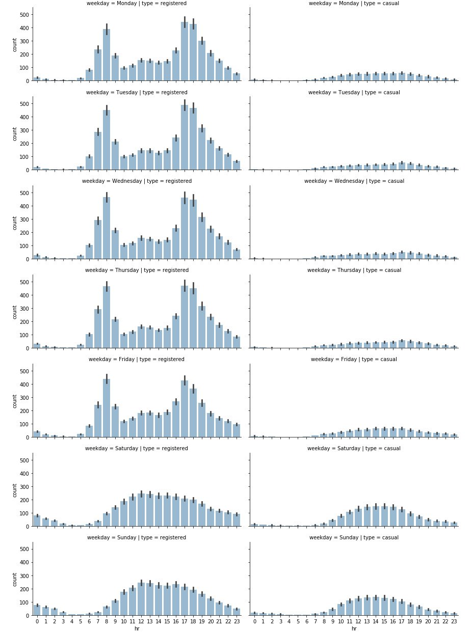
Figure 1.6: Distribution of rides on a daily and hourly basis
Exercise 1.02: Analyzing Seasonal Impact on Rides
In this exercise, we will investigate the impact of the different seasons on the total number of rides. Our goal is to create grid plots, similar to the one in Figure 1.6, in which the number of rides will be distributed over hours and weekdays, based on the current season. This exercise is a continuation of Exercise 1.01, Preprocessing Temporal and Weather Features:
- Start by combining the hours and seasons. Create a subset of the initial data by selecting the
hr,season,registered, andcasualcolumns:# select subset of the data plot_data = preprocessed_data[['hr', 'season', \ 'registered', 'casual']]
- Next, unpivot the data from wide to long format:
# unpivot data from wide to long format
plot_data = plot_data.melt(id_vars=['hr', 'season'], \
                           var_name='type', value_name='count')
- Define the seaborn
FacetGridobject, in which rows represent the different seasons:# define FacetGrid grid = sns.FacetGrid(plot_data, row='season', \ col='type', height=2.5, \ aspect=2.5, \ row_order=['winter', 'spring', \ 'summer', 'fall'])
Note that we are also specifying the desired order of rows here. We do this as we want the rows to appear in a certain order.
- Finally, apply the
seaborn.barplot()function to each of theFacetGridelements:# apply plotting function to each element in the grid grid.map(sns.barplot, 'hr', 'count', alpha=0.5) # save figure grid.savefig('figs/exercise_1_02_a.png', format='png')The resulting plot is shown in Figure 1.7:

Figure 1.7: The distribution of rides on a seasonal level
As can be seen in the plot, while each season has a similar graph shape, the count is lower for the winter graph. So there are fewer rides (registered and casual) during winter. This makes sense, as fewer rides are likely to occur when the weather conditions are poor.
For the second part of the exercise (the distribution of rides on a weekday basis), we proceed just as we did in the first part.
- First, create a subset of the initial preprocessed data, containing only the relevant columns (
weekday,season,registered, andcasual):plot_data = preprocessed_data[['weekday', 'season', \ 'registered', 'casual']]
- Again unpivot the data from wide to long format, but this time use
weekdayandseasonas grouping variables:plot_data = plot_data.melt(id_vars=['weekday', 'season'], \ var_name='type', value_name='count')
- The
FacetGridobject is created using theseaborn.FacetGrid()function:grid = sns.FacetGrid(plot_data, row='season', col='type', \ height=2.5, aspect=2.5, \ row_order=['winter', 'spring', \ 'summer', 'fall'])
- Finally, apply the
seaborn.barplot()function to each of the elements in theFacetGridobject:grid.map(sns.barplot, 'weekday', 'count', alpha=0.5, \ order=['Monday', 'Tuesday', 'Wednesday', 'Thursday', \ 'Friday', 'Saturday', 'Sunday'])
Note that we are also specifying the order of the days of the week, which is passed as a parameter to the
seaborn.barplot()function. The resulting plot is shown in the following figure:
Figure 1.8: The distribution of rides over the days of the week
Note
To access the source code for this specific section, please refer to https://packt.live/2Y43Kpx.
You can also run this example online at https://packt.live/30hgeda. You must execute the entire Notebook in order to get the desired result.
An interesting pattern occurs from the analysis conducted in Exercise 1.02, Analyzing Seasonal Impact on Rides. There is a decreasing number of registered rides over the weekend (compared to the rest of the week), while the number of casual rides increases. This could enforce our initial hypothesis, that is, that registered customers mostly use the bike sharing service for commuting (which could be the reason for the decreasing number of registered rides over the weekend), while casual customers use the service occasionally over the weekend. Of course, such a conclusion cannot be based solely on plot observations but has to be backed by statistical tests, which is the topic of our next section.


