Search icon CANCEL
Subscription
0
Cart icon
Your Cart (0 item)
Close icon
You have no products in your basket yet
Save more on your purchases! discount-offer-chevron-icon
Savings automatically calculated. No voucher code required.
Arrow left icon
Explore Products
Best Sellers
New Releases
Books
Videos
Audiobooks
Learning Hub
Free Learning
Arrow right icon
Arrow up icon
GO TO TOP
Practical Business Intelligence

You're reading from   Practical Business Intelligence Optimize Business Intelligence for Efficient Data Analysis

Arrow left icon
Product type Paperback
Published in Dec 2016
Publisher Packt
ISBN-13 9781785885433
Length 352 pages
Edition 1st Edition
Languages
Arrow right icon
Author (1):
Arrow left icon
Ahmed Sherif Ahmed Sherif
Author Profile Icon Ahmed Sherif
Ahmed Sherif
Arrow right icon
View More author details
Toc

Table of Contents (16) Chapters Close

Practical Business Intelligence
Credits
About the Author
About the Reviewer
www.PacktPub.com
Customer Feedback
Preface
1. Introduction to Practical Business Intelligence FREE CHAPTER 2. Web Scraping 3. Analysis with Excel and Creating Interactive Maps and Charts with Power BI 4. Creating Bar Charts with D3.js 5. Forecasting with R 6. Creating Histograms and Normal Distribution Plots with Python 7. Creating a Sales Dashboard with Tableau 8. Creating an Inventory Dashboard with QlikSense 9. Data Analysis with Microsoft SQL Server

Building a sales dashboard in Tableau


There are many ways to get started with visualizing in Tableau. One convenient way is to build out several separate visualizations in sheets and then connect them together on a single dashboard canvas later on.

Building a Crosstab

Next to the Data Source tab, click on the tab called Sheet1 to get started visualizing our first component, as seen in the following screenshot:

As we get started with our first visualization, we will primarily see a blank canvas along with access to dimensions, measures, and visualization options. Any object that comes through as a non-numeric field from the data will be labeled under the Dimensions header and can be accessed from the upper left-hand side, as seen in the following screenshot:
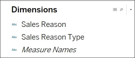
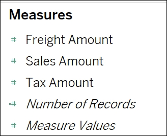
Subsequently, any object that comes through from the data as a numeric field will be interpreted as a measure and will fall under the Measures header, as seen in the following screenshot:
And finally, if you are looking to see what the...

lock icon The rest of the chapter is locked
Register for a free Packt account to unlock a world of extra content!
A free Packt account unlocks extra newsletters, articles, discounted offers, and much more. Start advancing your knowledge today.
Unlock this book and the full library FREE for 7 days
Get unlimited access to 7000+ expert-authored eBooks and videos courses covering every tech area you can think of
Renews at $19.99/month. Cancel anytime
Banner background image